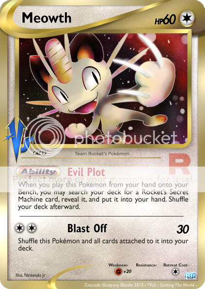
PokéBeach Create-A-Card December 2013! Lemonnade and Zygarde are victorious!

RE: PokéBeach Create-A-Card December 2013!

Since we won't be getting a CaC for Jan, can we have a "dual card" CaC for Feb? As in, make two cards, each card is graded out of 25 points instead of 50, and maybe an additional /10 mechanics/originality/whatever you wanna call it points if the cards work together (such as legend cards work together).
 
RE: PokéBeach Create-A-Card December 2013!

The suspense is killing me. Can't we just get someone else to judge image-based this time? Why is this not problem solved?
 
RE: PokéBeach Create-A-Card December 2013!

Mora said:
The suspense is killing me. Can't we just get someone else to judge image-based this time? Why is this not problem solved?

I like this idea.
All right.
Anyone who isn't a contestant in image-based, you can try your hand at judging the image-based for this month, since CMP is sadly AWOL. The first person to PM me a complete list of everyone's scores will have that one posted.

This is open to anyone, as long as you aren't an entrant in image-based this month (because that would be biased). You have until whenever, but the sooner the better.
...okay, go!

Here are the people (13 of them) who did image entries this month:

anabel1406 *
Arcticwhite *
bigfootaus *
Blui *
Heavenly Spoon *
Mora *
Nod3 *
Nekoban Ryo *
PMJ *
RealArity *
RedArceus *
Xous *
Zygarde *
 
RE: PokéBeach Create-A-Card December 2013!

I'm just gonna put CAC up without image, then...
 
RE: PokéBeach Create-A-Card December 2013!

Machamp The Champion said:
I'm surprised Teal scored so low. "So low" being a pretty respectable score. This is probably the lowest score he's ever gotten, lol.
Ah, well, I worded the attack wrong to see how well DNA can judge because I wanted to know if he is a good wording judge since I'm not sure I will be a good one. I was actually thinking more of that it's supposed to be worded like Kecleon's attack.

On the Ability I just wasn't sure how to word it, it's not like I made that one wrong on purpose, but I wanted to see how DNA sees it. Usually when I didn't know how to word something, I just switched the idea, lol.

That's what I was refering to with my post before judgings, too.
 
RE: PokéBeach Create-A-Card December 2013!

Keeper of Night said:
Maybe I should send in scores for the fun of it...
I hope you're joking when you say 'for the fun of it'.
 
RE: PokéBeach Create-A-Card December 2013!

As in, maybe I'll send in serious scores, but the act will be for fun.
If that makes sense.
 
RE: PokéBeach Create-A-Card December 2013!

Keeper of Night said:
As in, maybe I'll send in serious scores, but the act will be for fun.
If that makes sense.
I think that's what DNA meant with what he said. :p
 
RE: PokéBeach Create-A-Card December 2013!

DNA said:
Mora said:
The suspense is killing me. Can't we just get someone else to judge image-based this time? Why is this not problem solved?

I like this idea.
All right.
Anyone who isn't a contestant in image-based, you can try your hand at judging the image-based for this month, since CMP is sadly AWOL. The first person to PM me a complete list of everyone's scores will have that one posted.

This is open to anyone, as long as you aren't an entrant in image-based this month (because that would be biased). You have until whenever, but the sooner the better.
...okay, go!

Here are the people (13 of them) who did image entries this month:

anabel1406 *
Arcticwhite *
bigfootaus *
Blui *
Heavenly Spoon *
Mora *
Nod3 *
Nekoban Ryo *
PMJ *
RealArity *
RedArceus *
Xous *
Zygarde *

Wait, really? Good idea? That's it? I'm surprised that was as easy as it was. Why we didn't think of this sooner?

If I could, I'd nominate Teal to judge because he/she isn't in image, and he/she seems to know what he's doing, and I don't want to some user who just signed up and happened to see this to be the first person to PM DNA scores because that would be weird :p
 
RE: PokéBeach Create-A-Card December 2013!

Teal said:
Zygarde said:
I understand that this is text based only, but are we allowed to make cards for past metagames?
No, since I can't necessarily judge them since I have played the TCG only since DP.

Since people on image usually go for other format cards, I don't think Teal would be suited for the job. No offense Teal :)
 
RE: PokéBeach Create-A-Card December 2013!

Well, I'd prefer it if it were someone who's been a contestant in the past several months, of course :p Probably someone who's been a winner or runner-up at least once before.
Also, I'd not be against one of the image-based contestants doing the judging, but the problem with that is that they'd have to disqualify themselves, and I'd rather not have that.
 
RE: PokéBeach Create-A-Card December 2013!

How bout I judge everything except mine, and somebody else can judge mine?
 
RE: PokéBeach Create-A-Card December 2013!

No. I agree, definitely none of the contestants should be able to officially judge the rest of the competition.
 
RE: PokéBeach Create-A-Card December 2013!

Getting results tomorrow would be the greatest gift to me. And for a good reason.
 
RE: PokéBeach Create-A-Card December 2013!

I'm just going to go ahead and judge the image-based for this month myself, since CMP isn't here. Consider this my parting gift to you all.

I won't be good as CMP was, and I don't know all the intricacies and such, but I have been watching him and I'll try to emulate what he looks for. At the very least it's better than nothing and I know some of you are anxious.

There's 13 entries to go through, so without further ado, here we go, the last bit of CAC 2013.

~~~~~~~~~~~

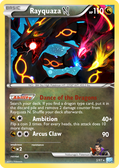
anabel1406:

11515858933_6140cffd26_o.png


Alphabetical!

I definitely remember Nobunaga's black Rayquaza, back from when I played Conquest. It was truly a majestic beast, and the choice for a picture is actually quite impressive. Nobunaga's face is also at the bottom right of the card. Though, the picture is only one small part of the card; there is still much more besides.

Up by the HP, I don't think that the picture extends beyond the frame normally on cards; the picture extends all the way off to the right. The font used for the Pokedex entry and Nobunaga is a little odd too, though maybe it's just me.

The ability and 2 attacks look scrunched together as well; all the letters come together and they don't look like they have much breathing room. The ability I think can also start higher up the card as well.

Wording is the thing I look for the most, having done text-based (and wording becomes the most important bit), and the wording could use a bit of upkeep. Here's how it would probably be done:

Ability: Dance of the Dragons
Once during your turn (before your attack), you may search your deck for a {Dr} Pokémon and discard it. If you do, heal 20 damage from this Pokémon. Shuffle your deck afterward.

{Dr}{C} Ambition 40+
Flip 3 coins. This attack does 10 more damage for each heads.

{Dr}{C}{C} Arcus Claw 90

As far as playability it actually comes pretty close; I'd probably have the second attack cost {Dr}{Dr}{C} (assuming Dragon is a basic Energy here), but other than that I think it works. Nice way to start it off.


Creativity/Originality: 16/20
Wording: 12/15
Fonts and Placement: 8/10
Believability/Playability: 4.5/5
Total: 40.5/50


Arcticwhite:

152kme8.jpg


It's been a while since I've looked at one of your cards, and I have the feeling I've seen this card before. Maybe from a previous month, but spruced up?

Picture has the pop-out effect that is typical of most LV.X cards, and for the most part, everything appears to be okay - the Poke-Power and attack could be spaced slightly apart though, like you see here - a very small difference, but still it can be enough.

Speaking of which, Moon Skip is probably how Lash Out should be worded - "If this attack Knocks Out the Defending Pokémon, draw a card." and Uprising would be "Once during your turn (before your attack), you may flip a coin until you get heads. For each tails, remove 2 damage counters from each of your Pokémon." It's not that you're wrong per se; it's that you can say it with less words.

Though I am scared it would create an infinite loop with that Shiftry...


Creativity/Originality: 19/20
Wording: 13/15
Fonts and Placement: 9/10
Believability/Playability: 4.5/5
Total: 45.5/50


bigfootaus:

inkay_by_jedi201-d6z0g1k.png


Dat Radiant Collection.

I actually like the background picture - Inkays going in all directions, and it kinda looks like something out of Radiant Collection too - it even has a unique foil pattern. Though I'm not sure why the speckles would extend onto the yellow border as well...

The numbers used for the damage, as well as the word "HP", look kinda thin. The rest appears to be okay, though I think the attacks could be a teeny bit lower. Though, what concerns me the most is, while you mention 'your opponent's Active Pokemon' in the first attack, you switch back to 'Defending Pokemon' for the second one. I like consistency in wording. ;-;

Other minor fixes would be 'that attack does nothing' at the end of Ink Cloud, and the tails coin flip thing to start with 'Whenever' - look at this card for an example.


Creativity/Originality: 18/20
Wording: 13/15
Fonts and Placement: 9/10
Believability/Playability: 5/5
Total: 45/50


Blui:

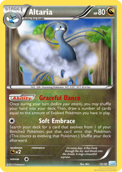
altaria_card_by_blui129-d6yqtcl.png


I know you don't like holo cards for being mainstream, but if you think about it, Dragon-types are also too mainstream.

This card appears to be mostly acceptable; nothing is too largely out of place and everything appears to be aligned correctly, though on the attack you should replace the comma with the word 'and', like Leavanny here, and Spiritomb before that. I do like the draw-refresh bit, though, but I can't help but feel it was designed with Fluffychomp in mind...


Creativity/Originality: 17/20
Wording: 14/15
Fonts and Placement: 10/10
Believability/Playability: 5/5
Total: 46/50


Heavenly Spoon:

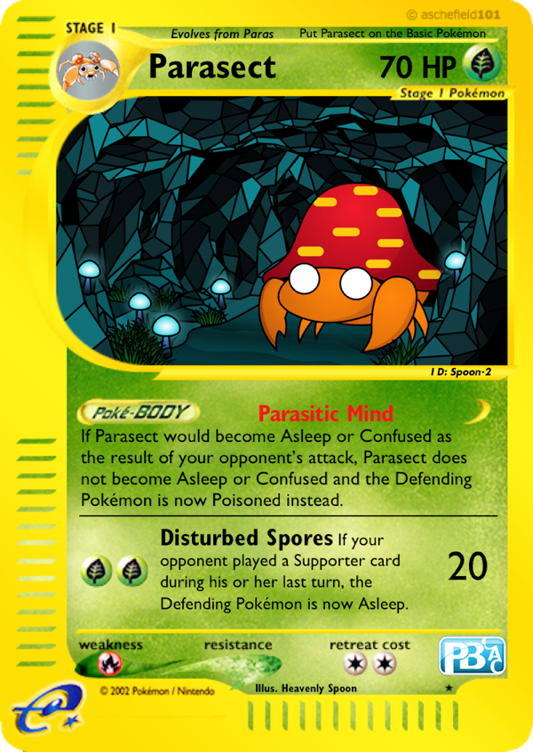
eAJngQt.png


And yet somehow I am not in the least bit surprised by this.

It really does go well with the theme of Parasect here; Parasect usually manipulates Special Conditions, though that is to be expected. I don't have a whole lot to say here as most everything appears to be in order, though one thing really stands out:

Why is the outside bit of the card somewhat blurry? (Look at where it says Stage 1 Pokemon, Weakness, Resistance, and Retreat Cost, as well as the Poke-Body symbol. They're mildly smudged.) Did you blow up the card or something? It's somewhat distracting...


Creativity/Originality: 18/20
Wording: 15/15
Fonts and Placement: 8/10
Believability/Playability: 5/5
Total: 46/50


Mora:

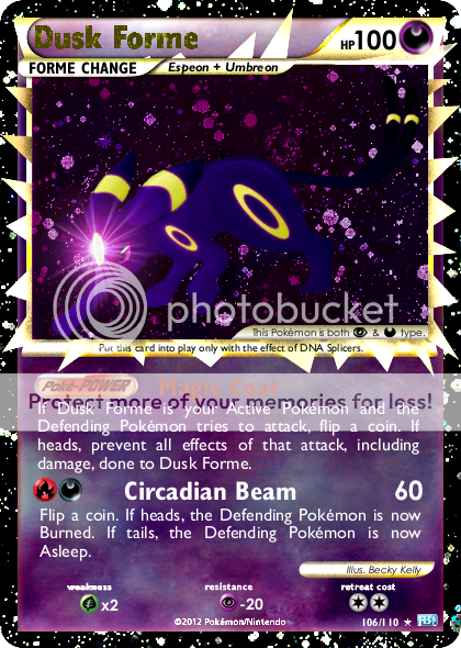
106DuskForme_zps8767f6b2.png


DNA Splicers - Trainer

Choose 1 or more of your Pokémon in play. Search your deck or your discard pile for a Forme Change Evolution card that evolves from that Pokémon and put it on the Pokémon you chose. (If you chose more than 1 Pokémon, put the Forme Change Evolution card on each Pokémon and all cards attached to them.) If you search your deck, shuffle your deck afterward.

...Well then.

I do see the new mechanic you're doing here, though I am a little surprised why you chose the HGSS Prime blanks to do so, instead of, say, Delta Species blanks, that were already of dual-typed Pokemon.

I was a bit surprised that the Poke-Power and attack were that close to each other, but I looked at an existing Prime and they're like that too. The words 'Circadian Beam' are thicker than 'Magic Coat', though, and should be a bit thinner. The '100' for the HP I believe is the incorrect font, and (more obviously) the 'Dusk Forme' looks, well, tacked on.

I know that I usually point out what's wrong with the cards, but it's to help improve. If I don't say much, it's because I don't really have much to add.


Creativity/Originality: 19/20
Wording: 14/15
Fonts and Placement: 9/10
Believability/Playability: 4/5
Total: 46/50


Nekoban Ryo:

shining_sneasel_fake_card_by_karite_kita_neko-d6y87ku.png


Neo cards? Challenge accepted.
...the set number is 12/13; usually Shining cards are beyond the ending point. :p

Other than that, everything reminds me both of Sneasel and of Shining cards back in the day, with their weird foil patterns and everything, that would make them appear very dark, but only because the foil was on the Pokemon itself.

Everything looks in order, though I think the Reap text is a little bit too big. But, sadly, you forgot the "You can't have more than 1 Shining Sneasel" clause along the top of the card. Alex how could you do this to me. ;-;


Creativity/Originality: 17/20
Wording: 14/15
Fonts and Placement: 9/10
Believability/Playability: 5/5
Total: 45/50


Nod3:

MMibWK9.png


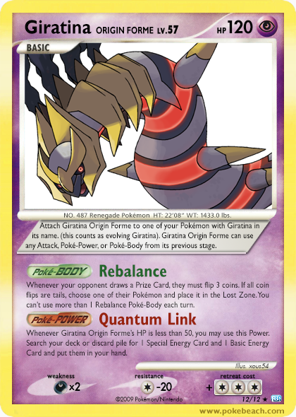
(The retreat cost's special background and plus represents inheritance - if "evolved", it will take the retreat cost of the card it evolved from plus the retreat cost it has.)

That Giratina has a very fat retreat cost. What would that be, 3+3=6? Freaky.

I feel like you could have done way better. The picture's generic, and although that isn't odd on its own, the words look a little blurred and too spaced out. On top of which, none of the wording looks correct (and I'm a bit of a Nazi for wording).

I think it should be:

Poké-Body: Rebalance
Whenever your opponent takes a Prize Card, he or she must flip 3 coins. If all 3 are tails, put 1 of your opponent's Pokémon and all cards attached to it into the Lost Zone. You can't use more than 1 Rebalance Poké-Body each turn.

Poké-Power: Quantum Link
Once during your turn (before your attack), if Giratina Origin Forme's remaining HP is 50 or less, you may search your deck or your discard pile for 1 basic Energy card and 1 Special Energy card, show them to your opponent, and put them into your hand. If you search your deck, shuffle your deck afterward.

This is unlike you; you usually put more effort into your image fakes. I'm surprised.


Creativity/Originality: 16/20
Wording: 12/15
Fonts and Placement: 8/10
Believability/Playability: 4/5
Total: 40/50


PMJ:

i7TE3YX.png


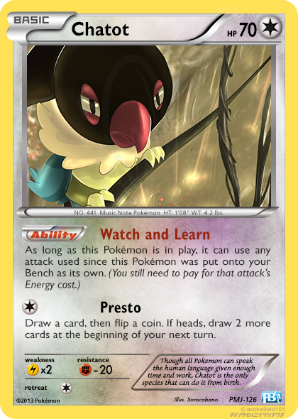
Watch and Learn is like a wording Nazi's nightmare. And yet there's no existing example so I don't think it really can be fixed.

>attempt to fix Watch and Learn
>can't find a way to
>tries not to cry
>cries a lot

That Colorless Energy symbol is really fat, and the words look a mite too thin. The x2 and -20 on W/R look too thin as well, but other than that, it's a pretty solid entry.


Creativity/Originality: 19/20
Wording: 15/15
Fonts and Placement: 9/10
Believability/Playability: 4/5
Total: 47/50


RealArity:

gengar_gl__morty_s_gengar__by_realarity-d6yyzgj.png


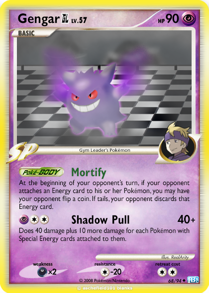
"Ah don' think ah've seen you 'round these parts, pardner."

Gengar GL, wasn't that a thing once? Not a big deal; it can still work. Though the GL cards did have silvery borders, it was more so blending into the rest of the yellow border, more than just having a silver line around the edge, and then a yellow one.

Mortify has some quirky wording; I'd think it'd be different, but it's not exactly wrong either. Though, for Shadow Pull, it'd be "Does 40 damage plus 10 more damage for each Pokémon in play that has any Special Energy cards attached to it." Veeeeery slight difference. I also think the font is a tiny bit too fuzzy, but that could be just me. Overall, as a first entry, this is pretty solid.


Creativity/Originality: 17/20
Wording: 14/15
Fonts and Placement: 9/10
Believability/Playability: 4.5/5
Total: 44.5/50


RedArceus:

uaBK15R.png


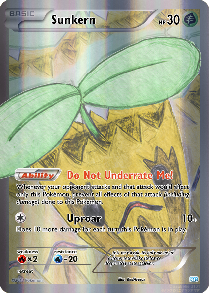
AAAAAAAAAAAAAAAAAAAHAHAHAHAHAHAHAHAHAHAHAHA
I think this is my favorite due to sheer lulz

I thought it was crying at first, due to the jagged markings, but then I realized its eyes were wide open. Other than that, your Sunkern full art is definitely a worthwhile entry. Only thing I really have to suggest is that you write out 'including damage', and don't put it in parentheses.

I really want this card to be real.


Creativity/Originality: 20/20
Wording: 14/15
Fonts and Placement: 10/10
Believability/Playability: 4/5
Total: 48/50


Xous:

xerneas_legend_by_xous54-d6wh7c2.png


Ah, the last card I'll see from Xous in a while? Let's make it worthwhile, then.

As usual, I see you have a flair for the interesting, the shiny, and the LEGEND mechanic. This Xouneas *shot* is no different. Since LEGEND cards have a lot going on in them, I had to comb over the card really well to make sure everything works. What I found:

On the top half of the card, the LEGEND clause is not in the same bar as the HP, but rather on the side perpendicular to it, below the HP number (like here). That's the only bit off with the top half.

On the bottom half of the card, the effect text for the power and attack seem to be too thick/wide - I looked at Lugia and the text seems to be roughly the same size as on other cards.

Yet these things do not detract from the beauty of the card as a whole, and as before you do not fail to impress us all. Excellent job.


Creativity/Originality: 19/20
Wording: 15/15
Fonts and Placement: 9/10
Believability/Playability: 5/5
Total: 48/50


Zygarde:

meowthen_zps67b8f810.png


Meow, then?

You and your weird blanks; they always make things more difficult for me :p Everything looks good, though the "HP" and "60" look really scrunched together; you could probably space them out a bit, because now it looks a bit clumsy. I'm also not sure what's behind the italicization of both the HP and the attack damage; I suppose it's an aesthetic touch, though it is somewhat distracting. The "+20" for Weakness is also pretty small, and hard to see.

Still, I credit you on using your own unique blanks for most of your entries. This kinda reminds me of the Drag-Unite Dragonite from way way back.


Creativity/Originality: 19/20
Wording: 15/15
Fonts and Placement: 10/10
Believability/Playability: 5/5
Total: 49/50

And there you have it. I'm not a bit of a versatile grader as CMP is, and I apologize for that, but I owe it to you guys to not leave this month without a conclusion. It was difficult, seeing as there were a lot of 45s and 46s.

First place, interestingly enough (to some) is Zygarde with his Team Rocket's Meowth, scoring pretty high, with 49 points. Sometimes, simple is better, though that alone didn't make him win. Second place we have a tie with RedArceus and Xous each getting 48 points, on two completely different ends of the spectrum (Sunkern and Xerneas LEGEND are as different as night and day). PMJ got what he wanted and finished solidly in third.

Good luck in 2014, guys!
 
Woo, congratulations to all involved! =D

I do have some responses to the feedback I got though:

I actually like the background picture - Inkays going in all directions, and it kinda looks like something out of Radiant Collection too - it even has a unique foil pattern. Though I'm not sure why the speckles would extend onto the yellow border as well...
I'm not sure if the PokeBeach scans show it too well, but all Radiant Collection cards that have speckles have the speckles extend to the border. I'm looking at my collection of Shaymin EX FA, Emolga FA, and other Radiant Collection cards in my binders and they all show that. Plus, I had the same thing going with my Klefki in November. No problems were reported with speckles on that.

The numbers used for the damage, as well as the word "HP", look kinda thin. The rest appears to be okay, though I think the attacks could be a teeny bit lower. Though, what concerns me the most is, while you mention 'your opponent's Active Pokemon' in the first attack, you switch back to 'Defending Pokemon' for the second one. I like consistency in wording. ;-;
Yeah I figured my fonts would be off... I can never seem to get them quite right, but I do try to make up for it in other areas!
Now, regarding using " your opponent's Active Pokemon" and then "Defending Pokemon": it's come up in other threads (and was my intention for this card) that the effects applied to a Defending Pokemon then get removed if, say, a Keldeo EX rushes in. Keldeo EX (being the new Defending Pokemon) does not have the effects that the old Defending Pokemon had.
However, with Inkay's Ink Cloud, the Ink Cloud affects all opponent's Active Pokemon no matter what switches happen to the opponent's Active Pokemon. While the effect is similar to a Sand-Attack, Ink Cloud is meant to be a persistent thing for the entirety of your opponent's turn.
So in summary: the inconsistency is on-purpose to signify different effect durations. Hope it all makes sense.


Okay now that all of the negative stuff is out of the way I just wanna say: Thanks for appreciating the art! It went through so many iterations, I'm glad people like it ;_; I totally try to become the master of RC-styled cards here heh heh
 
However, with Inkay's Ink Cloud, the Ink Cloud affects all opponent's Active Pokemon no matter what switches happen to the opponent's Active Pokemon. While the effect is similar to a Sand-Attack, Ink Cloud is meant to be a persistent thing for the entirety of your opponent's turn.
So in summary: the inconsistency is on-purpose to signify different effect durations. Hope it all makes sense.
Since 'opponent's Active Pokemon' and 'Defending Pokemon' are synonymous terms, what you'd be aiming for is something along the lines of
"Whenever your opponent tries to attack during his or her next turn, your opponent flips a coin..."

Because that way it doesn't matter who's up front. If you want you could also add a clause of "Benching this Pokemon ends this effect" but that would be up to you.

16/20 for creativity for Nod3? That card should earn a 20/20, and then some.
You realize that image-based creativity isn't just thinking up new concepts, right?

I'm not sure if the PokeBeach scans show it too well, but all Radiant Collection cards that have speckles have the speckles extend to the border. I'm looking at my collection of Shaymin EX FA, Emolga FA, and other Radiant Collection cards in my binders and they all show that. Plus, I had the same thing going with my Klefki in November. No problems were reported with speckles on that.
Wait, really? Even on non-FAs? I must not have noticed... I'll have to check my non-FA Radiant Collection stuff later...
 
Back
Top