Darn, I don't have SAI, thanks for telling me!
You are using an out of date browser. It may not display this or other websites correctly.
You should upgrade or use an alternative browser.
You should upgrade or use an alternative browser.
SC Pokemon Artwork
- Thread starter Silver_Cyh
- Start date
The zodiac for this year~
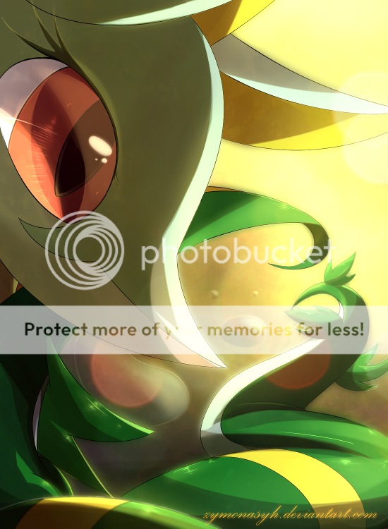

unbelievably incredible!!! Love it!!!
Sylveon looked damm osem =3= <3
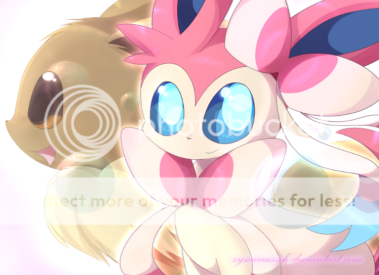

Articuno said:I really like the latest artwork! What effects and layer modes did you use?
luminous/addition and overlay for the brightness and light effect
multiply for the shadow
gaussian blur for sylveon's radiating effect
motion blur for the ribbon
This is so cool!!! I love the lighting effects and the facial expressions;3
Can't wait to see more!
Can't wait to see more!
This latest one is nice, but Sylveon's eyes seem out of place unlike Eevee's eyes. I think it's something you could fix with simply adding a layer over of something to cover it up a bit, but beyond that I like the piece.
The new artwork is awesome! You show a lot of your knowledge of effects in your artwork. I just want to say two things about this piece that I think are kind of off: The piece is too effect heavy. Some of the effects are too over used, and since it is a brighter piece you shouldn't rely on effects too much to add to it. I would say for this sort of piece leave out the bubble-like effects. The second thing is Sylveon's nose. It's a bit too small and looks more like a cartoon human nose than an animal nose. Either make it bigger in general or increase the line size.
Otherwise, awesome job!
Otherwise, awesome job!
:O I'm in love with that Serperior. Amazing! Great work, can't wait to see more artwork from you!
HolyMackerel said:This latest one is nice, but Sylveon's eyes seem out of place unlike Eevee's eyes. I think it's something you could fix with simply adding a layer over of something to cover it up a bit, but beyond that I like the piece.
Now that you mentioned, indeed.
I would pay more notice in the future.
cinnaminbuns said:... The piece is too effect heavy. Some of the effects are too over used, and since it is a brighter piece you shouldn't rely on effects too much to add to it. I would say for this sort of piece leave out the bubble-like effects. The second thing is Sylveon's nose. It's a bit too small and looks more like a cartoon human nose than an animal nose. Either make it bigger in general or increase the line size.
Otherwise, awesome job!
The effect is intended for this art to make it somehow "dreamy". Since I did not draw, nor use any background on this one, the character itself would be plain without the brightening. Same goes with the bubbles, they were last minute addition to make up to the lack of objects over here.
(I don't know how Eevee evolve into Sylveon yet, or else I'd make a theme referring to it.)
The tiny nose... I just made it on-scale with Sugimori's artwork. Small nose is cute, i think ^^;
But if the effect is too much, i'll take not of it.
Imma take a sleep
Good night ~,~
p.s. i received some birthday wishes. I know it's a bit late, but thank you. I never expected that C':
Good night ~,~
p.s. i received some birthday wishes. I know it's a bit late, but thank you. I never expected that C':

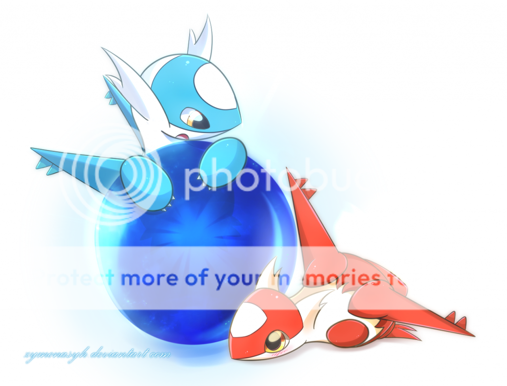
Silver_Cyh, your artwork never fails to impress me. One thing that I always admire about your art style is the use of light. The luminosity emanating from Latios, Latias, and the orb truly bring out the wonderful qualities of this art piece.
Amazing job!
Amazing job!
Coliche - Holy Guardian of Peace
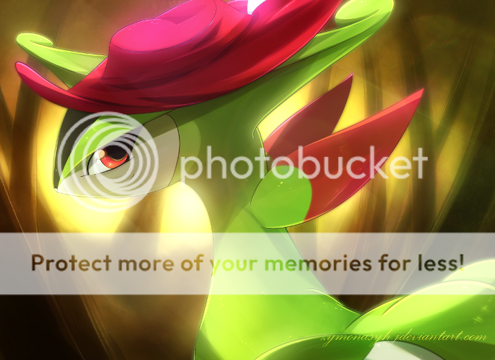

Just got back into TCG this lately...

Every artist draws a specific way and not everyone tends to draw it in a similar manner to the official artwork. In this case, Silver_Cyh is focusing on attracting the viewer's to the eyes and showing the true artistic detail within them.
--
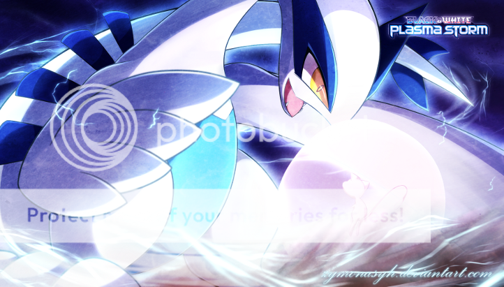
Amazing job on Lugia, Silver_Cyh. The force of the attack, the intensity of the various colors used, and just the overall pose scream POWERFUL. The only thing that I would have possibly made different is slightly reduce the intensity of the colors of the attack and maybe add a few more shades in, but I understand that you are trying to make Lugia the main, important subject in this piece.
Blui said:Sexy work man, it looks really epic. Only thing I don't really like is how big Lugia's eye is, but this is a recurring theme across your work so I'll let it slide.
oh damm ^^;. I thought that bigger eye = cuter.
Ice Arceus said:The only thing that I would have possibly made different is slightly reduce the intensity of the colors of the attack and maybe add a few more shades in
I'm not really clear on this point
The attack it's creating is a bit too bright. I would just slightly reduce the brightness of that and/or maybe incorporate a couple more shades of that pink color or increase the area of that pink section just a bit.

