In my previous art thread, most of the pic I uploaded isn't Pokemon-based. Plus, the commission I received are mostly non-Pokemon themed (sigh), so it isn't really active since I don't really think it's appropriate to upload those into the forums
I think I'll share some artwork here if it's Pokemon-based. I'd need some critique too, if possible
------
This is somehow a Pokemon-Pony crossover, but I hope that you don't mind about the pony (there can be haters). I'd like some feedback on this...
Lati@s + Rainbow Dash
------
My first attempted on the blurring effect to indicate the distance between the character and the viewer. Also the motion blurring effect
http://i1103.photobucket.com/albums/g479/silvercyh/RoseluckRoselia2.png
-------
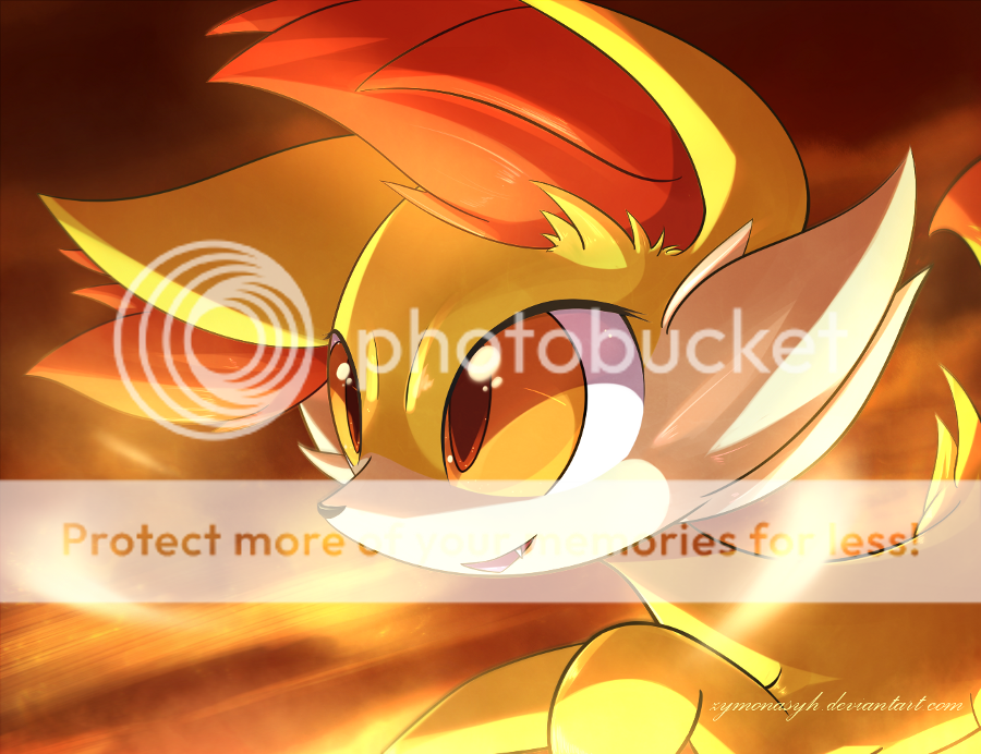
I like Fennekin
http://i1103.photobucket.com/albums/g479/silvercyh/Fennekin_zps450144f0.png
-------
Serperior
http://i1103.photobucket.com/albums/g479/silvercyh/Serperior-Copy_zpsfa9533ac.png
-------
Sylveon is cool
http://i1103.photobucket.com/albums/g479/silvercyh/sylveon_zpsf3e2b9b7.png
-------
Soul Dew
http://i1103.photobucket.com/albums/g479/silvercyh/Latis_zpsb4fad7d7.png
-------
Coliche - Holy Guardian of Peace
http://i1103.photobucket.com/albums/g479/silvercyh/Coliche-Copy_zps792e5fcf.png
--------
Lugia ex
http://i1103.photobucket.com/albums/g479/silvercyh/kajsdf_zpsbc0b1505.png
--------
Mega Absol
http://i1103.photobucket.com/albums/g479/silvercyh/asd_zps08c8c91e.jpg
--------
Darkrai Absol Sableye
http://i1103.photobucket.com/albums/g479/silvercyh/DAS_zps47741a09.png
--------
Mega Absol
http://i1103.photobucket.com/albums/g479/silvercyh/MegaAbsol_zps0a5e4c93.png
--------
Delphox
http://i1103.photobucket.com/albums/g479/silvercyh/delphoxtrap_zpsfdb27282.png
--------
Xerneas + Yveltal
http://i1103.photobucket.com/albums/g479/silvercyh/Untitled_zpsfec46ce9.png
--------
Braixen Pokemon amie
http://i1103.photobucket.com/albums/g479/silvercyh/BadAmie_zps1ebcb3c4.png
--------
Zoroark maid
http://i1103.photobucket.com/albums/g479/silvercyh/zoroark_maid_by_zymonasyh-d6xjh78_zpsa765be6d.png
I think I'll share some artwork here if it's Pokemon-based. I'd need some critique too, if possible
------
This is somehow a Pokemon-Pony crossover, but I hope that you don't mind about the pony (there can be haters). I'd like some feedback on this...
Lati@s + Rainbow Dash
------
My first attempted on the blurring effect to indicate the distance between the character and the viewer. Also the motion blurring effect
http://i1103.photobucket.com/albums/g479/silvercyh/RoseluckRoselia2.png
-------
I like Fennekin
http://i1103.photobucket.com/albums/g479/silvercyh/Fennekin_zps450144f0.png
-------
Serperior
http://i1103.photobucket.com/albums/g479/silvercyh/Serperior-Copy_zpsfa9533ac.png
-------
Sylveon is cool
http://i1103.photobucket.com/albums/g479/silvercyh/sylveon_zpsf3e2b9b7.png
-------
Soul Dew
http://i1103.photobucket.com/albums/g479/silvercyh/Latis_zpsb4fad7d7.png
-------
Coliche - Holy Guardian of Peace
http://i1103.photobucket.com/albums/g479/silvercyh/Coliche-Copy_zps792e5fcf.png
--------
Lugia ex
http://i1103.photobucket.com/albums/g479/silvercyh/kajsdf_zpsbc0b1505.png
--------
Mega Absol
http://i1103.photobucket.com/albums/g479/silvercyh/asd_zps08c8c91e.jpg
--------
Darkrai Absol Sableye
http://i1103.photobucket.com/albums/g479/silvercyh/DAS_zps47741a09.png
--------
Mega Absol
http://i1103.photobucket.com/albums/g479/silvercyh/MegaAbsol_zps0a5e4c93.png
--------
Delphox
http://i1103.photobucket.com/albums/g479/silvercyh/delphoxtrap_zpsfdb27282.png
--------
Xerneas + Yveltal
http://i1103.photobucket.com/albums/g479/silvercyh/Untitled_zpsfec46ce9.png
--------
Braixen Pokemon amie
http://i1103.photobucket.com/albums/g479/silvercyh/BadAmie_zps1ebcb3c4.png
--------
Zoroark maid
http://i1103.photobucket.com/albums/g479/silvercyh/zoroark_maid_by_zymonasyh-d6xjh78_zpsa765be6d.png
") )but in this pic it works!
)but in this pic it works!