
You are using an out of date browser. It may not display this or other websites correctly.
You should upgrade or use an alternative browser.
You should upgrade or use an alternative browser.
~ * Pineapple X's Fakes Treehouse * ~ [UPDATED! Now With a Flying Green Thing ;3]
- Thread starter Pineapple X
- Start date
RE: ~ * Pineapple X's Fakes Treehouse * ~
Meesa is veeeery glad to hearing that ;3 (screw Jar-Jar jokes.)
Oh, no, I'm just doing random stuff. Mixing different eras. Sounds stupid though. xD
I'll probably start taking requests if these are in any way good.
––
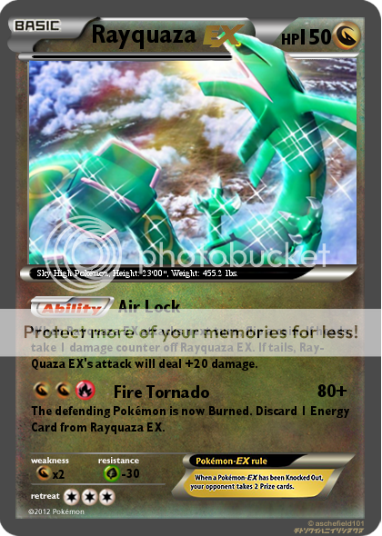
Behold, the mighty Rayquaza EX is out! Work took about 0,5l of Pepsi Max and a lot of EDM. Also 3 hours. I know it's not really that good but I did my best. I especially like the way I managed to get the head out of the frame.
Any feedback? Btw, please tell me some good fonts & give me download links. Right now I only have these ones, which don't even look like the proper ones.
––
Oh crap, forgot the credits. Blank is by Aschefield101, some symbols by Nekoban Ryo & Metagross101. Artwork is by littlev321, found it. ;3
CMP said:I'm excited to see how you've improved! Did you end up going with EX-era?
Meesa is veeeery glad to hearing that ;3 (screw Jar-Jar jokes.)
Oh, no, I'm just doing random stuff. Mixing different eras. Sounds stupid though. xD
I'll probably start taking requests if these are in any way good.
––
Behold, the mighty Rayquaza EX is out! Work took about 0,5l of Pepsi Max and a lot of EDM. Also 3 hours. I know it's not really that good but I did my best. I especially like the way I managed to get the head out of the frame.
Any feedback? Btw, please tell me some good fonts & give me download links. Right now I only have these ones, which don't even look like the proper ones.
––
Oh crap, forgot the credits. Blank is by Aschefield101, some symbols by Nekoban Ryo & Metagross101. Artwork is by littlev321, found it. ;3
You must give credit to the artist. Make sure you update your card with the necessary information soon (if you can't find it the artist, then link me in a PM of where you found the actual artwork (so I can go search for the original artist)). (I'll be checking back).
Besides that, I think you did a pretty nice job with the card. The font is one of the major things that need to be fixed. Also, you want to make sure that the Pokemon's face isn't blocked by any text (it is one of the most important features in a card's artwork).
Besides that, I think you did a pretty nice job with the card. The font is one of the major things that need to be fixed. Also, you want to make sure that the Pokemon's face isn't blocked by any text (it is one of the most important features in a card's artwork).
Much better! =) As Ice Arceus said, though, you do need to find the original artist.
The fonts should be available here. If you'll be faking any DP or BW cards, you'll need to find get Futura and Sanvito Pro, which (unfortunately) I don't believe are free. Here's a higher quality symbol sheet than the ones you're using, and this dA folder can be used as a font guide. Placement of your fonts and symbols looks pretty good! I would suggest moving the Ability and Energy symbols a few pixels to the left, as they shouldn't be lined up with the effect text (and make "Air Lock" red). Additionally, in BW, cards never name the Pokémon, instead using "this Pokémon," nor do cards hyphenate. Try to justify the text box. Not sure what program you use, so I can't, unfortunately, explain how to do it.
Otherwise, I see a great improvement, so good job! My only suggestions are to really examine card scans for placement and wording purposes. Keep practicing, man!
Here are some fonts
Gill sans
http://ufonts.com/fonts/gillsans.html
Gills sans MT Condensed(couldn't find the right font but this should be okay)
http://font.downloadatoz.com/font,72344,gill-sans-mt-condensed.html
All you have to do is change the fonts for the card and make the text white.
Also rayquaza should be over the EX symbol.(I think)
EDIT- also here are some symbols
http://fc01.deviantart.net/fs71/f/2012/080/4/9/bw_symbols_sheet_v2_by_aschefield101-d4syil1.png
Thanks for feedback and fonts! I'll find the artwork maker today.
Also - I'm new to TCG, so some of my texts might look weird. As CMP said, I'm gonna look at some BW text / symbol placing and that should help a lot.
//POST #200 ;3
Also - I'm new to TCG, so some of my texts might look weird. As CMP said, I'm gonna look at some BW text / symbol placing and that should help a lot.
//POST #200 ;3