
You are using an out of date browser. It may not display this or other websites correctly.
You should upgrade or use an alternative browser.
You should upgrade or use an alternative browser.
TCG Fakes Blui's Image Fakes // A Return?
- Thread starter Blui
- Start date
A RETURN!
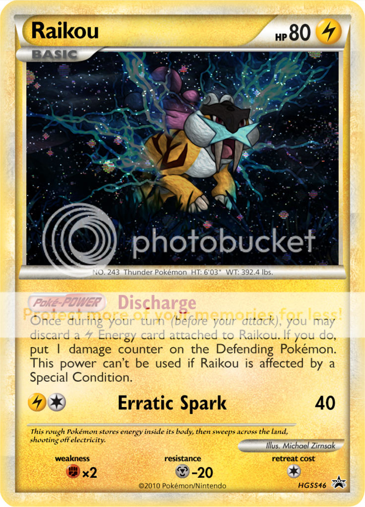
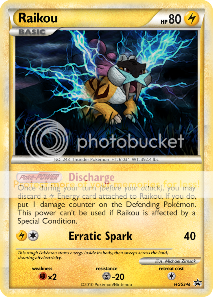
I'm pretty impressed by the electrical sparks that surround Raikou -- they look to be part of the art, instead of something hastily thrown on top -- and that's an effect that I find challenging to replicate in my works unfortunately. The smooth variance in hue in particular, with the white highlights to the bright blues, is really nicely done. How did you create that energy effect?
I'm pretty impressed by the electrical sparks that surround Raikou -- they look to be part of the art, instead of something hastily thrown on top -- and that's an effect that I find challenging to replicate in my works unfortunately. The smooth variance in hue in particular, with the white highlights to the bright blues, is really nicely done. How did you create that energy effect?
I'm pretty impressed by the electrical sparks that surround Raikou -- they look to be part of the art, instead of something hastily thrown on top -- and that's an effect that I find challenging to replicate in my works unfortunately. The smooth variance in hue in particular, with the white highlights to the bright blues, is really nicely done. How did you create that energy effect?
It is an overlay from two Van de Graff generators that have been trimmed and filtered to fit the art. A lot of time went into making them seem more organic and believable within the artwork. This is why there are two layers of lightning: one in front of Raikou and one behind. A good way to meld these layers together is to become familiar with the blending modes that you can set each layer to and using multiple layers to enhance whichever effect you are trying to achieve. In this image I've set all the lightning layers to Hard Light and with an eraser with low hardness and opacity trimmed away at things I didn't want in it. It takes some time to get the desired result and tinkering with the background really helps to bring cohesion to the piece, so as an artist you want to spend some extra time taking care of any details you want in your work. For instance, in this piece I added multiple layers of blue glow throughout the glass to give the lightning a more real presence because without the glow the lightning felt very fake. Another trick that I used here (and also in fire effects in other stuff) is by adding a dark layer behind it to really intensify the brightness of the lightning/fire without just making it white.
So if there's anything I'd really like to be taken away from that paragraph it would be that spending time just tinkering around with new layers and blending can massively improve your own work and promote new ideas.
If you (or anyone else) have any questions about any of the graphics work I've done in the past or future I'd be happy to answer them.