TCG Fakes Reggie McGigas's Image-Based Fake Cards: Wailmer and Wailord

In the past, Pokémon hasn't really made any effort to create effects that fit their attacks' names. On Shaymin-EX LTR, Synthesis, rather than healing, searches for Grass Energy. Warlord-EX's High Breaching puts it to sleep. Vicinity ROS's Me First can't be used on your first turn, but most likely will be used on your second turn.
EMP refers to numerous things, but I assume the one you mean is an electromagnetic pulse. According to Wikipedia, it's a burst of electromagnetic energy that is disruptive to electronics in the area. While Trainer cards could be viewed as the electronic equipment of a Pokémon game, and disrupting them could be like an electromagnetic pulse, Energy cards could also be viewed as such. By discarding them, you're slowing down your opponent, which could be seen as a disturbance to the electronic equipment.
As for the power level, it really depends on the Energy acceleration in Reggie's format. 4 Energy for 100 isn't great, and the secondary effect really doesn't matter against, say, Blastoise or Bronzong. But if Reggie has nothing like that in his format, the effect could be good and balanced for 4 Energy.

However, Reggie, you might want to change the Pokédex entry on Raichu. ;)
 
The Regular art Volcarona's ability is impossible to read without looking at the full art. I like the flame effect,but you need to be able to read the card. sorry
 
The Regular art Volcarona's ability is impossible to read without looking at the full art. I like the flame effect,but you need to be able to read the card. sorry
I can see the ability perfectly fine. Check your computers brightness, perhaps it is too low/bright to see the effect.
 
I can see the ability perfectly fine. Check your computers brightness, perhaps it is too low/bright to see the effect.
tgk is right. The effects (or the blank) behind it are a bit too bright and makes the ability name hard to see.
 
OK, I've looked everywhere for a comparison card for the Ability, and the only Fire-type EX with an Ability is Ho-Oh, which has the effects circulating in an unobtrusive way. It seems they were very hesitant about letting effects overlap the text before the XY block.

I faced a similar problem with my Reshiram-EX in Forces of Truth, which also had effects under the Ability. I think the best solution is just to rework the effects so they don't go under the Ability name. However, I would like to make sure that you're using color #C23600 for the Ability – it looks a little brighter than it should be.
 
I overall like these fakes, however, here's some comments about the cards in general:

* Most of them has font problems. Even if you use the correct fonts, they are usually out of place. Take Venusaur's HP as an example, the "1" is too far from "30". The same goes for "Evolves from" and "Bulbasaur" on Ivysaur. The Pokédex datas are a bit too "notepaddy". Change the text color to grey, and make it bolder.

* The ability "button" is too blurry.

* Some typos. Like in Ivysaur's text, you forgot a comma.

* The fire icon on FA Volcarona EX's Ability is either missed, or just cannot be seen.

* The Pokédex entries, on the other hand, are too bold. The same goes for EX rules.


On the other hand, Volcarona EX (not the FA) is almost perfect (aside from EX rules) and it is indeed an awesome job.

As I said, I actually like your works, but to make them perfect, I suggest to beware of these errors I've mentioned. Keep up the good work!
 
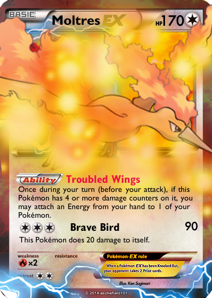
Considering I'm not a TCG expert, I'll just stick to the visuals in this review. When working on the art, pay attention to the colors you may be incorporating and how it affects the card itself. The dark blue leaking below the frame is dipping dangerously into the attack text, which makes it difficult to read. Either avoid using such colors or try to redirect it to other places of the card as long as it isn't obtrusive to the important elements.
 
I'm guessing the effect you're trying to achieve is something like what Asche refers to as glow balls, right? I remember looking through his cards to find a tutorial for them, and I ended up learning a bit about it, although I still can't quite replicate his method.
The idea is to create a general shape for the flow of the effect, such as from Gigalesch's mouth to some spot on the border. You map out that shape with tiny (2-3 pixels) dots with a brush tool, or GIMP's equivalent. The dots should be farther apart the farther it gets from Gigalesch's mouth (or other point of origin). Then you go over that with ever-increasing sizes of brush, in different colors (for the only card I've tried this on, Tropius-EX, I used varying shades of green, orange, and white. For Gigalesch I suggest shades of blue, purple, and white).
I tried to explain it as concisely as possible; if there's anything you don't get, or anything I left out, let me know.

Otherwise, I'd suggest a holosheet. Nekoban Ryo (I think icycatelf on dA) made a very nice refractor foil accurate to BWXY-era EXes.
Also, there's a bit of lightning that appears to be coming from the Pokémon's mouth, but it's not very clear. For Photoshop, Liquify is good for this, but I don't think GIMP has that. I looked it up and apparently the equivalent is iWarp. I'd suggest looking into that.
 
GlowBalls™ :D

But yeah I generally :
  • Use an empty layer and just paintbrush the direction I want the glow balls to go, normally following any effects used flowing around the card.
  • Open a new layer and unleash the GlowBall brush, splatter em everywhere along the line - milky yellow colour. Add in outer glow.
  • Duplicate the layer, change colour to orange. Duplicate this layer, palce it below all glowball layers and hide.
  • On the Orange one begin to remove certain balls that just don't work, this takes time.
  • As per above, remove yellow. You generally want more of the yellow than the secondary.
  • Unhide the hidden layer above, remove all effects from it (right click layer in list to find the option) - then gaussian blur filter, I call this the mist, change opacity and/or filter to fit your effects/background.
  • Remove direction line layer.
Size for all the above is entirely dependant on blank size, image size and effect size. Go mad! GO GLOWBALL!™ :eek:
 
I got my computer fixed! I tried following Asche's tutorial but I had trouble understanding the directions. I still think it turned out well, though. I'm very proud of these cards :)

922410_orig.png
1269638_orig.png
 
These are getting better and better, Reggie! The textures in particular are noticeably improving.

For the Moltres itself, I'm intrigued by the decision to make it Colorless. I'm all in favor of cards with a type that you don't usually see on other prints, but Colorless is unique in its own right. What made you decide to stay away from Fire?

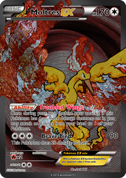
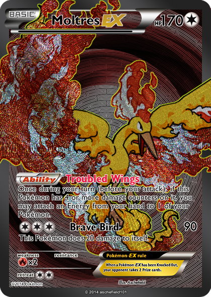
I also suggest gold lines on the FA. I'm not sure how one would go about creating them in GIMP, but there must be something.

Overall, keep up the good work!


Well, I was kinda inspired by colorless Rayquaza EX. I thought "this makes no sense". So I applied that to Moltres because a lot of things Pokemon does do not make sense.

For the gold lines, I could do a golden silhouette that is larger than the Pokemon itself and placed behind the layer the art is on, creating a gold border. However I don't think there is a way to do it for all the lines inside the Pokemon.
 
I think the thought process behind Colorless Rayquaza, Shaymin, Skarmory, etc. is that it's Roaring Skies, so they focus on the sky aspect rather than the elemental aspect. If they really wanted to, though, they could have introduced a Flying mechanic.

If all else fails, there's always the brush tool (which I'm fairly certain GIMP has).
 
This really are awesome! Getting much better. I've got a bit of the feeling that there are you went just a little bit too overboard with the glowballs, it feels a bit too buys and hides a lot of the Moltres art.
 
This really are awesome! Getting much better. I've got a bit of the feeling that there are you went just a little bit too overboard with the glowballs, it feels a bit too buys and hides a lot of the Moltres art.

I'll try making one with less glowballs and post that later today. Same with a golden lined full art.
 
Here's the updated cards. I don't know about the RA, I think the original looks better. I think the full art looks nicer but I couldn't get the interior lines done without it looking rubbish.

6748777_orig.png
2605284_orig.png
 
idk - I sorta like the second version. I think that holofoils shouldn't be affecting the Moltres art.

In the FA the black line really needs to be replaced. There are some spots on Moltres were the line hasn't replaced anything (the wings). Why doesn't gold on the inside of the art not look good?
 
idk - I sorta like the second version. I think that holofoils shouldn't be affecting the Moltres art.

In the FA the black line really needs to be replaced. There are some spots on Moltres were the line hasn't replaced anything (the wings). Why doesn't gold on the inside of the art not look good?

Well, I'm using an outline-like tool to make the outside effect so it looks decent. Unfortunately the only way to do the gold on the inside of the card is by hand, which I am not very good at.
 
Well, I'm using an outline-like tool to make the outside effect so it looks decent. Unfortunately the only way to do the gold on the inside of the card is by hand, which I am not very good at.
You couldn't do pixel by pixel? Atm I'm having to choose some really small text to put some filters on by maraquing pixel by pixel Dx
 
Back
Top