Did anyone look at the actual filler cards for Fusion Strike and Brilliant Stars? Most of them have an attack for 2-3 energy that doesn't do anything. 10-15 or so cards with literally no text on its attacks that isn't a basic pokemon, on top of useless, ugly rainbow rares...what's wrong with the people running this game?Yeah I agree tbh. Some non-AA full arts look nice, but sets are way too big. Nothing worse than pulling a garbage full art that is just there for filler

You are using an out of date browser. It may not display this or other websites correctly.
You should upgrade or use an alternative browser.
You should upgrade or use an alternative browser.
Top 300 Entries Revealed for 2022’s Pokemon TCG Illustration Contest!
- Thread starter Water Pokémon Master
- Start date
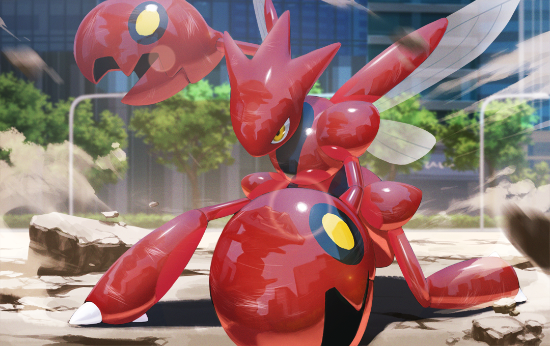
It's not that they're bad (at least they rarely have complete misses), but a lot of times they're just...mediocre? You look at it and think "oh ok it's a Pokemon" and not "oh wow this is a cool card I want to collect".I'm not sure that Scizor is a render – but more to the point, I don't think 5ban is a bad artist/group(?) at all. They're good at capturing a variety of Pokémon in dynamic poses and doing it in high volume, possibly even on short notice (or some other factor that leads to Creatures being so amenable to commissioning so much work from them). Their work is fine. It's always just a question of oversaturation – even the undisputed master, Mitsuhiro Arita, would begin to grow tiring if he was doing this much artwork, for so many sets, for so long. Variety is the spice of life, and the TCG.
If all they have going for them is "can complete submissions quick" that's just not good enough considering there are so many artists available.I'm not sure that Scizor is a render – but more to the point, I don't think 5ban is a bad artist/group(?) at all. They're good at capturing a variety of Pokémon in dynamic poses and doing it in high volume, possibly even on short notice (or some other factor that leads to Creatures being so amenable to commissioning so much work from them). Their work is fine. It's always just a question of oversaturation – even the undisputed master, Mitsuhiro Arita, would begin to grow tiring if he was doing this much artwork, for so many sets, for so long. Variety is the spice of life, and the TCG.
And then when they come up with utter abominations that are completely off model like Blastoise V with 0 sense of style, then no they really should be phased out.

A good working relationship is worth a lot.If all they have going for them is "can complete submissions quick" that's just not good enough considering there are so many artists available.
And then when they come up with utter abominations that are completely off model like Blastoise V with 0 sense of style, then no they really should be phased out.
As far as Blastoise, I think even the most fervent Blastoise afficionado (I include myself here) will admit that Blastoise hasn't looked like Blastoise in over 20 years. This is probably something you could blame TPCI for, because some of the OG got minor/major redesigns most likely for the sake of merchandising/animation/etc. and Blastoise is probably one of them.
Christopher Johnson さん, UMiUSHi さん, and Louie Zong stand out on first look. WOW!
Can they, like, give future jobs to all these artists? These are incredible! What variety!
Although your friend didn't get in, I could definitely see this being artwork for a card. I especially love the backgroundI came across the art contest a few days before the deadline, and sent it over to a friend of mine to see if she wanted to participate in it. I'm a little bummed she didn't make top cut, but I wanted to share her submission she was able to make in the little time she had.
View attachment 16517
Alas, I didn't make the cut either.
Lot of beautiful art for all of the Pokémon involved, though.

Lot of beautiful art for all of the Pokémon involved, though.
most of these should made into real card artworks. the diversity of expression and the level of meticulous detail is evident. the creativity and caliber in skill is there.
As a graphic designer with an eye towards print production, I can see why they would cut this one. The art is beautiful (love the little ponyta in the corner, so adorable!), but those highly-saturated RGB blues and teals are outside of print gamut and would not look right off screen. One of the criteria they said they'd be evaluating on was print suitability—pieces that use too much black, out-of-gamut colors, etc. were going to be cut according to the instructions.I came across the art contest a few days before the deadline, and sent it over to a friend of mine to see if she wanted to participate in it. I'm a little bummed she didn't make top cut, but I wanted to share her submission she was able to make in the little time she had.
View attachment 16517