RULES
1. Give credit if using.
2. DO NOT steal my work or rip it.
3. Don't ask for requests here, I work in The Community Shop for stuff like that.
4. Don't use ones I say not to use. Anything else you can use.
5. Give constructed feedback, like "Its not too good, I would try [recommend thing here]" and not like "OMG THIS SUCKS"
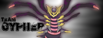
BANNERS
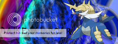
 Don't use please!
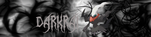


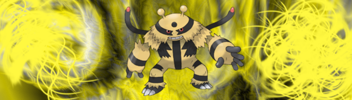
 Don't use please!
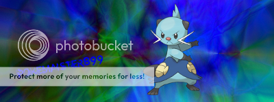
 Don't use please!


AVATARS


TUTORIALS
Logo Tutorial
1. Give credit if using.
2. DO NOT steal my work or rip it.
3. Don't ask for requests here, I work in The Community Shop for stuff like that.
4. Don't use ones I say not to use. Anything else you can use.
5. Give constructed feedback, like "Its not too good, I would try [recommend thing here]" and not like "OMG THIS SUCKS"
BANNERS
AVATARS
TUTORIALS
Logo Tutorial
") .
.