MIDNIGHTdesigners -- GFX Group

NerdSparks said:
@Blui

How are you making your bgs?

I generally get a free use vortex wallpaper and maybe another (like I did with Hydreigon's) and slap them on and edit them with PS tools. Pretty simple really.
 
HolyMackerel said:
I really loved Kawaii Mew's work when it was around. I don't know if they changed their username, but they gave me big inspiration into tag making.
I think Sparks liked Kawaii Mew's work too. Must have been the pink.

When I started making sigs, I really liked the sigs Anastasia R made on PE2K. They were my first real inspiration to get better.
http://www.pokemonelite2000.com/forum/showthread.php?t=96166
 
Blui said:
NerdSparks said:
@Blui

How are you making your bgs?

I generally get a free use vortex wallpaper and maybe another (like I did with Hydreigon's) and slap them on and edit them with PS tools. Pretty simple really.

Have you tried anything more advanced/intricate? I could link you to some tutorials, and there's one in the main post if you're interested.

That actually goes for everyone, I'd like to see you all try one tag that's outside your usual routine. I like us all to get better as a group =)
 
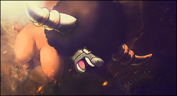
afro_tag_by_spm3-d6irfsw.png


Mehh...
 
Spammy said:

The direction should be diagonal left -> right. Since that is/should be the main direction the text doesn't fit. Speaking of text for a tag like this it probably shouldn't be stroked, but maybe it's just the way you went about it that makes me think that. I think that for a render like this you need a more complicated light source than one in the corner. Going somewhere around the 2nd horn and than something like a sharp effect with the one visible eye.


Based on your 'meh' I assume you made this just messing around, but no reason I can't give you my thoughts anyway.
 
Thank you for your thoughts. =D

I started with the flow going diagonal right to left on the right side, sort of behind the render, then for some reason decided to flip it on the left side in front of it. The text... idk XD I really rushed it and it shows. I'm not that good with making simple text. :L I don't like the light source but I wasn't sure what else to do, I'm not that great with lighting =(

I needed the practice XD Haven't done graphics for a while. Also I am working on the logo! =) If you'd like, I'll post my progress.
 
midnightdesigners_by_spm3-d6j2btg.png


Here's the logo =D I noticed the designers text is a bit off center, but the more I look at it the more I think I like it that way. Feel free to share your opinions, everyone :)
 
@Sleuth- It was definitely the pink, at least for me.

Well, my outside-of the box project was to literally work outside of the box, since I hardly ever do "pop-out" banners. So, here it is.


It took a lot longer than I thought it would, and I can't say I'm overly pleased with the results, but I'm happy with the effort I put through, and how it turned out considering it was my first real try.
 
Thank you ^_^

Gee, Sparks/Sleuth, it would be nice if the leaders would post once in a while ;o
 
Spammy said:
Thank you ^_^

Gee, Sparks/Sleuth, it would be nice if the leaders would post once in a while ;o

Well, sounds like someone is asking for homework!

So, since spm3 is so eager, here is what I want everyone to do:

1. Read this tutorial: http://senthrax.deviantart.com/art/Full-Signature-Tutorial-55042010
2. and this one: http://tsa197.deviantart.com/art/Text-In-Signatures-195768620
3. download 4 fractals packs: http://www.deviantart.com/?q=fractals+pack
4. download 4 c4d bubble packs: http://www.deviantart.com/?q=c4d+bubble+pack
5. download 4 c4d effect packs: http://www.deviantart.com/?q=c4d+effect+pack
6. download 4 c4d packs that don't say effect: http://www.deviantart.com/?q=c4d+pack
7. browse through this site: http://www.sigtutorials.com/

when you're done with that, make a signature(with your new knowledge/resources) and post it here =)
 
@HolyMackarel: Can I see the tag without the pop out effect, that's what I am more interested in: the basic composition of it.

@Morsus: Nice to have you in! Eager to see what your first piece will be.

@Spammy: I got lost for a week.
 
@Spammy: I totally thought I posted my thoughts. For the tag I like the last color the best, but in general it needs something sharper to attract my eyes. Additionally, I can see the radial gradient you applied and I don't think it completely works in this. Try soft brushing the areas directly that you need rather than staying confined to that particular space of the gradient.

I can't decide what's off about the logo so I'll get back to you on that. But I do think it's an amazing start!

------

OK for everyone else. This is all the stuff that I personally looked at today...

:Renders:
1 2

:Tags:
The colors in this are sooooo well done.
The atmosphere and then underwater effect created in this one are insane.
Direction and lightning in this one are something to admire.

3 more that I like...
1 2 3

And two tutorials...
Smudge
Clipping Mask/Splatter

Go through those at your leisure but please do, knowing whats out there is a major part of improvement!
 
I did apply a radial gradient but most of what you see is manually brushed lighting whether with dodge/burn or b/w soft brushes. My aim here was to draw the most attention to the center where the colors were =P
 
Sorry I just started school again so I've been a little tied up. I have been checking the thread but I didn't see any new posts. Any who weekly update of gfx/renders.

l RENDERS l
1 2 3

I'd like to see all members make a piece using one of these renders.

l INSPIRATION l
1
2
3
4
5
6

Tell me which ones you like, don't like, what you like about them, ect.
 
No one has posted anything so I'll post the last thing I've done.

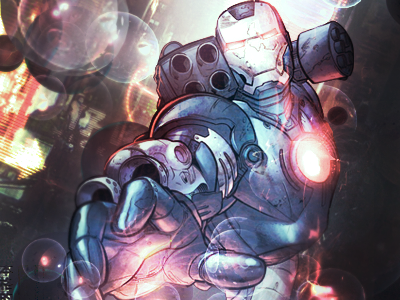
ironman_2_signature_by_nerdsparks-d6lsdsh.png


Meant to put a horizontal border on but oh well. Comments appreciated.

Do you all want another weekly update with some renders and inspiration pieces? I don't mind doing it but if no one is looking at it I won't bother.
 
Very vibrant. I like it.
As for weekly stuff... no, not really. Between school and video games, I don't have much time. xD Sorry.
I did, however, have enough time recently to make these two banners. The first one I did a while ago; the second one I did earlier this evening.
0prn.png

bu7j.png
 
Back
Top