
Greetings! It's been a while fellow pokéfans!
I've been busy since my last thread, though slowly and surely, progress has been made for my custom card set. I'm not sure if anyone remembers my Sylveon card a while back, but I've made some notable changes to it (I had to make a Fairy type blank after all).

The most important change here is the illustrator's name, which I believe now credits the right person. If I'm still wrong, please let me know! You can find more of this person's work here.
After I updated this card I realised the pokéball symbol denoting the flavour text has a rather bad placement, causing too much space to be wasted near the bottom as it prevents the attack text from filling the space nicely.
-----------------------------------
Once I make more cards I will reorganise this post so that it will be easier to just see the cards, and avoid my inane ramblings.
-----------------------------------
I've been busy since my last thread, though slowly and surely, progress has been made for my custom card set. I'm not sure if anyone remembers my Sylveon card a while back, but I've made some notable changes to it (I had to make a Fairy type blank after all).

The most important change here is the illustrator's name, which I believe now credits the right person. If I'm still wrong, please let me know! You can find more of this person's work here.
After I updated this card I realised the pokéball symbol denoting the flavour text has a rather bad placement, causing too much space to be wasted near the bottom as it prevents the attack text from filling the space nicely.
The sylveon card will likely be updated again, though I'm saving it for later as I want to paint my own illustration for it. But enough of that! I'll show you my next card, with the tweaked flavour text graphic. Also removed the embossing from the stage 1 text and w/r/rc. I'm still not convinced if it was an improvement or not, what are your thoughts?
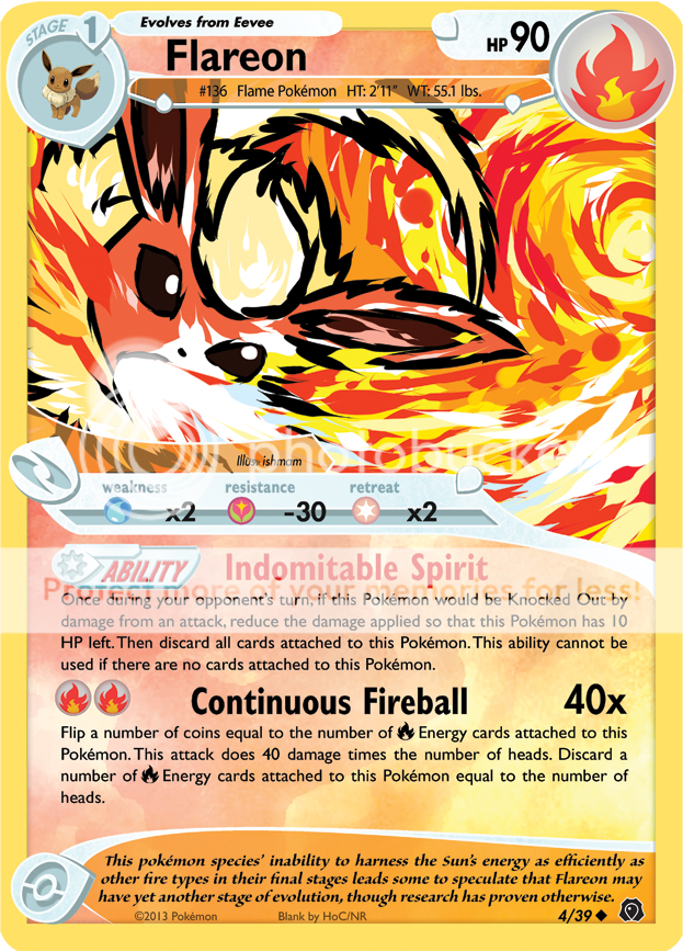
I must say, the artwork really makes the card again. I love ishmam's style, try seeing more of it yourself at his dA! This card is also officially the first card of my 39 card set. I have yet to settle on a name, though I'm leaning towards Mists Unveiled: Voyage Begins.

I must say, the artwork really makes the card again. I love ishmam's style, try seeing more of it yourself at his dA! This card is also officially the first card of my 39 card set. I have yet to settle on a name, though I'm leaning towards Mists Unveiled: Voyage Begins.
Once I make more cards I will reorganise this post so that it will be easier to just see the cards, and avoid my inane ramblings.
-----------------------------------
Other credits go to Latios101 (I used his B/W font guide to help me on this, though I had to substitute one or two fonts - the ability graphic and rarity symbol are his), Flame Claw (There was a texture used in here that he supplied in another site's resources thread), and whoever did that holosheet (I cannot remember for the life of me.. it was a saved pattern on my PS).
")