Artistic Inquiries Thread - Ask Anything Related to Art!

I was curious if it is a good investment to get a tablet if I only draw casually, since I want to draw digitally, but I don't want to shell out $50 on a tablet I only use once or twice and never get my money back.
A drawing tablet is something you'll need some dedication/motivation to learn how to use, if you get one. If you don't think you'll use it often, don't get it. I avoided buying one during an illustration subject at uni because it was going to be the only subject in that area during my games degree - animation and modelling students purchased tablets and use them still today (>2 years since I took the class).

So, a drawing tablet can be useful for:
- Digital painting / sketching in software such as Photoshop, Paint Tool Sai, and other drawing programs
- 3D modelling in software such as 3DS Max and Zbrush
- 2D & 3D animation (especially doing it by hand) but I'm not familiar with what software is used for it other than Autodesk Maya

Even if you don't know how to use a tablet or any of the programs I mentioned above yet, if you see yourself doing any of that stuff in the future or are interested in learning how to do that stuff it'd be really helpful for you. Especially if it's so cheap - industry-minimum-standard tablets here in AUS cost at least $200! A cheap tablet might be a good investment in your future if any of those listed things are things you want to be doing for a while.
 
So, as some of you may know, I am working on a custom TIME magazine (one of America's biggest magazine publishers). I have tried Paint and Word, but as expected, both made the magazine look really bad, to my teacher of course. I would like to ask everybody for any recommendations for programs to use, and if it costs money, any under $300 for the one time fee. And if you feel really nice, links for layout or commonly used titles would be good as well as small pieces of advice to image edit
 
For image editing software, probably the best out there are either Photoshop (which costs a lot) and GIMP (which is free and nearly just as good). They are both very powerful and can allow you to achieve amazing pieces, if you get skilled enough at it. That said, they both can be difficult to get your head around at first, so don't expect a walk in the park.

However... Microsoft Word is perfectly fine for designing magazines, so if you're familiar with Word, I suggest you just stick to it. I've used it for designing various articles for assignments, with positive results. Would we be able to see some copies of your magazine, and did your teacher specify any specific issues with your magazine? We might be able to give you some tips. ^.^
 
Have you tried using GIMP? It's a free image manipulation software that has a lot of the same features as Photoshop and is relatively easy to use. I used it before I got Photoshop and Clip Studio Paint, and it's really good for a free program. The only problems I had with it were that I couldn't figure out how to move around images (although the Move tool should be the answer to that), and that there wasn't any anti-aliasing when drawing. You should give it a shot! ^v^
 
Alright so I will try GIMP, but will it work well if I have semi-ok i3 core laptop, it is a bit slow. As for your questions @bbninjas my teacher said that it really just looks like images thrown together, and very pixely, which I agree with. I have not posted an image on Pokebeach, so if you can tell me how to post one, I will scan my cover page and post it
 
Alright so I will try GIMP, but will it work well if I have semi-ok i3 core laptop, it is a bit slow. As for your questions @bbninjas my teacher said that it really just looks like images thrown together, and very pixely, which I agree with. I have not posted an image on Pokebeach, so if you can tell me how to post one, I will scan my cover page and post it

Images shouldn't look pixelly in Word unless you've done something wrong, and the reason why those images looked pixelly in Word may not be fixed up in other image editing software. Anyways, to upload pictures, you'll need to screenshot using Print Screen or otherwise export your document using the "Save As" tool. You then need to click the "Upload a File" button next the to the Post Reply button [example] to upload you image/file.
 
Oops I meant paint not word heh. And I will post the image after dinner, thanks for the info on how to link an image

So here is the cover page, the black boxes after the names are to censor out my group's last names out of privacy and respect, but it does not overlap with the printer and is in the same format as the first name
 

Attachments

  • CoverPage - Copy.png
    CoverPage - Copy.png
    91.3 KB · Views: 8
I've moved this thread from the Beach Life to the Smeargle's Canvas' Artistic Inquiries thread, since it's a fairly specific artistic question rather than a discussion thread. ~bbninjas

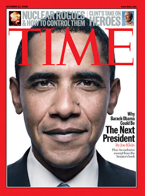
For the image, I think you've upscaled it somewhere along the line, at that is why it looks so pixally. A general rule of thumb is to NEVER upscale a .jpg or most .pngs, because it always always always looks terrible. You've also got a white background for your "How did this..." text box, which is cutting into the printer behind it.

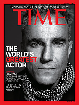
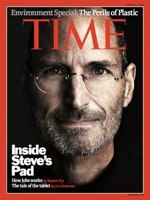
Anyways, I suggest you took another look at some official Times magazine covers. Analyzing example texts that are relevant to your project is a very important skill in producing good assessment pieces, especially for English. This is even more vital if your teacher is one of those who doesn't actually teach you how do stuff, like my English teacher this year just gone.

Time.jpg
tumblr_nf7jutboMp1til03oo2_r1_400.jpg
134439-jobs_time_cover.jpg

Here's a few aesthetic choices that I immediately notice:
- There is always a single image that is large and covers most of the page. They are also always pictures of people.
- Notice the use of colours. There is white (or black) for most of the text. Some of the "less important" text is grey. Emphasis is added using the bright red colour.
- Magazines use a wide variety of sizes and styles for the text. The text that the designer wants your eye to be drawn to is large and in bold letters. Notice how for the longer headlines, the most important part is larger ("The Next President").
- On that note, the fonts used are generally bold or thick. Arial Black, Times New Roman Bold, Berlin Sans and the like are all good magazine fonts. Also notice how italics was barely used and rather ALL CAPS was used for effect.
- Most of the text are at the top around the "TIME" part, or to one side. There isn't a lot of "negative space" - there isn't much text covering the cover.
- The date/timestamp that you've got on your cover is much to big.

And here's a few more technical elements:
- There is always an eye-grabbing headline that is normal short-and-sweet and relates to the picture on the cover.
- There is often a few other article headlines featured on the front. Those articles will have the author written immediately after the headline in a differentiating style.
- There is also another article featured above the "TIME" text. This would be your second most "important" article that should be trying to hook a potential reader.

You can do every single thing that I mentioned above in Microsoft Word, and probably easier than in a more complicated image-editing program.
 
Last edited:
@bbninjas
Alright, thanks for the lettering/typing tips, would you happen to know any of the fonts used for the subtitles, but you even if you don't know, I don't know how to thank you enough for the help, if we can give a shoutout at the end of our presentation I will literally yell your name out. If you would like, I can send you some of my articles via PM

I have a English teacher who does projects rather than teach too:p
 
@bbninjas
Alright, thanks for the lettering/typing tips, would you happen to know any of the fonts used for the subtitles, but you even if you don't know,
Similar fonts to the ones I mentioned. Just scroll through your font list in Microsoft Word and find some that you're happy with after comparing to the official magazines.

I don't know how to thank you enough for the help if we can give a shoutout at the end of our presentation I will literally yell your name out. If you would like, I can send you some of my articles via PM
Haha, no problem! If you want to send me some of your articles feel free to, but just know that any feedback that I give will not be as extensive as my little guide above if they are for your assessment, since I'm not going to do your assessment for you! :p
 
Back
Top