Art Gallery thegrovylekid's Super Amazing Avatars! [Accepting Requests]

thegrovylekid

Makes fake cards
Member
Hey everyone! Welcome to my super amazing avatar Gallery and shop!

Screen Shot 2015-07-26 at 8.40.16 PM.png
Screen Shot 2015-07-26 at 9.00.13 PM.png
I'm taking requests!

The steps:
Step 1: Ask for a request
Step 2: Name up to 3 Pokémon
Step 3: Wait for me to tag you with your super amazing avatar!

The credit is in the Pichu, just saying. So Pichu will be in all of my avatars as my "logo", so to speak.
 
Avys ^____^

I think the main thing I'm having problems with is the blurry background. Can you find some high quality scans and then pattern them that way?
 
Avys ^____^

I think the main thing I'm having problems with is the blurry background. Can you find some high quality scans and then pattern them that way?
I'll try. It's surprisingly hard to get scans of the back of the cards. Let's try this:
Screen Shot 2015-07-27 at 8.11.29 AM.png
 
This is a pretty interesting concept you have going on here. My main concern is that you won't be able to see the Pokemon in detail with the fairly large background itself, so maybe think about reducing the size of it? Additionally, I would also make the "logo" something a bit less apparent, considering it's a Pokemon that's being included within the group of Pokemon that a member might request. Moving it somewhere off to the corners of the avatar might be something to consider, and maybe making a text logo or a small, unique design would work better?

I would also highly recommend you (or rather requiring you) to give credit to the artist of the Pokemon art somewhere in your post.
 
It's the Pokémon Dream Wold art. I don't know who drew it [yet] and the information is certainly doing its best to stay hidden from me.
 
Disclaimer: I take no credit for any of these images. The artwork for the Pokémon was made by Nintendo/TPC, not me, and the Back and Logo were made by our very own @Jabberwock !
0KOISgI.png
Screen Shot 2015-07-27 at 1.52.34 PM.png
Screen Shot 2015-07-27 at 1.46.10 PM.png
Thanks so much to @Jabberwock for providing the new logo and a higher-quality background!

This is a pretty interesting concept you have going on here. My main concern is that you won't be able to see the Pokemon in detail with the fairly large background itself, so maybe think about reducing the size of it? Additionally, I would also make the "logo" something a bit less apparent, considering it's a Pokemon that's being included within the group of Pokemon that a member might request. Moving it somewhere off to the corners of the avatar might be something to consider, and maybe making a text logo or a small, unique design would work better?

I would also highly recommend you (or rather requiring you) to give credit to the artist of the Pokemon art somewhere in your post.
It seems to work better with Fairly large Pokémon, although I did have to shrink pretty much all of them to get them to fit at all.
 
Dream World art, like all Pokémon art, should be free use; TPCi doesn't require credit for pretty much everything.

And I have to agree with IA; the Pokémon don't show up very well when used as an avatar. I'd suggest doing one or more of the following:
  • Make it a square image.
  • I use about 3x3 for all of my avatars, which seems to work well, although I'm not sure if the size has anything to do with it.
  • Use a bevel, drop shadow, etc. to make the Pokémon appear separate from the background. When the background is as detailed as it is, you need to work a little harder to differentiate it from the foreground.
  • Don't allow for any space that does not contain a Pokémon. By this, I mean cropping the image so that only what needs to appear on the background, appears on the background, if that makes sense.
  • Add a stroke of white to the outside of each Pokémon. This is another way to differentiate it from the background.
I was fully intending to post all of that earlier, but apparently it just saved as a draft, and I didn't click the Post Reply button.

Thanks so much for those pieces, tgk! I love the use and placement of the packart Pokémon. ^_^
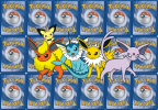
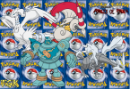
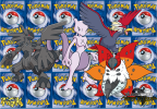
I'm quite shocked that that wasn't TDK. I learnt the hard way that the back of a Pokémon card actually has the worst possible combination of colours - red, blue, white, and yellow, to the point where it's really hard to make things stand out. Golurk in particular, being a darker Blue. The Forces of Truth logo I'm still not to happy with it, but that's the best I could do.

- As I said before, it actually works better with Larger images that way, although Reshiram and Zekrom each took up almost half the space at their original size. So, trying to find a balance between Too Small and Too Big is actually pretty difficult. For inctance, The eeveelutions and the TDK avatar look pretty squished, but the Forces of Truth avatar took me almost 20 minutes to actually get all the Pokémon sized and arranged the way I liked it, but without it looking TOO squished.

- I'll try, I'm not the best at technical stuff. Just give me some time, mmkay?

Thanks for the advice!
 
Back
Top