The art of Power Keepers

Tomokazu Komiya

He's cool. Sorta.
Member
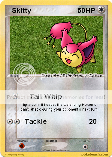
I really like most of this set's artwork. Mitsuhiro Arita did really good on Flygon and Salamence ex. Some of the art on the other ex's seems kind of sloppy, like on Metagross and Shiftry, but it's good on a whole. (Claydol ex is awesome) I HATEHATEHATE all the Ken Sugimori stuff.... It's very bland, lazy, and slapped-together. On the other hand, some of the new stuff is amazing. Charmeleon is AWESOME. All the Sachiko Adachi (clay stuff) is awesome - Kirlia, Lairon, Trapinch, and Charmander are all winners. Nuzleaf and Vigoroth are pretty cool - Kusajima's comic-book style works well in this set. Gardevoir.... meh.Fukuda's art works well on Magneton and Blaziken, but Delcatty doesn't look too good. Tomokazu Komiya is horrible as usual - Skitty, Aron, and whatever other crap he's done are horrendous. But of course, my personal favorite...
15.jpg
What does everyone else think?
 
I think that Ken Sugimori art may be a bit bland (and a little 2-D), but it is a bunch better than the clay pictures by Sochico Adochi. Masakazu Fukuda's art is great. All of Ryo Ueda's art is well done, except walrein and claydol.
 
Ken sugimori didnt gave his best to draw the best art- u can see the pics? they have absolutely no background! (they make the background holo-ish so that u cant notice nothing's in the background)
 
My favourite art in power keepers has to be the mightyena card. It looks fierce. I like most of Ken's artwork. Though I did cringe a little when I saw the altaria. Aron is the worst card IMO.
 
Disappointing. Ken Sumigori Art should not be used in Cards because it makes the Picture plain and Blank. Other plain ones would be Salamence-ex, Flygon-ex and Altaria. I personally like Metagross-ex and Skarmory-ex, maybe even the reprints, but Gardevoir is a disappointment from the previous one.
 
I love most of the sugamori artowork. It makes me feel like we're back in the WotC days when he did all the artwork. But I do wish some of the backgrounds where a little better. None of his cards have really had "backgrounds" but look at machamp (base), Blastoise (base), etc. Even though they aren't actual backgrounds they are vibrant and really catch your eye unlike the cards in this set.

Masakazu has probably my favorite art of the cards in the set. I've always loved his style and I wish he could have done mroe cards. Midori's artwork is always trash IMO except for the gardevoir which is pretty so-so. Slaking looks absolutely terrible by comparison to it's R/S predecessor. The art on Mightyena looks like it popped out of Magic the Gathering. And just in general the textures of all his art looks very rough, as if it was drawn on sandpaper. Most of the ex artwork is pretty bad too.

My favorite artwork is probably either Delcatty or Vaporeon*
 
magneton looks great, but it isn't the best magneton art I've seen so far /men drools over e-skyridge kouki magneton :p
Vaporeon looks great, and gard looks ugly...
I don't mind the Ken-arts, although some look way too plain, I like his style, + you can't really blame the creators, it was a pure-US set, I'm surprised that they got so many artists to draw cards for the set, you would expect the set to be ken-only :p
 
My fiance said he liked the magneton too. There have been some really rubbish magnetons in the past. I think the mightyena is good because in the past it has looked too soft and gentle. I like the fact that it has a bit of an attitude this time. Dark pokemon are hardly meant to be all cute and cuddly.
 
^ wouldn't you just hug a sableye to death?
But that besides the point, yes, mightyena actually looks like it doesn't wants to be pet for once, unlike the SS one, man, I've seen tiny toothless dogs that looked 10 times scarier then that thing :S
 
cute-mew said:
you can't really blame the creators, it was a pure-US set, I'm surprised that they got so many artists to draw cards for the set, you would expect the set to be ken-only :p
^ Point taken. :D
 
Blaziken is better compared to the old one.About the Mightyena's I think the DX one looks vicious.:p
 
And I thought Tomo quit pokebeach! hahaha long time no see!

Yep, PK has good art, the best for me would be Claydol ex!
 
o boy, we will have another 'ken sugimori' set - DP

hey WPM, can u add another kind of sets in front of the main page? Let the title be - "ken sugimori's" set. this includes RS, PK, DP, base and any other set that have like 80 % ken sugimori's set

They should have let kouki saitou draw them...:(
 
^ Well, ken art is available for everyone, and already existed, Kouki would have to draw all the pokes, and although he's the best :), that would be rather impossible :S

anyhow, Tomo's back, and he made Skitty look ugly, CONGRATS! And Tomo's back, and he said Skitty looked ugly, YAY!
 
Well really we should be greatful that any artist offered to do the cards. Yes, the skitty is bad but that is that artist's kind of style. However, I still hate it.
 
Yeah, the art for Skitty is butt-ugly!
I've re-made it from a friends art-work for a Skitty pic.
Tell me which one is "Cuter"
Set:
62.jpg

Mine:
Skitty_PK-Remake.png
 
Well of course yours, but I don't call that re-making it. I call it copy/paste another Skitty pic. and put it on a different background. :/

Arcanine out.
 
Back
Top