Art Gallery SS's Image-Based Fakes - Classic Series: Safari - Three new cards!

Shiny Shinx

WE ARE IN THE BEAM
Member
I guess this is where I'll be dumping all of my fakes from here on out...

neoinfinity_logo_zpsaali4lo9.png

(of course, I'm starting at the end and working my way forward, in a very indirect fashion)
87_megapidgeot_zpsiheukvxl.png
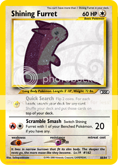
(Furret is the best, and Shining Furret is even better)
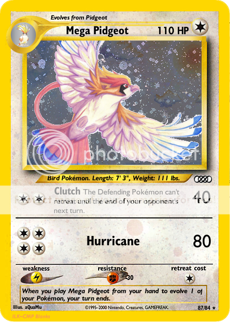
88_shiningfurret_zps7q5p71a0.png


safari_setlogo_zpssqfvrdms.png

(new and improved!)
dragonite_1_hr_zpsc6n8bhy1.png
(also fixed!)
kabutops_2_zpsucrtlkeg.png
(foil coverage isn't perfect, I tried to do it freehand, gave up, and just went with the good ol' magic wand.)
omastar_3_zpszah3jowa.png
(no, I definitely did not forget to include the resistance amount the first time I posted this, of course not)
rhydon_4_zpspsaxibm0.png
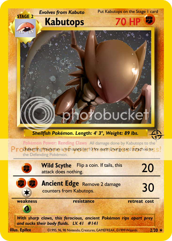
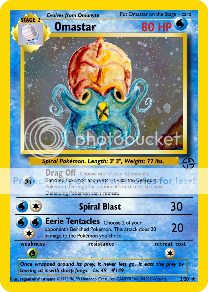
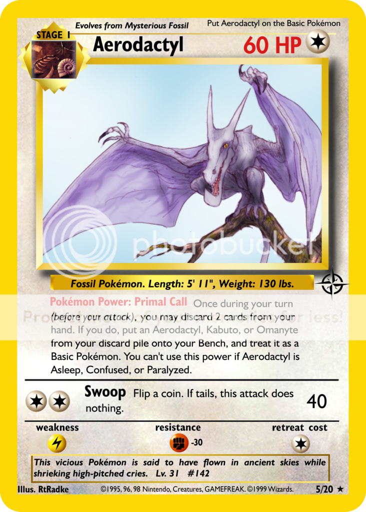
(figured I might as well close out the Mysterious Fossil trio)
aerodactyl_5_zpsmyyhxcxw.png
(this one took a surprisingly long time)
electabuzz_6_zpswfyvi0as.png
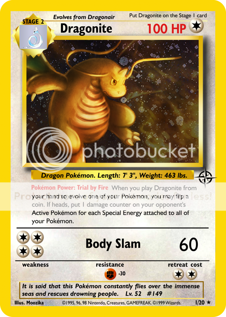
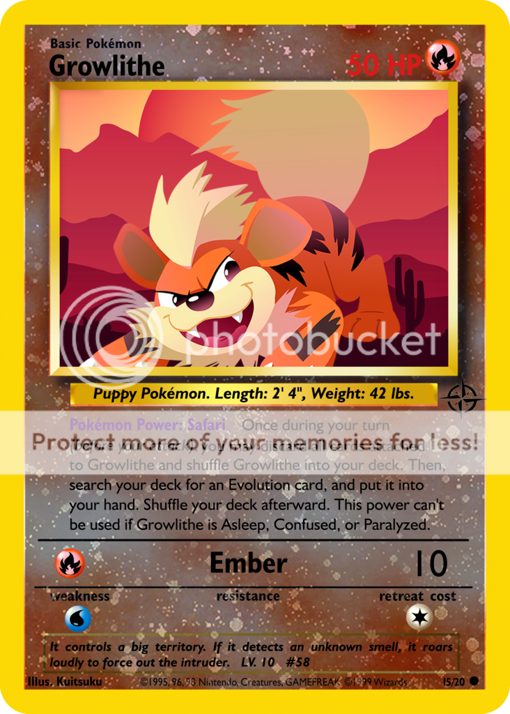
(Growlithe is the mascot of the set, hence the RH treatment. I've got a new foil sheet that lacks the ugly lines *previously* seen on Dragonite and Kabutops, and I think I've fixed my HP problem.)
growlithe_15_zpspjtlxdxj.png
~SS
 
Last edited:
Ah, I love old-school fakes. Anything Classic-Neo is pure nostalgia. <3

Futura LT Heavy (99% width) is what you want for HP. I see a few other problems as well:

  • Most notably are the attack division lines. They should be the same width as the line that divides the attacks from the WRRC area.
  • Energy costs should also be shifted further left. One Energy on a row should have the left side aligned with the left side of the Stage 1/2 text. 2 Energy on a row should have the left side aligned with the left side of the division line.
  • Set number should be a bit closer to the rarity symbol (about 5-6 pixels apart).
  • Attack damage size should never be reduced. There's room on that Omastar for full-size text. Also, the last attack says it does 2 damage. I think you meant 20.
  • Growlithe's description seems a little too close to the left border. Illus. credit also seems rather huge.
  • I personally suggest using classic artwork for the evo boxes of old-school fakes. You should be able to find most of them at pldh.net (though you may have to darken them slightly).
  • If you're using Photoshop, try out the Refine Edge feature (Select - Refine Edge) to smooth out your selection when adding foil.

Other than that, these are looking pretty good! Are these some of your first image fakes? It took me years to get mine as good as these.
 
Ah, I love old-school fakes. Anything Classic-Neo is pure nostalgia. <3

Futura LT Heavy (99% width) is what you want for HP. I see a few other problems as well:

  • Most notably are the attack division lines. They should be the same width as the line that divides the attacks from the WRRC area.
  • Energy costs should also be shifted further left. One Energy on a row should have the left side aligned with the left side of the Stage 1/2 text. 2 Energy on a row should have the left side aligned with the left side of the division line.
  • Set number should be a bit closer to the rarity symbol (about 5-6 pixels apart).
  • Attack damage size should never be reduced. There's room on that Omastar for full-size text. Also, the last attack says it does 2 damage. I think you meant 20.
  • Growlithe's description seems a little too close to the left border. Illus. credit also seems rather huge.
  • I personally suggest using classic artwork for the evo boxes of old-school fakes. You should be able to find most of them at pldh.net (though you may have to darken them slightly).
  • If you're using Photoshop, try out the Refine Edge feature (Select - Refine Edge) to smooth out your selection when adding foil.
Other than that, these are looking pretty good! Are these some of your first image fakes? It took me years to get mine as good as these.

Fortunately, I saw your advice right before I posted Rhydon,
rhydon_4_zpspsaxibm0.png
and I went back and I think I fixed everything.

These aren't, technically, my first fakes, but seeing as it's been something like five years since I last made anything, meaning I had to pretty much relearn the process, and those that I made back then weren't particularly good, it feels like these are my first.

~SS
 
Last edited:
So I decided that I wanted to try to make a Mega, in the Neo style, so I cobbled together a few blanks out of bits and pieces of other blanks, and came up with an acceptable-looking Mega Pidgeot, (but there's still major room for improvement). Right after I saved it, I was browsing around DA, and I found CMP's Mega Charizard for Neo Redux, which completely blew Mega Pidgeot out of the water (air?). So now I guess I'll wait and see if CMP releases his Mega blanks, because that would make my job a whole lot easier.

~SS
 
Back
Top