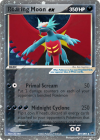
I made my first card with the cardmaker! The illustration was modified from a piece of Xous54 "Ken Sugimori style" artwork by a member of the Pokémon TCG Fakers Community, and I must say I was impressed with how much care they took into making the piece. It looks like a real Pokémon Star illustration, even without the Cosmos Holofoil edited in (yet). This is hardly the final product (I'll need to track down the original, hi-res file and Katsu's DeviantArt username, in addition to double-checking my wording), but in this case I was using it as a test of the program.
(Yes, the image I used was saved on my iPhone, and there wasn't enough space to download the high resolution version when I wanted to move it over. That's why there's an exclamation mark in the bottom right.)
My first thought was "wow! Everything fits! I'm impressed!" I'm not sure if you added text scaling after all or if this was already part of the code, but congratulations! The ability to fit in this much text is an invaluable asset to users, and I thank you for taking the extra mile to implement it!
One thing I was curious about was the fact that set numbers are programmed to always be in "_/_" format. This is to be expected from normal set numbers, but in the cases of promos, it would be advantageous to be able to remove the "/_" part of the set number.
One problem I noticed with the formatting around the image frame was that the illustration seems to be covering up the tail of the "δ" that was woven into the "Basic" stage plaque. I'm guessing this is an issue that occurs primarily with the "δ delta species" blanks, but it might be worth looking into how other blanks could be affected.
The "Poké-Power" blank feels a little blurry, by the way, but it's probably not a big deal. It's probably the largest you can find, and I'm sure upscaling it isn't a big priority. I have heard there are AI that can upscale smaller blanks fairly easily, though. You might want to talk to Nekoban Ryo about that. He recently upscaled a couple of his older holofoil patterns, including a custom "windmill foil" pattern. But as I said, probably not a priority or worth very much time.
Overall, I'm impressed with how it's come along so far! Keep up the good work!


")


.png")
.png")

.png")
.png")
