You are using an out of date browser. It may not display this or other websites correctly.
You should upgrade or use an alternative browser.
You should upgrade or use an alternative browser.
Art Gallery Mora's Artwork
- Thread starter Mora
- Start date
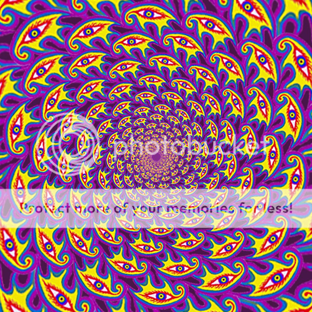
MlleFalki said:Wow, it's very aggressive if you want my opinion. Though I like the colours of the second one.
What do you mean by aggressive? Is that a good thing or a bad thing?
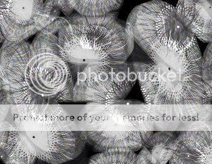
HarZard said:I like the first one, the color scheme seems odd at first but the deeper you look, it becomes appealing in an odd sort of manner. However it looks a bit pixelated, maybe use a better res image.
I'm glad you like it. I think it's pixelated because it's not supposed to be that big. I guess the size got messed up when I uploaded it somehow. I should definitely fix that. Thanks for pointing it out!
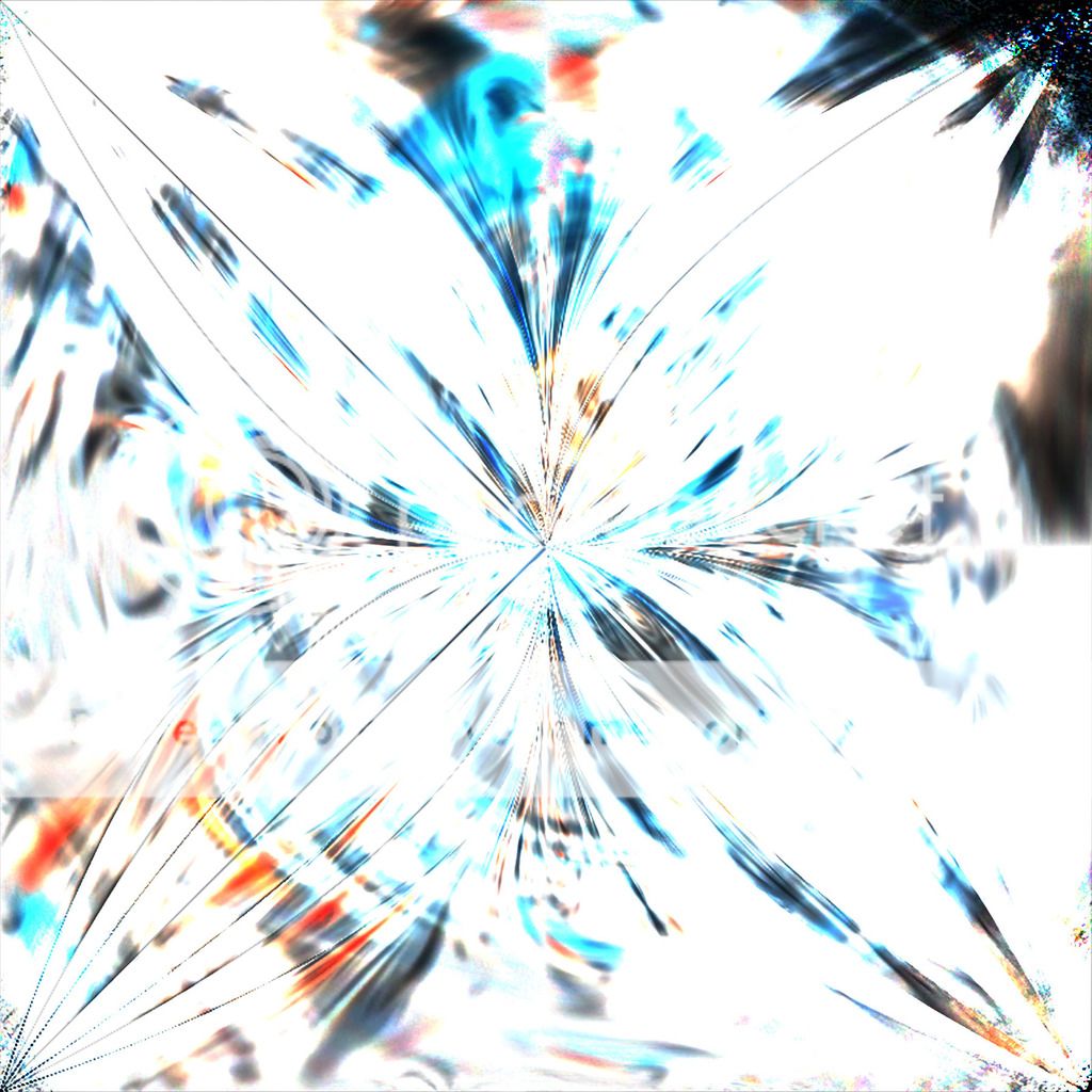
I should have two more up soon.
bbninjas said:Ooooo
I really like the second one! I feel the first one is a bit too bright, at least on first look. It's a nice concept, however!
Yeah I'm surprised how well that one turned out. I was honestly just playing around with some of the tools to familiarize myself with them when I made this. If / when I ever go back and fix any of these, I'll take all of you guys' suggestions into consideration.