Awesome, but the purple thing in the first one is a but blurry. Was that meant to be?

You are using an out of date browser. It may not display this or other websites correctly.
You should upgrade or use an alternative browser.
You should upgrade or use an alternative browser.
Midnight Designers:: Redux [GFX]
- Thread starter NerdSparks
- Start date
- Status
- Not open for further replies.
yeah I messed it up. Made it too big. Was meant to be in the background. Was blurred to create depth but as I said. It's too big 

A quick little celebratory banner for Trevor Bayne. He won the Daytona 500, being the youngest to do so. Decided to make the text the same color as the hood.
I hope I did a good job on this.

SDB-I think that some more detail could be added to the BG. Just putting pictures together doesn't seem to be enough for GFX'ers these days...
;_;
EPM-It's a bit bright. It may just be my screen settings, but it kind of hurts my eyes... Lower it down, and maybe make the Oshowatt a little less transparent.
;_;
EPM-It's a bit bright. It may just be my screen settings, but it kind of hurts my eyes... Lower it down, and maybe make the Oshowatt a little less transparent.
guys I'm going to be making a tut on my new style soon.
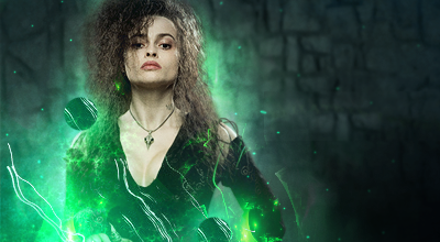
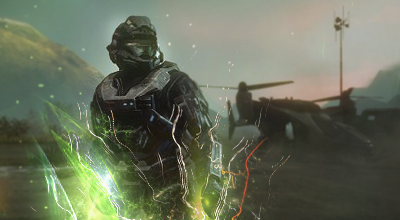
I need you to vote on which sig you like better. My halo one or the bellatrix one
or
I need you to vote on which sig you like better. My halo one or the bellatrix one
or
^
Both are awesome, but I think Bellatrix is a bit better, I would use that in the tutorial.
Both are awesome, but I think Bellatrix is a bit better, I would use that in the tutorial.
Sorry for not being here, but I can't find a reason to until I get money to buy an external hard drive.


The first sig is the best, but could still use some work. The lighting is too strong, and you can see that by how dark Sharpedo is compared to the rest of the sig. Plus, you might have C4D-spammed this one. While maybe you only used two or three C4D's, but too much of it are visible, so it lowers the sig's quality.
For the second sig, those Bubble C4D's (are they?) aren't blended into the sig well, and just look really bad. They're isn't much lighting or depth either, making the sig look a little flat.
For the second sig, those Bubble C4D's (are they?) aren't blended into the sig well, and just look really bad. They're isn't much lighting or depth either, making the sig look a little flat.
guys still need opinions on which sig to make a tut on
I like the Halo one better, the circle things on Bellatrix kind of bother me.

Wow! EPM! That's great! I love it! It's like a whole new and different style, and it looks great!
haha EPM I used to do that style too
I always thought of it as a trippy stlye XD
Anyway onto the CnC
I think that the wailmer takes up too much space on the canvas remember the rule of thirds XD
Also not digging the spatter type of effects and the contrast of the render. Looks like you set the render on multiply or overlay?
Try smoothing out this style and it will look pretty sick.
Don't give up on this style for now. Just try add something new to it
- Status
- Not open for further replies.