
Tutorial: Finding Placements Through Scans
Placement is one of the most key factors in making a fake image-based card. Even if symbols are placed just a few pixels off, it can make the card look a bit odd. To achieve accurate placement, different fakers use different techniques. @aschefield101 has made a guide for placing symbols and text by counting pixel-by-pixel, which you can find here: [link]
Other blank creators may create a .psd (Photoshop) or .xcf (GIMP) font guide, which you can open with their blank and simply fiddle with the text as you see fit. We have some of these files available in our Resource thread.
However, sometimes these options are not available. Available font guides may not be compatible with your image editing program, or a good guide simply may not be available. Counting the individual pixels is also a bit tedious, so many fakers will use an actual card scan to find their exact placements. This tutorial will explain how this is done.
Step 1: Find a scan. It is recommended to use the official, digital pre-printed scans from the Official Trading Card Database, as it can be ensured these are 100% accurate. The scan you pick should be the same Stage and era as the Pokémon and blank you plan to make a card of, and, if possible, have the same number of attacks. For placements such as Pokémon names, it is generally best to find a scan of the same Pokémon you are faking. While not necessary, having these attributes line up makes it much easier in the long run.
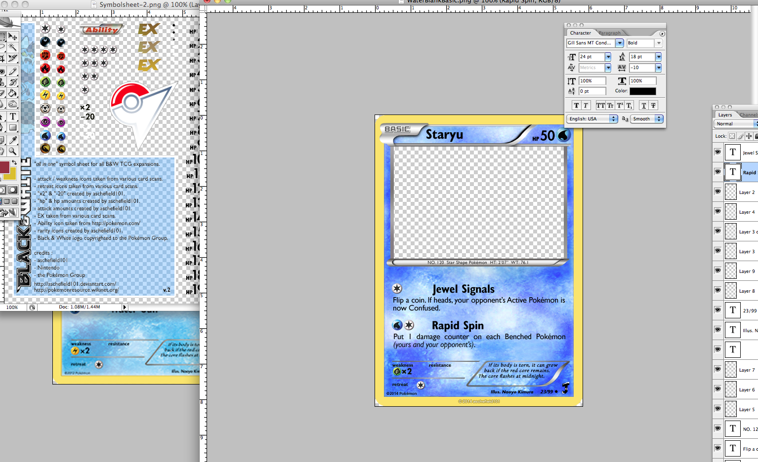
Step 2: Import the scan into your image editor. This is pretty self-explanatory. You can generally copy and paste, drag and drop or use a tab in the header bar to import an image.
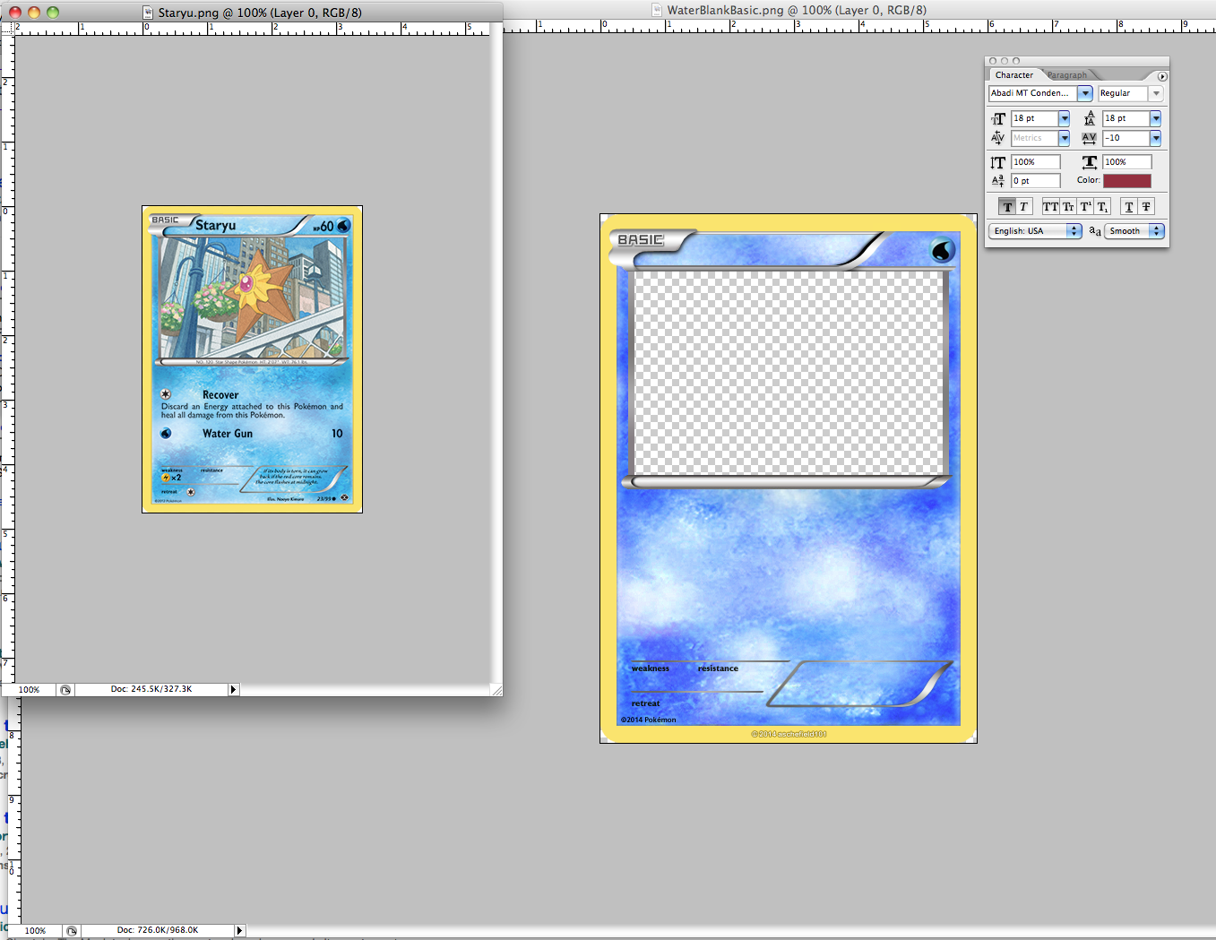
Step 3: Set the size of the scan to the size of the blank. Blanks created by the community will vary in size. Some older blanks tend to be around 420x590 pixels, while others are larger. If you’re unsure about the dimensions of your blank, you can easily check it by right-clicking the blank in the file explorer/finder and opening the file’s properties.
In your image editor, you can change the size of the scan you imported. Resize the import to be the same dimensions as your blank.
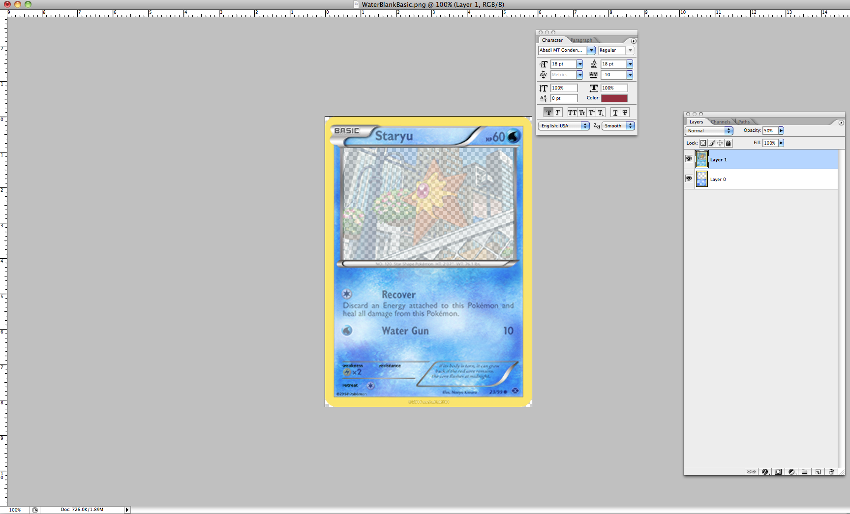
Step 4: Position the scan above the blank and set opacity to 50%. Drag the scan over to the blank or use an align tool to center the scan onto the blank. The scan layer should be on top of the blank. Then, set the scan’s opacity to 50% by changing the percentage next to ‘Opacity’. In most programs, this option is found on the Layer window/bar.
Often, the scan will not line up exactly with the blank, even at the same dimensions. To fix this, nudge the scan to position and/or continue resizing it (stretching and squishing it), until the scan lines up. For maximum efficiency, line up the scan based on specific features of the blank and the scan, such as the type symbol, art box and dex bar. It is best not to position a blank based on its (yellow) border, as blank borders generally are not the exact proportions of your scan.
Step 5: How to use the transparent scan:
Step 6: Look over your placements. Fakers should always look over their placements. Turn off the visibility of the layer with the transparent scan and look over your card. If you notice anything odd or that otherwise looks at of place, continue with Step 5. For this step, it is sometimes helpful to compare to a scan not placed on top of the blank. Once you are happy with your placements, move onto Step 7.
Step 7: Delete the transparent scan. Simply delete the layer with the transparent scan. Your text and symbols should appear on the blank without obstruction. Just add some artwork and export the card, and the card’s finished!")
Tips:
Placement is one of the most key factors in making a fake image-based card. Even if symbols are placed just a few pixels off, it can make the card look a bit odd. To achieve accurate placement, different fakers use different techniques. @aschefield101 has made a guide for placing symbols and text by counting pixel-by-pixel, which you can find here: [link]
Other blank creators may create a .psd (Photoshop) or .xcf (GIMP) font guide, which you can open with their blank and simply fiddle with the text as you see fit. We have some of these files available in our Resource thread.
However, sometimes these options are not available. Available font guides may not be compatible with your image editing program, or a good guide simply may not be available. Counting the individual pixels is also a bit tedious, so many fakers will use an actual card scan to find their exact placements. This tutorial will explain how this is done.
Step 1: Find a scan. It is recommended to use the official, digital pre-printed scans from the Official Trading Card Database, as it can be ensured these are 100% accurate. The scan you pick should be the same Stage and era as the Pokémon and blank you plan to make a card of, and, if possible, have the same number of attacks. For placements such as Pokémon names, it is generally best to find a scan of the same Pokémon you are faking. While not necessary, having these attributes line up makes it much easier in the long run.
Step 2: Import the scan into your image editor. This is pretty self-explanatory. You can generally copy and paste, drag and drop or use a tab in the header bar to import an image.
Step 3: Set the size of the scan to the size of the blank. Blanks created by the community will vary in size. Some older blanks tend to be around 420x590 pixels, while others are larger. If you’re unsure about the dimensions of your blank, you can easily check it by right-clicking the blank in the file explorer/finder and opening the file’s properties.
In your image editor, you can change the size of the scan you imported. Resize the import to be the same dimensions as your blank.
Step 4: Position the scan above the blank and set opacity to 50%. Drag the scan over to the blank or use an align tool to center the scan onto the blank. The scan layer should be on top of the blank. Then, set the scan’s opacity to 50% by changing the percentage next to ‘Opacity’. In most programs, this option is found on the Layer window/bar.
Often, the scan will not line up exactly with the blank, even at the same dimensions. To fix this, nudge the scan to position and/or continue resizing it (stretching and squishing it), until the scan lines up. For maximum efficiency, line up the scan based on specific features of the blank and the scan, such as the type symbol, art box and dex bar. It is best not to position a blank based on its (yellow) border, as blank borders generally are not the exact proportions of your scan.
Step 5: How to use the transparent scan:
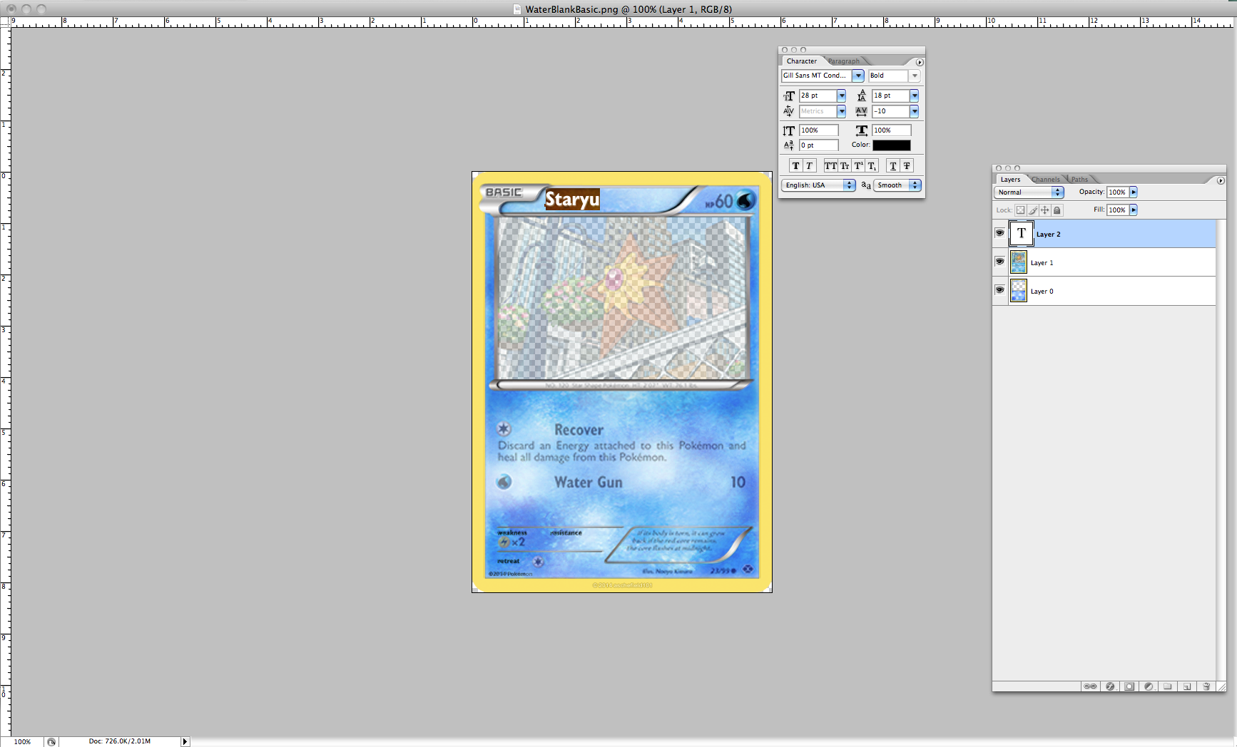
- Text: Firstly, you’ll need to find the correct fonts for each part of the card. Although the above link to @aschefield101’s font guide lists fonts specifically for the XY/BW eras, these fonts are also generally correct for the other eras. Once you have your text with the correct font, line it up with the corresponding text on the transparent scan to find the correct placement. It is best to have the scan underneath your text layers. Using the nudge function with the arrow keys available in most programs is also ideal in this step. Stretching or squishing text, specifically for names of the card and attacks, may also be necessary. For attack effects, you'll need to Justify the text.
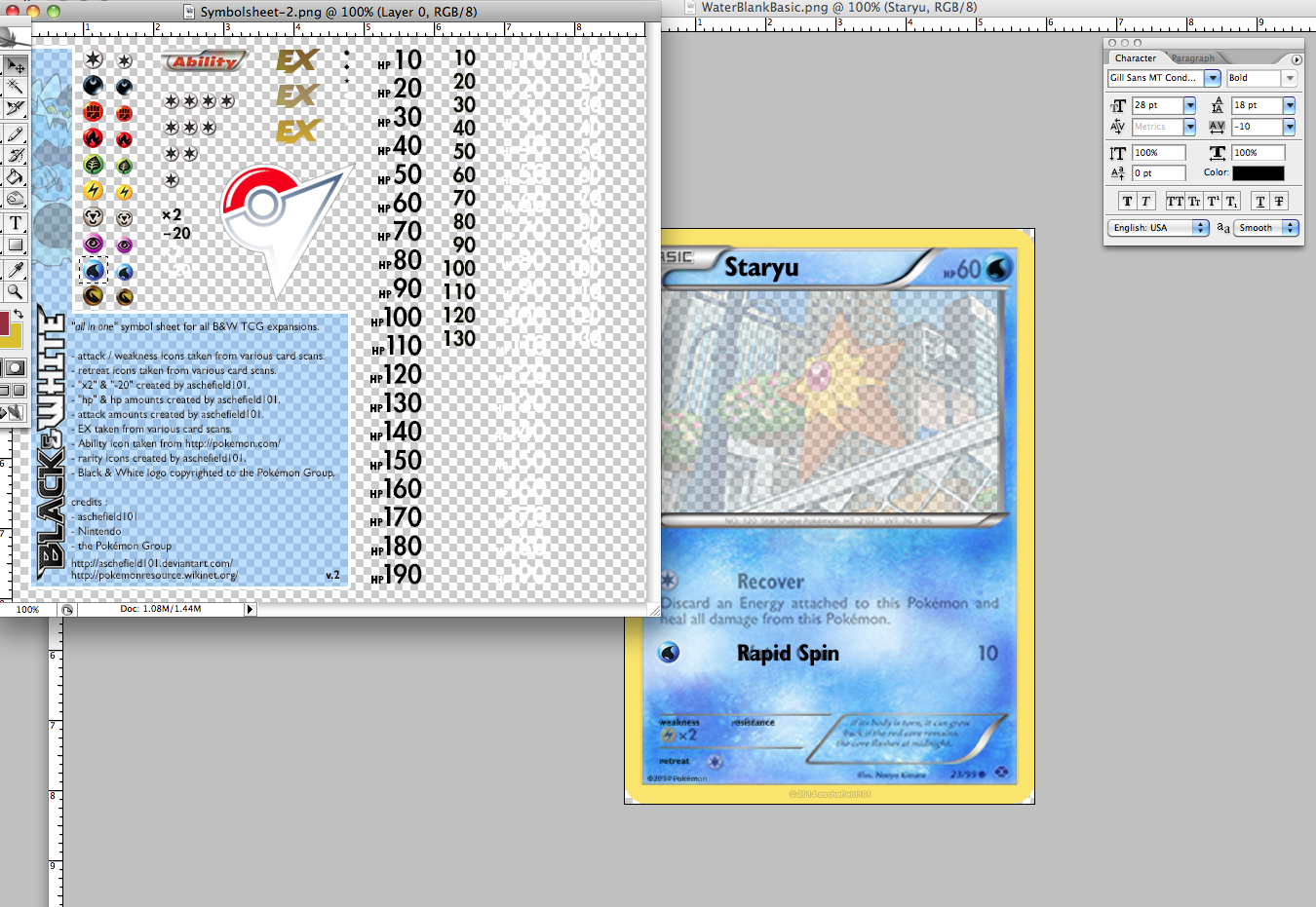
- Icons and Symbols: You can position icons and symbols –– and really anything you would find on a symbolsheet –– in the same way. Cut out the symbol you will use (with either the Lasso or Marquee tools), and then use the Move tool to drag the symbol on top of the corresponding symbol on the scan.
Step 6: Look over your placements. Fakers should always look over their placements. Turn off the visibility of the layer with the transparent scan and look over your card. If you notice anything odd or that otherwise looks at of place, continue with Step 5. For this step, it is sometimes helpful to compare to a scan not placed on top of the blank. Once you are happy with your placements, move onto Step 7.
Step 7: Delete the transparent scan. Simply delete the layer with the transparent scan. Your text and symbols should appear on the blank without obstruction. Just add some artwork and export the card, and the card’s finished!
Tips:
- Remember: If a Pokémon card has 4 or fewer lines of effect text, the gaps between the stat bar, attacks, and bottom text are much wider than they are if the card has 5 or more lines of text. Compare Ariados AOR (5 lines) and Metang AOR (4 lines) for reference.
- The “nudge” tool is your friend! Mastering this will allow your placements to look much more authentic.
- Don’t hesitate to use multiple scans as references. You may want to use one for name placements, another for attack/effect placements and yet another to compare!
- Don’t be afraid to experiment with a placement method that works for you best. This tutorial is just a starting point.
- Be patient! Placements should be the bulk of the time you spend on your cards, aside from the art and aesthetics.
- If you have any questions, feel free to ask anyone in the TCG faking community! We always enjoy sharing our tips with new fakers.