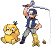
Hello, and welcome to my art thread. I'm not a very skilled artist, but I do enjoy making art from time to time. Since I've recently gotten back into drawing, specifically Pokémon images, I thought I would make a thread here to share with you guys.
") Comments and critique are welcome, though keep in mind that I'm an amateur and mostly doing this art for my own fun; suggestions will be taken seriously in the future for later pieces, but I don't have plans to do much (if any) editing to the pieces I've already completed.
Comments and critique are welcome, though keep in mind that I'm an amateur and mostly doing this art for my own fun; suggestions will be taken seriously in the future for later pieces, but I don't have plans to do much (if any) editing to the pieces I've already completed.Pokémon Artworks
I used to draw Pokémon (well, sketch, really) rather commonly and I've recently picked it back up for the Create-A-Card Contests in our Fan Fakes forum. Since the artwork was originally planned for cards, I grew fond of using the holosheets that are used for making fake Pokémon cards and incorporating the holo into the design.

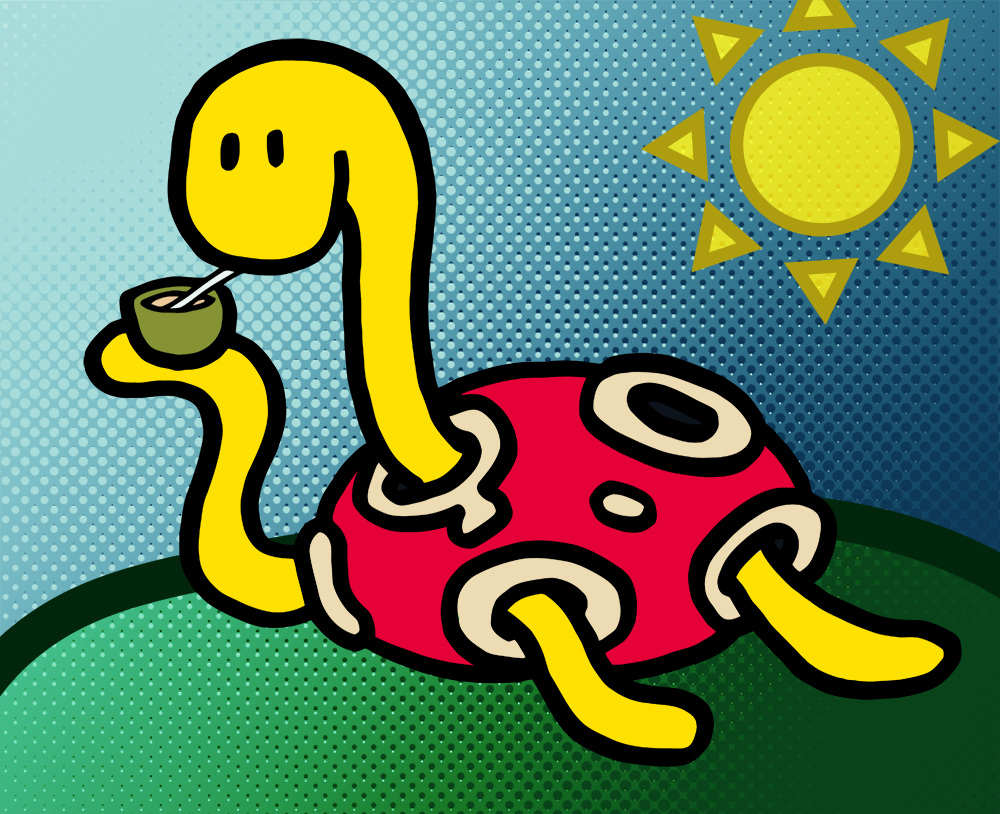
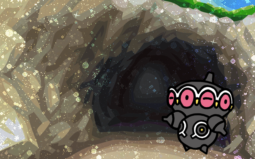
By request of @Jabberwock for his recent prize in The Challenge, I drew him a Palossand! It actually turned out pretty damn well, I think. Nothing too fancy, just a pencil sketch, inked/markered, then scanned, vectored, and cleaned before colouring. I had a problem getting the "finger" bits on the "hands" to look right, so I just kind of put them into this simple pattern which kind of makes him look like he's giving double peace signs. :U
This piece of something of an homage to one of my favouritest TCG art pieces, the EBB/Legendary Treasures Shuckle card by MAHOU. I've always been amused by the whole Shuckle berry juice thing, and I love MAHOU's style. This is kind of a simple piece, but I'm pleased with how it turned out, especially with the difficulties I had with the original drawing.
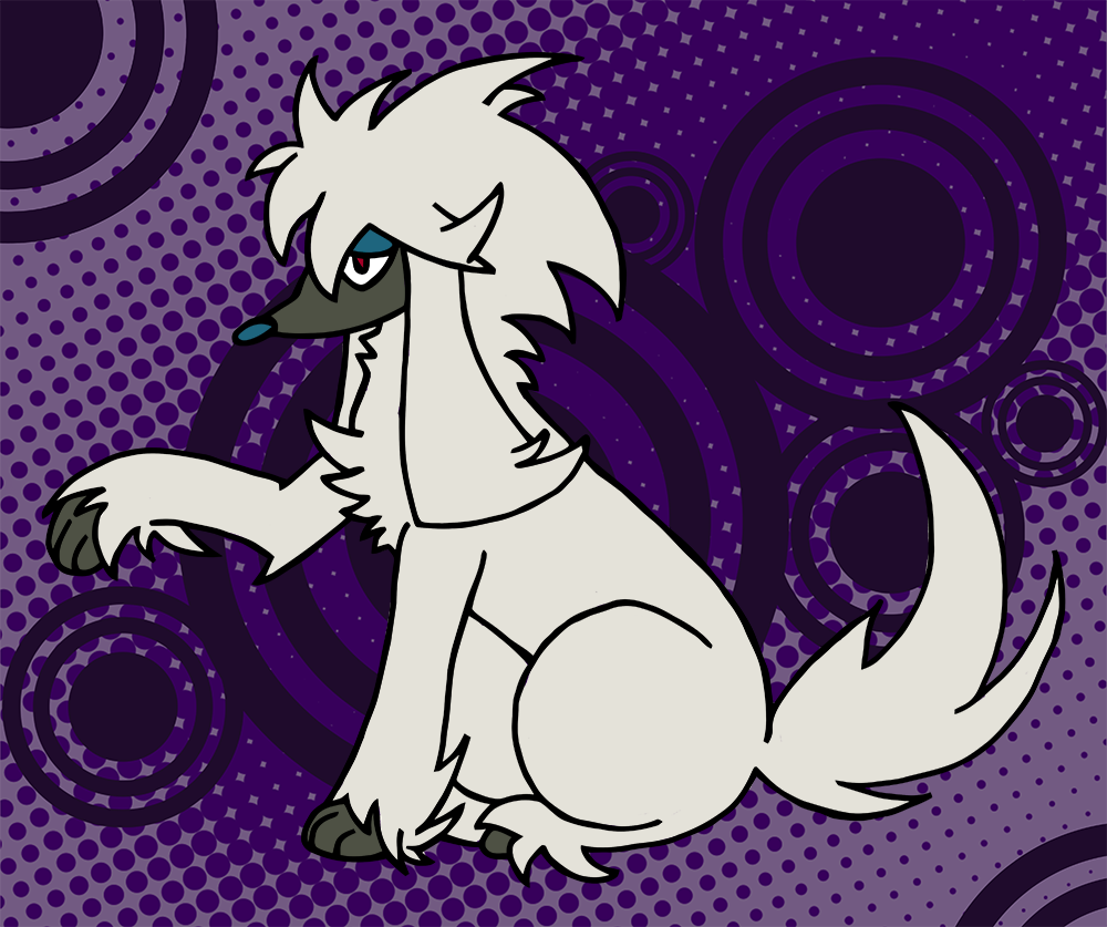
Due to the detailed nature of Furfrou's hair spikes, I opted for a thinner rollerball pen instead of my typical marker. I actually kind of made a mess of it with ink smears and was dreading the long clean-up time, so I decided to experiment a bit and vectorize my initial scan instead of cleaning it up manually by hand. I had to tweak it a bit and still do a few things by hand, but the vectored image did so much of the work for me that it was amazing! I think I'll continue to do that from now on to save my sanity.
In general, though, I'm really proud of how well the pose turned out. Furfrou's spikes were fun to make, but it was difficult to figure out how they should work for the hind leg and begging paw. I was originally planning on making him have a panting face as well, but it looked too weird; the stoic look seems to fit him better. He kind of reminds me of L from Death Note a bit...
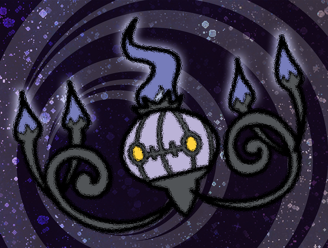
This is my art for July's CaC, done ahead of time since I'll be in the US without scanner/software access while the contest itself is actually running. I really like the glass distortion effect over the lines; it makes him feel more ghostly!
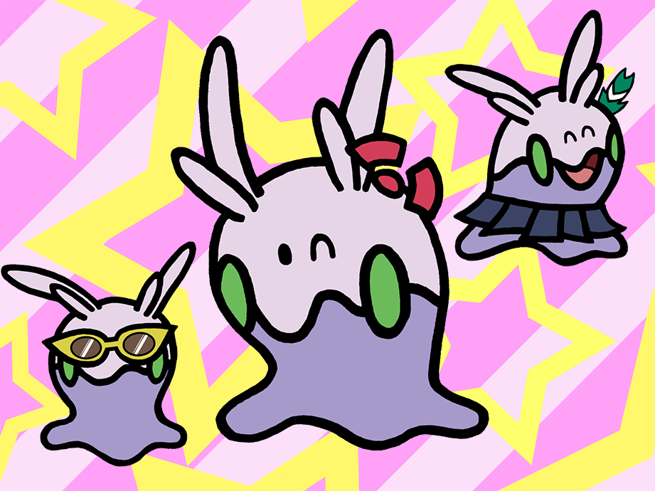
The user who made the text for the card asked for the artwork to contain multiple Goomies, and I got the idea to give them all accessories to make them stand out!
Admittedly, the one with the skirt and the Fletchling feather is my favourite.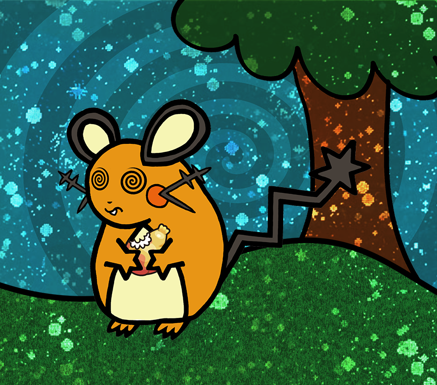
"If held by a Pokémon, it restores the user's HP in a pinch, but it will cause confusion if the user hates the taste."
This one was surprisingly annoying to clean. The whiskers were done in thin-point again, so they were a mess, and the tail I practically redrew with the mouse after it was scanned. The left ear is a bit too big I think, but none of the fixes I tried looked good, so I just left it.
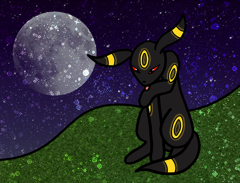
Umbreon was originally going to be a spiritual successor to the derpy-legged Espeon, but I couldn't get the pose to work and somehow ended up with this instead. For the first time, I used a slightly new lining technique, where I only used the thicker marker for the major body parts and did the face and accents (in this case, the rings) in a thinner pen. While this did require more clean-up of those thin line sections, I think overall it worked really well and stopped those detailed bits from losing too much detail. You can see the just-scanned lines version here for a better shot of how that looked on paper
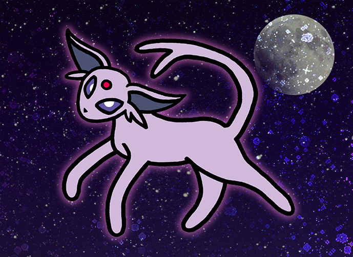
I somehow got an idea in my head to draw an Espeon with really derpy legs. A couple hours later, I was done with this magnificent piece of art. Like my previous Mew, I'm pretty happy how all of it came out except for the tail, which I can't seem to fix for the life of me. I guess I just can't draw tails. Don't me why he's glowing pink, either; it's probably some kind of Psychic thing. :U
Although I kept my signature foil effect, I like the version without foil, too.
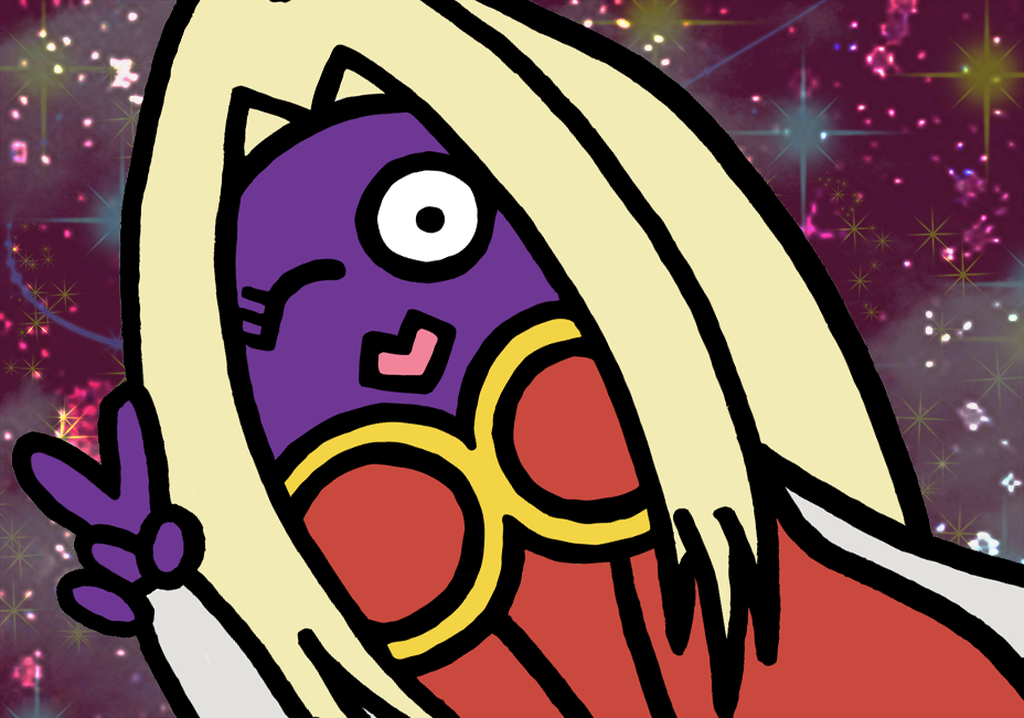
I've always felt that Jynx gets a bad rap. While I do understand that to most Americans her design (especially the earlier version where she had black skin instead of purple) was reminiscent of blackface, she's always reminded me of her (likely intended) roots as a Ganguro girl, which was a (completely ridiculous) fashion trend popular among some young Japanese women back in the 90s that involved bleach hair and deeply tanned skin. Although Ganguro has mostly dyed out and changed into different trends now, I like to think Jynx would move on to new obnoxious trends, like decking herself out with bling and taking selfies, which was the inpiration for this art and the particular pose. The wink + peace sign also gives her a nice anime girl look. I purposefully aimed to make the background as obnoxious as possible. This was a very fun drawing to make.
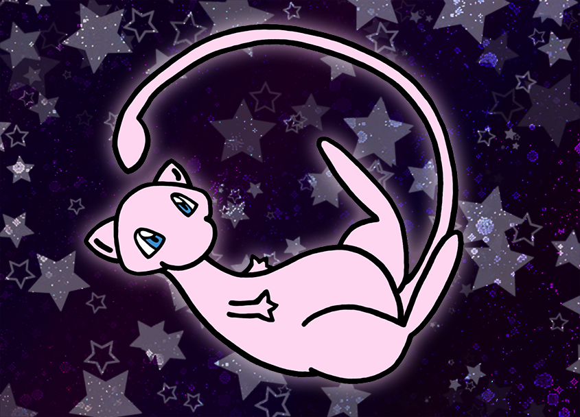
My contribution to this month's CaC. They said I could choose anything, so I chose the Pokémon who can choose everything: Mew! It was lots of fun to draw. I'm still not entirely happy with the tail, but eventually I had to give up and admit that I fixed it as much as I could.
My contribution to January's Cac. PMJ and I decided to do an homage to DNA and make him a Claydol card. Sadly, there's not a lot of positioning you can do with Claydol, though I think it still turned out pretty good. The background is a vectorized version of one of the location cards from HGSS, the one for Mt. Moon which is right by Rte. 3 where Baltoy is found in that game.
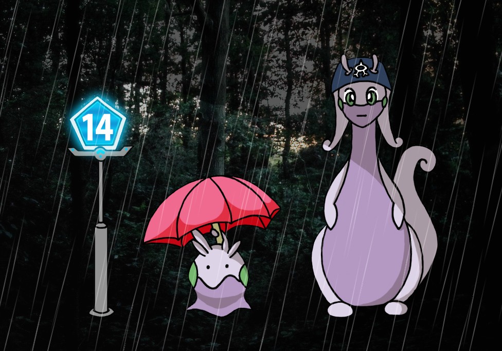
The Goodra line has always seemed kind of silly to me, so it kind of makes sense that they'd be paired with the goofier Team Aqua, plus there's the nice water/rain connection, even if Goodra isn't part water at any point. I liked the idea of a Goodra recruiting for Team Aqua and somehow the idea to base a posing off the Totoro poster came to being and I just couldn't say no. I don't even pretend to understand where my brain gets its ideas from these days.
The Route 14 sign ended up being more machine- than man-made in the end. I originally draw it all out by hand, but I ended up remaking the lines for the pole in photoshop to make them straighter, and changed the "14" to a font so that it could be white over the blue with no lines and still look nice.
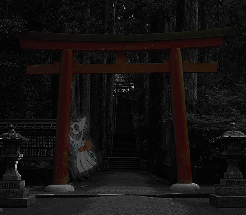
This month's CaC theme is ghosts. It was PMJ's idea to do Froslass, but it worked out perfectly for me since A) Froslass is one of my favourite Pokémon, and 2) I immediately had a cool idea for it.
There's definitely more focus on the background than my typical Pokémon art. The inspiration for the setting is actually one of my favourite video games, Fatal Frame. The main villain in the first game is a shrine maiden named Kirie (a name I frequently use on other websites) and there are many shots of her and other ghosts in kimono surrounded by traditional Japanese settings, including a shinto temple. Being a kimono-fied ghost Pokémon, I felt the comparison very fitting. I was originally planning on using an actual screenshot from the game, but I couldn't find one at a high enough resolution at the kind of location I wanted and without any characters, so I resorted to be a bit of photograph manipulation. Sadly, I don't know the origin of this photo, but it worked very well for my purposes.
I did something a bit different this time around, namely not working with a huge-ass file. I typically scan and do all of my clean-up and colouring at 300dpi... which is pretty large. Mostly this is because I'm used to thinking in a print mindset; you want anything printable to be at least 300dpi to make sure that it prints nicely. When I worked at the printshop, I would make prints and stuff of my own drawings all the time, but now I'm solely digital, and I don't use those high-res versions for anything. So, I still scanned at 300dpi (so the raw scan is that large, at least), but resized down to 100dpi before cleaning and colouring, in the hopes that it would make my workload significantly less. And it worked! I spent MUCH less time cleaning and colouring than I usually do and I'm still left with a nice picture in the end, just not one that would look super great if printed, which, OH WELL.
I did duplicate and rotate the entire arm for the right arm, just to make sure it was positioned nicely, and also dicked around rotating the eyes and such. My old thick marker that I used to use for these thick-line scans is actually dry so I had to use a different one that I actually didn't like as much, but it got the job done well enough. I left the eyes with the thinner pen only so they wouldn't turn into blobs. Originally I outlined the inner flowers in the thicker marker, too, but I didn't like how that turned out so I ended up cutting and pasting the inner flowers from the thinner-line scan that I made first, then later thickened those lines up a bit with the paint tool. So, in the end, they ended up at a thickness somewhere in between the the two tools.
Overall, I'm pretty pleased. The background is boring, but mine usually are; I'm not a fan of making backgrounds, which is partially why I'm so partial to adding the holo effect. >_> Speaking of which, not sure if you can tell, but I used a different holosheet this time. This one is CMP's, the one he has to match his Neo Redux set. I had the holo downloaded since I plan on hopefully making some fake cards with his blank set soon so figured I'd give this one a try this time to see how it worked. I was very pleased!
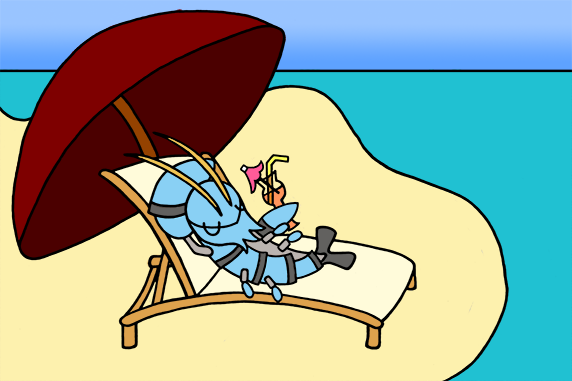
Clauncher was drawn by the request of CMP for use in his Neo Redux fake card set. I really love the work he's done with the cards and I'm very honoured to be a part of it. I might make some more Pokémon for him too in the future if we can think of some good ones to do together. I'm particularly fond of this pose since it gives Clauncher a bit of silliness that usually isn't reflect in his typical serious poses.
Because the initial drawing was so small (about 6cm) is ended up taking me several hours to do all the clean-up work for it, though I'm very proud of the results. It does make me want to get a drawing tablet even more, though.
I'm particularly fond of this pose since it gives Clauncher a bit of silliness that usually isn't reflect in his typical serious poses.Because the initial drawing was so small (about 6cm) is ended up taking me several hours to do all the clean-up work for it, though I'm very proud of the results. It does make me want to get a drawing tablet even more, though.
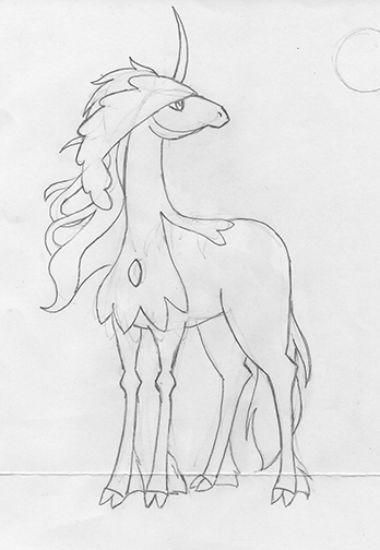
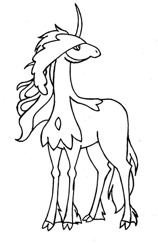
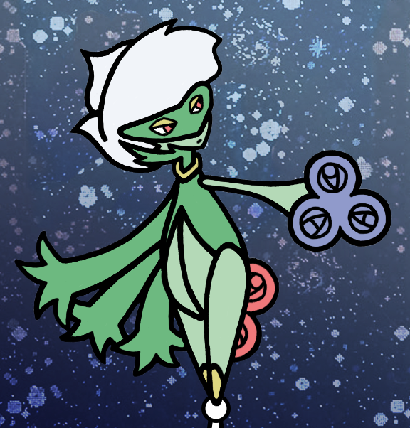
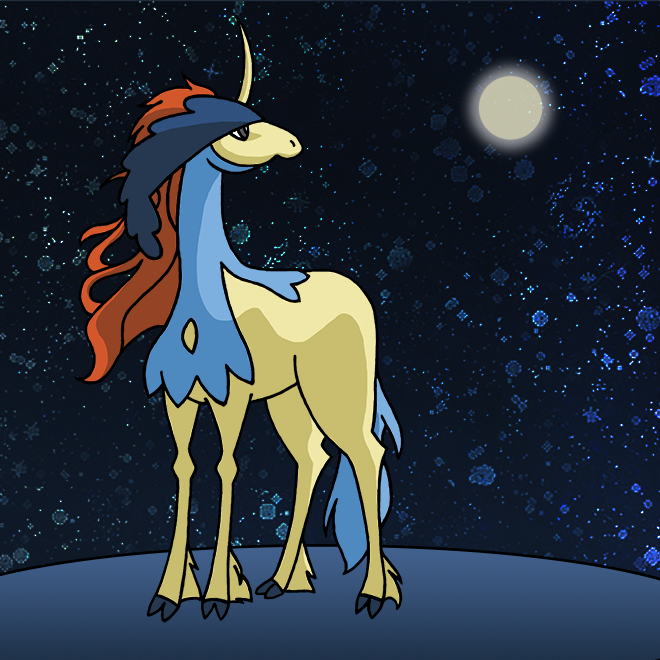
The theme for CaC July is Legendaries, and while my initial thought was to do a Mew or Jirachi that would fit my simple, chunky-lined art style, I got a fun idea for a Keldeo drawing that would be something of an homage to one of my favourite movies: The Last Unicorn. I had a difficult time getting the shape of the head down, but the rest of the initial drawing went pretty smoothly, followed by an agonizing several hours of clean-up, and even some shading in the colouring. I was able to base the shading off of my reference drawing, so I don't think it turned out too poorly for once. As usual, I capped the piece off with my traditional holofoil background, though I also did another version with a star field brush instead. Hope you enjoy!
This is my art for the June CaC Contest. This month's theme was Gen. 3 Pokémon, in honour of ORAS. Since I did one of my favorite Gen 3. (Flygon) for last month's, I thought I would do one of my other favourite Gen. 3 mons for this month: Whiscash!
Whiscash was drawn on a significantly larger canvas than my previous arts (A4 instead of A5). In theory, I hoped that a large original drawing would mean less cleaning up work once I had it scanned in, but in practice, this proved to not be true. Because of the larger drawing, this also meant longer lines, which meant I was more apt to break my flow while inking causing bumps and fits and starts. I think I'll stick to A5.
Because of the larger size, his lines ended up being thinner than Flygon's, even though I actually used a thicker marker. I really do like using the thick marker for this style of drawing, though, and I think I will continue on with it in the future.
I am especially proud of how it turned out, especially considering my current restrictions. I ended up using a binder for a desk and drew this while I was stuck on the couch recuperating.
My art for May 2014's CaC Contest. The theme was Stage 2 Pokémon, and in honour of OR/AS, I thought I would draw one of my favourite Hoenn (and, really, in general, too) Pokémon: Flygon! Flygon always seems so cute and playful that I thought I would give him something of a fun pose. When I was first inking, I originally used my regular pen, but after scanning that in, I thought the cartoon-y nature of the drawing might look better with thicker lines, so I went over it again with a permanent marker. I think it turned out really great.
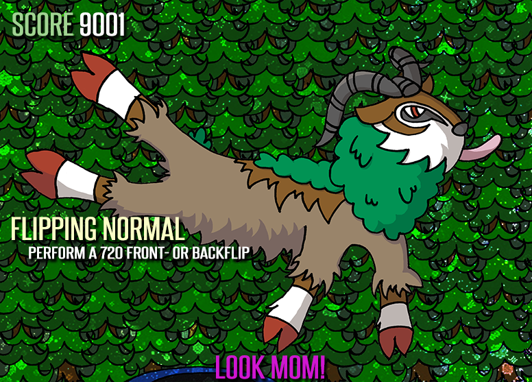
This drawing was done based on the new, silly Goat Simulator game, which is where the text and the silly pose are related. The background is simply the same tree copied over and over because I'm lazy.
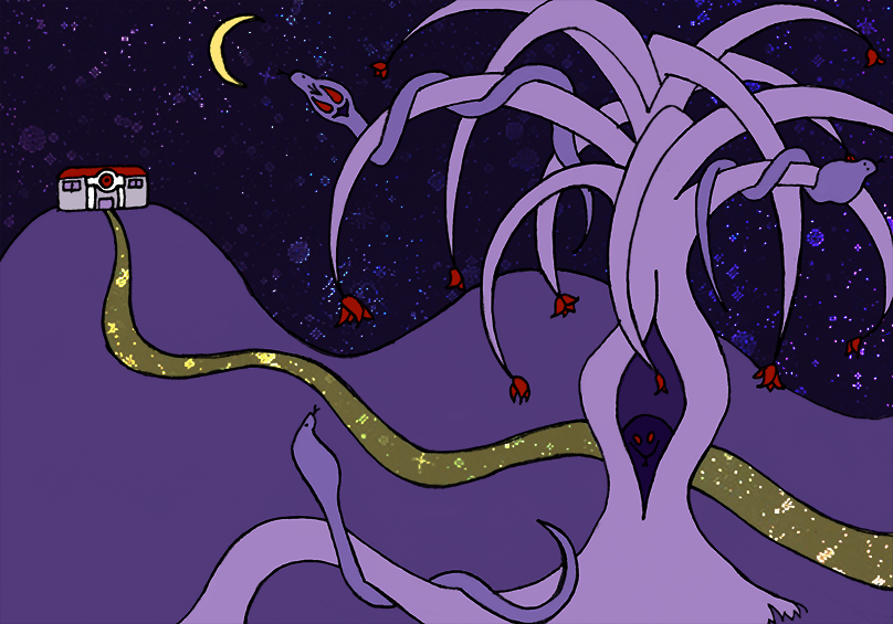
I have a fascination with abstract, creepy landscapes featuring bizarre trees and flowers; this actually came about as a result of a novel I wrote a few years ago and doing storyboard sketches for that. It's kind of fun for me to picture Pokémon living in the same world. I like to imagine the Arbok would have loved this type of tree as a form of camouflage to help them hide from predators.
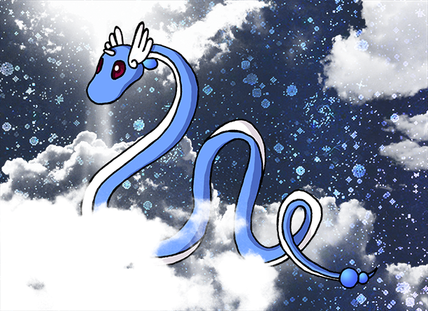
A more simplistic drawing than the other two, featuring a twisty, curvy Dragonair, one of my favorite Pokémon. I always loved that they could fly through the sky, despite not yet having the wings of their final evolutionary form; it gives them an extra air of mystery and grace. The clouds were made from a couple different photoshop brushes.
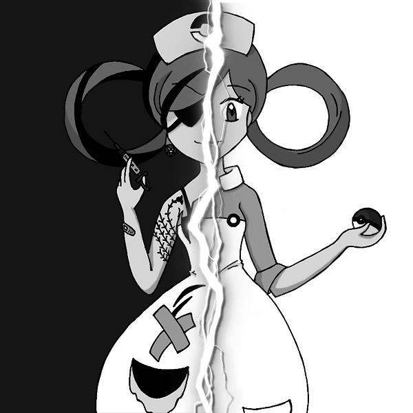
This artwork was done for a particular assignment in The Challenge 5. The idea for a two-faced sort of person was suggested by another member of our team; I decided to do it as Nurse Joy and ran with it, though it was kind of a rush job. The "dark" side of Nurse Joy features heavy inspiration from the nurses of the manga Pure Trance.
I'll be doing some Stage 2 artwork for the current month's CAC; if you have any suggestions, feel free to share! I can't promise I'll choose to use them, but I love hearing cool ideas.
Other Artworks
Pokémon Sprites
Sprite splices made of Pokémon Trainers, using various DS trainer sprites as a base.


These are all DS-style Pokémon trainer sprite splices made for a Pokémon RPG that I played in, each with varying levels of customization from existing trainer sprites. The girl with the Bellsprout was my PC, Idalia, and the others were all the characters of the other players. Yes, the fisherman did, indeed, had a Sudowoodo as a peg leg.


Some other random Pokémon Trainer splices of mine. The first one is of me and my husband, the second is a character named Juri from some other RPG, and the third is of an old internet friend of mine and his girlfriend at the time (I believe they're married now, too).
The moral of this story is that if I make a couple sprite of two people, they get married, I guess.
Fire Emblem Sprites
Sprite splices made of Fire Emblem characters using the face shots of characters from FE6, 7, & 8. These were made when I was heavily involved in the old FE ROM hacking community, Fire Emblem Universe.


Sprites of various characters for ROM hacks and role-plays. Except for the 2nd, which is actually an FE sprite made to resemble my husband.
They're a few years old; the FE site I used to hang out at is sadly no longer in existence. As such, most of the character information is lost, though the sprites remain, and in some cases, the names (4: Lexa, 5: Rhiannon, 7: Arialora).Toner Art
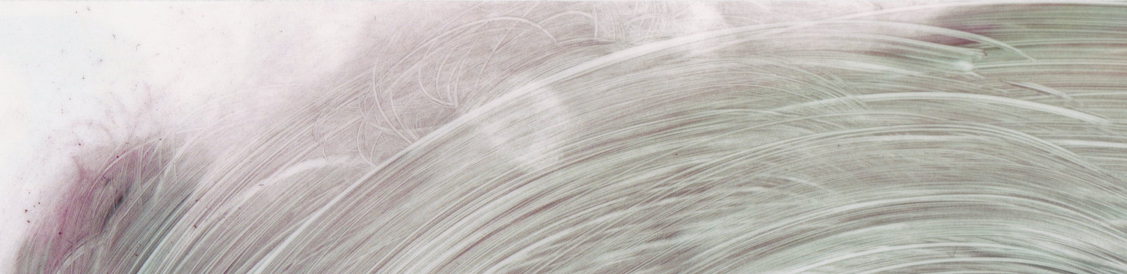
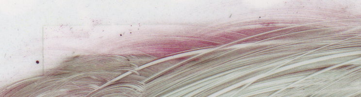
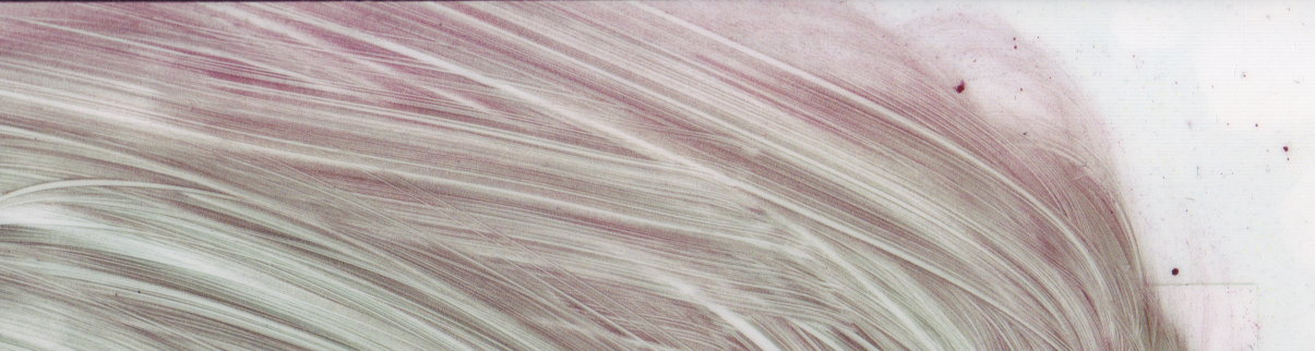
One of the coolest non-digital mediums I've ever used for art was... toner.
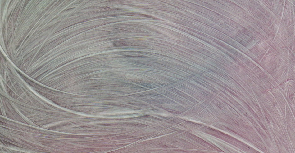
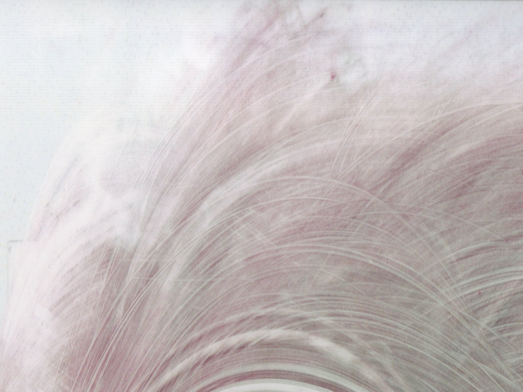
Backstory: I used to work in a print shop; most of our printers were laser copiers that use toner. One day when I was working, I kept getting awkward paper jams while printing on a particular paper for a customer. The paper was jamming in such a way that all 4 colours of the toner were layed down on the sheet, but the toner was not yet fused, leaving a loose powder on the paper. I removed the sheets and set them carefully off to the side so as not to make a mess, then fixed the problem so I could finish the customer's job. Later, when I went to clean up the jammed sheets, I accidentally smudged one and was surprised at how cool the toner looked when it smeared. Since the sheets, 3 in total, were just going to be tossed away anyway, I decided to have some fun smearing the toner across the paper to make cool patterns and colours. To finalize the art, I laminated each sheet to fuse the toner and keep the "art" in place.
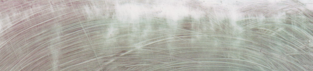
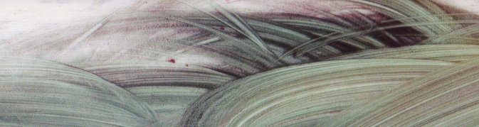
You can see a scan of one of the full sheets here. On the left of this image, you can see where the print began to fuse before jamming. The full sheets are kind of cool as a whole, but the best images, I feel, were the pieces that I later cropped out of the whole. Take a look at them in the spoiler! The second to last one is my personal favourite, but they're all cool.
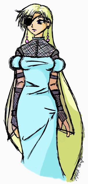
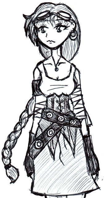
Miscellaneous Old Art
This section will showcase old art of mine. I started scanning and digitally colouring artwork back in my Gaia Online days, though only a few of my most recent Gaia artworks remain. After my Gaia stint was finished (back in '05 I think?) I kept at the art, but mostly it was of characters for RPGs I was involved in or stories I was writing.
Mostly I'm posting this stuff here as a record of sorts. I've lost so much of my previous art in old accounts that are lost (Gaia, dA, PB), floppy disks that have snapped, USB drives that have been corrupted. It's not particularly good artwork, but it may give you a bit of an insight into my styles for various things and how my art has changed over the years.
Having uploaded all of this now... it's kind of depressing how little of my artwork I still have anymore.
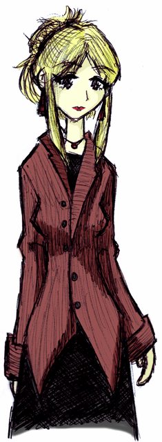
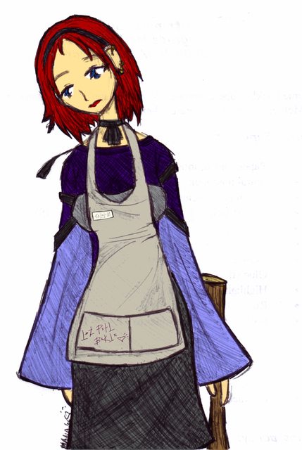
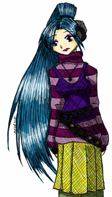
Tairre, Melissandra, Jessicka, and Caroline (in order) are 4 characters from a story series of mine called Beneath the Sky. Melissandra, Jess, and Caro were in the original first story; Tairre is from a later story that serves as something of a prequel and Caro also appears in that story as well. These were all made back in 2006.
Titled "Alexi", this art is of an old Gaian friend of mine, though I don't recall any details aside from that. You can tell this was rather early in my digital career since I wasn't very good at leaning up scanned line art then.
Based on the title (RPGMelissandra), I'm guessing this was an RPG character of mine, and probably the source of the name of the other Melissandra who later went on to become a main character in my stories.
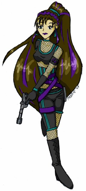
Another RPG character, Alana, this time for Star Wars (probably the d6 one).
Another RPG character, Alana, this time for Star Wars (probably the d6 one).
My file name for this drawing is just "test"; I have no idea who or what I was testing.
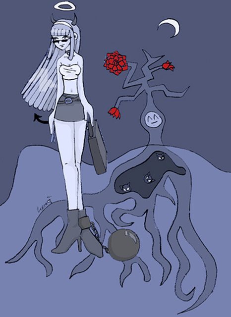
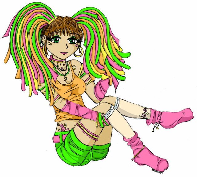
Don't ask me why this one is called "UFO Girl"; I can't go back in time to peg past-Athena's brain anymore than you can. This has always been one of my favourites of my old drawings, though, so I'm glad I still have it. Made in '07.
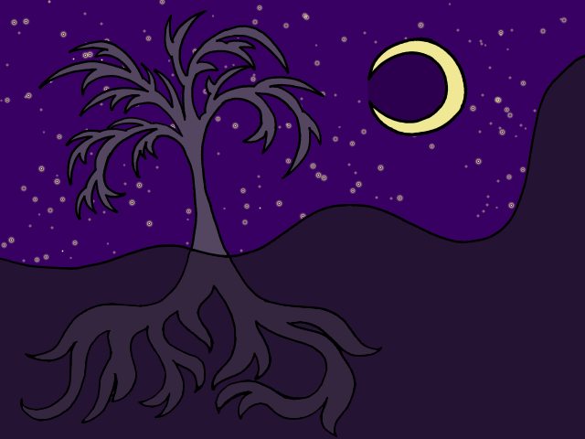
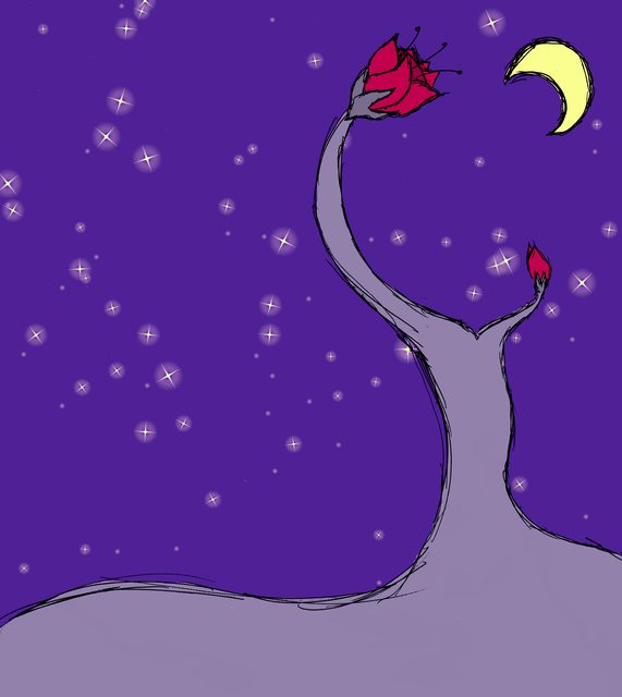
Sometimes I would just make backgrounds, often of weird flowers and trees and flowering trees.
PHIPAQ
Q: What's a PHIPAQ?
A: Since I haven't been asked any questions yet, I can't rightfully have a FAQ, so I have a PHIPAQ instead. It stands for: Potentially Helpful Information Phrased As Questions. I like providing information in the form of a Q&A, deal with it.
Q: What's all that art in your banner?
A: Those are samples of the various artwork I've done in the past: spriting (Pokémon and FE), sketches, Pokémon, landscape art, etc. Even the background is a crop from a piece of art that I made by smearing around unfused toner.
Q: What do you use to make your art?
A: Depends. Recent artwork has been made with a mechanical pencil, inked over in a rollerball pen, then scanned, edited, and coloured in Photoshop CS6. I also sometimes sketch directly in pen, or use MSPaint for silly things, or explore with other mediums, like the aforementioned toner art.
Q: You really suck at shading. :|
A: That's not a question! I do agree with you, though. I blame it on my poor depth perception (I hardly have any). As a result, I typically do minimal or no shading in most of my works, especially character drawings.
Q: Would you draw [X] for me?
A: Maybe! I'll happily take suggestions, especially suggestions I specifically ask for in thread, but I mostly do art because I feel like it, so if a particular idea doesn't hit me, or I don't like, I won't. Also, any artwork suggested may be done in as soon as a few days or as long as a year or two, so please don't hold your breath.
Q: Can I use your artwork for [X]?
A: If you want to, go for it? I honestly can't imagine anyone ever wanting to use my art for something, but I figure it's a good thing to mention. I don't mind if you use my art for non-commercial purposes, so long as you credit me. It would also be cool if you tell me about it, mostly for my own curiosity, but that's not necessary.
Q: Do you have a tumblr, dA, etc.?
A: Nope, sorry. I do have a tumblr, but I use it for writing notes and such for myself, so I don't exactly share it. I used to have a dA account, like, 12 years ago, but I don't even remember what username and e-mail I used, so that's long lost to the ages. UPDATED: I have actually made a new account on dA. You are welcome to see my work there as ShinyBellsprout.
Q: I have a question about something that's not mentioned in this post, what should I do?!
A: Just post it here, I won't bite.
Last edited: