A Rare Look Into the Design Process and Feedback Between Creatures and Pokemon Card Illustrators

Water Pokémon Master

I like Pokemon more than you! :p
Webmaster
Elite Member
Advanced Member
Member
To promote the 2024 Pokemon TCG Illustrator Contest, Creatures has published a fascinating column that gives us a rare glimpse into the design process behind a Pokemon card’s artwork.
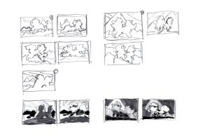
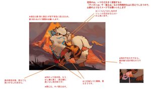
The article asks illustrator Atsushi Furusawa about his philosophies and processes for drawing Arcanine from 151. We see his drafts from start to finish.


column08_img_04-300x197.jpg


column08_img_05-300x179.jpg


The article also gives us an unprecedented look into the direct feedback The Pokemon Company and Creatures gives Furusawa as he revises his artwork. Unsurprisingly, the artwork for every Pokemon card is given extensive...

Continue reading...
 
Last edited:
That was an interesting, informational, and encouraging read! I don’t suppose Atsushi Furusawa is reading this right now, but if he is, I would like to share why this interview was meaningful to me.


Hi, Atsushi Furusawa. You mentioned that you read what fans think about your art online, so I am writing this reply hoping that you will find it while reading what fans thought of your review.

Your Arcanine was one of my favorite illustrations from Pokémon 151! I always thought the art was regal, and the evening lighting makes the scene feel warmer and more soothing. Using a mountain range instead of a single mountain was a good idea: I admit to trying to figure out what mountain I was looking at!

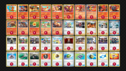
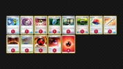
I used Arcanine in a deck for a custom format without Rulebox Pokémon. and enjoyed playing it. I have attached a picture of my deck below. It does not look anything like a deck from Standard because of this format’s unique rules (https://gymleaderchallenge.com/rules), but I thought you would like to know that people are using your art while playing the Pokémon Card Game as well as collecting it.

Charizard Armarouge Gym Leader Challenge 1.pngCharizard Armarouge Gym Leader Challenge 2.png

I enjoyed reading about the process of creating an illustration, especially the draft stage. I photograph Pokémon figurines outside, trying to recreate your fellow Pokémon artist Yuka Morii’s style (you can see my photographs here: https://www.deviantart.com/charmaster04/gallery), but I want to learn to paint with watercolors. I still have to learn a lot before I can use your drafting techniques effectively, but I am sure they will be very useful. I also need to learn to finish projects a couple days in advance so I can look over them before submitting them, like you describe yourself doing in the interview.

Finally, I enjoyed reading your interview because I enjoy pretending to be a Pokémon card designer. I write the attacks and abilities and other card text for a Pokémon, ask an artist on the internet for permission to use their fan artwork, create a picture of a card using a Photoshop tool, and share that picture with other Pokémon card fans. Many other fans enjoy designing Pokémon cards in this way, and some of these fans are inspired by artists like you to submit their art to official Pokémon Illustration contests with the hope of becoming official illustrators. This article can help people like me enjoy a hobby that can inspire more artists to enter these contests.

Thank you for sharing your wisdom with me and with thousands of people like me,
Sincerely,
Charmaster
 
Last edited:
Super interesting, I'd love to see what the notes on Komiya's art look like lol
The notes probably tell Komiya when the Pokémon are too on model, but after browsing his art on pkmncards, some of the Pokémon are more on-model than others, so I’m sure the notes sometimes lean in the other direction. Charmeleon from Expedition has shakier edges than modern Komiya art, and Jynx from Silver Tempest is one of the most off-model illustrations in the past year, especially compared to Sandile, who is almost completely on-model.

Seeing Komiya’s feedback notes would be a fascinating insight into what goes into his illustrations, though. Remember, he was interviewed for this contest last year, so we do have many insights to go off of already. https://www.ptcgic-cr.com/2024/en/column/article-6/

I'm surprised they accept his art. I don't mean any disrespect, but I literally can't interpret his art.
I’m curious about what you mean by “interpret.” Some of Komiya’s art, like Drampa from Evolving Skies, is very abstract, while some other pieces, like all the ones with people screaming (including the Drowzee Illustration Rare from Scarlet & Violet), are very surrealist, but others, like Cyndaquil from Breakthrough, have very idyllic and readable scenes, like the Fire Mouse Pokémon snoozing contently, draped over a pile of firewood while a fire softly crackles on the hearth.

That being said, the more stylized artwork is, the more divided people can be over it. Komiya is, in many ways, the classic stylized artist, though not the first, since some other artists who debuted during the Vending Series hand drew their cards with crayons. Not being able to interpret Komiya’s illustrations is a fair way of expressing why you have a hard time enjoying it, though. I still don’t think I know what is happening on the aforementioned Drampa, though it doesn’t bother me.

(Personally, my favorite Komiyama illustrations are Cyndaquil from Breakpoint and Alolan Vulpix from Ultra Prism.)
 
omg this is such a treat to get to see!! Furusawa is possibly my favorite TCG artist, and his Dragonite V alt and Suicune V alt are truly spectacular, definitely in my top 10 favorite cards in my collection. it's so cool to get to see more into his process, I love that he puts so much thought into every level of the design - and you can really tell! so much heart and feeling and a sense of wonder
 
In my opinion, the card chosen for the article is TOO on model. The main focus of the card, the pokemon itself, looks like only the very front was drawn anew. The rest looks pretty much like the reference image shown in one of the pictures, so much so that the tail looks practically traced.
(I do NOT say it is traced! I do NOT believe it is traced! I just say its so on model it LOOKS traced)
Thats a bit too much and if they are always that finicky with designs being on model, I don't want to think of all the designs and poses we didnt get simply because it didnt look close enough to the stock image.

Now that I have the bad out of the way, the good:
Aside from my above point, the article sounds like working as a TCG artist for creatures is a very good time.
I don't know how many drafts are common (maybe I overread it?) but the article looks like its a reasonable amount.
Working as a commission artist, it is very key to be in close contact with the customer. And creatures seems in very close contact. I know I said this particular card looks too on model, but as an artist for hire I can tell you all that a customer who has a specific image in mind and can put their wishes/changes into words is a godsent! Makes the work so much easier! So I am happy they have proper dialogue between artist and company.

As usual Furusawas backgrounds are astonishing, and the shadeing lovely.
All in all loved this little look behind the scenes!
 
Super interesting, I'd love to see what the notes on Komiya's art look like lol
Might actually be a shorter list than you think.
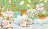
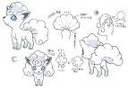
Komiyas work is very.... stylized (read that in a very annoyed tone), bit does hit all the on model beats creatures wants. Take alolan Vulpix for example.
tumblr_a0ce650ea21c6f1d49774fc06ba1d280_18f74cdd_1280.jpgLooks like typical Komiya-fair. Wobbly legs, strange stretched bodies, optional gravity, optional bonestructure. I am not sure what is going on here to be honest. BUT if we take alolan Vulpixes conceptsheet:
800px-Alolan_Vulpix_SM_concept_art.jpg
We see that Komiya hits even small design details wich makes them on model. such as the little bottom tailswirl, the specific hairswirls, pawpattern, two tufts of hair in the ears, the tail only "divided" at the root with the end looking fused.

I do not like Komiya. In honesty I cant stand Komiyas work. BUT Komiya is on model and thats what creatures wants.
 
I wonder what the notes were on the naked Misty's Tears art that was banned in English. Or the "middle finger" Sabrina's Gaze card.
Both cards are from Gym series sets.
 
I wonder what the notes were on the naked Misty's Tears art that was banned in English. Or the "middle finger" Sabrina's Gaze card.
Both cards are from Gym series sets.
Well I'm willing to bet if you held a Pokeball like Sabrina did in that card thats where your middle finger will lie. Also its just America that made those cards banned, the rest of the world didn't care. So no, I doubt there was any kind of conspiracy on those cards, Americans are the Snowflakes of the world for years, long before the term was coined.
 
I wonder what the notes were on the naked Misty's Tears art that was banned in English. Or the "middle finger" Sabrina's Gaze card.
Both cards are from Gym series sets.
They didn't do notes at the time. Misty's Tears, it's worth noting DOES have her wearing a swimsuit, it's just hard to make out because the printer resolution at the time was very very very big, so the lines of hte top fade into the shadows.
The notes probably tell Komiya when the Pokémon are too on model, but after browsing his art on pkmncards, some of the Pokémon are more on-model than others, so I’m sure the notes sometimes lean in the other direction. Charmeleon from Expedition has shakier edges than modern Komiya art, and Jynx from Silver Tempest is one of the most off-model illustrations in the past year, especially compared to Sandile, who is almost completely on-model.

Seeing Komiya’s feedback notes would be a fascinating insight into what goes into his illustrations, though. Remember, he was interviewed for this contest last year, so we do have many insights to go off of already. https://www.ptcgic-cr.com/2024/en/column/article-6/


I’m curious about what you mean by “interpret.” Some of Komiya’s art, like Drampa from Evolving Skies, is very abstract, while some other pieces, like all the ones with people screaming (including the Drowzee Illustration Rare from Scarlet & Violet), are very surrealist, but others, like Cyndaquil from Breakthrough, have very idyllic and readable scenes, like the Fire Mouse Pokémon snoozing contently, draped over a pile of firewood while a fire softly crackles on the hearth.

That being said, the more stylized artwork is, the more divided people can be over it. Komiya is, in many ways, the classic stylized artist, though not the first, since some other artists who debuted during the Vending Series hand drew their cards with crayons. Not being able to interpret Komiya’s illustrations is a fair way of expressing why you have a hard time enjoying it, though. I still don’t think I know what is happening on the aforementioned Drampa, though it doesn’t bother me.

(Personally, my favorite Komiyama illustrations are Cyndaquil from Breakpoint and Alolan Vulpix from Ultra Prism.)
My favorite will always be Weedle from Vending, just because of how simple and abstract it is.
 
Back
Top