“Klara / Cyrus Premium Tournament Collections” Product Images Revealed!

Water Pokémon Master

I like Pokemon more than you! :p
Webmaster
Elite Member
Advanced Member
Member
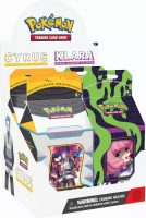
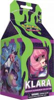
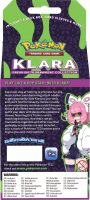
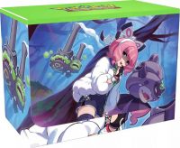
As we exclusively revealed last month, we will be getting two “Premium Tournament Collections” on March 24th featuring either Cyrus or Klara. This will be the first time two Premium Tournament Collections release at once.


Cyrus-Klara-Premium-Tournament-Collections-134x200.jpg


Klara-Premium-Tournament-Collection-109x200.jpg


20002356_ALT06-90x200.jpg


20002356_ALT07-145x200.jpg


20002356_ALT09-200x147.jpg


20002356_ALT08-200x164.jpg
...

Continue reading...
 
Last edited:
Hope it's a reprint because I still don't have the original. I always put it low on my list of priorities when filling old sets because this girl's design creeps me out.
 
It's a shame the actual card art doesn't reflect the new stuff displayed on the front, as they look amazing. The original FA Klara is nice mind you, Naoki Saito always does great cards, but this look feels more sinister which is neato; where as, the Cyrus inspired Boss's Orders just looks a bit meh for me personally and I would have much preferred the card including the Pokemon here; however, that wouldn't be in line with the FA Boss's Orders theme like the other versions have.
 
Whose idea was it to commission artwork for a card portraying the famously stoic disdainer of emotions as an enraged hothead powering up to Super Saiyan?
It's the scene of him delivering a speech to his grunts at Galactic HQ. I feel it's more stern than Super Saiyan.
 
Are the sleeves like the etb (matte in the front) or more like the Japanese ones?
 
What's wrong with it, it looks like when Cyrus addresses all the galactic grunts in the veilstone base
It takes a little but to figure that out. I still think he should have been drawn with 2 grunts flanking him on either side and this art would have been a slam dunk.
 
Back
Top