Pokemon Pokémon That Look Better Than Their Evolved Forms

Mora said:
And don't get me started on Mega Gyarados.

EDIT: Magmortar is a stupid, ugly, overgrown, flaming chicken!

Mega Slugados generally takes the cake. I really hoped for more with Rhyperior, but.... Wierd holey arms, random boulder.... Thing? Terrible body proportions? As for most of the other evolutions added in Gen IV, obviously the best route according to TPC was to make them rotund.... I guess I'm not the only one who shivers when I look at Magmortar.
 
RE: Pokemon that look better than thier evolved forms

Leaf_Ranger said:
Togetic...I was expecting more in the vein of a fairy with body, neck and head and instead what came out was a fat fairy plane with triangles that reminded me of Lati@s, which isn't a good thing!

Wait what?
The Latis have had blur/red triangle on their belly from the beginning. I was waiting for this to happen ever since o___O

IMO Togekiss doesn't resemble them well enough! xD
 
As some of you talked about, I agree that Dragonite should've kept it's serpent like body as the pre-evolutions have. I think it would have a lot of potential and could of look so cool.

I like Pidgeotto more than Pidgeot because Pidgetto looks more fearful, like a predator bird should look like (because they are predators right?)
I also like the red feathers on Pidgeotto more than the feathers on pidgeots head.

Also.. Porygon looks better than porygon2, can't explain why xD
 
RE: Pokemon that look better than thier evolved forms

Mitja said:
Leaf_Ranger said:
Togetic...I was expecting more in the vein of a fairy with body, neck and head and instead what came out was a fat fairy plane with triangles that reminded me of Lati@s, which isn't a good thing!

Wait what?
The Latis have had blur/red triangle on their belly from the beginning. I was waiting for this to happen ever since o___O

IMO Togekiss doesn't resemble them well enough! xD

I don't think they resemble each other but Togekiss' triangles do remind and take my mind to Lati@s. What can I say? I see Electivire and I think of Robotnik/Eggman from Sonic (in this case, because I see an actual resemblence, albeit small)!


Also, I prefer Tympole over Palpitoad! Tympole is cute and Palpitoad is just a fat face/belly that looks like it's mocking us in B2! I do like Seismitoad though.
 
Leaf_Ranger said:
Ocho said:
^
That's such a good idea, maybe some day we will get lucky and that will happen! You guys have to admit though, Dragonite was cool in his debut in the anime, but that's about it lol.

Not to mention that in the first movie, Dragonite ended up being the friendly postman for Mewtwo! So much for its brightness. :rolleyes:

Yes that's right!! Poor Dragonite was doomed to a sorry existence from the start :(


adam44 said:
As some of you talked about, I agree that Dragonite should've kept it's serpent like body as the pre-evolutions have. I think it would have a lot of potential and could of look so cool.

I like Pidgeotto more than Pidgeot because Pidgetto looks more fearful, like a predator bird should look like (because they are predators right?)
I also like the red feathers on Pidgeotto more than the feathers on pidgeots head.

Also.. Porygon looks better than porygon2, can't explain why xD

I like Porygon2 better, I like Porygon for it's originality but I think Porygon2 is a cooler design :)

Yeah if Dragonite kept more of a serpent-like body it could've been so awesome!
 
Ocho said:
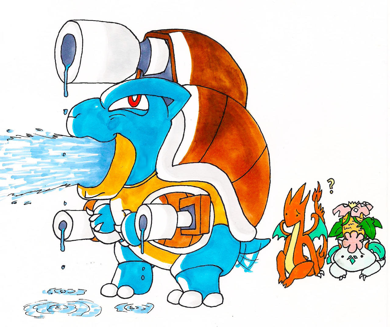
Haha I can't disagree with that one. Do you dislike Mega Blastoise single water cannon or the extra shells he grows on his shoulders? They remind of pool floaties....

Sorry I'm bad at quoting! I have to learn.

The extra shell arm cannon things and his ears. It makes him look too serious, but those arm cannons look ridiculous, so overall, it just looks stupid.

mega_blastoise_used_hydro_cannon__by_venix94-d6l1nit.jpg

Spoiler tag added for large image. ~Athena
 
RE: Pokemon that look better than thier evolved forms

Leaf_Ranger said:
Last but not least, the gender difference isn't the size of the shoes, but the fingers!! Red feet - ok, red fingers - no!

Also, the females have the longer fingers, not the males.

Ocho said:
Hahaha Mega Ampharos is hilarious! I have no idea what's going on with that supermodel hair. The card art for the Mega Charizards in the tcg is cool so I don't mind them, but the design of Y especially is a little underwhelming he could've been so epic.

I think normal Charizard looks like a mega compared to Mega Charizard Y.
 
RE: Pokemon that look better than thier evolved forms

Blob55 said:
Leaf_Ranger said:
Last but not least, the gender difference isn't the size of the shoes, but the fingers!! Red feet - ok, red fingers - no!

Also, the females have the longer fingers, not the males.

(...)

I know but both of them still look akward and what I said is that if there's to be a gender difference and pertaining size, them it should be in the shoes, since that's (the shoes) what came from Tangela!
 
I prefer Sneasel to Weavile. Sneasel looks awesome, but Weavile just gives me mental images of objects that have clusters of holes in them (google image search "trypophobia"). Also, its face looks like it could just be torn off like a mask made of paper, and the three lines above the yellow gem on its head look like hairs, and that grosses me out for some reason.
 
I forgot to mention, but I also like Totodile more than Croconaw and Feraligatr. Totodile is adorable, but Croconaw looks like a teenage caveman slob and Feraligatr looks like it bathes in sewer water.
 
I have determined, as I'm training one now, that I much prefer Machoke to Machamp, mostly because of the face. And when I say 'mostly', I mean 'entirely'.
 
Seven is a Color said:
I prefer Sneasel to Weavile. Sneasel looks awesome, but Weavile just gives me mental images of objects that have clusters of holes in them (google image search "trypophobia"). Also, its face looks like it could just be torn off like a mask made of paper, and the three lines above the yellow gem on its head look like hairs, and that grosses me out for some reason.

I wish you didn't make me look that up. Also, I fail to see how that looks anything like Weavile.

If we're also including Mega evolved Pokémon, I have to say that Mega Metagross looks really stupid. I also think Mega Swampert looks dumb, as he looks like Cao Ren on steroids.

The Mega Latis are the same colour, making it hard to tell which is which and they have those odd fat things on their wings.
 
Blob55 said:
Seven is a Color said:
I prefer Sneasel to Weavile. Sneasel looks awesome, but Weavile just gives me mental images of objects that have clusters of holes in them (google image search "trypophobia"). Also, its face looks like it could just be torn off like a mask made of paper, and the three lines above the yellow gem on its head look like hairs, and that grosses me out for some reason.

I wish you didn't make me look that up. Also, I fail to see how that looks anything like Weavile.
It doesn't. It's just what it makes me think of when I look at it. I have this thing that seems kind of similar to synesthesia where my brain associates one thing with another thing that isn't directly linked to the original thing. (I think synesthesia involves the 5 senses instead of thoughts or mental images, but it's similar in the sense that subject A leads to Subject B, which has nothing to do with Subject A)

Some more examples: the number 6 makes me think of pandas, metal music gives me images of people eating stainless steel, and I wrote a story about someone who puts measuring tapes in peoples' refrigerators because I thought of it while eating chicken noodle soup.

So that this post is on topic: I like Bulbasaur and Ivysaur more than Venusaur. Like Mega Swampert, it has the steroids look to me, and it also has what look like pimples on its legs.
 
Agreed, Bulbasaur looks better than both Ivysaur and Venusaur. Still, Venusaur and Ivysaur are still very cool, but Bulba is the coolest. Machoke is much better looking than Machamp and I agree it's definitely the face. Machamp's 4 arms can look weird too, so Machoke looks better to me.
 
Ocho said:
Agreed, Bulbasaur looks better than both Ivysaur and Venusaur. Still, Venusaur and Ivysaur are still very cool, but Bulba is the coolest. Machoke is much better looking than Machamp and I agree it's definitely the face. Machamp's 4 arms can look weird too, so Machoke looks better to me.
I think Ivysaur looks better than Venusaur. I like the vines staying out of the bulb, and the flower starting to grow.

I also think that Igglybuff looks better than Jigglypuff. Although Igglybuff came later, I definitely think a straight Igglybuff => Wigglytuff line would be a better option, apoligies to all Jigglypuff lovers. But Wigglytuff does look the best out of the line.
 
Tepig looks better than Pignite and Emboar. Pignite seems like a fat greek-roman fighter with a pompom at the end of its tail and despite being supposed to be a beard, Emboar's fire under the chin seems more like it's on fire after shaving.


Omega Soul said:
This may be strange, but I think vigoroth>slaking. I'm very impatient.

I never really liked Slaking for it's Ability but after seeing it putting its finger in the nose, I find it disgusting!
 
Leaf_Ranger said:
Tepig looks better than Pignite and Emboar. Pignite seems like a fat greek-roman fighter with a pompom at the end of its tail and despite being supposed to be a beard, Emboar's fire under the chin seems more like it's on fire after shaving.
100% agreed. Tepig is a cute little fire pig. So when you see him, you know he's going to evolve into something big and tough. But I expect him to evolve into a giant boar with big horns. I don't expect him to turn into a fat sumo-wrestler human pig thing.
 
Sceptile disappoints me. I wish it had looked more like Grovyle. I don't like how it lost Grovyle's red underside. I don't like how it exchanged the cool almost dragon-like head for one with awkward looking ridges that's kind of bulbous between them. I don't care for the random bulbs on its back. I don't like how it's commonly pictured in a weird, hunched-over posture. I don't like how Grovyle had these cool leaf feathers that made it feel like a dinosaur and then they became these two weird protrusions at 90 degree angles from eachother on each forearm. I don't think Sceptile is bad, but I really don't see why people like it so much when it could've been much better if it had more of the elements Grovyle had.

I like Lairon better than Aggron. Aggron is cool and all, but there's something about Lairon that's more appealing to me. It looks like some sort of heavily armored tank-dinosaur-turtle-thing that just looks better than Aggron to me.
 
I agree with Tepig. After the B/W starters were revealed, it was my favorite and I wanted to use it. But when I saw the evolutions, I was disappointed with Pignite and Emboar, both appearance wise and typing wise (being the third Fire/Fighting in a row).
 
Back
Top