You are using an out of date browser. It may not display this or other websites correctly.
You should upgrade or use an alternative browser.
You should upgrade or use an alternative browser.
TCG Fakes [ℒℯ] Nod'3 Card Trhеad [sic]
- Thread starter Nod3
- Start date
RE: Multitypes, Items, and more Bugs, oh my! Nod'3 Card Thread [sic]
Nice cards, you just forgot the é in Pokémon on Beautifly.
Nice cards, you just forgot the é in Pokémon on Beautifly.
RE: Multitypes, Items, and more Bugs, oh my! Nod'3 Card Thread [sic]
Nah, I was just in a huge rush and thought "screw it I can fix it later"
Arcticwhite said:Nice cards, you just forgot the é in Pokémon on Beautifly.
Nah, I was just in a huge rush and thought "screw it I can fix it later"

RE: Multitypes, Items, and more Bugs, oh my! Nod'3 Card Thread [sic]
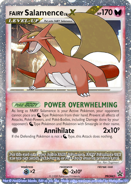
That's a fairy unusual card! /badumtsch
That's a fairy unusual card! /badumtsch
RE: [ℒℯ] Magnets (pls comment I'm so lonely) Nod'3 Card Thread [sic]
I think the Magnemite artwork would have looked nicer if the background had an out-of-focus effect (lens blur, Gaussian blur, oilify, or any combination of these), but I love how the Magneton card turned out. I'm pretty sure that "energy" in the item effect should be capitalized, though.
I think the Magnemite artwork would have looked nicer if the background had an out-of-focus effect (lens blur, Gaussian blur, oilify, or any combination of these), but I love how the Magneton card turned out. I'm pretty sure that "energy" in the item effect should be capitalized, though.
RE: [ℒℯ] Magnets (pls comment I'm so lonely) Nod'3 Card Thread [sic]

 Fix'd.
(I also made the background for magnemite lighter)
Nekoban Ryo said:I think the Magnemite artwork would have looked nicer if the background had an out-of-focus effect (lens blur, Gaussian blur, oilify, or any combination of these), but I love how the Magneton card turned out. I'm pretty sure that "energy" in the item effect should be capitalized, though.


(I also made the background for magnemite lighter)
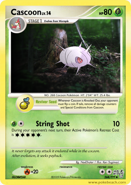
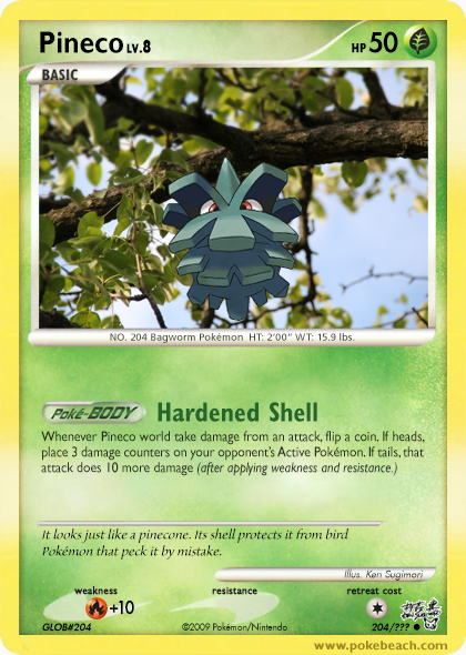
RE: [ℒℯ] Magnets and worms (pls comment I'm so lonely) Nod'3 Card Thread [sic]
Interesting ideas on all the dual-types, keep it up
Just a few things:
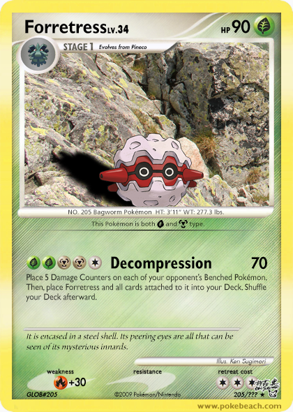
For Forretress, with the type symbol, wouldn't you have the grass symbol on grey, or metal on green?
I don't believe Damage Counters nor Deck should be capitalised.
Apart from that everything looks awesome
Interesting ideas on all the dual-types, keep it up
Just a few things:
For Forretress, with the type symbol, wouldn't you have the grass symbol on grey, or metal on green?
I don't believe Damage Counters nor Deck should be capitalised.
Apart from that everything looks awesome
RE: [ℒℯ] Magnets and worms (pls comment I'm so lonely) Nod'3 Card Thread [sic]
I've decided to stick with primary type as the type symbol (but I might change it later)
I'll check the wording tomorrow
Hey. Hey guys. Remeber my last thread? You know, the one that gave everyone brain cancer?
Well, guess what. One of the mechanics is actually good and I'm brining it back.
Lemonnade said:Interesting ideas on all the dual-types, keep it up
Just a few things:
For Forretress, with the type symbol, wouldn't you have the grass symbol on grey, or metal on green?
I don't believe Damage Counters nor Deck should be capitalised.
Apart from that everything looks awesome
I've decided to stick with primary type as the type symbol (but I might change it later)
I'll check the wording tomorrow
Hey. Hey guys. Remeber my last thread? You know, the one that gave everyone brain cancer?
Well, guess what. One of the mechanics is actually good and I'm brining it back.
RE: [ℒℯ] Magnets and worms (pls comment I'm so lonely) Nod'3 Card Thread [sic]
oh no
I <3 the Magnemite line
oh no
I <3 the Magnemite line
RE: [ℒℯ] Magnets and worms (pls comment I'm so lonely) Nod'3 Card Thread [sic]
I'm really digging that magneton. Great work!
I'm really digging that magneton. Great work!
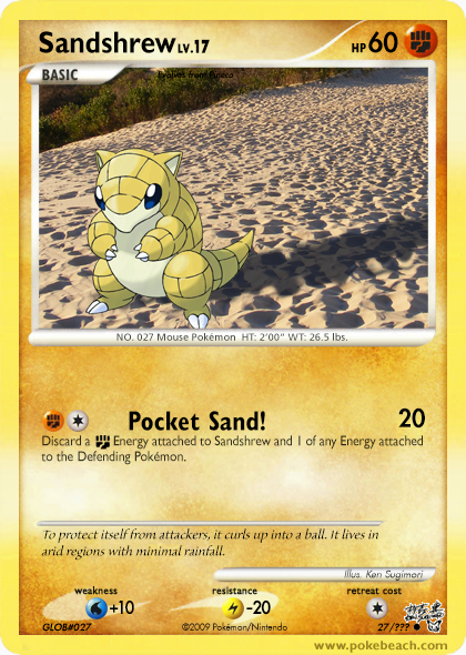
RE: [ℒℯ Pocket Sand!] Pocket Sand! (pls comment POCKET SAND) Nod'3 POCKET SAND! (Card Trhead) [sic]
Oh my, I just looked over this and realized I never thanked a lot of people for their support and feedback, so rather than silently bury this, I shall once again revive an ancient relic to say this (better late than never): Thank you, so much, all of you, for your support and feedback.
Oh I feel much better now.
Sleep time.
RE: [ℒℯ] Nod'3 Card Thread [sic]
Very nice, as always, especially the dual-type parts (I have this thing for gradients) Though, is it just me or the lightning energy symbol seem a bit large? Just looks a little out of place though I don't have the dedication to completely check the size... (currently checking this)
Anyway, that large thing in the OP, is that your signature? looks pretty stylish to me
Very nice, as always, especially the dual-type parts (I have this thing for gradients)
Anyway, that large thing in the OP, is that your signature? looks pretty stylish to me


