Okay, here are my ratings (for the bannetr co9ntest that is)! Due to lack of time the fanfic contest has to wait til my weekend to be rated, but at least I hope my ratings are useful for you guys!
------------------------------------------------------------------------
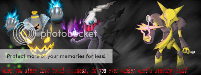
Prof. Shinx's Entry
- Style: 17/20, I looked the overall idea and it has a nice finishing touch to it! Too bad you made the white ''border'', you could have tried to make it transparent, but no major point loss from me here.
")
- Originality and use of color: 16/20, I have mixed feelings about this... It has a ncie touch to it, and it is original, but it reminds me of halloween a bit, so maybe it's not all that original...? Anyways, I like it!
- Relation to the Challenge: 15/20, it fits nice with the challange. Nothing more to say here.
- General Effects: 19/20, I only substracted 1 point due to that white border thingy, other than that it has a nice overall touch to it, the scenery blends in perfectly, and the feathers ''outside'' the whole is a REALLY nice touch in my opinion.
- Effort: 3/10, We pick a card image! We pick a background! We grab a blender! Okay, okay, I guess you get my point? It's a nice banner, but a little more effort could be given overall I think...?
- Overall: 8/10, I liked this one quite a lot, and only some minor substractions due to that white border thingy and the amount of effort used... On the other hand it shows how something simple can be so good-looking!
Total: 78/100 (+2 Added = 80)
Charizard88's Entry
- Style: 8/20, this might look harsh, but really... I'm NOT pleased with this... I expected WAY more, and it ends up with a color-changing duskull image and some text...? The 8 points you get from me is for the animations, and the nice cut-out from the image. Enough said about that though...
- Originality and use of color: 12/20, You get points for originality here, as your ''slogan'' was quite original compared to most others. As for the use of color... Red and black are a nice mix, but too bad that was all you used (no, I'm NOT counting the white from the text, sorry)
- Relation to the Challenge: 18/20, It's a plain ye olde banner!
- General Effects: 14/20, Animation is all I can give you points here for... Oh, and what the heck, I'll give you some extra's due to the red+black combo(once again I'm NOT counting the white text, but this time it works in your favor, so that's fair, right?).
- Effort: 2/10, Not to brag, but I can make this in like, 10 minutes...? And that's counting 4 for starting up my pc and the programs for using. Well, I'm not trying to insult you/bringing you down, but I SERIOUSLY think you ought to put ALOT of more effort in any future challanges... At least, compared to this.
- Overall: 4/10, Black and red (Duskull). Moving text. Nothing else. I don't ''hate'' it, but I'm most certainly not a ''lover'' either.
Total: 58/100
Xous' Entry
- Style: 19/20, Assuming you did everything yourself, you got yourself a new fan! I'm a BIG fan of original work, especially scrap-artists....! The style is nice, en especially creative! Keep this up! ^^ Just a single point distracted because it's not perfect... But hey! Nothing's perfect!
- Originality and use of color: 18/20, The use of colour is great, and it makes for a nice whole. Also very original, a lot of extra points here for you!
- Relation to the Challenge: 18/20, Matched the theme well, so good work!
- General Effects: 18/20, I can only comment on the graphic effects, but they look nice, so all I can say is keep it up!
- Effort: 10/10 I don't give ''perfect'' scores often, so you might be proud of yourself, or you might not.
Seeing the banner and assuming you did everything yourself, I'd give you 20 out of 10! Once more, I simply LOVE scratch-artists, and I think you deserve every point you got from me!
- Overall: 9/10, Nice banner, nice graphis, nice colors! It's just not perfect, so ya... No ''perfect'' score either!
Total: 92/100 (+2 Added = 94)
George2FRESH's Entry
- Style: 17/20, It's a nice whole, and the style kind of attracts me (don't make fun of that please...!
), so good job there! The only ''bad'' part I think it's a little cloggy (mist effect runs trough the whole banner, but I'd personally wouldn't have run it trough the wood stuff), but even that is to a minimum.
- Originality and use of color: 18/20, it had a nice original feeling to it, especially the gengar ''hazed'' away in the background!
- Relation to the Challenge: 18/20, It's a nice banner. No further comments here!
- General Effects: 18/20, Nice effect used, as well as the background and the woods. The mist is both a pre and a con, seeing its a nice detail, but it could have been used otherwise or at least not fully across the whole banner in my opinion. Still, good job!
- Effort: 8/10, You put in quite some effort in this I think, and that should be rewarded!
- Overall: 8/10, I'm a fan, and I liked it, but I'm not a big fan. Still, one of the better banners who entered I think...!
Total: 87/100
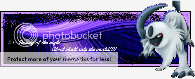
Frozengallade's Entry
- Style: 12/20, I liked the components used, but the added graffiti and text ruined it a little for me....
Other than that, nice idea and look!
- Originality and use of color: 14/20, The idea was quite original, and I like purple a LOT, but it doesn't go well together with with black... At least, if it's not that dark of a purple.
- Relation to the Challenge: 14/20, not all that ''haunting'', but a nice idea to use Absol instead of some ghost pokémon or so.
Apart from that, it's a decent banner, so yeah, nothing more to say here!
- General Effects: 18/20, Apart from the graffiti and the text it looked great to me!
- Effort: 7/10 Didn't take too much effort I guess... Still it has a nice look to it, so I can always give you some points extra for that
- Overall: 7/10 Once again, the graffiti ruins it for me. Other than that, nice decent banner!
Total: 72/100
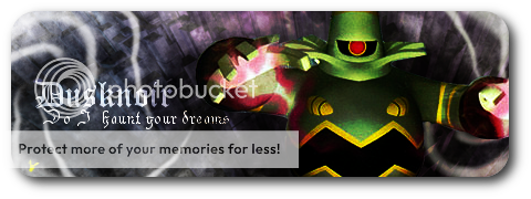
lilsparks101's Entry
- Style: 19/20, A tad too ''messy'' for me, and at first I had some trouble reading the text (but this could be just me). Other than that, it looked awesome to me, kudos to that!
- Originality and use of color: 16/20, Not all that original, but most certainly nice effects of with the colors.
- Relation to the Challenge: 18/20, Nice banner, a fitting pokémon, what's there not to love? In my case, the overall ''mysterious'' feeling.
- General Effects: 17/20, Nice background, and the Dusknoir blends in nicely.
- Effort: 9/10, looks like it took some effort, so enjoy the points!
- Overall: 8/10, I liked the banner as a whole, but I'm not TOO fond of it, sorry...!
Total: 87/100
.::n00bmuffin::.'s Entry
- Style: 14/20, In my opinion nothing too special actually. I'd love to judge your OWN style, but all that I can clearly see are two TCG pictures... Apart from that you blended them nicely together, so props for that.
- Originality and use of color: 11/20, Sorry, but I give you 0 points for originallity here. Or wait, I still give you 1 for putting the pokémon together, which is quite original. Otherwise I think putting two TCG pictures is totally NOT original. The use of color is pretty good actually, so I'll grant you 10 for that!
- Relation to the Challenge: 16/20, Mysterious...? Pretty much it is, seeing both Mewtwo and Dusknoir are quite mysterious. What they do on the banner being mysterious? Apart from why they are placed on it, I have no idea!
- General Effects: 19/20, Apart from you using excisting images, you blended them PERFECT, and some other effects are also good. Good job on that one.
Effort: 6/10, Picking two TCG images doesn't take much effort. Sticking them together some, as well as making them to a banner. Next time, please use other material to work with, or at least not too much ''already excisting'' material.
- Overall: 7/10, despite my criticism I like it fair enough. I'd only like to see some more originallity next time...!
Total: 63/100
------------------------------------------------------------------------
James' Scoreboard:
1st: Xous – 92/94 points
2nd: George2Fresh & Lilspars101 – both 87 points
4th: Prof Shinx – 78 points
5th: Frozengallade – 72 points
6th: N00bmuffin – 63 points
7th: Charizard88 – 58 points