
You are using an out of date browser. It may not display this or other websites correctly.
You should upgrade or use an alternative browser.
You should upgrade or use an alternative browser.
TCG Fakes Neko's Fake Creations: Cards, Screencaps, and More!
- Thread starter Nekoban Ryo
- Start date
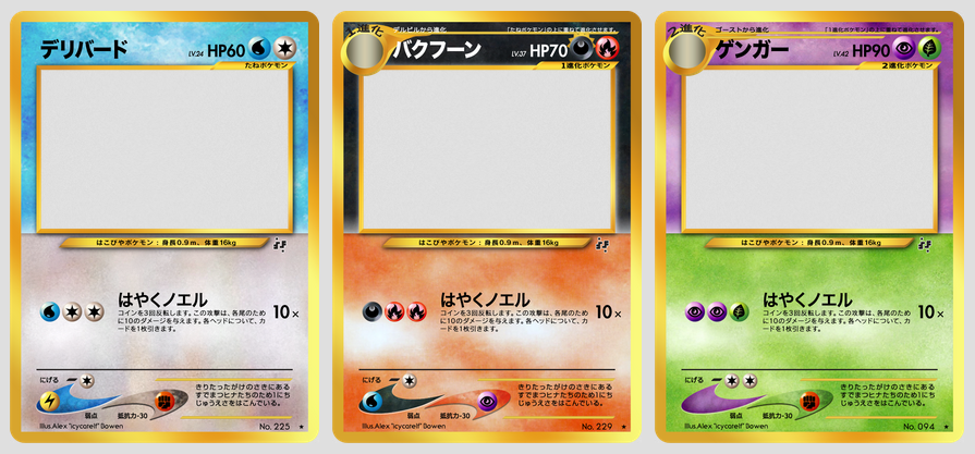
Glad you like them!These are much, much better then the XY dual types! What's the difference between Japanese Neo and English Neo? I'd like to try out some English Neo Dual Types because these custom blanks look soooo pretty! ^_^
I'm not sure if the effect will look as nice on English Neo cards (the Japanese templates look more sleek in my opinion), but here are some of the differences I've noticed:
- Different fonts, obviously (the only font that remains is HP)
- English cards have a thicker, solid yellow border
- Some texture/symbol colors are different (for example, Psychic and Colorless are darker in Japanese)
- Japanese Neo cards had larger Type/Energy symbols
- Japanese art boxes are shorter (but slightly wider) than English art boxes with more space above
- Japanese art frames also seem slightly thinner
- Until Neo Destiny, English Neo card lacked the drop shadow on the specs bar (height, weight, etc.)
- English Neo cards don't invert the drop shadow for Darkness
- Energy costs are centered on English Neo cards and only fit up to 2 Energy per line, but they're aligned left on Japanese cards and can fit up to 5 per line (the symbols are also larger on the Japanese versions)
- Because of this, attack names and effects are often shifted far to the right
- Power/Attack names and effects are typed on different lines on the Japanese versions, but share the top line on English Neo cards (like all English cards before the ADV sets)
- Division lines are thinner on Japanese cards and line up with the art frame, whereas English versions are slightly thicker and extend past the art frame
- English Neo cards have the exact set-up for the WRRC and flavour text as classic English cards, but with the "boomerangs" shrunk and added, while the Japanese versions had a fresh new look
- Japanese Neo cards don't have any Copyright info at the bottom (since that was included on the back in those days)
- Rather than including them with the flavour text, Japanese Neo cards listed the Pokémon's level at the top of the card (in front of its HP) and number at the bottom right (instead of its set number).
- Some rarity symbols are different sizes
Last edited:
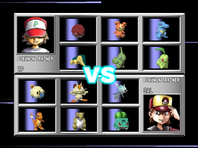
Not a TCG card, but I decided to try to make a Trainer Card (the kind that show your team and Friend Code) inspired by classic TCG Trainer cards as well as graphics from Pokémon Stadium 2. What do you think? Any suggestions (that don't involve changing the size of the card)?

(3D models from Pokédex 3D Pro, recolored by me)
The e-Reader code at the bottom was a last-minute addition. The original design was shorter, but I expanded the border to make the dimensions match a Pokémon TCG card and needed something to fill it in and didn't want to use Badges.
(3D models from Pokédex 3D Pro, recolored by me)
The e-Reader code at the bottom was a last-minute addition. The original design was shorter, but I expanded the border to make the dimensions match a Pokémon TCG card and needed something to fill it in and didn't want to use Badges.
Last edited:
My only suggestion would be that you might want to remove the E-reader code and place your friend code in that space; the red, as BBninjas pointed out, doesn't play nicely with that background, but it might with the yellow background; I'd recommend to add spaces between the digits so you spread the bright color a little more along the horizontal, too.
For a slightly more holistic solution, maybe you could place the "plate with screws" where the E-reader code is now, with the friend code inside, and place your picture and your pokemon's in one or two black rectangles (like the one you're using for the picture; I recommend a single wide rectangle); this adjusts the card to the more standard up-down reading direction of all pokemon cards, and it shouldn't alter your proportions much... as long you only use only two screws instead of four for the plate, but that's your decision.
For a slightly more holistic solution, maybe you could place the "plate with screws" where the E-reader code is now, with the friend code inside, and place your picture and your pokemon's in one or two black rectangles (like the one you're using for the picture; I recommend a single wide rectangle); this adjusts the card to the more standard up-down reading direction of all pokemon cards, and it shouldn't alter your proportions much... as long you only use only two screws instead of four for the plate, but that's your decision.
I really love it!  If I have any comments, it's that the 3D models of the Pokémon don't really mesh very well with the old set in my opinion. I think that Ken Sugimori art or traditional sprites would match the older TCG aesthetic of the card as a whole.
If I have any comments, it's that the 3D models of the Pokémon don't really mesh very well with the old set in my opinion. I think that Ken Sugimori art or traditional sprites would match the older TCG aesthetic of the card as a whole.This looks really neat! Here's my critique:
- The red trainer code is a bit bright and hard on the eyes.
- I feel like there should be some variant in the background behind the trainer image, as it looks very hollow at the moment being all black.
I agree that the red is a little hard to read. I based it on the original (English) Mysterious Fossil card, a Trainer card with red HP. I thought it might give it a more nostalgic feel.
The plain black background is based on Pokémon Stadium 2 trainer mugshots.
My only suggestion would be that you might want to remove the E-reader code and place your friend code in that space; the red, as BBninjas pointed out, doesn't play nicely with that background, but it might with the yellow background; I'd recommend to add spaces between the digits so you spread the bright color a little more along the horizontal, too.
For a slightly more holistic solution, maybe you could place the "plate with screws" where the E-reader code is now, with the friend code inside, and place your picture and your pokemon's in one or two black rectangles (like the one you're using for the picture; I recommend a single wide rectangle); this adjusts the card to the more standard up-down reading direction of all pokemon cards, and it shouldn't alter your proportions much... as long you only use only two screws instead of four for the plate, but that's your decision.
I'd sort of like keeping the FC in the upper right as a nod to classic cards (particularly Mysterious Fossil), but I might play around with this. Thanks for the input!
I initially tried putting the plate with screws at the bottom, but it didn't look right (even with two screws). :/
I really love it!
Glad you like it.
The 3D models with the 2D trainer pic is a nod to Pokémon Stadium 2:
- - -
EDIT: Tried all the recommended changes, but the original still looks the least odd out of the bunch. :/
Last edited:
The name "Tribelf" (tribal + elf) popped into my head yesterday, so I tried to make a Fakemon based on it. I might tweak the design a bit (I made it up in like 2 minutes), but this should give you the general idea. EDIT: Fixed!
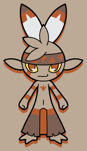
Tribelf (tribal + elf), the dual-Type Fairy/Fighting Primitive Fakemon. Here's what I have in mind for it, but all of this may change later:
Tribelf have different colors depending on their region. Each variation has a specific Type associated with it.
North (Snow Tribe): Turquoise, associated with Ice
South (Soot Tribe): Charcoal, associated with Fire
East (Wood Tribe): Olive, associated with Grass
West (Clay Tribe): Terracotta, associated with Ground
When paired with a Pokémon of the corresponding Type, "Beast-Warrior Mode" (which I've yet to design) is activated, raising its stats to rival that of a Stage 2 Pokémon! Although Tribelf's Type doesn't change upon transformation, its signature attack (name pending) does and gets STAB (a same type attack bonus) anyway.
Last edited:
I narrowed my favorite Types down to 8 and picked my favorite design for each of those from my previous sets of custom Gym Badges to make this batch:
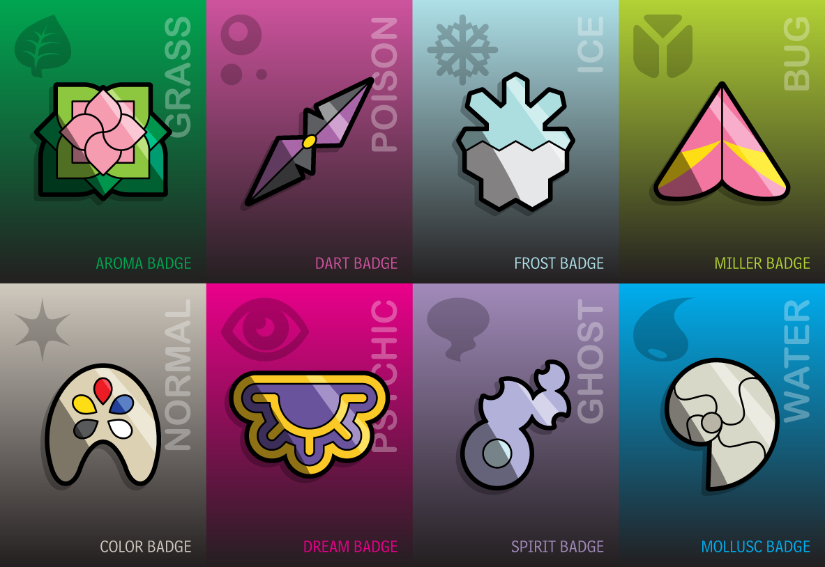
I don't plan on making a game with these, so feel free to use them yourself. Maybe someone would like to make a Gym-style fake card set with them?
I don't plan on making a game with these, so feel free to use them yourself. Maybe someone would like to make a Gym-style fake card set with them?
Last edited:
I'm still alive!
No new cards unfortunately, but I did update my Pokémon Trainer OC (Xander) and his Badge/Emblem for Gym-style cards:
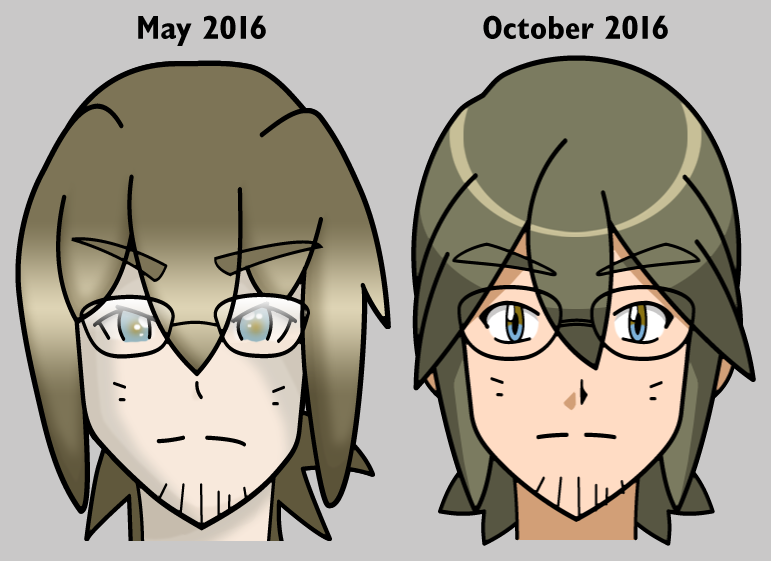

No new cards unfortunately, but I did update my Pokémon Trainer OC (Xander) and his Badge/Emblem for Gym-style cards:
Last edited:
Thought it would be fun to try a mock-up of an Evolutions-style Neo card:
Last edited:
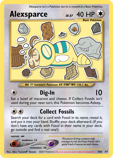
Sorry for the lack of cards. I finally did 5 or so sketches a couple weeks ago, but I haven't been feeling motivated enough to finish them.
Hopefully I'll be more active in 2017. In the meantime, feel free to have a look around my room:
Hopefully I'll be more active in 2017. In the meantime, feel free to have a look around my room:
Last edited:
The card back in this preview image looks awfully familiar...
https://www.walmart.com/ip/Pok-eacute-mon-Mystery-Power-2-Box/54445774
Recognize it?
It's my old (and rather poor) attempt to replicate a card back for jumbo-sized cards! xD
Sorry, still no new cards. I've been preoccupied with Shiny-hunting in Pokémon Moon. I finally got the full-odds Shiny Alolan Sandslash I wanted (and plan to make a card of it eventually), but now I'm busy trying to get a Shiny Moon Ball Mothim. I hatched a full-odds Shiny Burmy yesterday, but it was female... Dx
My take on Japanese Neo Dual-Types (preview):
Horizontal splits for duel-types? Dang, why couldn't I think of that? I've been fruitlessly trying to get duel-types to look good on the custom blanks that I've been working on for a while, but this might work!
Anyway, I just wanted to say @Nekoban Ryo that you're easily one of my favorite card fakers around, and have been quite the inspiration for my own fakes that I've been working on, but am not feeling ready to show to the public yet (stay tuned). Keep it up, man!
It's been so long since my last decent fake. ;w;

Click the card for the full-size image. Click here for the card without foil effects (for printing).
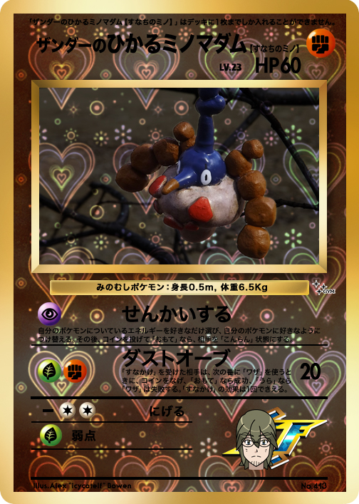
I decided to train that Shiny female Burmy after all. Given that I'm often looking through rocks and sand in search of fossils, I figured Wormadam Sandy Cloak was a good fit for me.
Hope you like the artwork! Figured I'd mix it up a bit and make a sculpture instead of a drawing (I think I've only done that once before).
I'll make a Japanese version later for "TheShiningTrainers," but for now I just wanted to give my print-resolution Gym blanks a spin. (Note: Shining Pokémon in this set can be of any rarity and, instead of having rarity symbols, are differentiated my their foil effects. This card is uncommon.) I might change the attack effects first, though. Any suggestions?
Good luck!

Click the card for the full-size image. Click here for the card without foil effects (for printing).
I decided to train that Shiny female Burmy after all. Given that I'm often looking through rocks and sand in search of fossils, I figured Wormadam Sandy Cloak was a good fit for me.
Hope you like the artwork! Figured I'd mix it up a bit and make a sculpture instead of a drawing (I think I've only done that once before).
I'll make a Japanese version later for "TheShiningTrainers," but for now I just wanted to give my print-resolution Gym blanks a spin. (Note: Shining Pokémon in this set can be of any rarity and, instead of having rarity symbols, are differentiated my their foil effects. This card is uncommon.) I might change the attack effects first, though. Any suggestions?
Thanks so much! Glad I can be such an inspiration!Horizontal splits for duel-types? Dang, why couldn't I think of that? I've been fruitlessly trying to get duel-types to look good on the custom blanks that I've been working on for a while, but this might work!
Anyway, I just wanted to say @Nekoban Ryo that you're easily one of my favorite card fakers around, and have been quite the inspiration for my own fakes that I've been working on, but am not feeling ready to show to the public yet (stay tuned). Keep it up, man!
Good luck!
Went ahead and made the Japanese version anyway. I also made one stylized like those bootleg sticker cards found in vending machines around 1999-2000. Anyone remember those? I always thought they were cooler than the real ones with those crazy foil effects and am surprised I've never done fakes in this style before. (Credit to CascadeGonpory for the Japanese Gym blanks.)

Yay for Fakemon cards!

(Click to fit to screen)
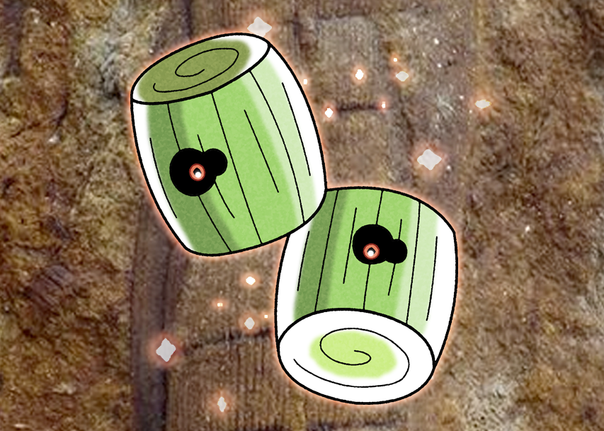
Kalamyte is based on Calamites, ancient tree-like reeds. It's the most common type of fossil I find (I used a photo of one of my fossils for the background), so I thought it would be a perfect Fakemon for my OC.
As a reminder, despite all cards in this set (The Shining Trainers) being Shining Pokémon, their rarity can vary from Common to Ultra Rare. Instead of using rarity symbols, however, rarity is denoted by the card's hologram effects. Common cards such as this have no hologram effects.


(Click to fit to screen)
Kalamyte is based on Calamites, ancient tree-like reeds. It's the most common type of fossil I find (I used a photo of one of my fossils for the background), so I thought it would be a perfect Fakemon for my OC.
As a reminder, despite all cards in this set (The Shining Trainers) being Shining Pokémon, their rarity can vary from Common to Ultra Rare. Instead of using rarity symbols, however, rarity is denoted by the card's hologram effects. Common cards such as this have no hologram effects.
Last edited:
Two cards in the same month? WHAT IS GOING ON!?

Japanese:

Art:

Japanese:
Art:
>The image link for the art is broken, at least for me.
Otherwise, Nice
Otherwise, Nice
You commented just when I was fixing it (accidentally used the Deviation URL instead of the direct URL). Thanks!>The image link for the art is broken, at least for me.
Otherwise, Nice