My first fake

How do you like Registeel?

  • Very Good

    Votes: 4 40.0%
  • Good

    Votes: 6 60.0%

  • Total voters
    10

ChanseyMaster

OH HAY LOL
Member
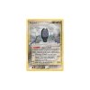
This is my first fake card. I know all the fonts are messed up, but I still don't know where or how to use them. Also, the placements might be a little messed up because I don't follow those instructions down to the pixel. I just put 'em where they look good. Comments and ways for me to improve would be nice. Also, if you know how to get all the fonts (Sorry FangKing, for some reason my comp won't use the fonts) then tell me. I hope you like my card, Registeel!

EDIT: I tried making a poll, but when I got halfway through it (what you see at the top) my I lost my internet and got logged out of AOL. Now when I try to edit it, it says I can't because I've been restricted from using it. What's going on? (WPM, if you see this, could you un-ban me or something so I can create and edit polls again?)
 

Attachments

  • RegiNF1JPEG.jpg
    RegiNF1JPEG.jpg
    155.6 KB · Views: 55
That card is awesome good work and I hope you make more.:)
 
If you want to make your cards look better, you'll have to use the correct fonts (AND place them where they are supposed to be, that means zoom in and get it right down to the pixel as best you can, stop estimating). Times New Roman or whatever font you used looks horrible, not to mention it's not justified at all.

You're missing an illustration and the -30 in the Resistance.

Even ignoring the fact that all the fonts are wrong, the card looks bad because it looks like you tried doing an old-school card with a new blank. The wording is beyond wrong.

The colon after Magnet Pull is what really irks me though. Have you ever seen a colon (or any other symbol) after the name of a Poké-Power? Of course not!

Bah.
 
RE:  My first fake

Crazy Weavile said:
I suck at faking and use Paint, and my fakes STILL look better!
no reason to be so mean man. ChanseyMaster is trying their best, no reason to be so mean.

Arcanine out.
 
Oh well it is his/her first time and I would say it is pretty good for that.:)
 
RE:  My first fake

xxashxx said:
Oh well it is his/her first time and I would say it is pretty good for that.:)

That's not really a valid excuse. If you have the right tools and the ability to follow instructions, you should be able to crank out authentic-looking fakes. Scope out this Mew I did. It's one of the first cards I ever made.

mewpsd2.jpg


No problem.

Also, if you hover your mouse over ChanseyMaster's image after loading it, you should be able to zoom in on it and read it in its entirety.
 
That card is cool but the one he/she made is good too. It just needs some fixins on it before it is done.:)
 
No it's not. Nothing about it is right.
 
All s/he has to do now is give credit to the artist.
All that I can see is:
Wrong font (try useing "Arial")
Move the name of the Pokémon up just a fraction.

But other then that it's fine.
(take mine for example):
(BTW it's a new one that I made for: Neo-Lionheart from croftminster)
 

Attachments

  • Shining Jolteon-card.PNG
    Shining Jolteon-card.PNG
    316.3 KB · Views: 20
Mateo, mateo, mateo, lemme lay it on you. First of all, I just don't have the fonts. I was really too lazy to get the fonts, and once I did, they didn't work. Lastly, with all these people saying stuff like, "It's just his first time", I would rather want some ideas on how to fix things than excuses to protect me. Mateo, go to your fonts folder, and upload those fonts onto a post. If you're sure that fonts mean everything, then spread the perfectness to other people. For people like xxAshxx and Lord who like my versions of cards, ill take requests. Heck, there are worse people than me :p. -ChanseyMaster

EDIT: Thanks LV, unlike the mudslinging from some people, you've offered advice that will improve my fakes. Thanks. -ChanseyMaster

Also, I'm a guy, my profile says so. Don't call me he/she (I'm not a hermaphrodite :D)
 
RE:  My first fake

Light Venusaur said:
All s/he has to do now is give credit to the artist.
All that I can see is:
Wrong font (try useing "Arial")
Move the name of the Pokémon up just a fraction.

But other then that it's fine.
(take mine for example):
(BTW it's a new one that I made for: Neo-Lionheart from croftminster)
I love the fact that because you can't read Japanese, you just take the illustration from Jolteon * and stick it on your own card. :p Funny...
 
RE:  My first fake

ChanseyMaster said:
Mateo, mateo, mateo, lemme lay it on you. First of all, I just don't have the fonts. I was really too lazy to get the fonts, and once I did, they didn't work. Lastly, with all these people saying stuff like, "It's just his first time", I would rather want some ideas on how to fix things than excuses to protect me. Mateo, go to your fonts folder, and upload those fonts onto a post. If you're sure that fonts mean everything, then spread the perfectness to other people. For people like xxAshxx and Lord who like my versions of cards, ill take requests. Heck, there are worse people than me :p. -ChanseyMaster

EDIT: Thanks LV, unlike the mudslinging from some people, you've offered advice that will improve my fakes. Thanks. -ChanseyMaster

Also, I'm a guy, my profile says so. Don't call me he/she (I'm not a hermaphrodite :D)
Thanx....ask me any time u want so help!
 
I always tell people when they do something good so don't take it as spam. That is just my nature and it has always been that way.:)
 
I don't know why your fonts don't work. I would rather not make cards than have them look terrible. Light Venusaur's Shining Jolteon is bad, too.

I can't upload the fonts because I don't have them. I also don't have Photoshop, so any fakes I would make would probably end up looking like crap anyway. My artistic talent is nil, and the person who does the art for my cards doesn't have the time to do it anymore, so I really have no reason to make any more fake cards. But if I did, you had better believe they're going to be flawless (or very close to it) because I want my cards to look real. So should everyone else.

And when I do care to critique people's cards, I do tell them that having the right fonts should be a #1 priority.
 
Back
Top