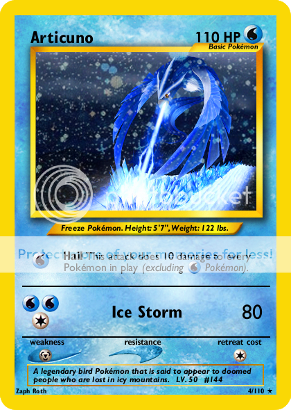
Looks pretty good! The issuatrator isn't Mitsuhiro Arita, though -- it's Ken Sugimori.
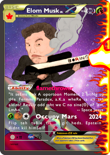
I'd suggest reducing the size of Combustion, too. It's a little too big in comparison to the rest of the card. While I'm really only used to my own Neo blanks, it appears the attack damage needs to be moved in a bit. The right side of the damage should be about 1 pixel in from the outer part of the 't' in 'Cost.' The '-30' needs to be move to outside the resistance swoosh.
Additionally, try making the text box with Flame Tail's effect text smaller (drag the right edge into the center a little bit). When there's damage involve, the text box shouldn't go past the 'r' in 'Retreat.' Looks like you're also missing the copyright text at the bottom of the card, too.
From a realism standpoint, [R][R][R][C] for 120 was pretty OP'd back in the Neo days.
Otherwise, nicely done.