Mora's Fakes

Mora

Don't Panic
Member
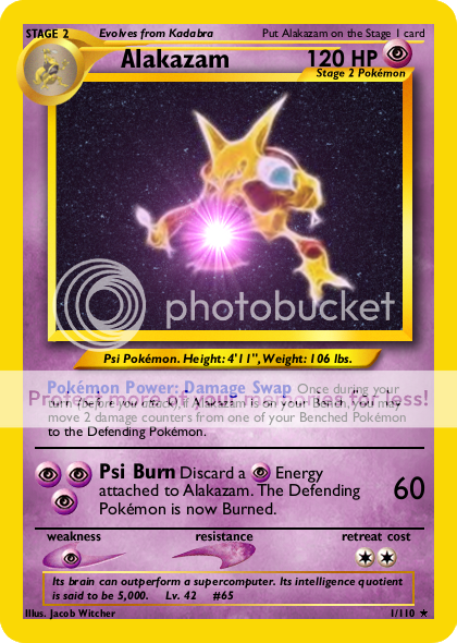
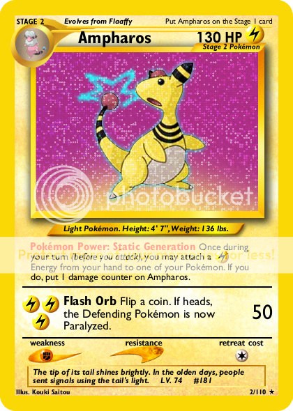
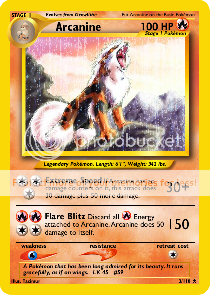
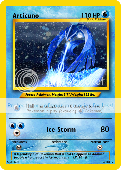
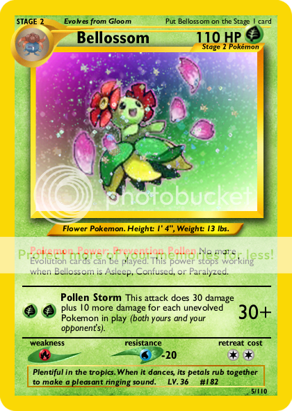
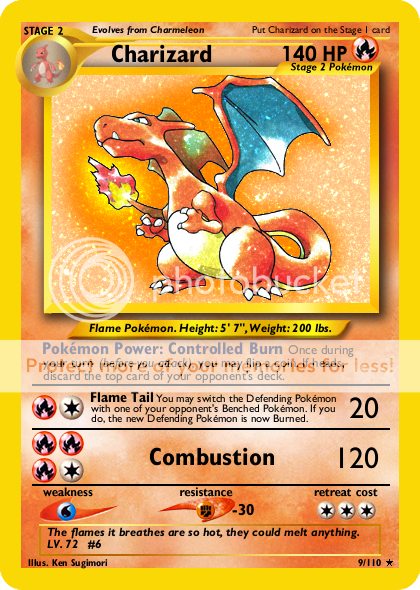
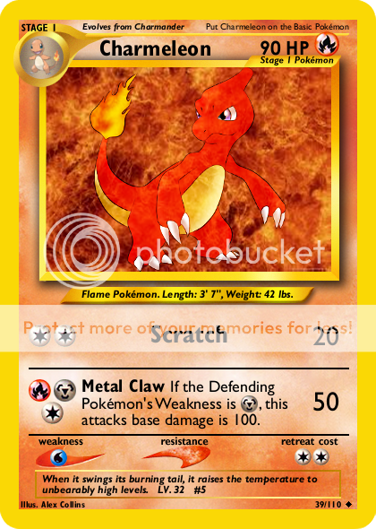
Yup, I'm doing this. I've had these on my computer for quite some time, but I've never done anything with them before--never shown anyone. I've been entering the Create-a-Card on PB, and I'd like to start doing imaged based, because the text based is kind of boring without some nice artwork to look at. I need help with the card's artwork. Placing text and getting the wording right is easy for me, but the other stuff is difficult. I'm just going to post these and let some of the better fakers tell me what I'm doing wrong (or just good job in the unlikely event that I've done everything perfectly). Without further ado:
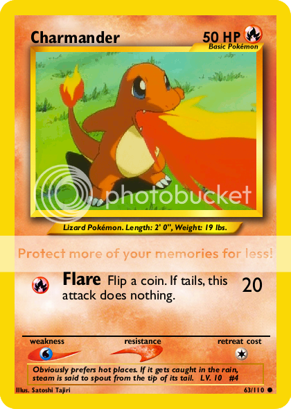
1Alakazam_zpsa3e1f014.png
2Ampharos_zps759a0660.png
3Arcanine_zps09d8be88.png
4Articuno_zps75b70982.png
5Bellossom_zps4d6e195c.png
9Charizard_zps4a37b48c.png
39Charmeleon_zps0919ac6b.png
63Charmander_zps403ec42c.png
77Mareep_zpsc544de24.png
81Pikachu_zps61ab5df4.png
 
I think you should upload those onto Tinypic, then click on the uploaded image and click 'View Raw Image' and copy the url from there.
Then, write
so everyone can see your cards without downloading.

The fakes are okay, but the font seems really weird, and the blanks look very low quality, and for some reason the images and energy symbols look fuzzy and dotty.
 
I'll try to get around to that later. I used Gill Sans for the font; that's what I was told to use, and it looks pretty close to the Neo font, but I could be wrong. And yeah, I need a new symbol sheet before I can fix any of that.
 
Mora said:
I'll try to get around to that later. I used Gill Sans for the font; that's what I was told to use, and it looks pretty close to the Neo font, but I could be wrong. And yeah, I need a new symbol sheet before I can fix any of that.

The text type itself should be smooth :) What program are you using?
Also, Nekoban-Ryo has some Japanese Neo blanks, but you can use English text over them. And welcome to the world of faking!
 
Judging by the foil, jagged energy symbols, and "clear type" text, are you using Paint? If so, I suggest downloading the free GIMP. It's not perfect, but it can do a better job than Paint. I've also read that Adobe released a free version of one of their older Photoshop releases, so you might want to look into that.

Gill Sans is the right font for effect text and damage, but the Pokémon and attack names should be Gill Sans Condensed Bold and HP should be Futura LT Medium Bold (or you can substitute it with Century Gothic Bold).

You can find tons of blanks, symbols, and foil sheets here: http://pokemoncardresources.deviantart.com/ CMP has some high-quality Neo blanks available, but only Basic blanks at the moment. Metagross101 has all the stages, not as large as CMP's, but they're still nice-quality.
 
I'm using GIMP, I just have such low quality resources. It should be a quick fix. Thanks for the link. I tried some of the links in the resources thread, but they were either broken or not what I was looking for. What about the artwork on the card? How does that look?
 
Mora said:
I'm using GIMP, I just have such low quality resources. It should be a quick fix. Thanks for the link. I tried some of the links in the resources thread, but they were either broken or not what I was looking for. What about the artwork on the card? How does that look?

I think the pokebeach sticky needs heavily updating tbh, 99% of the resources you will find at the DA link neko gave though, so that should help you loads. Especially the GIMP specific guides :)
 
Mora said:
I'm using GIMP, I just have such low quality resources. It should be a quick fix. Thanks for the link. I tried some of the links in the resources thread, but they were either broken or not what I was looking for. What about the artwork on the card? How does that look?

Really? I tried to reproduce the text with GIMP on my computer at that size and I can't quite get it to look like yours regardless of setting. I thought for sure it was clear type. Now that you mention it, however, I do spot GIMP's signature kerning errors.

What settings do you have on your text? Back when I used GIMP for text, I think I usually kept Hinting turned off.

As far as art choice, Articuno seems a bit small. Alakazam's size seems okay, but if you're going to have it offset to the right like that, I would add more details to the background to make it more interesting (waves/globe/random abstract).
 
Yeah, hinting is on. (The box was checked by default, and I only recently noticed.) I noticed it made the smaller text clear, so I turned hinting off for the small the stuff at the bottom with the level and number. I don't remember it making a big difference for the larger text, but I wasn't paying that much attention to it.

I think when I made the Alakazam, I intended to go back and add some kind of something (Shadow Ball, Focus Blast, etc.) That was a while back; I'll see if I can add something to make it look good. But the Articuno looks fine? If I could zoom in on it, and it's not pixelated, it would be good? I really like the foil on it; it kind of looks like snow.
 
Unless the original Articuno artwork is bigger than this, I don't see you having much luck with it. Even the best-known methods for enlarging an image cause some degree of blur. It's difficult to make out the detail on the Pokémon as-is, so blurring would just make things worse.

I agree that the foil looks like snow, but you could work a little on blending modes to make it less faded.
 
Ok, I fixed them using the new blanks (By the way, the new blanks are of noticeably better quality; thanks!) and edited the artwork. Alakazam isn't quite as boring, and Articuno is now (slightly) larger. Thanks to everyone for the help.

Nekoban Ryo said:
I agree that the foil looks like snow, but you could work a little on blending modes to make it less faded.

I just put the opacity on the foil layer at ~10-15%.
 
These look significantly better than the old ones. However, I suggest making Alakazam bigger this time. Right now, the ball just looks like a dot floating next to Alakazam rather than some kind of attack or background detail. After making Alakazam bigger, that might fix it, but if it doesn't, you could try moving the ball further up and left to make it look like a star or a really shiny moon.

Also, on Neo cards, the symbols in the effect text were inside orbs rather than free-floating like this. You need to find a different symbol sheet, too (notice how the energy symbols are colored differently from the type symbols and how the shapes are slightly different). You also needn't put "x2" next to the weakness on this era of cards.

When you apply foil, try changing the Blending Mode to Multiply at about 55-70% opacity, duplicate the layer, then change the top copy to Dodge at about 85-100% opacity. Multiply 70% under Dodge 100% usually gives a pretty shiny effect and is what most fakers use, but you can lower the opacity if you don't want it as intense.

EDIT: I also suggest changing Alakazam's Pokémon Power from red to blue (see here), since it's hard to read red text on a Psychic template. Also, avoid saving as JPG, as this tends to make the card fuzzy and distorts certain colors, including red text, very badly. Try saving your cards as PNG images.
 
Nekoban Ryo said:
Also, on Neo cards, the symbols in the effect text were inside orbs rather than free-floating like this. You need to find a different symbol sheet, too (notice how the energy symbols are colored differently from the type symbols and how the shapes are slightly different). You also needn't put "x2" next to the weakness on this era of cards.

I'm torn between trying to make them look exactly like Neo sets and trying to blend the older blanks with newer stuff like the energy symbol without the ball, newer wording (but not the dumbed-down Black & White wording), and other stuff of that nature. I'm not sure if I like it without the ball, though. I'll play around with it and see. I included the "x2" because I intend to have some Pokemon with DP Weakness where it was +10-30. If I have both +X and x2 Weaknesses, then I feel it would need to be written out. I may change that, though, and if I do, I'll go back to not including the "x2". Thanks for catching that, though.

Nekoban Ryo said:
EDIT: I also suggest changing Alakazam's Pokémon Power from red to blue (see here), since it's hard to read red text on a Psychic template. Also, avoid saving as JPG, as this tends to make the card fuzzy and distorts certain colors, including red text, very badly. Try saving your cards as PNG images.

Duh, how could I forget :p I'll fix that next.

Like this?

1Alakazam_zpsa659be5d.png
1Alakazam_zps3f46a313.jpg


I kind of like the first foil effect because it doesn't make Alakazam look so much darker. Also, I fixed the energy symbol at the top. It's the one from the energy sheet pasted over the original one.
 
Alakazam still seems a bit small to me. Also, the background is back to being a black void. Try adding some blue ripples or something and making Alakazam bigger so the glowing ball doesn't cover it's face. Also, apply foil behind the Pokémon instead of in front (unless it's a Shining or holo Delta).
 
Your cards look good! Here are some tips.

1) I'm not really digging Articuno's artwork. You can barely see him!

2) Also, because these are the old school cards, pictures of the pre evolution to a stage 1 or stage 2 should be the old school drawing not the newer ones.

The Alakazam is great! Keep up the good work.
 
My CaC submission without the set symbol:

5Bellossom_zps4d6e195c.png


Also playing around with foil effects:

2Ampharos_zps759a0660.png


Reggie McGigas said:
Your cards look good! Here are some tips.

1) I'm not really digging Articuno's artwork. You can barely see him!

I kind of like the art (probably because I put a lot of work into it redrawing a part, and fixxxing the background), but I'll see if I can play around with the foil effect and make Articuno more visible.

Reggie McGigas said:
2) Also, because these are the old school cards, pictures of the pre evolution to a stage 1 or stage 2 should be the old school drawing not the newer ones.

The Alakazam is great! Keep up the good work.

I want to do a few of the newer Pokemon, so I'd need the pre evolution sheet with all of the Pokemon on there. Sorry if it doesn't look authentic, but the quality of the other sheet I had was pretty terrible. Which Alakazam? The one with the red or blue Power font. I like the one with the red more, but I'd need to change it to where it looks like Alakazam is doing something with the purple ball and not just coexisting with it. Thanks for the feedback!
 
I believe the Ampharos needs the (before your attack) and 'Energy' right after the symbol in the power unless I'm mistaken. You're improving quickly, keep it up.
 
Illustrator credit, Illustrator credit, Illustrator credit! ALWAYS give credit to the person who made the artwork. Failing to do so is art theft.

Why do you put the foil over the Pokémon itself? The whole point of making a card holographic is to make the image appear to float in front of the artwork (if you close one eye, holographic cards give off a 3D effect). When you put the foil in front of the entire image, it just looks flat and distorts the artwork. I know it's easier to just pop the foil on there like that, but you should try taking time to erase the bit covering the Pokémon itself.

Also, don't forget the accented "é" in Pokémon (before I got a Mac, I would just copy it from the Internet when I needed it). And, wow, that's a blurry type symbol on Bellossom.
 
Mora said:
My CaC submission without the set symbol:

5Bellossom_zps4d6e195c.png


Also playing around with foil effects:

2Ampharos_zps0a2d0459.png


Reggie McGigas said:
Your cards look good! Here are some tips.

1) I'm not really digging Articuno's artwork. You can barely see him!

I kind of like the art (probably because I put a lot of work into it redrawing a part, and fixxxing the background), but I'll see if I can play around with the foil effect and make Articuno more visible.

Reggie McGigas said:
2) Also, because these are the old school cards, pictures of the pre evolution to a stage 1 or stage 2 should be the old school drawing not the newer ones.

The Alakazam is great! Keep up the good work.

I want to do a few of the newer Pokemon, so I'd need the pre evolution sheet with all of the Pokemon on there. Sorry if it doesn't look authentic, but the quality of the other sheet I had was pretty terrible. Which Alakazam? The one with the red or blue Power font. I like the one with the red more, but I'd need to change it to where it looks like Alakazam is doing something with the purple ball and not just coexisting with it. Thanks for the feedback!

I like the red one better. Also you need to credit the illustrator on your cards and use an accented 'e' in Pokemon. Just google Pokemon and copy and paste the word into whatever program you are using.

EDIT: Ninja'd
 
Back
Top