Art Gallery Athena's Art Dungeon and Garden Center (Jan 11 - Palossand)

Thanks for the suggestion, IA. :) I did spend some time working on the tail and when I had it curled in front, it definitely looked a lot more natural. My own cat tends to sit with his tail off to the side like that, but I guess I just couldn't capture it right.

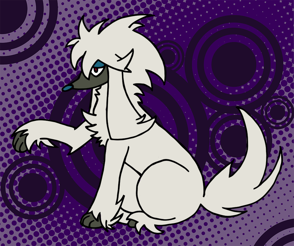
Anyway, here's finished Umbreon!

k5WXRTC.png


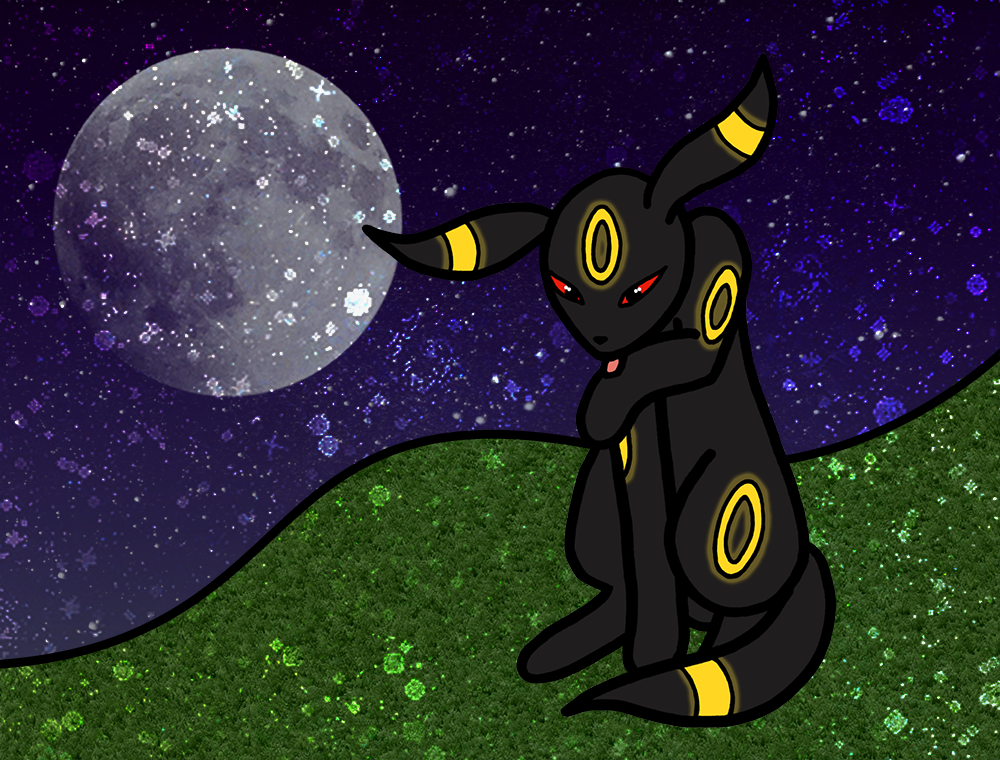
Umbreon was originally going to be a spiritual successor to the derpy-legged Espeon, but I couldn't get the pose to work and somehow ended up with this instead. For the first time, I used a slightly new lining technique, where I only used the thicker marker for the major body parts and did the face and accents (in this case, the rings) in a thinner pen. While this did require more clean-up of those thin line sections, I think overall it worked really well and stopped those detailed bits from losing too much detail. You can see the just-scanned lines version here for a better shot of how that looked on paper
 
June's CaC art is of Dedenne!

"If held by a Pokémon, it restores the user's HP in a pinch, but it will cause confusion if the user hates the taste."

This one was surprisingly annoying to clean. The whiskers were done in thin-point again, so they were a mess, and the tail I practically redrew with the mouse after it was scanned. The left ear is a bit too big I think, but none of the fixes I tried looked good, so I just left it.

zkXXL5t.png
 
Made the artwork for my first official card as part of my fake TCG card set, Rainbow Valley. It's Goomy! :D I plan on getting the card itself made up tomorrow, but for now, enjoy the artwork of some very fashionable Goomies.

ZJ288Fw.png


The user who made the text for the card asked for the artwork to contain multiple Goomies, and I got the idea to give them all accessories to make them stand out! :D Admittedly, the one with the skirt and the Fletchling feather is my favourite.
 
Those Goomies look great with thick lines but I bet they would look even better with some sort of stitching, embroidery or fabric lines and texture. I might be thinking a little too hard on Yoshi's Woolly World and Kirby's Epic Yarn...have you ever tried to give lineless a shot?
You make flat images look really nice, if you experimented a little further I think you could make some really awesome looking stuff. (Just seen your toner stuff. Amazingly cool art.)
 
I would totally love to, but... I would have no idea how to even start doing something with crazy textures or lineless. >.> The amount of formal art education I've had is practically zero*. Everything that I do is basically doodle, scan, clean, and colour following the exact same simple tutorial that I read way back when PS7 was the newest and best. :p I don't object to learning new things, I just have no idea how to even begin. I still do some very minor experimentation with backgrounds occasionally and such, but I have a tendency to stay within my comfort zones because I don't really have the knowledge or time to jump into things more in depth.

(* - I actually did take an art class in high school but there was no direction of any kind, just "here, have some paints and a canvas , everyone gets an A for effort so long as you actually make something." :U)
 
More new arts!

gq7X7v5.png


This is my art for July's CaC, done ahead of time since I'll be in the US without scanner/software access while the contest itself is actually running. I really like the glass distortion effect over the lines; it makes him feel more ghostly!

Pokémon Cards, I love them so
I buy a bunch then trade for more
Listed with the cards I offer
Safely hides clue number four
 
Last edited:
Time for more PokéArt! This one is neither for CaC, nor my own set, but drawn at the request of Zygarde for his Welkin TCG set. He asked if I would be willing to draw 2 Pokémon for his set, and the first that I tackled is Furfrou! See the artwork in the spoiler below.

ll4UTTl.png


Due to the detailed nature of Furfrou's hair spikes, I opted for a thinner rollerball pen instead of my typical marker. I actually kind of made a mess of it with ink smears and was dreading the long clean-up time, so I decided to experiment a bit and vectorize my initial scan instead of cleaning it up manually by hand. I had to tweak it a bit and still do a few things by hand, but the vectored image did so much of the work for me that it was amazing! I think I'll continue to do that from now on to save my sanity.

In general, though, I'm really proud of how well the pose turned out. Furfrou's spikes were fun to make, but it was difficult to figure out how they should work for the hind leg and begging paw. I was originally planning on making him have a panting face as well, but it looked too weird; the stoic look seems to fit him better. He kind of reminds me of L from Death Note a bit...
 
My second piece of artwork for Zygarde's Welkin TCG set is this glorious Shuckle, complete with his own berry juice:

KuBt3zN.png


This piece of something of an homage to one of my favouritest TCG art pieces, the EBB/Legendary Treasures Shuckle card by MAHOU. I've always been amused by the whole Shuckle berry juice thing, and I love MAHOU's style. This is kind of a simple piece, but I'm pleased with how it turned out, especially with the difficulties I had with the original drawing.
 
Thank you for pointing that out! The image should be appearing in the OP properly now. :)
 
Man, it's been a while, hasn't it? :p
zpgHpR.png

By request of @Jabberwock for his recent prize in The Challenge, I drew him a Palossand! It actually turned out pretty damn well, I think. Nothing too fancy, just a pencil sketch, inked/markered, then scanned, vectored, and cleaned before colouring. I had a problem getting the "finger" bits on the "hands" to look right, so I just kind of put them into this simple pattern which kind of makes him look like he's giving double peace signs. :U
 
*sniff* It's beautiful! ;~;

Thanks Athena! <3 I love the double peace signs; idc what anyone else says
 
Back
Top