Art Gallery AstronaughtV24's Image-Based LEGEND Cards

AstronautV24

Call me VVVVVVVVVVVVVV
Member
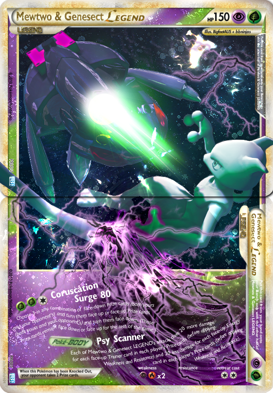
I always wondered how LEGEND cards would look like when they are re-introduced to the XY era.

Here are some cards I made recently:

Shiny Mega Gardevoir LEGEND
M Gardevoir LEGEND.png

Mega Banette & Mega Mawile LEGEND
Mega Banette and Mega Mawile LEGEND.png

Glaceon & Leafeon LEGEND
Glaceon and Leafeon LEGEND.png

Meloetta LEGEND
Meloetta LEGEND.png
Still working on the wording on some of these cards, so errors are not uncommon.
Please tell me what you guys think! :)
 
Hey, I know you! Welcome to PB! I must say, you've done a great job in finding beautiful art pieces. What program do you use? Otherwise, here's my recommendations on things to improve on:

- You should remain consistent with the font outline. Generally LEGEND cards do not need any black outline.
- The font looks a little off. May I ask what font you are using? (It may just be me :p ). The text also looks blurry occasionally; I'm not too sure why that would be, but perhaps you should look into it.
- Try to keep the art in the box. While having art in the form you do is nice, it doesn't feel as authentic as the LEGENDs and should improve your holosheet with the tip I give below.
- It's great to see you're trying out holosheets! However, they tend to make your card look a little dull at the moment due to the holosheet being on top of the entire card. On actual LEGEND cards, the holosheet is only on the background of the artwork and the coloured parts of the blank (i.e. the purple/green textures in my example). To do this, I use a clipping mask and either the eraser tool or the paintbrush to "cut" parts of the holosheet from the card.
- There is some wording that needs fixing up, but you're pretty good with it already. ^.^

You can see this and more applied in this card that I made in an older collaboration (not perfect) with another member:
mewtwo_and_genesect_legend_cac_july_collab_by_bbninjas-d92v00x.png

I think you've got a lot of untapped potential with your works that I'm really excited to see flourish so you can make top quality cards. Now, just do me a favour and don't use that Suicune/Virizion artwork that I have been eyeing for a while. ;D
 
Hey, I know you! Welcome to PokéBeach! I must say, you've done a great job in finding beautiful art pieces. What program do you use? Otherwise, here's my recommendations on things to improve on:

- You should remain consistent with the font outline. Generally LEGEND cards do not need any black outline.
- The font looks a little off. May I ask what font you are using? (It may just be me :p ). The text also looks blurry occasionally; I'm not too sure why that would be, but perhaps you should look into it.
- Try to keep the art in the box. While having art in the form you do is nice, it doesn't feel as authentic as the LEGENDs and should improve your holosheet with the tip I give below.
- It's great to see you're trying out holosheets! However, they tend to make your card look a little dull at the moment due to the holosheet being on top of the entire card. On actual LEGEND cards, the holosheet is only on the background of the artwork and the coloured parts of the blank (i.e. the purple/green textures in my example). To do this, I use a clipping mask and either the eraser tool or the paintbrush to "cut" parts of the holosheet from the card.
- There is some wording that needs fixing up, but you're pretty good with it already. ^.^

Hello, glad to see you here bbninjas! I'm a big fan of you and asche's works!
I use gimp 2.0 for all of my works, it's not Photoshop-level, but it gets the job done.

- I'm trying to find ways that I can darken the artwork without ruining it, but yes, I do know that LEGEND cards favor texts without outlines and remaining consistent with is something I just physically cannot do XD
- I use Gill Sans (19pt) for my attack description and Gill Sans Bold Condensed for my attack names (32pt) and card name (39pt, 30pt). I still don't know what's causing it to blur though, I'll have another look at it.
- I will try scaling the artwork down to fit in the box whenever it's possible from now on, thanks :)
- Great advice! I just tested it out and I love it! Thanks! :D
- Thank you thank you thank you!!! :D

No, I won't use that, don't you worry ;)
 
Ohhey, Astronaut! Welcome to the Beach! :D

It's interesting to see that you're keeping all effects of the "Mega rules" for your M-Pokémon-LEGEND. I especially like the use of 3D Japanese text on the LEGEND blank. :) I would, however, like to suggest a couple of things regarding the text~
  • The Mega text is almost always standing upright, not leaning over, as it appears on your M-Gardevoir (can't think of a better way to describe it >.>). Might I ask how you create the text? Do you use a 3D program for it? If so, would there be a way to keep the text upright while still applying a 3D effect?
  • There's also usually a white sort of lining around each edge of the text. This is done in Photoshop through bevel, but I'm not sure how you could do that in GIMP. I wrote this up a while back in reply to bb, but it's not perfect and it's sadly only for PS, so you might have to do some adapting. :(
All that said, it's great to see you here on PB! Keep up the great work! :)
 
Ohhey, Astronaut! Welcome to the Beach! :D

It's interesting to see that you're keeping all effects of the "Mega rules" for your M-Pokémon-LEGEND. I especially like the use of 3D Japanese text on the LEGEND blank. :) I would, however, like to suggest a couple of things regarding the text~
  • The Mega text is almost always standing upright, not leaning over, as it appears on your M-Gardevoir (can't think of a better way to describe it >.>). Might I ask how you create the text? Do you use a 3D program for it? If so, would there be a way to keep the text upright while still applying a 3D effect?
  • There's also usually a white sort of lining around each edge of the text. This is done in Photoshop through bevel, but I'm not sure how you could do that in GIMP. I wrote this up a while back in reply to bb, but it's not perfect and it's sadly only for PS, so you might have to do some adapting. :(
All that said, it's great to see you here on PokéBeach! Keep up the great work! :)

Hello Jabberwock! Glad that you're here! :D

- I just use the perspective tool to give it some kind of angle, and I did the rest of the text by following this guide: http://gimpchat.com/viewtopic.php?f=23&t=285
I'm still experimenting with the perspective tool, so I might as well try making it upright :p

- That is why I'm so desperate to get Photoshop! You guys get to make cool effects while I'm stuck here with what I have :(

Anyway, thanks for commenting! :)
 
I use gimp 2.0 for all of my works, it's not Photoshop-level, but it gets the job done.
- That is why I'm so desperate to get Photoshop! You guys get to make cool effects while I'm stuck here with what I have :(
Well, I know a few people who make really nice pieces using gimp. I don't even use Photoshop myself, and instead this program that noone knows about called COREL PhotoPaint, which has big limitations in itself. :/

- I'm trying to find ways that I can darken the artwork without ruining it, but yes, I do know that LEGEND cards favor texts without outlines and remaining consistent with is something I just physically cannot do XD
Perhaps you could try some blending modes? They tend to add a bit of contrast or the like and can make a neat effect when done well.

- I use Gill Sans (19pt) for my attack description and Gill Sans Bold Condensed for my attack names (32pt) and card name (39pt, 30pt). I still don't know what's causing it to blur though, I'll have another look at it.
I'm not sure if they're the same or different, but I use Gill Sans Std. I think they're the same though.

- I will try scaling the artwork down to fit in the box whenever it's possible from now on, thanks :)
I recommend you to have a look at multiple official LEGEND cards (Darkrai & Cressilia is a good one) to see how they use art on cards. It should be easier for you to replicate that way.

- Great advice! I just tested it out and I love it! Thanks! :D
- Thank you thank you thank you!!! :D
No problem! You should totally post that new card of yours though. :x
 
Well, I know a few people who make really nice pieces using gimp. I don't even use Photoshop myself, and instead this program that noone knows about called COREL PhotoPaint, which has big limitations in itself. :/


Perhaps you could try some blending modes? They tend to add a bit of contrast or the like and can make a neat effect when done well.


I'm not sure if they're the same or different, but I use Gill Sans Std. I think they're the same though.


I recommend you to have a look at multiple official LEGEND cards (Darkrai & Cressilia is a good one) to see how they use art on cards. It should be easier for you to replicate that way.


No problem! You should totally post that new card of yours though. :x

- I's pretty sure someone makes sweet FA cards with Gimp in the faking community but I forgot who it was... I might have to do some digging now. And I would never have though of you using anything but Photoshop, your work looks so official 0_0

- I don't usually touch them (because I really don't know what they do so I only use them for holofoils and sheets), I may try some out who knows :/

- Pretty sure there's a slight difference, if it ends up looking better than Gill Sans then I might as well switch to Std.

- That's a really sweet card, good shout :D Thanks!

- Nah, I wanna keep some of my work deviantART exclusive 8D
 
- I's pretty sure someone makes sweet FA cards with Gimp in the faking community but I forgot who it was...
That would probably be Nekoban Ryo/icycatelf.

- I don't usually touch them (because I really don't know what they do so I only use them for holofoils and sheets), I may try some out who knows :/
Try out Soft Light, Color Dodge, Hard Light, Multiply and Overlay. They can produce some nice effects.

- Nah, I wanna keep some of my work deviantART exclusive 8D
Haha okay then. :p
 
Back
Top