You are using an out of date browser. It may not display this or other websites correctly.
You should upgrade or use an alternative browser.
You should upgrade or use an alternative browser.
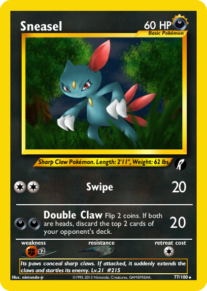
TCG Fakes Neo Battlefield: Sneasel (Image Based)
- Thread starter Reggie McGigas
- Start date

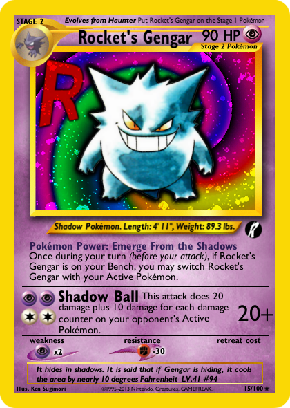
Next up maybe the Gengar line
Whoo! Long time, Reggie––this is way overdue, but good to see ya back. ^.^
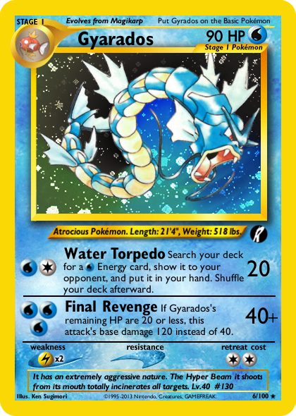
I do really like that Gyarados art. Think it fits in really well with the Neo aesthetic (speaking of which, nice choice of era! ^.^). A few quick critiques, though:
")
I do really like that Gyarados art. Think it fits in really well with the Neo aesthetic (speaking of which, nice choice of era! ^.^). A few quick critiques, though:
- The Pokémon's name is Gyarados, not Gyrados.
- Water Torpedo's text should read "Energy card", not "Energy"––this is something that's garnered a bit of discussion 'round here, but can't remember if you were around during it. Relevant text from the Wording Errors Compendium: "Energy is Energy when attached, it’s an Energy card when not. This means you can’t search your deck for Energy. [Reference: Palkia-EX, Lugia-EX, Fisherman, Aromatisse XY, Shuppet ROS]"
- In this era, too, you don't "reveal it", you "show it to your opponent". Additionally, attacks don't just do "80 more damage", they do "40 damage plus 80 more damage".
- Weight should be rounded to the nearest whole.
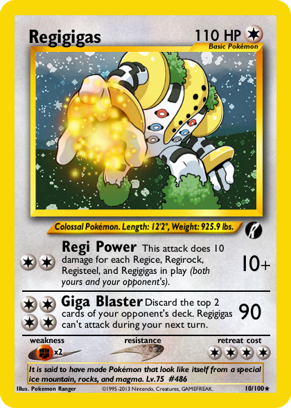
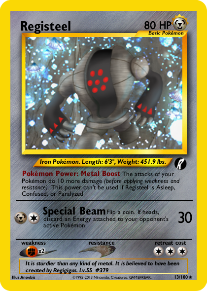
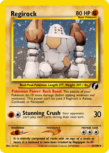
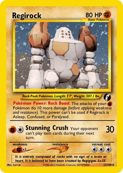
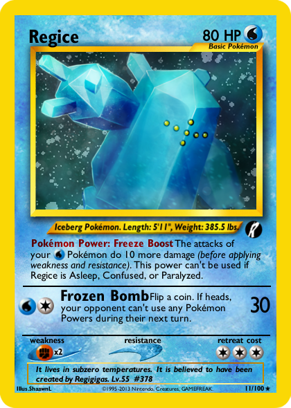
All the Regis are missing the period at the end of their Pokémon Power effects. I also think the attack effects should be the same size you used for Regigigas.
I think you need to increase your line spacing as well. A drop-down letter like "p" or "g" in an attack name shouldn't be able to touch the caps in the effect text. 1pt higher than the font size seems to work in Photoshop, but I'm unsure about GIMP (its been far too long since I've used it for faking).
Also, remember that you can shift textboxes up/down or enlarge text if you've got extra space.
Last edited:
In addition to the great points made above, I'd also suggest moving your divider bar between the Powers and attacks to the left so as to line them up with the bar dividing the attacks and W/R/RC, and to ensure your Energy costs are always lined up with each other (check Regigigas to see what I mean). Basically just small stuff that you'd benefit from just glancing over before you post.
I'd also use a variation of Neo Genesis Heracross for Gyarados' Final Revenge to read something like "If Gyarados's remaining HP are 20 or less, this attack's base damage 120 instead of 40." It's a pain, but I always try to double check real cards for reference.
I'd also use a variation of Neo Genesis Heracross for Gyarados' Final Revenge to read something like "If Gyarados's remaining HP are 20 or less, this attack's base damage 120 instead of 40." It's a pain, but I always try to double check real cards for reference.
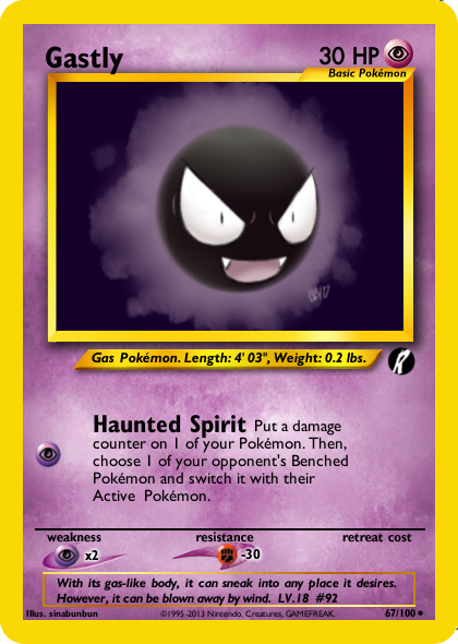
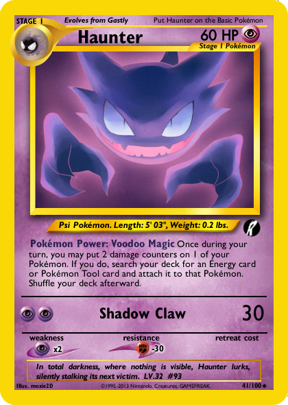
Thanks everyone for the criticism and comments! I fixed up Gyarados and next I'll redo the Regis, I also make Ghastly and Haunter.
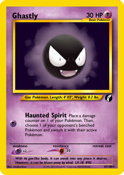
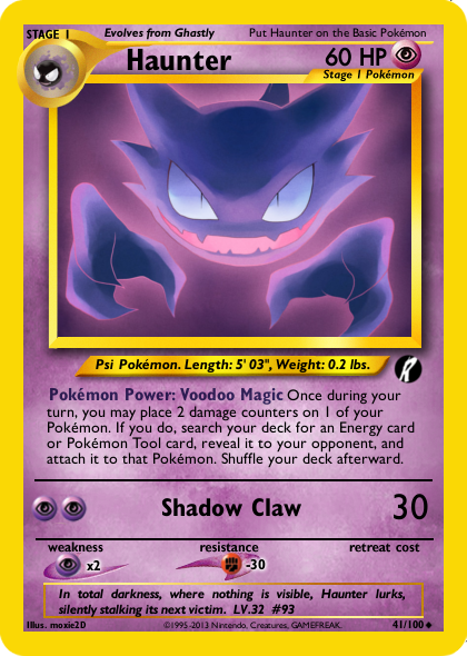
On Gastly, remember to capitalize "Benched" and "Active." On Haunter, you should include "before the attack" in the Power. You "put" damage counters on Pokémon, not "place," and remember as Jabberwock said, you don't "reveal" in Neo-era, you "show it to your opponent." Since you're attaching it right away, you don't even need that part, though.
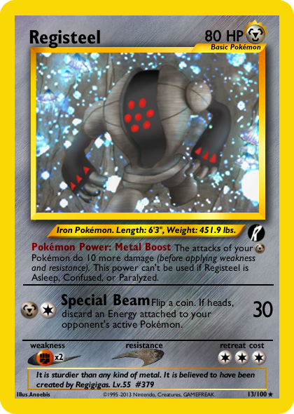
Th eallignment on special beam seems slightly off still as well as forgetting to capitalize active n Registeel so I'll look at that next - I'm too tired tonight to fix it
I just noticed some of the symbol sizes look off. On Regirock, the Fighting and Colorless attack symbols look different sizes. Then, the Fighting Resistance symbol on Rocket's Gengar is absolutely smaller than the Fighting Weakness symbol on Registeel/Regirock.
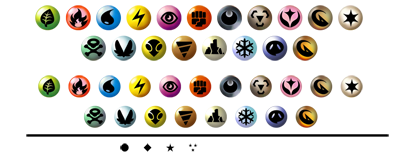
What blanks/symbolsheet are you using?
What blanks/symbolsheet are you using?
I just noticed some of the symbol sizes look off. On Regirock, the Fighting and Colorless attack symbols look different sizes. Then, the Fighting Resistance symbol on Rocket's Gengar is absolutely smaller than the Fighting Weakness symbol on Registeel/Regirock.
What blanks/symbolsheet are you using?
I am using your symbolsheet, actually. The problem is that I need to resize for my blanks (I forget where they came from) so I try to line it up with real cards but sometimes it's not exact. One thing I can try to do in the future I just realized is to download an image of a real card and put it at 30% transparency on the fake card so I can line up the symbols.
I'll resize it for you at the same percent reduction I reduced the holosheet. Then you can just do a simple copy and paste.I am using your symbolsheet, actually. The problem is that I need to resize for my blanks (I forget where they came from) so I try to line it up with real cards but sometimes it's not exact. One thing I can try to do in the future I just realized is to download an image of a real card and put it at 30% transparency on the fake card so I can line up the symbols.
Hey Reggie -- here's the symbolsheet. Thankfully, I designed the width to equal my blanks, so if I need to resize it, all I have to do is match the width of the blank!
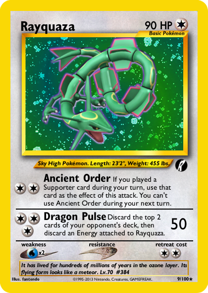
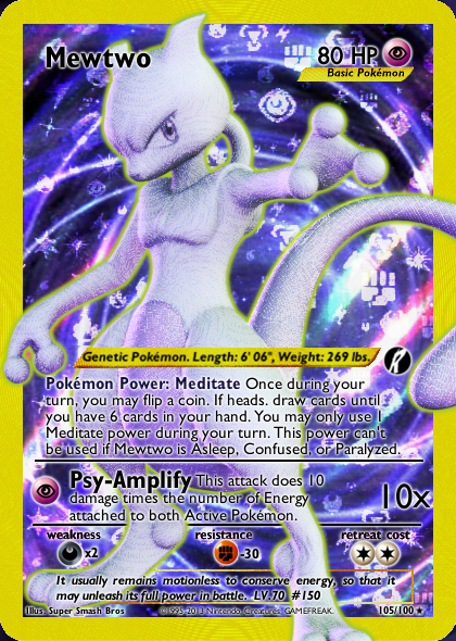
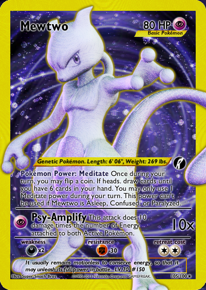
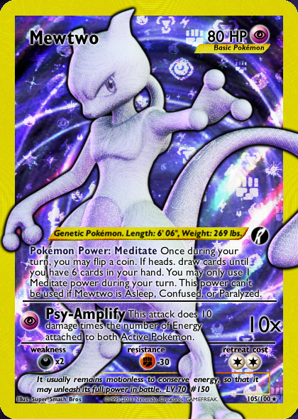
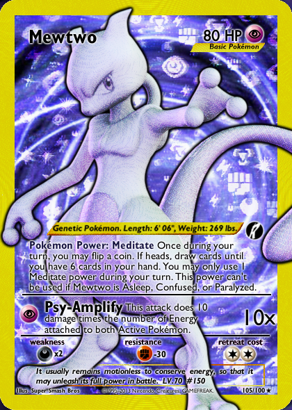
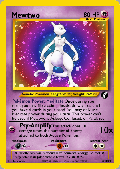
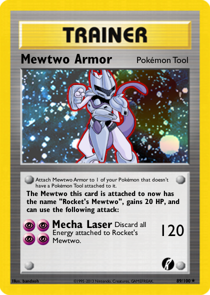
Thanks so much, CMP! You've been a big help to the quality of my set improving. Here's Rayquaza and Emerald Orb (Made these before your symbolsheet was released but I'll redo it along with Mewtwo next). Rayquaza is the second of the two primary Pokemon in this set (the other being Mewtwo) as it serves as the main counter to Rocket's Pokemon.
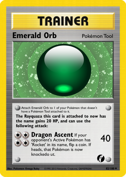
Which of these four do you like the most?
Last edited:

Next is rocket's weavile! Updates will come less often because I am now focusing more of my time on Reggie's Racing Cup (sign up here!)