OLD: The Fake Card Resources and Help Thread

Status
Not open for further replies.
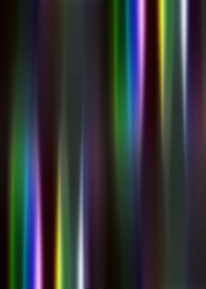
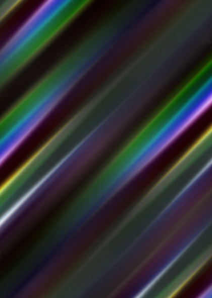
A couple new foils. The first two resemble some of my previously-released sheets (refractor and XY holo), but a little more colorful. The last one is completely custom.

custom_refractor_2015___a_by_icycatelf-d9rktg8.jpg

Multiply or Hard Light (70%), Soft Light (70%) for darker backgrounds.

custom_refractor_2015___b_by_icycatelf-d9rkwvi.jpg

Same settings as above. If used as a substitute for XY foil (non-Japanese), flip the foil horizontally or vertically. Looks great on borders!

techno_canvas_foil_by_icycatelf-d9rm4g2.jpg

Multiply (70%) should work for nearly everything, Soft Light (100%) for darker backgrounds.
 
Don't know if this is the right place, just thought it would help to ask here. I am trying to make a fake card on GIMP but whenever I type with Gill Sans Std Bold, it makes the letter HUGE. Can someone please tell me how to prevent this from happening.
 
Can you screenshot/screencap exactly what you mean? Gill Sans Std shouldn't suddenly grow in size like that.
 
This (for Windows) and this (for Mac) is how you take a screenshot. Anyways, I'm still confused on what you mean.

In case you're unsure, PrtScr is short for Print Screen.
 
Cool, glad to hear its fixed!

First off, you import the symbol sheet into your work. Then you get a marquee (your selection thing) and box the symbol you want. I'm not sure if this works in GIMP or not, but then you can generally right click and copy your selection into a new layer, and there you have your symbol! Otherwise, you can just cut out everything except for that symbol after inverting the marquee.
 
Last edited:
Ok so I just started a new one (where the size glitch doesn't happen) and I have one question. How do I use a symbol sheet?
Symbolsheets are made with the assumption that users have the knowledge regarding Marquee/Selection tools in various programs.

While the names may differ, they generally do the same thing. It's a case of dragging the tool over/around the image you want, then (and again this varies for each program) you can cut/copy/move/open in a new window said image. For Photoshop and possibly GIMP (which should be similar), you can right click and copy as a new layer (then ctrl + a to select all, ctrl + c to copy, then ctrl + v to paste) or a basic ctrl + c, then ctrl + v onto the card.

The sheets are made this way due to the time it takes to save each symbol as a single image, and baring in mind that it takes alot more time to upload them etc as well :) (not to mention where you're uploading too, with rules etc)
 
Got the base Evolution template done for the beta-style blanks (added to previous post). The scans are a little inconsistent and small, so there may be inaccuracies. (I think I see a pill-shaped bubble around Venusaur's Pokémon Power symbol, but it may be an outer glow or just sharpening. Also can't tell if the power name is black or another color -- looks a little purplish to me, maybe red and blending with the texture from compression.)

Now I've got to work on the textures. These aren't the same as the final TCG textures. These all seem to share the same texture, but with different colors. I'm having trouble recoloring my current mock-up texture, so I'm going to try a different method that will hopefully work. Wish me luck! After that, I've just got to make a symbol sheet and they should be ready to use.

(I might also try making English versions. Would anyone be interested in those?)
 
Last edited:
Beta blanks are done!


Includes Basic, Stage 1, and Stage 2 blanks of every classic type (no Fairy, Darkness, etc.) and a Symbol sheet. No Trainer/Energy blanks.

Font guide and tips coming soon (though feel free to get started earlier using my example cards above for reference).
 
So I've been working on an EX and am trying to replicate the light/wind/power streaks/bursts that you can find in the following examples. I feel like they're the things missing from my current WIP. Anyone got any ideas?

eg, Charizard-EX (Gen), Rayquaza-EX Promo, Gallade-EX ROS and M-Mewtwo-EX Y
 
I think I'd probably do something like this:

#Use the pen tool to draw a straight path.
#Right-click > Stroke the path (make sure the brush is preset to 2-4 px and whatever color you want).
#Edit > Transform > Free Transform to make one end thicker than the other.
#Layer > Layer Style > Outer Glow in whatever settings you want. You can also apply gradients and whatnot here.
#Set opacity to 70-80ish%, if desired.

asche probably has a better way to do it, though. :p
 
Attempted the beta font guide. No basic guide (yet), but most things should be the same. I think I covered everything, but may have left out some things. (I know I left out symbol placements.)

beta_font_guide__stage_1_2__by_icycatelf-d9uqti5.png


Think I should just make the font guide an editable PSD instead?
 
I think I'd probably do something like this:

#Use the pen tool to draw a straight path.
#Right-click > Stroke the path (make sure the brush is preset to 2-4 px and whatever color you want).
#Edit > Transform > Free Transform to make one end thicker than the other.
#Layer > Layer Style > Outer Glow in whatever settings you want. You can also apply gradients and whatnot here.
#Set opacity to 70-80ish%, if desired.

asche probably has a better way to do it, though. :p
Ouch - that uses basically all the things my program has difficulty doing. xD
 
Status
Not open for further replies.
Back
Top