And I have another that I am on debating on how to finish. I will post it eventually. Is anyone still keeping up with this?


Gentlefish said:I'm still here.
safariblade said:USERNAME = safari
PROGRAM(S) OF CHOICE = Adobe Illustrator, PS, Indesign
DEVIANTART ACCOUNT = I don't really use dA anymore, I use Dribbble.
2 EXAMPLES OF YOUR OWN WORK = http://dribbble.com/theZHAN
3 EXAMPLES OF GFX INSPIRATION (things you like) = My inspiration! All of these beautiful shots: http://dribbble.com/theZHAN/shots/likes


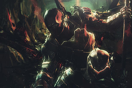


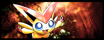
Prometheus said:
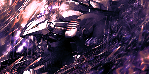
I'd like to request a serious critique on this one. Out of all the banners I've made so far, I think I've finally made some serious improvement with this. I'd like to say I am slowly gaining a hold on the basic concepts of flow and lighting in my banners, but I need for someone to tell me where I can improve even more. I saved every little bit of the process in a PSD file, if anyone is interested in seeing how I went about finishing it. If anyone woud like to see it, I can update this post with the attachment.