Contest PokéBeach Create-A-Card: July 2017 - Johto PokéDex - Results Are Up!

professorlight

Ice Queen
Member
Sigh. Just imagine the quote is actually a spoiler. I'm not going to lose two points for a post formatting issue.

Fixed. ~bbninjas
 

bbninjas

Ready or Not!
Advanced Member
Member
Just a reminder that there's just under three days remaining to complete and post your entry! This also means that the deadline to drop out and to not incur a penalty has passed. As per normal, if you have posted your submission and your name isn't bolded on the entries list, let me know. ^.^
 

WastedSkyPirate

...
Member
There are some mind-blowing entries this month, thank you all for giving me a lot of work to do in my first month of judging!

Keep them coming :cool:
 

quakingpunch73

At The Beach
Member
ZQp77u7.png
Delibird is a Pokemon known for having a not-so-subtle resemblance to Santa Claus, which is why I went with a Christmas theme for my entry. Secret Santa is a Power not unlike Jirachi-EX or Tapu Lele-GX, however, it comes with a twist. While using the power is a quick way to draw cards and it doesn't waste your supporter for the turn, there are some twists to balance it out. For one, your opponent gets a similar boost as well, and you both get to choose how much of a boost your opponent recieves! Clumsy Courier is a means of recycling Delibird by discarding and redrawing it, as well as helping with Delibird's bread and butter, its mill potential. Using cards like Engineer's Adjustments and Sage's Training, you could theoretically mill your opponent's deck by five cards every turn of the game, while using Clumsy Courier to keep adding Delibird onto your deck to minimize the number of cards drawn each turn by you. However, to prevent it from becoming too overpowered, Delibird is relatively squishy and can't deal damage, which makes it difficult to deal with hard hitting decks, as well as your opponent being able to mill you too with the same strategy, but having the disadvantage of not being able to use supporters that can mill as hard if they are playing a deck that isn't based around this strategy. Good partners of the HGSS era for Delibird include Scizor Prime and Celebi Prime for being able to block damage from decks that use Special Energy and Evolutions, and thus keep the milling going on for longer.
References: Jirachi CoL, Smeargle CoL, Delibird HGSS
Thank you to the PTCG Faking Community for helping with wording and other stuff over Discord! You guys are the best!
 

MarshalBry

Aspiring Trainer
Member
zSS9uCG.png

Espeon-GX SUM - GX attack wording for placing damage counters
M Mewtwo-EX (Y) BKT - Wording on energy attached to both active Pokémon
Giratina BW Promo - Special conditions affecting Active Pokémon

Inspiration
I've always liked the poison theme going on in Phantom Forces (on the Crobat, M/Gengar-EX etc.), and while looking down the list of Johto (& other allowed Pokémon) I thought it'd be neat to give something similar a go with a Pokémon I felt was a little underrated from Gen 2. Ariados typically seems to see use as a support Pokémon (such as in its last print in Ancient Origins), and I tried to reflect its usually usage while making it a main attacker (though it could easily fit as a backup attacker in Lurantis-GX in Standard, and Genesect-EX in expanded).

Part of me wanted to see the old Hex Giratina be playable, and I absolutely tried to reflect that here and attempted to "fix" what was wrong with it -- too much attack cost, for too little damage on a low-health Pokémon (as well as Special Energy reliance). Ariados-GX features a defensive ability that makes up for being as frail as it is, and has a slightly cheaper cost -- as well as having notable synergy with the upcoming Venusaur in Shining Legends.

Edit: Had to fix not having aschefield101 credit
 
Last edited:

bbninjas

Ready or Not!
Advanced Member
Member
There is just under 32 hours remaining before this month's deadline passes. Make sure you don't forget to submit!

Also, if you haven't been following the other thread, we are holding a competition to find a new, universal CAC symbol that image-based fakers are to use in their CAC submissions. If you'd like to cast your vote (anyone can!), you can find the details here.
 

double o squirtle

Sweet Summer Child
Member
I can finally do a Honchkrow card! <3 Here's my entry :D

Honchkrow GX Stage 1 HP: 190 [D] (Evolves from Murkrow)

Ability: Take Charge
Once during your turn (before your attack), if 1 of your Pokémon was Knocked Out during your opponent’s last turn, you may switch your Active Pokémon with this Pokémon.

[D][C] You Do It 60
Switch this Pokémon with 1 of your Benched Pokémon.

[D][D] Crony Call GX
Search your deck for up to 5 Basic Pokémon and put them onto your Bench.

Pokémon GX rule
When your Pokémon GX is Knocked Out, your opponent takes 2 Prize Cards.

Weakness: [L] x2 / Resistance: [P] -20 / Retreat: [C]
 

wonderful_whismur

The most wonderful whismur in the world
Member
Ho-Oh5.png

Here's my entry! Thanks to @aschefield101 for the blanks, symbols and foils! I always like cards with multiple types of Energy so I chose Ho Oh. Last time around they said I should try out holosheets so here's me trying to do that.
 

Ty Comfy Hat

The Cosmic rage of Astral Dwarfs from Aberdeen.
Member
Oh boy, I promise never again to leave a months entry this late (my computer's been down for a big chunk of this month).

morty_s_misdreavus__cac_july_2017__by_tylercomfyhat-dbht472.png
I chose this 'Mon out of my itch to make a Ghost type, and also wanted to use Neko's blank again since it was such a joy to use last month (and using the same blank for two CaC entries in a row is becoming a trend for me).

Fun fax; the "214/251" numbering is a reference to Misdreavus's "New Pokédex" number in GSC.

Pokémon Power:
Unown V (Neo Destiny 89)- "(other than [...])"
Misty's Cloyster (Gym Heroes 29)- "You may reduce all damage done by attacks to [...] by 10 (after applying Weakness and Resistance). (Any other effects of attacks still happen.)"
Dark Feraligatr (Neo Destiny 5)- "This power stops working while [...] is Asleep, Confused, or Paralyzed."
(I could have sworn there's a Gym or Neo Era card somewhere with a reference for "For each Pokémon in play named [...] or [...], you may..." but I can't find it. Probably a fake, oh geez)


Attack:
Erika's Gloom (Gym Heroes 45)- "Flip a coin. If heads, the Defending Pokémon is now Asleep, Confused, Paralyzed, or Poisoned (your choice)."
Entei (Neo Revelation 6)- "Discard [...] Energy card(s) attached to [...] or this attack does nothing."

Certainly not mod-abuse edit; I forgot to credit @CMP for the Morty Icon, and @Nekoban Ryo for the blank so here I am doing so. Didn't edit the card, promise.
 

Blui

lv85 paladin
Member
shininghoohentry_zpsx5fuxp68.png

Johto! My time to shine!
I really enjoyed working on the Shining Blank last month and here's an improved version for this month. I changed the holosheet to make it more special and made the border feel better design wise.
Few things to note about the card:
-Symmetry of the number three (HP is a multiple of three, need three different Pokemon to bring Ho-Oh back, three energy to attack for 30 damage and three energy to attach and three retreat cost).
-[R][W][L] are the types of the Legendary Dogs if you didn't notice that
-Lost Zone is a fun mechanic and I wanted to explore it more. I thought it'd be cool to have Ho-Oh come back from the Lost Zone.
-Cutting out the holosheet was a nightmare. Took between 30-45 minutes.
-B.I.A is fantastic. Check them out on Pixiv.
-Probably my last CaC entry for a while. Thanks for the ride folks!

References:
-Fossil Excavator - "If you searched your deck [...]"
-Celebi Prime - "If [...],"
-Regigigas (Stormfront) - list of pokemon goes in pokedex order
-Ho-Oh cards (various) - retreat, hp, weakness/resistance
-Parasect (Generations) - attack wording
-Lost Remover - "put [name] in the Lost Zone"
-Giratina LvX
 

bbninjas

Ready or Not!
Advanced Member
Member
As there's a few people who have missed the deadline and asked, and since it's been 13 hours passed already, we have decide to extend the deadline by 10 hours. In future, please make sure you all check the given countdown for the exact time, as there's really no excuse for missing the deadline then. We will be stricter on this in future competitions.

Also, we aware that there are a number of people who made slight edits to their submissions simply to correct formatting, or to add credits. I have checked that no other edits were made, such as to the entry itself, and so the judges will be wavering the normal edit penalty for these people this month. HOWEVER, in future, please contact myself or a judge if there's a significant formatting issue (such as a broken spoiler tag) instead of fixing it yourself. If you've forgotten the necessary credits, make an ammendment by the way of posting. In future, if you edit your entry for any reason, you will result in the edit penalty, as per the rules
 

MarshalBry

Aspiring Trainer
Member
As there's a few people who have missed the deadline and asked, and since it's been 13 hours passed already, we have decide to extend the deadline by 10 hours. In future, please make sure you all check the given countdown for the exact time, as there's really no excuse for missing the deadline then. We will be stricter on this in future competitions.

Also, we aware that there are a number of people who made slight edits to their submissions simply to correct formatting, or to add credits. I have checked that no other edits were made, such as to the entry itself, and so the judges will be wavering the normal edit penalty for these people this month. HOWEVER, in future, please contact myself or a judge if there's a significant formatting issue (such as a broken spoiler tag) instead of fixing it yourself. If you've forgotten the necessary credits, make an ammendment by the way of posting. In future, if you edit your entry for any reason, you will result in the edit penalty, as per the rules

I've just noticed I've accidentally covered up the aschefield101 credit on the blank I used. Does the extension apply from the time of the post or from the deadline?
 

bbninjas

Ready or Not!
Advanced Member
Member
The extension applied until when the countdown I gave ticked to 0, which means that submissions are now closed! Marshal, please fix up that credit as soon as you can; it'll be up to the judge to see whether or not you will incur an edit penalty for that. :)
 

bbninjas

Ready or Not!
Advanced Member
Member
Text-Based - https://www.surveymonkey.com/r/36KSDTR
Image-Based - https://www.surveymonkey.com/r/35DVMF7

Thanks all for your patience - here's the fanvoting! The voting will be counted using manual ballot completion, and you can find more details in last month's fanvoting, here. Make sure you only vote once per form, because we can check if you do. The deadline for fanvoting is 72 hours from the timestamp of this post: see this countdown for the deadline in your timezone.

Also, you can now rank yourself however you'd like in the fanvoting if you so wish. It's just easier to do that then ensure everyone ranks themselves last. :p
 

bbninjas

Ready or Not!
Advanced Member
Member
Fan-Voting Results

Image-Based:
1st:
@Jabberwock - M Steelix-EX-ex-GX LEGEND - 102 points
2nd: @Edwin Santander and @Jadethepokemontrainer - Sudowoodo-GX - 82 points || @TheNyanCatXD - Suicune - 82 points
3rd: @professorlight - Lanturn - 79 points
4th: @MarshalBry - Ariados-GX - 78 points
5th: @Yog - Scizor - 74 points
6th: @quakingpunch73 - Delibird - 73 points

Text-Based:
1st:
@P3DS - Xatu - 60 points
2nd: @TheFlyingPidove - Corsola - 57 points
3rd: @Tails - Togetic - 51 points
4th: @NinJamezor - Houndoom-GX - 46 points
5th: @taschen88 - Kindgra - 45 points
6th: @GekkisaiDaiNi - Celebi-GX - 43 points || @SneaselGenesis - Brock's Sudowoodo - 43 points

Congratulations to the winners of the fanvoting! I find it amusing to note that both of the Sudowoodo entries tied for their spot! Judge voting shouldn't be too far off.

This was our second successful trial of using the ranking system for fanvoting. What do you guys think? Do you like this system, or do you find it tedious or lengthy to vote using it? I've noticed that the number of voters have dropped significantly since we started using this new system also.
 

bbninjas

Ready or Not!
Advanced Member
Member
How about the results themselves? Thanks goes to the judges for this month, who have been working hard to get the July judging done. ^.^

Image-Based Results

Judge: @WastedSkyPirate

ED1khOh.png


This card has a clear theme running through it - winning. The art style, Ability and attack names are cleverly interwoven and complement each other very well. In fact, your Scizor-EX truly feels like a special Promo card that one would receive for winning a special event. The Johto region is host to the Bug-catching Contest and Scizor just so happens to be a Bug (and a very cool one at that), so perhaps that's the angle you were going for. Good thinking!


As far as I can tell, the Ability's effect has not previously been printed as an Ability. On first reading, Winning Streak is strikingly powerful but you've balanced this by giving Scizor-EX an attack with an inconsistent damage output; so, you'd need a bit of set-up/assistance from other cards before getting the most out of it. Furthermore, the XY era is armed with several Ability-neutering cards to keep Scizor in check (e.g. Garbodor, Hex Maniac and Silent Lab).

Prize Cutter is a memorable and fitting name for an attack and it really suits this Scizor. Though unfortunately, I think you’ve made it too strong. Prize Cutter has incredible potential; once you’ve taken 4 Prize Cards you can easily see out a game by swinging for 200 damage for 1 Energy attachment – and that’s on a Basic Pokémon! That’s whack and it gets more whack if you reach 5 Prize cards and start dishing out 250 damage. However, it’s not just good for seeing out the game, you only need to have taken 2 Prize cards before you’re hitting relevant numbers. 100 damage is enough to 2HKO all Basic Pokémon-EX (except Wailord-EX) and with a Fighting Fury Belt, Muscle Band or Choice Band you’re OHKOing Shaymin-EX, at which point you’re in a very strong position thanks to the combination of Winning Streak and Prize Cutter’s now drastically increased output.


Bear in mind that Salazzle-GX is about to be released with the same attack. However, Salazzle-GX is a Stage 1 Pokémon (so a lot less spammable) and the attack will cost [R][R]. If a Basic Pokémon were to be printed with this attack I’d expect it to do less damage and cost at least 2 Energy attachments.

The HP and retreat cost are lower than those of the existing Scizor-EX (170 and [C][C] respectively) but, in light of the 'cutesy' art and general feel of the card, I can see why these choices were made and it works well.

Speaking of the art, it really is a refreshing change to the 3D models and glittery effects used on most Pokémon-EX. It’s a lovely illustration that pops out without being overbearing - great work. The holosheet has been overlaid well but I'd like to see some 'poke-through' on certain parts of the Pokémon (e.g. Scizor's eyes and the 'eyes' on Scizor's claws). Furthermore, the 'EX' symbol is quite hard to see, having Scizor's head just behind it, but I'm sure it would be clearer in real life thanks to the shine.

Overall, I really like this Scizor-EX. There's a clear, deliberate theme and the Ability and attack are both interesting. The fact that it feels like a special Promo card is a big bonus! Well done.

_______________

Wording errors:
  • Ability should read: "If your opponent's Pokémon is Knocked Out by damage from this Pokémon's attacks, prevent all damage done to this Pokémon by attacks during your opponent's next turn." [-2 points]

Fonts and Placement errors:
  • Ability and Attack name should be vertically aligned. [-2 points]
_______________

Creativity/Originality: 13/15
(A cleverly designed card where everything pulls in the same direction. The style is refreshingly original for a Pokémon-EX)

Wording: 13/15
(Generally good but there's a slight mistake in the sentence structure of the Ability. Attack wording is perfect.)

Fonts and Placement: 8/10
(The misaligned attack/Ability names is unfortunate. Also, I would advise you to double check your font size and leading for the Ability and attack’s effect text. Jirachi-EX is a perfect reference in this case as it has an Ability with 4 lines of text and attack with 2 lines of text, just like your Scizor-EX. Looking at Jirachi-EX, there appears to be a few more pixels between the bottom of the attack’s effect text and the card’s footer than on your Scizor-EX. This is very minor, so I’ve not docked points but it’s worth looking out for in future!)

Believability/Playability: 4/5
(I could see this being released as a Promo card or maybe a Secret Rare in a Johto-themed set. Unfortunately, the believability is offset by an overpowered attack.)

Aesthetics: 4.5/5
(Lovely artwork, good use of the holosheet but I'd have liked to have seen some poke-through on certain parts of the Pokémon.)

Total: 42.5/50

jumpluff_gx_by_dashking1313-dbf75t4.png


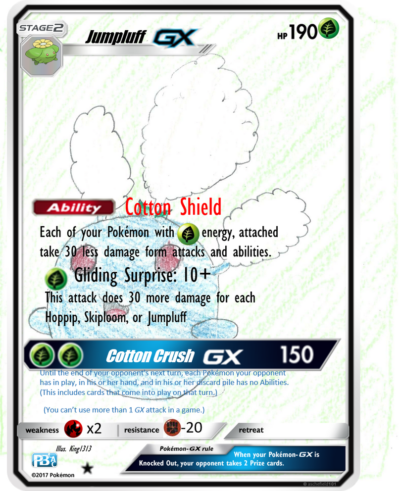
For someone new to TCG Faking, this was a brave undertaking. Not only have you jumped in at the deep end by entering the Image-Based contest, you also chose to create a Pokémon-GX! GX cards have a lot of “moving parts” that give creators a lot to think about, so credit to you for your efforts.

Speaking of those “moving parts”, it’s immediately apparent which bits of your card aren’t quite right.

Below are the errors to address:
  • Font and size for the Pokémon’s name, Ability and attacks is incorrect.
  • Ability and attack effect text should use the ‘justified’ alignment.
  • The Energy symbol in the Ability’s effect should be shown as a font.
  • Attack, weakness and resistance Energy symbol sizes are too large and a bit blurry.
  • The weakness and resistance ‘x2’ and ‘-20’ are too large and in the wrong font.
  • The rarity symbol is incorrect (should be a white star for Pokémon-GX) and is too large.
I highly recommend reading the ‘Faking Resources and Help - Designing Original TCG Cards’ thread in the ‘Creative Works’ section of the forums. This will provide you with all the resources you need (correct symbols, fonts, etc.) and some handy guides for how to implement them. You’ve had a good crack at it but, by following the guides, I’m sure you will improve dramatically.

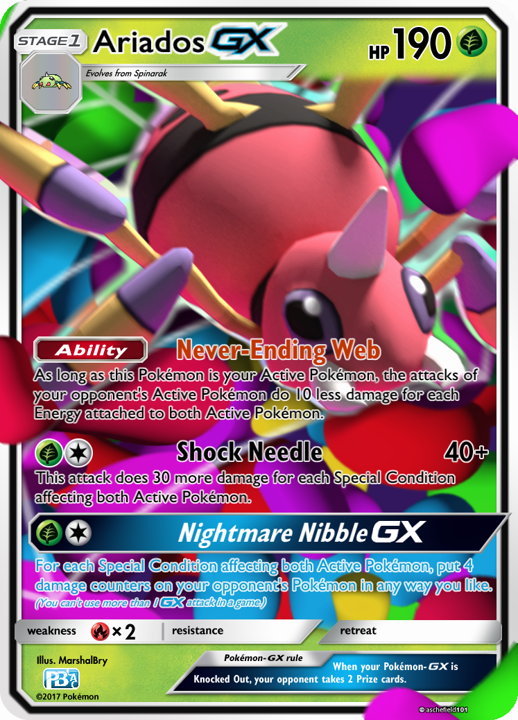
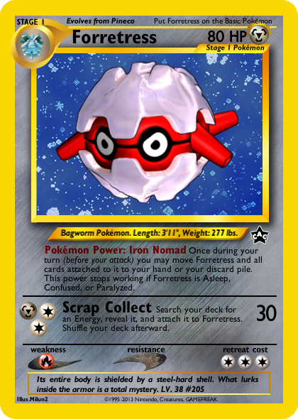
As for the feel of the card, I think you’ve struck a good balance – well done. 190 HP might be a bit on the low side for a Stage 2 Pokémon-GX but it’s not outside the realms of possibility for a Pokémon like Jumpluff, which typically has low HP (the latest Jumpluff card, from Steam Siege, has just 90 HP for example). However, you’ve offset this against a wonderfully named Ability that really fits with Jumpluff’s fluffy theme and reduces the damage it takes (though I’m not convinced it should reduce damage from Abilities). Furthermore, Jumpluff cards typically have low attack costs for low-to-medium damage – Gliding Surprise is, again, a good name for an attack and peaks at a respectable 130 damage. That’s a lot for 1 Energy, but the fact it’s difficult to move above this amount, plus it’s coming from a Stage 2 Pokémon-GX, stops me from considering it over-powered.

The GX attack another dimension to Jumpluff-GX entirely. Again, great attack name – ‘Cotton Crush’ is perfectly suited to the effect of the attack and could be game-changing if used at the right time, which is just what you want from your GX attacks. [G][G] is a low cost for the combination of big damage and a great effect; it feels too low but actually falls somewhere between Machamp-GX’s Muscle Punch GX (which is too costly) and Golisopod-GX’s Crossing Cut GX (which is decent without being overpowered).

Your hand drawn artwork is great, though I think it would be better suited to a non-GX card. Over the years, several cards have used this hand drawn style to great effect and I can certainly see your Jumpluff artwork working the same way. On a GX card, however, I’m looking for textures, holosheets and more detail that makes the Pokémon pop out of the card, which is difficult to achieve with a 2D style. Also, watch out for the artwork popping out of the right side of the card – crop this next time!

Overall, a decent first attempt but with lots of room from improvement. I’m not sure what software you’ve used to create your card, but I would highly recommend downloading Photoshop (CS2 is now freely available from the Adobe website). From there, download the correct font and symbol packs and read through the guides on the forums. Best of luck!

_______________

Wording errors:


  • You are missing necessary clarifications, such as when Weakness/Resistance should apply (before or after Cotton Shield’s damage reduction), and your sentence structure is close but not quite right. Cotton Shield’s effect should read: "Each of your Pokémon that has any [G] Energy attached to it takes 30 less damage from attacks (after applying Weakness and Resistance). [-3 points]

  • Gliding Surprise’s effect is missing clarification as to whose Pokémon it includes (yours, your opponent’s or both) and where they need to be to add damage (hand, Bench, in play, discard pile). Based on what you’ve put forward, I believe it should read: “This attack does 30 more damage for each Hoppip, Skiploom, Jumpluff and Jumpluff-GX you have in play”. [-3 points]

Fonts and Placement errors:


I’m afraid I cannot award any points for fonts and placements as there are too many errors;

  • Incorrect font for the Pokémon name.
  • Incorrect font for Ability and attack names.
  • Incorrect font for Ability and attack effects.
  • Energy symbols are not correctly aligned.
  • Energy symbols are not correctly sized.
  • Text alignment for Ability and attack effects should be justified.
_______________

Creativity/Originality: 10/15
(Thematically, your Jumpluff-GX really works. The Ability and attack names are fantastic and tie nicely with Jumpluff’s vibe. However, you lose points because neither the Ability or the attacks are truly original, per se, as they’ve been seen on other cards in some form (Raikou BKT, Passimian SUM, Greninja BKP.))

Wording: 9/15
(You missed some necessary clarifications for Cotton Shield and Gliding Surprise and the sentence structures were not quite right. Perfect wording for the GX attack.)

Fonts and Placement: 0/10
(This is your area for improvement! Download the correct font and symbol packs, read the guides on the forums and I’ve got no doubt you’ll do much better next time.)

Believability/Playability: 3/5
(There’s some good ideas in here and I can see something similar being released in the future, however it would have 3D artwork that GX Pokémon typically have and the wording errors would be fixed.)

Aesthetics: 1/5
(Good thinking with the hand drawn artwork, but it’s not suited to a Pokémon-GX. Furthermore, you’ve skimped on the textures and holosheets associated with a GX card. I’d recommend building your skills on simpler, non-GX cards first (it was good practice for me too.))

Total: 23/50

rdkvIMP.png


Wow Yog, this card looks great! I’m immediately struck by the Scizor leaping out at me; it’s very fitting artwork.

One of the things that’s important to me, when creating or judging fakes, is whether the card feels real – can I picture this being released in an upcoming set or as a Promo? The answer for your Scizor is a resounding ‘Yes’!

As you pointed out in your balance notes, this Scizor feels like a tribute to its BCR brethren; a card that I always kept my eye on as a fun-tech for an EX-dominated metagame and, whilst we’ve been given updated Safeguard Abilities (Alolan Ninetales BUS), we’re yet to be given a Resistance Blizzard-type attack for Pokémon-GX in the SM block. Judging from the hype, we’ll be living in the world of Gardevoir-GX very soon, so your Scizor is a timely introduction for both its Metal typing and its Steel Slash attack.

The second attack is brilliantly balanced and fits right into that category of “nearly great”, to the extent it’ll sucker some people into building a deck around it. On its own, the damage scale is a bit underwhelming but, as you say, there are plenty of support cards that make this oh-so tempting to take to a League Challenge.

Your wording and placements are on point and you’ve clearly put time into mastering non-GX SM era fake cards and I think this might be your best yet. The only error that stands out is the font for the Pokédex entry however, as none of the Creative Team (myself included) know what the actual font is (it’s notably absent from the SM font pack), I’m happy to let it slide.

Overall, it might not be the most creative card in terms of whacky effects, but you’ve put a lot of thought into the balance and visual appeal such that it feels like a genuine Pokémon card. The reverse holosheet has been implemented nicely and although it’s not quite as shiny as your Venipede from last month, it still looks fantastic. Great work!

_______________

Wording errors:


None


Fonts and Placement errors:


None


_______________

Creativity/Originality: 9/15
(You win points for the way you’ve balanced the card but Steel Slash is just a slightly updated version of the attack from BCR’s Scizor. Counterweight is a nice attack name, with a fitting effect, but has been seen before (e.g. Team Aqua’s Kyogre.))

Wording: 15/15
(No mistakes.)

Fonts and Placement: 10/10
(No mistakes.)

Believability/Playability: 5/5
(Where you’ve dropped points in the Creativity department, you’ve made them up in Believability; so much so, that it’s only a matter of time before we get a version of Steel Slash’s effect in the TCG. Counterweight is a classic example of an attack that could be good, given support – these types of cards are released in every set.)

Aesthetics: 4.5/5
(Great, fitting artwork and excellent application of the reverse holosheet. The card looks fantastic. There is only one teeny, tiny error that loses – 0.5 points: the Scyther art should carry a slight bevel effect and have a black outline.)

Total: 43.5/50

sudowoodo_gx_ra__animated__by_edwinsantander59-dbgeckc.gif


Holy moley this card looks gorgeous! You fine fellows have done an amazing job of creating a card with striking visual appeal. Furthermore, it looks like a genuine GX card with amazing artwork. Well done!


On the flip-side, whilst the animated effects are a nice touch, I find them a bit distracting (especially the falling leaves). I think you’d benefit from perfecting all the basic elements of your blank, fonts and placements before adding superfluous effects.


Speaking of which, let’s talk about your blank. The shininess you’ve managed to generate is incredible, I cannot commend you enough. However, you seem to have added an emboss effect in lots of places where there shouldn’t be one. Take the footer, for example; you’ve embossed the illustrator text, set symbol, rarity symbol, the GX rule box, the GX rule text and the weakness/resistance/retreat bars. If you pick up any genuine GX card, you’ll see that these things are flat (i.e. no bevel and no emboss).


The card’s Abilities and attacks are all comically linked to what we know of Sudowoodo’s personality and I really like the thinking behind the effects. However, the names could use a bit of work, “Wet Flee”, in particular, sounds unfortunately euphemistic. “Forest’s Call” is a cool attack and, while it’s rare for an attack to reference a Pokémon not from the user’s evolutionary line, I think this is one of the cases where the effect is believable. The one notable oddity, however, is that you can’t target the opponent’s Active Pokémon – perhaps this was an oversight?


The GX attack is very creative but, blimey, 3 times? I would think 2 times would be good enough. I can see many a broken combination with Ninja Boy on the turn following Pseudo Punch GX.


Overall though, great creativity, cool attacks and a visual delight. The only thing letting you down is the minor details. Address this and you’ll be on to a winner!


_______________

Wording errors:


· There is an unnecessary comma after “Trevenant EX”. [-1 Point]


Fonts and Placement errors:


· The ‘GX’ and ‘EX’ in “Forest’s Call” should be the same font as the rest of the attack’s effect. [-1 Points]


· There should be 1 more pixel between the Energy symbols for the attack costs for both “Forest’s Call” and “Pseudo Punch GX”. [-1 Point]


· The phrase “(You can’t use more than 1 GX attack in a game)” should be in a smaller font size than the rest of the GX attack’s effect text. [-1 Point]


· The rarity symbol for a GX should be a white star. [-1 Point]

_______________

Creativity/Originality: 13/15
(I love what you’ve done with the Ability and attacks. Each of them really suits a Sudowoodo card and the GX attack is unique. However, you just lose some points for awkward Ability and attack names.)

Wording: 14/15
(Only a minor mistake in the “Forest’s Call” attack. You did a god job with the wording for the GX attack, which could have been tricky.)

Fonts and Placement: 6/10
(A few minor mistakes. It’s all about attention to detail!)

Believability/Playability: 3/5
(This is somewhere in the middle. A lot of this card is -nearly- believable but is either a bit too whacky (attacking 3 times!) or doesn’t quite feel right for a real card (e.g. Fire resistance) but, on the whole, it’s believable for a Sudowoodo.)

Aesthetics: 5/5
(Visually beautiful! The artwork, the shine and the overall feel of the card is amazing. Personally, I’m not a fan of the animation effects but, I won’t mark you down for this. Furthermore, there are some very minor errors in your blank (namely, the emboss effects) but they barely detract from the card’s visual impact. Great work!)

Sub-total: 41/50

Edit Penalty [-2 Points]


Total: 39/50

x4eKGrs.png


What a great throwback to the days of the Neo-series. I love the overall feel of the card. Good job in capturing that classic tone.


“Iron Nomad” is a cool name for a Pokémon Power and has an interesting effect. “Scrap Collect” is suitably powered for this era and has good synergy with the Pokémon Power. Combined with Iron Nomad, you can draw Metal Energy from the deck, take less damage and then return Forretress to your hand before it gets Knocked Out. I like the thinking behind this.


In terms of its competitive viability, I think Forretress would have struggled with the Neo formats. This era was dominated by Sneasel, Slowking and Rocket’s Sneak Attack and it would take something equally broken to break the stranglehold these cards had on the format.
_______________

Wording errors:


· The phrase “This power stops working…” is used for Pokémon Powers that have passive or non-optional reactive effects. In this case, “Iron Nomad” is a proactive effect which can be triggered at any time during the user’s turn, therefore the correct wording should be “This power can’t be used if Forretress is Asleep, Confused or Paralyzed.” [-2 Points]


Fonts and Placement errors:


· The “30” damage is quite a way off from where it should be as it should vertically align with the outside of the picture’s border. [-2 Points]


· The font for “Scrap Collect” is a touch too large. The font size of the attack name should scale with the font size of the effect text. [-1 Point]


· You forgot to add a rarity symbol or Promo number! [-1 Point]


· The Pokémon name should be 4 or 5 pixels more to the right. [-1 Point]


· Pineco’s art should be centred and fill the pre-evolution circle (reference Neo Discovery Forretress.) [-1 Point]


_______________

Creativity/Originality: 12/15
(You’ve clearly flexed your creativity muscles in coming up with this Forretress. The Pokémon Power is novel and Scrap Collect’s ability to target Special Energy makes it quite original, especially for the Neo era.)

Wording: 13/15
(One mistake in the phrasing of the Pokémon Power. Wording is quite tricky for this era but I think you did a great job overall.)

Fonts and Placement: 4/10
(A few small to medium mistakes that are apparent on close inspection.)

Believability/Playability: 4.5/5
(I could absolutely see this being released way back when. The Pokémon Power and attack are viable without being overpowered. However, I’m not sure Forretress would survive in the Base-Neo or Neo-On metagames. Furthermore, all Metal cards released in this era have a [G] resistance, and I would expect Forretress to have the same.)

Aesthetics: 3.5/5
(It looks good but it’s lacking some panache - the plain blue background behind Forretress is dull, which is unfortunate because Forretress itself looks great.)

Total: 37/50

nSUACx6.png


Woohoo, a firey Magmortar – good choice mate! I love the style of the artwork (though I swear this was used by someone else last month…).


Magma Blaster is a neat Ability and a necessary damage booster considering the low output of Electromagma. 60 damage is a high boost but you’ve sensibly decided to not make this stack with other Magma Blaster Abilities.


Electromagma is interesting. It’s a neat interaction with a Pokémon from a different evolutionary line and it builds on the connection between Magmortar and Electivire that was alluded to in Furious Fists. The dual energy cost is a touch odd but makes sense in the context of the attack’s effect and makes it more difficult to instantly repower following the discard on the previous turn. All in all, I think you’ve balanced the Ability and attack very well.
_______________

Wording errors:


None


Fonts and Placement errors:


· The colour of text for the Ability is a bit too orange. Fire Pokémon have a darker shade of red for the Ability to make up for the red background of the card. [-1 Point]


· “Illus. ishmam” and “July CAC” in the footer should be in bold. [-1 Point]

_______________

Creativity/Originality: 12/15
(It’s subtle, but this is actually quite an original card – great work! Discarding Stadiums is novel and the dual energy cost is a neat idea in light of the attack’s effect.)

Wording: 15/15
(No mistakes, excellent work. Great use of references for precedence.)

Fonts and Placement: 8/10
(Wrong colour for the Ability name text and a teeny tiny error in the footer, otherwise excellent.)

Believability/Playability: 4/5
(A very well balanced card but I’m not convinced it would be released with a dual energy cost (even though I really like that.))

Aesthetics: 3/5
(Fitting art and an overall nice feng shui. Just could do with something to make it really standout. A pity there’s no holosheet.)

Sub-total: 42/50

Edit Penalty [-2 Points]
Total: 40/50

Suicune_CaC.png


Oooh, what a spooky and mysterious Suicune.


Till the End is a neat little deterrent of a Poké-Body, which happens to fit the ghostly feel of the card. However, considering Poké-Bodies are typically related to the Pokémon’s body (the clue is in the name), I think this effect would feel better as a Poké-Power.


Sudden Chill has a hefty cost but, in this era, snipe damage is very powerful. However, I can’t help but think taking four turns to power it up isn’t quite worth the effect.


The artwork is well drawn but leaves me wanting. It’s a touch bland for my liking and Suicune doesn’t pop out enough. Also, the paint splats in the bottom right and top left take your eye away from the Pokémon.


You’ve done a good job with the holosheet and your fonts and placements are on point. Overall this is a solid submission. Good work.


_______________

Wording errors:


None


Fonts and Placement errors:


None

_______________

Creativity/Originality: 10/15
(Cool effect for the Poké-Body but not adventurous enough to score higher.)

Wording: 15/15
(No errors. Excellent work.)

Fonts and Placement: 10/10
(All looks good.)

Believability/Playability: 5/5
(I could absolutely see this having been released during the HGSS era.)

Aesthetics: 2.5/5
(The artwork is nice but doesn’t quite work for a Pokémon card; I find it a bit too one dimensional. However, you’ve done a great job with the holosheet.)

Total: 42.5/50

YTXTSM6.png


*Gulp*


Just the sight of this thing is enough to make a new judge player feel intimidated. I absolutely love this monstrous 4-card M Steelix!


I’ll be honest, this is the best executed “creative” card that I have seen for a long, long time. By “creative” I mean a new or different mechanic to that which is currently released in Standard Format. As a Faker, one of the biggest challenges is to strike the balance between creativity and something that looks like a real card. Here, I think you’ve done an amazing job – the way you’ve combined different mechanics and implemented them, through clever placement choices, is exceptional.


The artwork and background textures are just perfect! I can imagine picking this up in real life and seeing it’s crystal-like shimmer. The way that M Steelix’s threatening grin dominates the top-centre card is intimidating and taunting.


However, as much as it really is an excellent design aesthetically, I have some gripes with the card’s balance. If anything, I think you’ve made it underpowered! I really like what you’ve implied through the combined effects of the Ability and attacks: loading a bunch of Energy onto M Steelix and then blowing through the opponent’s entire board with a well-timed Diamond Rush GX. In practice, though, this seems woefully difficult to pull off. Not only do you need all 4 pieces of M Steelix before you can play it down but you need evolve it from Steelix (which ends your turn if you don’t have a Steelix Spirit Link equipped) and if you’re Knocked Out you lose all 6 prize cards! Furthermore, the non-GX attacks have low damage and mixed Energy costs making them cumbersome to power up using conventional means. This card is one heck of a Hail Mary (in many ways, you’ve created the Pokémon TCG’s Exodia) but I don’t see it coming together in a game without a lot of good fortune.


My final gripe is with the cards name. I feel that you’ve come up with such a good concept (combining, Mega Pokémon, Pokémon-EX, Pokémon-ex, Pokémon-GX, Pokémon LEGEND and even Crystal Pokémon) that it deserved to step out of the shadow of what’s come before. I’d like to have seen you come up with a suffix that wasn’t just a combination of previous mechanics and that was, instead, something of your own.


Overall – wow! You’ve clearly been building up to being released from judging duties by having this one in the locker. Amazing work.
_______________

Wording errors:


None


Fonts and Placement errors:


None

_______________

Creativity/Originality: 14/15
(Fantastic combination of past concepts and interesting synergy between the Ability and attacks. I’m yet to see anything quite like this. Unfortunately, you drop a point for not taking yourself seriously enough and giving this mechanic a suffix that isn’t just a combination of past mechanics.)

Wording: 15/15
(No errors. Excellent work.)

Fonts and Placement: 10/10
(A great job of making the card feel realistic through clever placement choices.)

Believability/Playability: 2.5/5
(It hurts me to say but, as much as this looks like a real card, there are elements that let it down slightly. The balance isn’t quite there (I think it’s under powered) and the ‘EX ex GX LEGEND’ suffix is a stretch of the imagination!)

Aesthetics: 5/5
(I almost fell out my chair when I first saw this. Textures, amazing art, vibrant colours – this has everything)

Total: 46.5/50

-kOC-IKika_SjK-kAeMKaSmAzH_hqemf1fDKPrTNVoWZmX1ADgjWVG96Dps6yKtvSkJ6Q8UG8G1MaXTmB9ZOTs5Pvuu3e2FwzOh2pA2ouCZ1wBikLaTXQ2IBMpKrsFStzmMv2MXkLS5uW9Q0XSmvhTzqAKjTe8jCI4eyEp2mr7JLDNQW5mOWiV6aUTRmvXrPhASX0iG0F-2m86vIsJCZcPVov1M81-3nWallSyAM7DCP4fO2eebax72IBnfiC6g0Lrg-kJsfkL4PcXdN5XOSHftXtPWpZg5ZKCTjDXRmA5Cgd6ZtbbotgkxSm-VemMkW7zz317k6nhkbRvhKHiMYSMXws_2DV3McXmzORjevjZWnzYmXa7psJcVcUJdrj5hbORfF6832MbCBz98nv7h3sk1UFMQbUhSKQfX1rtavrzmHT1bIzWS8mFZ3SyA4QkFROca2a3y8w8Xx2W2NGva0S74bN24Qgc5-BYxnL48ml0YK6viSC6OfFSS_1CtHxCH6M18eDsfcaSHjmQf8YRvGE1RAmTZH9_3fheGq9V8RSLTdm3JzR0FoZJg4b5_4sqnetZkBfmwTYShIOTM7IEpzg6zqsNtEDi3Tkd4IDPX6SlE3IKtt2uUOn6Y1xD7QlUkqm6Qk_Z9QQ0j6LgpzzwYwtCWVAjjyCKpDbU7JDxKmTR4IgQ=w659-h927-no


I’ve kept an eye on your CAC entries over the past few months and I always enjoyed seeing what you come up with and, with Lanturn, I think you’ve produced some of your best work!


Your blanks are always gorgeous but sometimes it can be hard to read the text through all the sparkle; luckily, there’s no problem here. This Lanturn is a card full of text and it’s a very welcome throwback to times prior to the systemic simplification of the Pokémon Trading Card Game. With lots of text, the risk is that the effects are overcomplicated but here I think you’ve done an excellent job of creating an interesting but well balanced Ability alongside a synergistic attack. Unfortunately, there are a few mistakes in the wording of the Ability but many of them are minor and, overall, I think you did an excellent job of implementing an inventive effect.


Your artwork is simply fantastic and, alongside the holosheet, it really brings Lanturn to life. I have a lot of respect for Fakers that bring their own artwork to the party and you’ve come up trumps again!
_______________

Wording errors:


· You need clarification depending on your intentions for the Ability’s effect, i.e. if your intention is for up to 3 [W] and up to 3 [L] Energy to be targeted or up to 3 in any combination of [W] and [L] Energy. I suspect the latter, in which case the correct wording is “… for each Pokémon in play (yours and your opponent’s) you may choose up to 3 in any combination of [W] and [L] Energy attached to that Pokémon …” [-2 Points]


· The phrase “will provide” should instead be “provides”. [-1 Point]


· “You can’t use more than 1 Ionization Ability per turn”. [-1 Point]


· The Ability’s first line should read “Once during your turn (before your attack) …”. [-1 Point]


· In the final line of the Ability, “ability” should be capitalised. [-1 Point]


Fonts and Placement errors:


None (custom blank).

_______________

Creativity/Originality: 13/15
(Smart synergy between the Ability and the attack with some rarely-seen effects coming into play. Ionisation opens a lot of options for Lanturn and I love how you snuck in the potential for forcing your opponent to miss their draw for turn!)

Wording: 9/15
(One sentence structure mistake and a handful of silly, minor errors. Nothing you can’t fix for next time!)

Fonts and Placement: 10/10
(Gorgeous custom blank. My only suggestion is to make both Energy symbols in the top right corner visible – the [L] is a little hard to see below the [W].)

Believability/Playability: 4/5
(It’s hard to judge when something like this would have been/will be released but I can an Ability akin Ionization coming our way in the future.)

Aesthetics: 5/5
(I think this is your best work to date. The artwork, blank and overall feel of the card is spot on. This is showcase material, well done.)

Total: 41/50

ZQp77u7.png


What a cute Delibird!


The first thing that stands out is how adorable the artwork is. One of the best things about the HGSS era is the fantastic and varied art. I can see this Delibird fitting straight into any of the sets with this wonderfully Christmassy scene of Delibird doing some good old fashioned present-delivering – Santa style!


Going with the Santa theme, you’ve come up with a great name for the Poké-Power. Secret Santa works on so many levels and, as you said in your development notes, you could use this in a similar way to Tapu Lele-GX (as draw support) or in more creative ways (such as discarding your opponent’s resources). This is unique, interesting and well balanced – just the type of effect we could do with seeing more of.


Clumsy Courier is a cute name for an attack, the effect is fitting and it does expand Delibird’s use as a support Pokémon but also takes up your attachment and attack for turn. It [W] decks that could use the recovery, I could see Delibird being played as a 1-of but not much beyond that (unless in mill/stall as you’ve suggested).


As much as the aesthetics are pleasing, something doesn’t feel quite right about the card. It looks as though you’ve not used the correct font for the Ability and attack’s effects. It’s a pity as it’s the only real blemish on an otherwise great creation.


_______________

Wording errors:


None.


Fonts and Placement errors:


· Incorrect font used for the Ability and attack’s effect text. [-3 Points]

_______________

Creativity/Originality: 11/15
(I love the thought you put into the Ability and the decisions taken to balance it but the attack leaves me wanting a bit more.)

Wording: 15/15
(None that I can see. I think you did a good job of wording what is a tricky effect in the Ability.)

Fonts and Placement: 7/10
(Placements are all fine but, unfortunately, you’ve used the wrong font for the Ability and attack’s effects.)

Believability/Playability: 4/5
(The overall feel and power level of the card is fitting for the HGSS era. As previously mentioned though, the attack’s effect and energy cost limit Delibird’s playability.)

Aesthetics: 3/5
(The art and feel of the card is lovely but I’m a touch disappointed that Delibird itself doesn’t stand out more. Furthermore, the Energy symbols used for the Weakness, Resistance and Retreat are a touch blurry – not sure what’s happened here. Otherwise lovely!)

Total: 40/50

zSS9uCG.png


Ariados! Good choice my man!


Never-Ending Web is a cool Ability, with a fitting effect. I can just imagine the opponent’s Active Pokémon struggling in Ariados’ web (and doing less damage as a result). This is well executed. In fact, both the attacks also have cool names; I especially like the alliteration of Nightmare Nibble GX – boy that would be satisfying to announce.


Both Shock Needle and Nightmare Nibble GX are suitably linked to Special Conditions, which is fitting for the big poisonous spider but I’m a bit perplexed that Ariados-GX itself can’t inflict any Special Conditions. If you want to make the most of this card, you’ll have to combine it with support cards. The most obvious support cards are Salazzle (Guardians Rising) and Ariados (Ancient Origins); unfortunately, the former requires you to run another Stage 1 line and the latter is rotating from Standard come September. Furthermore, I’m not convinced that the attack’s effects should be linked to Special Conditions affecting both active Pokémon – it doesn’t quite fit with the attack’s names and the context of this Pokémon.


The artwork is suitably 3D per every GX card released to date but loses some appeal by being a touch out of focus. It’s nearly there but doesn’t quite work. I’d also like to have seen an attempt at a holosheet to give it a bit more panache.


Overall, your Ariados-GX is a solid fake card with some interesting effects, it could just use a bit of a touch up to push it on to the next level.


_______________

Wording errors:


· For the Ability I would use the precedent set by Steam Siege’s Klinklang, thus the correct wording would be “Any damage done to this Pokémon by an opponent’s attack is reduced by 10 for each Energy attached to both Active Pokémon (after applying Weakness and Resistance).” [-3 Points]


· You missed the clarification as to when Weakness and Resistance applies for the Ability’s damage reduction effect. [-2 Points].


Fonts and Placement errors:


· Justify text for the Ability and attack effects. [-2 Points]


· The GX symbol in the Pokémon’s name is a bit big and too close to “Ariados”. [-1 Point].


· Spinarak should be a touch larger, have a bevel effect and a black stroke effect. [-1 Point]


· “Illus. MarshalBry” should be in bold and italicised. [-1 Point]


· You forgot the rarity symbol. For a Pokémon-GX, it should be a white star! [-1 Point]

_______________

Creativity/Originality: 10/15
(Never-Ending Web and Nightmare Nibble GX are aptly named with interesting, novel effects. Shock Needle is a solid attack but almost a direct port of Alolan-Muk-GX’s Chemical Breath.)

Wording: 10/15
(A couple of mistakes in Never-Ending Web but good otherwise.)

Fonts and Placement: 4/10
(Some unfortunate little mistakes here and there that have built up. It’s all about the attention to detail!)

Believability/Playability: 3/5
(You’ve made an Ariados-GX that feels -almost- authentic. With a bit of refinement, I could see this being released. You’re certainly going in the right direction by focussing on Special Conditions. On another note, I’m not convinced Ariados would have free retreat these days – that spider is slow!)

Aesthetics: 3/5
(Squint and it looks like a real card, look closer and you can see the art is a little blurry. A shame that Ariados’ face is partially obscured by the Ability text. Furthermore, a holosheet could have brought this more to life.)

Total: 30/50

ho-oh5-png.13793


What Johto themed month would be complete without a sparkly Ho-Oh! This artwork is truly lovely illustration, well suited for a fake card – good choice. I love the way you’ve implemented the holosheet too; the choice of holo gives off a Promo card vibe, which I further backed up by the decision to replace the Pokédex entry with a commemorative watermark celebrating 20 years of Pokémon! I like twists like this to keep things fresh – nice one.


By basing the Ability and attack around multiple types of basic Energy, you’ve neatly adhered to Ho-Oh’s long-running rainbow theme. Rainbow Wings has a strong effect which, for a strict trigger condition, is necessary to boost the card’s playability. However, I think it’s a touch under-powered as you’ve made it so that you need 4 different basic Energy attached to Ho-Oh; this really makes the Ability difficult to use as you’d need 4 separate attachments to get it going. Furthermore, Mystic Force is a touch underwhelming too. Personally, I think the attack works much better as 30 damage plus 30 more damage for each different type basic Energy (as opposed to multiplied, let alone on a coin flip!).


Unfortunately, there are a few wording and placement errors that lose you points but overall, I like what you were aiming for and think you delivered an aesthetically pleasing and interesting fake card.


_______________

Wording errors:


· The Ability uses an incorrect sentence structure, the following would be correct: “If this Pokémon has 3 or more different types of basic Energy attached to it, your opponent can’t attach any Special Energy cards from their hand to their Pokémon.” [-2 Points]


· Wording for the attack should be “Flip a coin for each different type of basic Energy attached to this Pokémon. This attack does 30 damage for each heads”. [ -2 Points]


· In the Ability, “three” should be “3”. [-1 Point]


· In the Sun & Moon era, “his or her” is replaced by “their”. [-1 Point]


· The “Basic” in “Basic Energy” should be lower case, i.e. “basic Energy”. [-1 Point]


Fonts and Placement errors:


· Ability and attack name font is incorrect (compare the ‘W’ in Rainbow Wings with that of Wimpod from Guardian Rising’s ‘Wimp Out’ Ability). [-3 Points]


· Ability and attack names should be vertically aligned. [-2 Points]


· Incorrect font used for the Pokémon’s characteristics (height, weight, etc.) [-1 Point]


· Ability should be positioned slightly higher up the card. [-1 Point]

_______________

Creativity/Originality: 10/15
(An interesting take on Ho-Oh that introduces a new Ability but doesn’t break the attack is tad underwhelming.)

Wording: 8/15
(A number of little mistakes, many of which can be avoided in future.)

Fonts and Placement: 3/10
(Some unfortunate errors with fonts and alignments. Double check next time around!)

Believability/Playability: 4/5
(You did a great job of making this feel like a real Ho-Oh card, however the Ability and attack are under-powered so I doubt this would see play. I could certainly see it being released as a Promo, however.)

Aesthetics: 4/5
(Gorgeous art and a nice touch with the commemorative ‘Pokémon 20’ watermark.)

Total: 29/50

morty_s_misdreavus__cac_july_2017__by_tylercomfyhat-dbht472.png


Man, I love Owner’s Pokémon and Pokémon from the Base Set and Neo eras, so this card ticks some good boxes straight away.


Aesthetically, this card looks dope – I mean, look at that sinister stare and smile on Misdreavus. The fact that you illustrated this card yourself adds to the allure, there are some very talented artists on this forum and you are clearly amongst them. Excellent work.


As for the Pokémon Power and attack, I like what you’ve gone for; the names are very suited to a cheeky-but-dangerous Misdreavus and I can absolutely see it vanishing and placing curses on its opponents. The Pokémon Power feels like a bit of a throwback to Fossil Haunter’s ‘Transparency’.


I do think there is a balance issue with the Pokémon Power though, as -30 resistance damage in this era was already such a big deal, throwing in scaling damage reduction that’s easy to pump up to 30 (or beyond if your opponent has Pokémon named Misdreavus and/or Mismagius in play) is whack, especially when Morty’s Misdreavus has no weakness!


The attack is decent and could be very powerful but you’ve balanced this with a coin flip and an automatic discard requirement, which I think works well. Unfortunately, attacks like this rarely saw the light of day thanks to the omnipresent shadows of Energy Removal and Super Energy Removal. Even so, it’s workable and has decent damage and effect.


Overall, this comes across as a genuine card and a real throwback to a bygone era. You even put in the Pokémon’s Level, which is a nice touch - good stuff Tyler.


_______________

Wording errors:


· The Pokémon Power reads “For each Pokémon in play named Misdreavus or Mismagius (other than this one) …”, however I don’t think the brackets are necessary here. This card is not called Misdreavus, it’s ‘Morty’s Misdreavus’ so the clarification is not necessary. [-2 Points]


Fonts and Placement errors:


None.

_______________

Creativity/Originality: 11/15
(A solid Pokémon Power and attack that both take existing concepts and add a bit of spice. The Pokémon Power and attack names fit Misdreavus excellently and the original artwork gives a sinister feel to the card.)

Wording: 13/15
(One minor mistake in an era notoriously difficult to word. Not bad at all.)

Fonts and Placement: 10/10
(None.)

Believability/Playability: 4/5
(A very believable card. I wouldn’t be surprised if this were real, the one thing that stops me from awarding full points is the slight power imbalance this Pokémon Power introduces to this era. This would make a great wall in a stall deck but I’m not sure that was the intention!)

Aesthetics: 5/5
(Fantastically illustrated art and excellent placements add up to a card that looks genuine. Brilliant!)

Total: 43/50

shininghoohentry_zpsx5fuxp68.png


Holy smokes!


Blui is back with another Shining Pokémon and I couldn’t be happier. This immediately stands out for its mind-blowing beauty! The artwork is superb, the blank and holosheet both look super sparkly and you’ve done a great job making the holosheet poke through the Pokémon’s name and on certain parts of the artwork. What’s more, the amount of text on this card, the Poké-Power and the multi-Energy cost lets me know straight away that this card is interesting as heck. Also, on a side note, great job of modifying the ‘Shining Pokémon rule bar’ below the picture frame – it looks completely natural here is much improved from last month’s Shining Golduck.


Shining Rebirth and Golden Wing have great synergy, are a fantastic to nod to Ho-Oh’s mythical connection to the Legendary Dogs and make use of the woefully underused Lost Zone concept. Your creativity shines through in the naming, effect and balancing of the Poké-Power and attack and I love the cycle of giving life to new Pokémon (i.e. the Benched Pokémon you are powering up with Golden Wing), fading to the Lost Zone and then being reborn. It’s fitting for any Legendary Pokémon, especially this phoenix.


Put simply, this card is gorgeous and I wish I had one in my binder. Very well done.


_______________

Wording errors:


· Golden Wing should read “If you do, shuffle your deck afterward and put Ho-Oh and all cards attached to it in the Lost Zone.” [-2 Points]


Fonts and Placement errors:


None.

_______________

Creativity/Originality: 15/15
(I didn’t want to give out a top score for creativity, as it should be so hard to come up with an original and well-crafted concept that a perfect score is nigh unobtainable, but here you really have cracked it. The combination of Poké-Power and attack work together on so many levels that you’ve clearly thought long and hard to come up with this gem. Amazing.)

Wording: 13/15
(One minor mistake in sentence structure for the attack. Other than that, excellent.)

Fonts and Placement: 10/10
(None.)

Believability/Playability: 5/5
(Never mind whether this could be released – it should be released!)

Aesthetics: 5/5
(Excellent blank, artwork, holosheet implementation and general feng-shui.)

Total: 48/50

3rd Place: Yog’s Scizor, with 43.5/50 points.
2nd Place: Jabberwock’s Jabberwock’s M Steelix-EX-ex-GX LEGEND, with 46.5/50 points.
1st Place: Blui’s Shining Ho-oh, with 48/50 points.
 
Top