Contest PokéBeach Create-A-Card: April 2017 - PokéDex Colours - Results Are Up!

Deku

The Starving Artist
Member
Ah, I made it in time! I will not be repeating this, that was quite stressful! Hopefully I didn't mess anything up!

lrowdLf.png
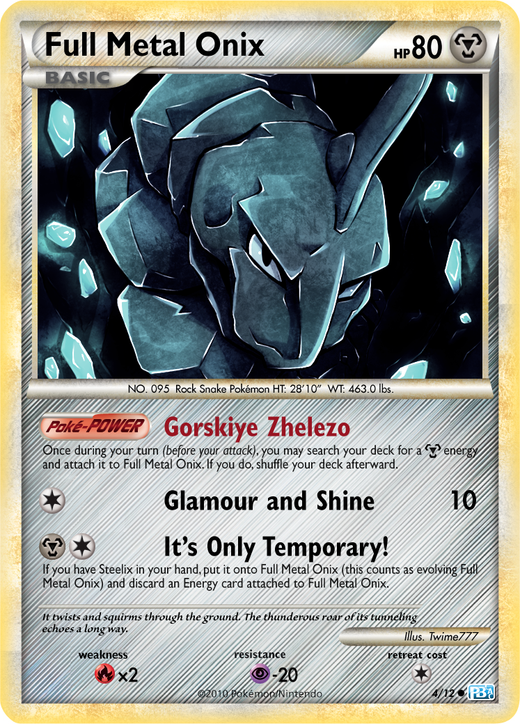
Full image: http://i.imgur.com/lrowdLf.png

I probably forgot something on the card. Oh well.
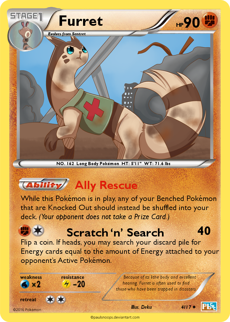
- I don't exactly know why I picked Furret, but for some reason I came up with the idea of a search and rescue themed Furret. I think it would be able to squeeze through small spaces and dig out survivors. Thus I themed its ability, attack, and Pokedex entry after the theme of search and rescue.
- I tried to make the card playable though not overpowered, but considering that I know very little about the competitive scene I probably made a really lame card.
- At first I wanted to use a Sun and Moon blank, but as of now there are no Sun and Moon blanks for fighting types.
- Also, the card originally had two attacks, but I quickly came to realize that it would not fit as both attacks had effect text. Thus I just used the one attack and modified it a bit.
- I know I messed up with the text sizing and such in some places, I haven't quite got the hang of that.
- The artwork didn't turn out as well as I'd have hoped, I went for a more simplistic style than my usual to better match the styles of the official card artists, but creating simplistic backgrounds that look good is surprisingly tricky.

Artwork: Me
Blank: http://fav.me/d9yel5q
Symbols: http://fav.me/d6wt4h9
 

Yog

Rogue
Member
Whoops, that deadline was stating to make a whooshing sound as it approached. Here is @Jadethepokemontrainer & my collab entry.

o3RCntf.png

This oughtta be Jade's part but I left it too late so I will try to explain the idea here. The bigger attacks are pretty straight-forward. 130 for three (R) attachments is a nice solid number to hit for, for the price. Can be sped up with Blacksmith in Expanded or the many "attach a (F) energy" attacks of other Fire Pokémon. Yet it's not OP to the point of ridiculousness. You will be hard pressed to make this a regular OHKO attack.

The GX is more powerful and much cheaper. Buuut, that's a big risk to have a coin-flip on the single GX attack you get to use in a game. Big risk, big rewards if it pays off.

The first attack is the bread and butter here and the most interesting. With a DCE it's a straight 40 damage. Not great. With a (F) attached you can inflict the Burn status - and suddenly the 40 plus potential 30s is hitting some numbers you'd be quite happy to see. Add a (L) card to the mix and now you're getting to the whole point of the card. Guaranteed Paralysis is a rare thing indeed in the TCG - and indeed, potentially OP which is why it's limited to usually very specific conditions. Here that condition is that you need to attach a mixed energy card that has no synergy with the other attacks on the card. You can try it with Rainbow Energy of course, but that leads to it's own problems. The fact that it is a Stage 2 in the first place will make it difficult to get to a point where you can manage it too. But get to a point where you are paying with (F)(L) and suddenly Typhlosion is extremely difficult to knock out of it's groove.

Hopefully that's a good balance between risk and reward. (And hopefully I've explained Jade's thought process well :p )

First thought is Oh man I suck at deadlines :D

I learned a lot this month though, which is why I try to take part in these even if I'm short on time. Even the slog of tracking down the right source image is more difficult than I'd have thought. It's a beaut though, full credit to Xous. The most interesting part for me was seeing exactly how the GX cards & their effects layer up. Like where the splash goes over the borders, and which bits sit to the front and how something is sharply outlined on the main but only tinted in front of something lke the bar for the GX attack. The lightning crackles are created from scratch too, quite proud of those.

In very general terms I wanted to try create a card where he is really bursting out of the frame in flames and lightning. I think I achieved that much.

Hopefully the text is free of errors. I caught myself on about 15 different ones already but all fixed now. ..I think.

Typhlosion illustration by Xous from dA. link
Frame/Symbols/Template courtesy of @aschefield101 link
All other source no credit required stock images.
 

aschefield101

is behind you !
Member
@Blui - That'd be a thick card with 2 holosheets on. Latios' art prolly could've done with color burn+multiply sheets on, with parts feathered out to duplicate light sources etc.
 

crystal_pidgeot

Bird Trainer *Vaporeon on PokeGym*
Member
I just wanted something easy to understand for my card. It would be interesting to see Hidden Power do something cool in the TCG though. Would make a random Pokemon good.
 

Blui

lv85 paladin
Member
@Blui - That'd be a thick card with 2 holosheets on. Latios' art prolly could've done with color burn+multiply sheets on, with parts feathered out to duplicate light sources etc.

There's only one holosheet (on Latios, the name and the rules box). What's on the light burst is meant to be a texture but I couldn't quite get it looking right. So the card wouldn't be any thicker than any given full art.
 

Celever

Wheeeee~
Member
The turnout this month has been awesome! Great job everyone. :D

Anyway, the deadline has dawned, so... fan-voting has too! Click here to vote. :D

Oh, and don't vote for yourself. It's kinda dirty-handed and stuff.

Deadline for fan voting is at 12PM GMT on the 1st of May. But you might as well just vote now so you don't forget :U
 

Ty Comfy Hat

The Cosmic rage of Astral Dwarfs from Aberdeen.
Member
Haha, I was beginning to think you guys relied on me for this.

Anyway, voted, and good luck everyone.
 

qrorohill

formerly known as TFP
Member
Yeah, best of luck to everyone!

I've seen many cool cards this month, so all of you should keep up making these great fakes!~
 
Last edited:

Deku

The Starving Artist
Member
Yeah, best of luck to everyone!

I've seen many cool cards this month, so all of you should keep up making these great fakes!~
It was really hard for me to pick when it came to voting, there were so many great cards! I learned a lot from this first experience, I'll definitely be entering next month! Plus I won't be shackled by college so I'll have more time to work on it. (Protip, don't take 20+ credit hours in a semester. It isn't worth it.)
 

Celever

Wheeeee~
Member
Fan-Voting Results

Image-Based:
1st:
J.Cole ~ Lucario -- 5 votes
2nd: professorlight ~ Pheromosa δ -- 4 votes
3rd: wonderful_whismur ~ Chili's Crawdaunt-EX, WastedSkyPirate ~ Seedot, Blui ~ Latios δ -- 3 votes

Text-Based:
1st:
double o squirtle -- 8 votes
2nd: TheFlyingPidove ~ Leavanny -- 3 votes
3rd: SneaselGenesis ~ Sneasel δ, Niteclaw1028 ~ Milotic-GX, Vracken ~ Vespiquen, Little Cherrim ~ Octillery, Celever ~ Mantine -- 2 votes

This month was so close, as you can probably tell by the extensive draws! For reference, there were only 2 image-based cards which didn't have at least one vote, and only a couple of text-based cards too.

Stick around for the official judging, and congratulations to all the fan-voting winners!
 

Yog

Rogue
Member
Congrats you two! (And the rest of ye too)

Meanwhile, these suspenders are killing me. No wonder having an entry cap is a good call. Must take a fair bit of time to sift through all the entries.
 

WastedSkyPirate

...
Member
Congrats you two! (And the rest of ye too)

Meanwhile, these suspenders are killing me. No wonder having an entry cap is a good call. Must take a fair bit of time to sift through all the entries.

I'll admit, I didn't join the dots that the entry cap is related to the work that goes into judging but you're absolutely right. Great call to limit the contests to 15-20 participants. Not only must it take a lot of time to go through all the entries but it must be bloody hard to be consistent with scoring across the board.

Good luck to everyone - these suspenders are killing me too.
 

Yog

Rogue
Member
Mmhmm. I was flicking through the scoring for previous months and that's a pretty substantial write-up for every single card the Judges leave. Penny only dropped for me then too.

Good work judges, keep it up.
 

Deku

The Starving Artist
Member
Mmhmm. I was flicking through the scoring for previous months and that's a pretty substantial write-up for every single card the Judges leave. Penny only dropped for me then too.

Good work judges, keep it up.
Yeah, I don't blame them for taking a while. I've done some similar types of judging for other things, and let me tell you it's a very long task. Writing up one substantial critique can take a while, can you imagine writing 15-20? I'd much rather that the judges take their time and write up good critiques for every entry rather than rush them!
 

Luispipe8

Pokémon Professor
Member
Oh, how funny it is for me to run into this conversation considering the post I'm about to make... :p

Already talked to the CW Staff but thought I might as well let you guys know since we're May 4th be with you by now: I had A BUNCH of stuff going on past month, between a new cat, University, Tournament organizing and other minutia; so, as you might expect... my judging is nowhere near finished :'v However, I am committing to you guys that you'll get them by Tuesday (or, if anything else extraordinary happens, one week from today) by the latest. So stay tuned for the results; and sorry for the delays.

Also, it'll be fun to see how ninjas takes the Judge seat for this month. :T
 

Ty Comfy Hat

The Cosmic rage of Astral Dwarfs from Aberdeen.
Member
Sorry for sounding impatient, but will the critique take much longer? I'd like to hear judgement on my card before I work more on my card for this month.
 

bbninjas

Ready or Not!
Advanced Member
Member
Expect the results to be up within the next 24 hours, or 48 hours tops. One of our judges got hit by an unexpected part of life, hence the delay.
 

bbninjas

Ready or Not!
Advanced Member
Member
Image-Based Results

Judge: @Jabberwock

Judge Note: So, before y'all get to the scores themselves, I'd like to note what an awesome month April was for scoring. You guys all really picked up the creativity this month and I must say I'm very pleased. Keep it up in May! ^.^

april-cac-png.13207


All right, first cards first. That Ability sort of reminds me of Dual Armor, in a way. It’s like the one reference to being a [W]-type on the card, except for the blank itself, and it’s a neat little way to tie it in (though tbh a bit more tying couldn’t hurt).

Type-hate tends to not work. I remember a relatively large discussion about it roughly a year back, and here’s the gist of it: There are only eleven Pokémon types in the TCG at the moment. Immunity to one of them is a very big deal. I do like that Soaked Fur is relatively low-key type hate (at least it’s not an Ancient Trait on a Basic or something), but you’re still removing the damage output of one of what are known to be the most offensively-oriented types in the game.

Wording errors:
- “Energy” should be capitalized. x2 [-1.5 points]
- “Your opponent reveals his or her hand” should be “Look at your opponent’s hand.” [-2 points]
- “Energy” -> “Energy card” in the attack. [-1 point]

Fonts and Placement errors:
- Name is too blocky and a couple pixels too low. [-1 point]
- HP is likewise a few pixels lower than it should be. [-1 point]
- Luxio evocon and “x2” are blurry, like they’ve been upscaled. [-1.5 points]
- Pokédex entry font is off. [-2 points]
- Justify text. [-1 point]

Creativity/Originality: 11/15
(Dual Armor-style Ability is a unique way to tie in the [W] typing.)
Wording: 10.5/15
(See above.)
Fonts and Placement: 3.5/10
(See above.)
Believability/Playability: 4/5
(Type-hate.)
Aesthetics: 3/5
(Just a Pokémon on a background.)
Total: 32/50

crawdaunt-edited-png.13277


Ooh, another Singapore-inspired card! One of the big things I was looking for this month was who would be able to draw believable connections between their chosen Pokémon and its new type, and I think you drew a perfect one. It’s even better that you made it an Owner’s Pokémon––Chili himself for the chili crab, no less.

Power levels and mechanics seem about in keeping with Crawdaunt of the past, particularly the most recent one from Primal Clash, in terms of limited uses of very good disruptive effects. I’m a little concerned about Reckless Blaze being usable after only two Energy attachments––the drawbacks are preventable, and 150 for two is very, very good. The other thing is that Paralysis isn’t something you can make a Pokémon do to itself with the effect of an attack, because it wears off at the end of your turn (immediately after the attack). The optimal thing to do for the effect I suspect you intended would be “This Pokémon does 50 damage to itself and can’t attack during your next turn.”

Wording errors:
- “One” in the Ability text should be the numeral “1”. [-1 point]
- “(before your attack)” clause should be italicized. [-1 point]
- Refer to “Crawdaunt” as “this Pokémon”. [-2 points]

Fonts and Placement errors:
- All the fonts look just slightly off––which is odd, because they do look like a variant of Gill Sans to me, which is what it should be. There’s some weird blurring and compression going on in parts of the text, though. Going to dock a solid [-2 points] for all font errors, because you’re using the right font family––just some weird settings.
- Text should be Justified. [-1 point]
- Energy symbols for attack cost are too spaced out. They only need to be a pixel apart. [-1 point]

Creativity/Originality: 12/15
(Cool connection between Crawdaunt and the Fire type.)
Wording: 11/15
(Minor things.)
Fonts and Placement: 6/10
(Something’s up with that variant of Gill Sans.)
Believability/Playability: 4/5
(150-for-two attachments is a little concerning, and Paralysis is never self-inflicted by an attack.)
Aesthetics: 4/5
(Nice customization of a blank for a Gym Leader.)
Edited: -2

Total: 35/50

NUy1_ashVjvZaQ6dj-Olsh9Ls3DQO_ZbKgpoW1c9epAbvXlnKQgG8o78At-54X_996M8roOA3auq8fApo35ITfwFJGaPCSdOxn1KLJ2lU6xbGRfxRq0kijybQRShp9cfIZDVi8HnmHlPTeyNqcl5uvpIzLUarZVP5YIjpqjj91A-2Jq2UIEwbpDBBFwTDyuur3NSEJeiHtWqlts_3buJ36ce8qigTIyk_WFi9ZhLUQR7S6FvB8CbNgveOBJXH2s3kRMG_U1mHyvlDVUAtJEvp-JFKWfbiIZsN2oVW9m3rADS4WFcT1xDotX8te80Jn4sljeYjK_gA0Ug9WBOnKAyNsIUFa6beihixiYGOqSHSytJu2YCnU4iad0wudvmQgRzPiL2vauCnH571ttAEnc7_GZWBUxGNU60igJcXmjpHy86StZFQSp1nuZXVRS6PbrXW-8GxROdQQPRddPBzrKCLZXcpbUaTJIR_s7umLSYEnbM5V_gN6wlYCM75dr2UM9TZEUXz0COc6WjDw3xyMLQuIUpJj0iab27Yqwwm2gEBArPNikbbfuppSp0hvftQhYs5P205gVjZcz0vN9xGg_eFFOxqerb0K5MqkZADiBmtpYNiXw6Nm6G2zFM9c9yWP9HY8gSAYkFdIXxOMAAmOyMshBVxybB7FS2JyjKiijYyQ=w675-h950-no


Nice and sparkly. A Holon effect is a good way to make a Colorless Pokémon interesting, though I’m not quite sure how that fits into Pheromosa. That art is beautiful, though. The only thing I’d say is that the sparkle effect you’ve got on the lower half of the card makes the Energy symbol nearly invisible. Perhaps all the attack text could benefit from the same outer glow you’ve applied to the UB rule, to make it in general more readable.

Wording errors:
Checking wording for your cards is always tricky, Light. I can actually see most of your wording here being actual wording for one era or another (perhaps a future one), so I’m just going to nitpick things that I can unequivocally say are false regardless of era.
- Ability should only work for basic Energy. It’s ridiculous to be able to attach a Rainbow and gain immunity to all types. [-2 points]
- Missing “(before your attack)” clause in Ability. [-2 points]
- Second use of “energy” in Ability should be capitalized. [-1 point]
- Each use of “there’s” in the attack should be “there are”. [-1 point]

Fonts and Placement errors:
- Looks fine. Would tentatively say the upper text should be above the art and not below it, but I can also respect that being a stylistic choice, and you can have a pass for it being a custom blank.

Creativity/Originality: 13/15
(Nice colorful Colorless card with good representation through that of Pheromosa’s real typing.)
Wording: 9/15
(Some missing clauses and grammatical things.)
Fonts and Placement: 10/10
(Looks fine.)
Believability/Playability: 5/5
(Looks balanced enough given the 1-of rule.)
Aesthetics: 4/5
(Very pretty.)
Total: 41/50

cac-apr-2017-png.13227


I’m sure I’ve mentioned by now that that’s a really sweet-looking blank. :p I like that you took the theme one step further––instead of a Psychic-type, you made Rattata a Poison-type, which works as an excellent connection. It’s a little bit on the powerful side for an evolving Basic, but nowhere near game-breakingly so. More props for making a non-boring evolving Basic, too.

Wording errors:
- Almost entirely on point. Only thing is that in the attack, “the Defending Pokémon” should be just “that Pokémon” or “it” (the latter being as per SM-era wording). [-2 points]

Fonts and Placement errors:
- Your blank, your rules. I will note that in my opinion the Ability name should be a bold condensed form of Gill Sans, and that the attack text should be Justified, but as with Light’s entry I’ll respect stylistic decisions.

Creativity/Originality: 12/15
(A Poison-type Rattata is a cool idea.)
Wording: 13/15
(A single error.)
Fonts and Placement: 10/10
(Custom blank.)
Believability/Playability: 5/5
(Seems all right.)
Aesthetics: 3/5
(A nice blank, but nothing overly special compared to other cards of your blanks I’ve seen.)
Total: 43/50

pidgeot-ex2-jpg.13232


That’s really nice art, but I’m honestly not sure how well it works for a Fighting-type Pidgeot that is, as you say, bred for battle. Something about the cheerful expression or the considerable flower might be throwing it off. I’m a little iffy on the holosheet, too; it seems a bit halfhearted not to do any holosheeting over the blank, and to just run it over the Energy Symbols instead.

Hidden Power’s, well, power, is concerning. You’re hitting for 120 damage on most [C], [D], [L], [R], [M], and [F]-type Pokémon, for a DCE. That’s over half the types that currently exist in the TCG! [C][C] for 60 wouldn’t be as worrying on a [C]-type Pokémon without that Ability (read: Tauros-GX), but on something capable of doubling that damage against six different types, it’s just a little outrageous.

On the pro side, I do like that you put a lot of thought into making a fake more adherent to the games than most cards are. It’s an interesting spin on Hidden Power’s uses in-game that PCL has never really explored before.

Wording errors:
- Seems fine.

Fonts and Placement errors:
- Far too much vertical spacing between attack text and name/icons for U-turn. [-1 point]

Creativity/Originality: 12/15
(Interesting take on in-game Hidden Power.)
Wording: 15/15
(Seems fine.)
Fonts and Placement: 9/10
(Too much attack text spacing.)
Believability/Playability: 2/5
(Concerning power levels.)
Aesthetics: 3/5
(Holosheets seem all-over-the-place; over Energy symbols but not blank. In the end, not the caliber of fake I’ve come to expect from you. :/)
Total: 41/50

8e8e86d75d.png


Yeah, Giratina’s sort of a perfect fit with its revamped typing. :p Good on you for going for it and coming up with a creative idea. The Ability and attack fit well with Giratina flavorfully, and Paradigm Purge is a cool name.

I also really like that you connected the effects to the current metagame––how Giratina’s [D] typing fits because of its popular inclusion in decks of that type, and the similarities between Paradigm Purge and similar attacks such as Flash Ray. All in all, it’s a very believable fake. The only thing that worries me is the HP––HP above 180 on an EX is very uncommon, usually being reserved for Megas, exceptional Legendaries like Zygarde, or tanks like Wailord. Giratina has been printed as an EX twice, and both times it has had HP in the normal range.

Wording errors:
- Bronzong NXD has a good wording reference for Darksider’s effect: “Damage can’t be healed from any Pokémon (both yours and your opponent’s). (Damage counters can still be moved.)” It would have to be changed a bit to accommodate for the slight differences in effect, but in essence it’s the same. [-2 points]
- Paradigm Purge should have “from his or her hand” affixed to the end. [-1 point]
- As much as I disagree with it, before SM1, all cards read “his or her” instead of “their”. [-1 point]

Fonts and Placement errors:
- Fonts are mostly on point, so props for that. Only major issues are sizing [-2 points] and Justification of text [-1 point].

Creativity/Originality: 12/15
(Nice and creative connections to current metagame.)
Wording: 11/15
(Reference existing cards for effects.)
Fonts and Placement: 7/10
(Sizing and Justifying.)
Believability/Playability: 5/5
(I could see this being printed.)
Aesthetics: 4/5
(A bit of work on positioning the model so that it doesn’t go beneath text.)
Total: 39/50

lucario_CACcompleteentry.png


I really like that art; I agree it’s a nice choice for a Water-type Lucario. The circle holosheet is weird for a BW-era card, but you did execute it nicely. Would’ve liked to see it go over the blank.

Energy Torrent seems good. It might be a little dangerous in any format that includes something like Double Rainbow Energy, but otherwise it isn’t too broken at all. Crystal Sphere might be a tad underpowered; discarding an Energy to heal 10 really isn’t worth the trade-off 99% of the time. 3-for-120 is fine for a Stage 1 in BWXY, though.

Speaking of Crystal Sphere––[W][F][M] just so happen to be the typings of the Golem trio, which would have made an ex-era version of this card incredibly cool. Ah well.

Wording errors:
- “before you attack” -> “before your attack”. [-1 point]
- Spelled “one” -> numeral “1”. [-1 point]
- When Energy isn’t attached to anything, it’s referred to as “Energy cards”. [-1 point]
- “Afterwards” -> “afterward”. [-1 point]
- “Benched” should always be capitalized. [-1 point]
- In BW, you don’t remove damage counters; you heal damage. [-2 points]

Fonts and Placement errors:
- The attack name should align-left with the Ability name. [-1 point]
- There should be just a few pixels more spacing between the attack and the bottom of the Ability text. [-1 point]

Creativity/Originality: 12/15
(Fun Ability.)
Wording: 8/15
(Lots of minor errors.)
Fonts and Placement: 8/10
(Sizing and Justifying.)
Believability/Playability: 4/5
(Nice Ability, but Crystal Sphere seems too underpowered to be playable.)
Aesthetics: 4/5
(Pretty art and decent holosheet execution. Still not a huge fan of circle holosheets for FA BWXY cards.)
Total: 35/50

DMkGZ9s.png


There’s a pretty cool unique connection to be had there, between a Pokémon and its evolution’s typing. Let’s get down to it.

You made me run straight to Google Translate to figure out what Gorskiye Zhelezo meant, and I admit I don’t really see a connection between Russian and Onix, though Mountain Iron is a nice name. There’s also something really interesting going on between the Poké-Power and It’s Only Temporary, where you can take a bunch of turns to power it up from the Bench, but you’ll eventually need it to be Active and possibly take a hit in order to evolve.

Glamour and Shine is fine, I guess.

Wording errors:
- “Energy” should be capitalized. [-1 point]
Fonts and Placement errors:
- Attack text seems needlessly small. [-1 point]

Creativity/Originality: 11/15
(Interesting Power/attack.)
Wording: 14/15
(One minor error.)
Fonts and Placement: 9/10
(See above.)
Believability/Playability: 5/5
(Not too sure about the Russian, but otherwise seems believable.)
Aesthetics: 3/5
(Nothing overly special.)
Total: 42/50

celesteela_gx_final_by_pokesage101-db6dg95.png


Okay so first things first: There’s a reason Abilities like Automation are never put on Basic Pokémon. It’s a very, very powerful Ability, of the sort that should require one Evolution at least; even two. To put it on a Basic is game-breaking; it requires no effort at all to have one in play at all times.

It’s a little strange to have both the regular and GX attack named the same thing, but Big Slam is indeed an interesting effect of the sort I can only remember seeing once before: Sharpedo TM’s Strip Bare. Again, not sure about putting this effect on a Basic, particularly since you’ve got 150 damage to go along with it. I get that it’s a GX attack, but this is the sort of attack you really will need only once per game.

Wording errors:
- Missing the “(You can’t use more than 1 GX attack in a game)” clause. [-2 points]

Fonts and Placement errors:
- Fonts aren’t nearly as off as they seem––they are all in the Gill Sans family, which is correct. Unfortunately, just about everything else is off. Font subfamily, size, placement, and lack of stroking is all wrong. I’m going to deduct a general [-5 points].

Creativity/Originality: 9/15
(Interesting GX attack.)
Wording: 13/15
(GX clause.)
Fonts and Placement: 5/10
(General deduction.)
Believability/Playability: 1/5
(Very overpowered.)
Aesthetics: 3/5
(Nothing overly special.)
Edited: -2

Total: 30/50

Seedot%20V2.0.png


Thematically and flavorfully, this is brilliant. “Falling Acorn” and “Tree Climb” are both very simple yet vivid names, and I can absolutely imagine a mischievous Seedot scurrying up a tree only to fall on people below. It’s simple yet playable in its own right, without need of an evolution, without being too overpowered for an evolving Basic.

It saddens me I can’t give you full aesthetics points for an evolving common, but fitting art has a certain appeal in its own right.

Before you look at your scoring rubric, you should know it’s not easy to get this kind of score from me. You’ve really done something special here. :)

Wording errors:
- On point.

Fonts and Placement errors:
- Attack text should be Justified. [-1 point]
- Not certain about that Pokédex text, but my uncertainty isn’t enough to dock you points.

Creativity/Originality: 14.5/15
(Ingenious concept.)
Wording: 15/15
(Looks good.)
Fonts and Placement: 9/10
(Just one thing.)
Believability/Playability: 5/5
(At its finest.)
Aesthetics: 3.5/5
(For reasons above.)
Total: 47/50

Staraptor_CAC.png


That was a sweet anecdote to read in your notes for this one––reminds me of how, in my not-so-distant childhood, I was convinced Lucario was Water/Psychic. Funny how types change.

Booming Gales and Stalwart Dive both seem like decent connections to the Flying and Fighting aspects of Staraptor, respectively. I could absolutely see a [C] Staraptor to that effect. Though the effects have been done before, it is a very believable card.

I also feel I’ve mentioned this at some point before, but your middle-text (the Ability and attack) are much too spaced out, beginning at the very top of the allotted space and reaching down to the very bottom, which is something never done; there’s always a little bit of space between the ‘dex bar and the first attack. Don’t be afraid to squish the effect text a bit to make it all fit. :p

Wording errors:
- Believe it or not, there is somewhat recent precedent for this Ability. Take a look at Vanilluxe NXD’s Slippery Soles Ability for reference. [-3 points]

Fonts and Placement errors:
- Attack text should be squished a bit more. [-1 point]

Creativity/Originality: 11/15
(Good connection to revamped type.)
Wording: 12/15
(See above.)
Fonts and Placement: 9/10
(Very close.)
Believability/Playability: 5/5
(Could definitely see this printed.)
Aesthetics: 3/5
(Surprisingly good use of Ken Sugimori stock.)
Total: 40/50

latiosentry_zps1ufyvtgv.png


Ohman, that’s a huge step up from last month! It’s one thing to make a pretty card out of pretty blanks and holofoiling and nothing else special, but it’s entirely another to customize those blanks for your own mechanic. The only thing I’d comment on would be using the circle holosheet on a Pokémon; I think a more linear holosheet could’ve done the job better. The texture in the background is quite nice, though; I’d love to see that on a printed card.

It’s an interesting take on the Pokémon-∂ mechanic, but I wouldn’t say that the old one was nothing but a naming convention. There were quite a few cards that affected only “Pokémon with ∂ on its card”.

My second thought seeing this card (after getting over the aesthetics) was that it’s underpowered in a weird way. It feels like you made a spoiler that was basically “∂ Latios - [W] 40 [W][W] 60” and then set about trying to nerf it in a bunch of ways. There’s the fact that you can’t have more than one in play, and that it can’t attack if your opponent only has one Pokémon, but beyond that, each attack has a downside of its own––one only works at full power if you don’t have a hand, and the other makes it give up two Prizes for a turn; both very serious disadvantages. The only way I can see to mitigate either of them would be to use the first attack with Claydol GE, but even that’s a stretch because you can’t guarantee every turn you’ll be able to get your hand down to zero, and even then it’s only 40 damage.

Overall it looks beautiful, but it’s a shame it just doesn’t seem much more playable than LEGENDs.

Wording errors:
- Perfect.

Fonts and Placement errors:
- Equally perfect.

Creativity/Originality: 13/15
(Interesting ∂ mechanic.)
Wording: 15/15
(See above.)
Fonts and Placement: 10/10
(Very close.)
Believability/Playability: 3/5
(Seems underpowered.)
Aesthetics: 4/5
(Circle holosheet on top of a Pokémon is a little weird.)
Total: 45/50

lrowdLf.png


A Ground-type rescue Furret, huh? Yeah, that’s fair. I like the art.

Ally Rescue is … interesting. It makes spread decks essentially obsolete unless they run some form of Ability lock as well. I spent a long time trying to decide whether this is an okay thing or a bad thing, and in the end reached the conclusion that if Marowak FCO exists, making Seismitoad-EX and Giratina-EX essentially obsolete under the same conditions (it’s even a Stage 1 [F] type), then this Furret is probably fine.

Wording errors:
- Don’t need the “While this Pokémon is in play” clause. [-1 point]
- Latter half of Ability should read: “If any of your Benched Pokémon are Knocked Out, your opponent can’t take any Prize cards for them. Shuffle those Pokémon and all cards attached to them into your deck.” or something very similar. References: Shedinja DRX, Cassius. [-3 points]
- The discard pile isn’t searched anymore; you just take stuff from it without having to search. [-1 point]
- “a number of” should be in that attack somewhere. Alolan Raticate SUM has a good wording reference for this. [-1 point]
- Need to designate where the cards you search for actually end up. In play? In your hand? Shuffled into your deck? Flung halfway across the room to hit some unsuspecting passerby? [-2 points]

Fonts and Placement errors:
- Placement is actually relatively close; just a few pixels up or down in some areas. The biggest thing is that the left side of the attack name and of the Ability name should align. [-1 point]
- Fonts are very off––they vaguely resemble the correct variant of Gill Sans, but I’m fairly certain these variations have never been used on a Pokémon card. [-3 points]
- All numerals excepting those in attack text should be in a variant of Futura. [-2 points]

Creativity/Originality: 11/15
(Thought-provoking Ability.)
Wording: 7/15
(Quite a few errors.)
Fonts and Placement: 4/10
(A few more errors.)
Believability/Playability: 5/5
(Not overpowered--perhaps a bit underpowered, but not by much.)
Aesthetics: 3/5
(All the icons seem weirdly blurry.)
Total: 30/50

o3RCntf.png


Anything that auto-paralyzes without any drawback at all (say, shuffling the user into the deck, or being a GX attack) is very, very dangerous territory. It’s not balancing to make the attack cost just slightly more prohibitive, as there’s always, in any format, some way to work around that. The only real drawback, I’d say, is that it’s on a Stage 2 with otherwise relatively low damage output …

… Except for that GX attack! [R] for 180 is also very, very dangerous. Incineroar-GX does only a little bit more damage for two more Energy. Giving it to this Pokémon lets it work around the one thing that would otherwise hold it back––now it can OHKO that pesky Keldeo-EX or Virizion-EX that was preventing its Paralysis lock from taking hold.

Don’t get me wrong; it’s nice use of Xous’ art and a cool design process, but it’s just too unbalanced to be playable without being broken. As an aesthetic thing for future reference (which I won’t dock points for this time around), regular-art GX’s never have lightning-style effects going over the blue bar that holds the GX attack, also also never below where the bottom gradient begins.

Wording errors:
- “Energy” should be capitalized. x2 [-1.5 points]
- “defending” -> “your opponent’s Active”. x2 [-1.5 points]
- “opponents” -> “opponent’s”; “active” should be capitalized. [-1.5 points]

Fonts and Placement errors:
- Close enough.

Creativity/Originality: 11/15
(Cool thought process behind the attack.)
Wording: 10.5/15
(See above.)
Fonts and Placement: 10/10
(Looks fine.)
Believability/Playability: 3/5
(Auto-paralysis and very good GX attack.)
Aesthetics: 3.5/5
(Turned out nice.)
Total: 38/50

And the final standings are ...

3rd Place: TylerRVG’s Rattata ∂, with 43/50 points.
2nd Place: Blui’s ∂ Latios, with 45/50 points.
1st Place: WastedSkyPirate’s Seedot, with 47/50 points.

Congrats to the winners! See ya in May!
 
Top