Pokemon Pokémon Designs You Dislike?

Breakfast Cereal

Aspiring Trainer
Member
NOTE: Posts should be thought out and elaborated! Analyze the design properly or don't post. In other words, don't simply state Pokemon names and not explain your reasoning. Thanks! ~ES

I think Mega Gengar is hideous. Why does it look like a Darmanitan? Ick.

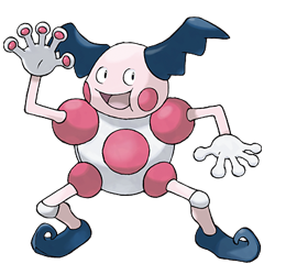
Also, Mr. Mime glares in your bedroom window at night and licks its lips.

65dH7.png


Horrifying.

So, what are the worst Pokemon designs, in your opinion?
 
RE: Worst Pokemon Designs?

Mega Heracross, Mega Scizor, Mega Mewtwo Y, and Mega Abomasnow in terms of Mega Evolutions in Gen VI. Aside from that two thirds of all of the designs from Gen V were the worst most notably the set species designs for Vanilluxe and Garbodor.
 
RE: Worst Pokemon Designs?

I seriously don't get the people who hate Garbodor and Vanilluxe for what they are. I mean, it's ok, I don't care that much about their opinions but... Hmm. I just think they're actually pretty good. I seriously was surprised by them, I wouldn't have expected seeing a Pokémon based on ice cream or a pile of garbage.

My least favorite designs are...

Seaking. Really, I don't like Seaking's design. It's just an orange-colored fish with a little horn. I've never really even used it, just because of that. It might be allright, though.

Sunkern. Not that I would dislike Sunflora at all - I actually kinda like it, but Sunkern... Ugh. Based on a seed? It's just... boring. Hard to put it with other words.

Unown. Yay, letters. Let me catch them all. They just seem like they were created for the frickin' movie. I'm no expert, but...

Yeah, that's my top 3. Don't hate if something you love is on the list. ;P
 
RE: Worst Pokemon Designs?

Garbodor <3

Anyways, my top 3 most hated pokemon designs-

3) Electrode.
Eww, it's just so stupid. And Ugly. And competitively useless. IT'S A BALL.

2) Goldeen and Seaking-

THEY'RE JUST SO STUPID AND UGLY
I mean, really, they're just horny fish with horns.

1) Mr. Mime
WTF, Its animation in XY is sooo freaky, it looks like it wants to do you.
 
RE: Worst Pokemon Designs?

all of you above who write "it's desing is boring" does even seen it in pokemon before? The most repetitive pokemons are bugs, birds and cats/dogs and other animals but after all it's matter of kind, but for example; sunkern, goldeen/seaking arent boring, they're interesing, they looks like living things turned into pokemons. [seaking actually excist, sukern too it's pretty awesome to using mutated seeds or trash bags] To be honest about desing, all pokemons are okay I analyze every gen. many times and I can't tell they're bad, they getteing better each generation and making pokemons more interesing and worth of play.
 
RE: Worst Pokemon Designs?

Every Eeveelution is a recolor of the next with a slightly different body shape. Fan favorites.

Garbodor is a cleverly designed anti-Totoro that not only uses a completely new concept, but also pays a homage to the Muk line. Universal hatred.

SIGH.
 
RE: Worst Pokemon Designs?

bacon said:
Garbodor is a cleverly designed anti-Totoro that not only uses a completely new concept, but also pays a homage to the Muk line. Universal hatred.

SIGH.

I so agree on that. And btw, that was a perfect example of how to analyze a Pokémon design. Thank you for that.

It really pisses me off when people just look at Garbodor and are like: "wtf come on GF u cant just base pokemanz on garbage like that i mean really its just garbage no idea in it". The design is just so much... well, deeper. :D

I think all the Eeveelutions are pretty good. I mean, they're kinda supposed to have the same style but a new form and color depending on the type.
 
RE: Worst Pokemon Designs?

Everybody in this forum is so negative...

In terms of design, there's not a lot that comes to mind. Every Pokemon is unique in their own way, which is one of the reasons why I love Pokemon so much. But if I HAD to choose one...it'd be Florges for me.

When Flabèbè was first released, I let out all my d'aaaaws. It was literally a flower baby. It was so adorable, with a little crown, and it's little flower. I wasn't disappointed at all when I saw Floette. It looked like a fairy all-around, and it kept it's flower with it. But then I saw Florges...

It. MERGED. With its flower.
Wh-what? WHY? She looks like she put a big fluff of macaroni around her and decorated it with FISH EGGS. The weird stem body...egh, makes her look like a prostitute. Her eyed are too big, and the leaves look like butt-wings, and I just...AAGH.

I'm just glad you don't have to fully evolve it though...
 
RE: Worst Pokemon Designs?

98Greener said:
Everybody in this forum is so negative...

In terms of design, there's not a lot that comes to mind. Every Pokemon is unique in their own way, which is one of the reasons why I love Pokemon so much. But if I HAD to choose one...it'd be Florges for me.

When Flabèbè was first released, I let out all my d'aaaaws. It was literally a flower baby. It was so adorable, with a little crown, and it's little flower. I wasn't disappointed at all when I saw Floette. It looked like a fairy all-around, and it kept it's flower with it. But then I saw Florges...

It. MERGED. With its flower.
Wh-what? WHY? She looks like she put a big fluff of macaroni around her and decorated it with FISH EGGS. The weird stem body...egh, makes her look like a prostitute. Her eyed are too big, and the leaves look like butt-wings, and I just...AAGH.

I'm just glad you don't have to fully evolve it though...

I thought the same about her eyes, but the big things are more like eyebrows or eyelashes, her eyes are smaller, and underneath them. I hated her before learning that fact, now I like her more.

That goes to show you all that sometimes only one small thing makes you hate a design, so, think about it instead of just blurting out WORST THING EVER ASDFFAGG.
 
RE: Worst Pokemon Designs?

Mega Gardevoir - it just got fat. Barely any changes to it.
Mega Manectric - ruined one of my favorite Pokémon. It literally lost its body to that yellow thing. How can it even move?
Mega Gengar - looks like an ugly Darmanitan and didn't need a third eye...and whatever that tail is.
Mega Heracross - there was nothing wrong with him. Now he has a weird nose. He just looks goofy.
Mega Tyranitar - he was fine the way he was. He looks overdone, and they tried way too hard on him.
Mega Mewtwos - must I explain? Frieza and Ugly Feet are a disgrace to Mewtwo.
Garbodor - it's trash. They got lazy.
Diggersby - looks like he's a messy eater. Bunnelby was cute, but then he got fat and weird. I wish they made him athletic or something.
Talonflame - it's wearing gray pants. The two pre-evos are fine. Then...ugh.
Quilladin/Pignite - literally ovals with limbs.
Delphox - because I'm disappointed in what Fennekin could've been. She's wearing a bathrobe.
Rhyperior - because nothing says "lame" like a Rhydon with beef patties on itself.

Soooo many more.
 
RE: Worst Pokemon Designs?

Serperior said:
Mega Heracross - there was nothing wrong with him. Now he has a weird nose. He just looks goofy.

Diggersby - looks like he's a messy eater. Bunnelby was cute, but then he got fat and weird. I wish they made him athletic or something.

Mega Heracross does have a reason for its nose, since there are beetles that have horns like that (can't find a link to any pics of them at the mo), but I do agree with you; vanilla Heracross is better than his Mega form. What's even more annoying is that they had the chance to make a seriously badass design for it, but they goofed up :/

I 100% agree with you on Diggersby. I can see where its design comes from, but it was horridly executed. (not to mention it started that awful meme that should have no place in existence)
 
RE: Worst Pokemon Designs?

Ok. I understand the nose thing - I've seen them before so I get where you're coming from. They could have done something more, but...I feel like it would have been too much. Heracross is cool enough in his own right.

I also wanna give a shout out to Mega Pinsir because it decided that drugs were fine to take. Its eyes. Enough said.

Braixen also sucks. I'm actually more against Braixen than I am against Delphox.
 
RE: Worst Pokemon Designs?

I think the problem with megaheracross is its hands, they balloon up and get really big for its body, but its claws stay the same, it's a matter of proportions, when you see it, the hands are more noticeable than its face; I don't get why that happens, since its legs remain exactly the same way as before.
If you can draw, do the test, give the mega the hands of regular heracross (smaller, even) and see if it looks better.

Mega gardevoir is not fat, actually, if anything she became even thinner, it's the dress that is huge.

Delphox is terrible, as I've said before. The proportions are just human enough to enter the uncanny valley, and the ear hair is just too large, not to mention the hobo tunic and the fact that it's of a stronger color than those of its evolutions, making it look even larger.
Braixen is awesome, in battle, she twirls her wand and does a badass flourish when she tucks it in her tail, and she has a cute skirt; furry connections aside, best middle starter ever.

One I really really dislike is prinplup, and I don't know why exactly, it's just so... boring? grumpy? I wish I could pinpoint it.

I don't care about the hated object pokemon, really, if they are well designed, it's all good; garbodor makes perfect sense when you compare it to totoro, it's a way of making a disgusting (by concept) creature more likable, and it works, many people say that trubbish is adorable. The vaniluxe line... well, they are well designed for their concept, but I think that concept was unnecessary and raises too many issues. If you want to make an ice cream inspired pokemon, fine, but add something more, like an ice cream snail with a conic shell that looks like an ice cream when upside down, not just ice cream because that's stupid. They severely lack subtlety; vaniluxe even has a smile drawn on its back.
 
RE: Worst Pokemon Designs?

Lickitung is certainly no beanpole, but it at least has a shape other than "circle on top of huge circle." Usually, I can at least find some redeeming quality in most Pokémon...but there are truly no aspects to Lickilicky's design that appeal to me at all.

Magmortar suffers the same problem...just simple shapes with color/patterns. Neither look like they could be found in "nature" (yes, I know this is a fictional world, but still)...Lickitung and Magmar both look like organic creatures, not just awkward shapes with faces.
 
RE: Worst Pokemon Designs?

Delphox is wearing wizard's robes, darn it. The Kalos starters are D&D characters. Chesnaught is a fighter, Greninja is a rogue, Delphox is a wizard.
 
RE: Worst Pokemon Designs?

CMP said:
Lickitung is certainly no beanpole, it at least has a shape other than "circle on top of huge circle." Usually, I can at least find some redeeming quality in most Pokémon...but there are truly no aspects to Lickilicky's design that appeal to me at all.

Magmortar suffers the same problem...just simple shapes with color/patterns. Neither look like they could be found in "nature" (yes, I know this is a fictional world, but still)...Lickitung and Magmar both look like creatures, not shapes.

Emboar as well. I hate that design on its stomach...
 
RE: Worst Pokemon Designs?

Bidoof and Bibarel - way too simple (at least Patrat has those big red eyes).

Lanturn - After seeing Chinchou I was expecting something scary but instead its evolution is a fat blue fish with a pretty face. -.-

Sawk and Throh - Pokémon wearing karate robes without explanation!? Despite not liking, I can live with Primeape's metal "shackles", Hitmonchan's gloves, Zoroark's bangle, Poliwrath's gloves and Timburr's family "props" but robes? What's next, a Pokémon wearing shoes? Spoink's pearl has an explanation, Timburr may bring down a tree to carry their logs and so on but what about Sawk and Throh? I prefer garbage, ice cream, Pkball, toxic waste, etc. Pokémon than these two, because those show us that the Pokémon world isn't perfect but what about these?
 
RE: Worst Pokemon Designs?

Leaf_Ranger said:
Bidoof and Bibarel - way too simple (at least Patrat has those big red eyes).

Lanturn - After seeing Chinchou I was expecting something scary but instead its evolution is a fat blue fish with a pretty face. -.-

Sawk and Throh - Pokémon wearing karate robes without explanation!? Despite not liking, I can live with Primeape's metal "shackles", Hitmonchan's gloves, Zoroark's bangle, Poliwrath's gloves and Timburr's family "props" but robes? What's next, a Pokémon wearing shoes? Spoink's pearl has an explanation, Timburr may bring down a tree to carry their logs and so on but what about Sawk and Throh? I prefer garbage, ice cream, Pkball, toxic waste, etc. Pokémon than these two, because those show us that the Pokémon world isn't perfect but what about these?

Well, Hitmonchan is already wearing shoes.
 
Back
Top