Art Gallery VinculumStellarum's Art Showcase

VinculumStellarum

Hello Tomorrow, going well? Any luck?
Member
Hello there! If you've seen me in the Ruins of Alph, you'll know who I am, but if not, that gives you a reason to check out my Al Catraz, Defense Attorney thread! (More advertising! Whee!) This is where I'll be posting art that I draw over the course of my day, whether it be during a class or on my computer.

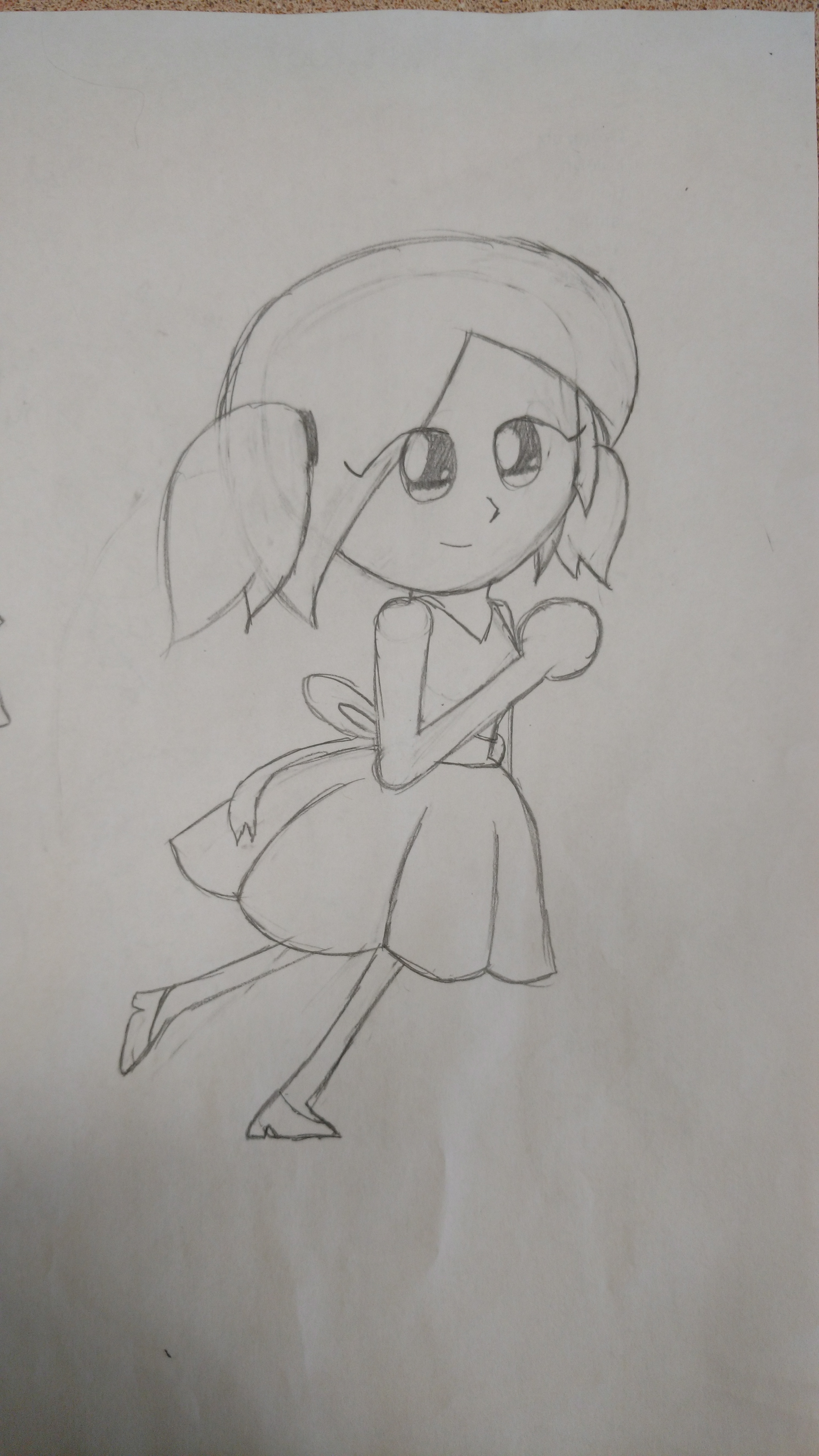
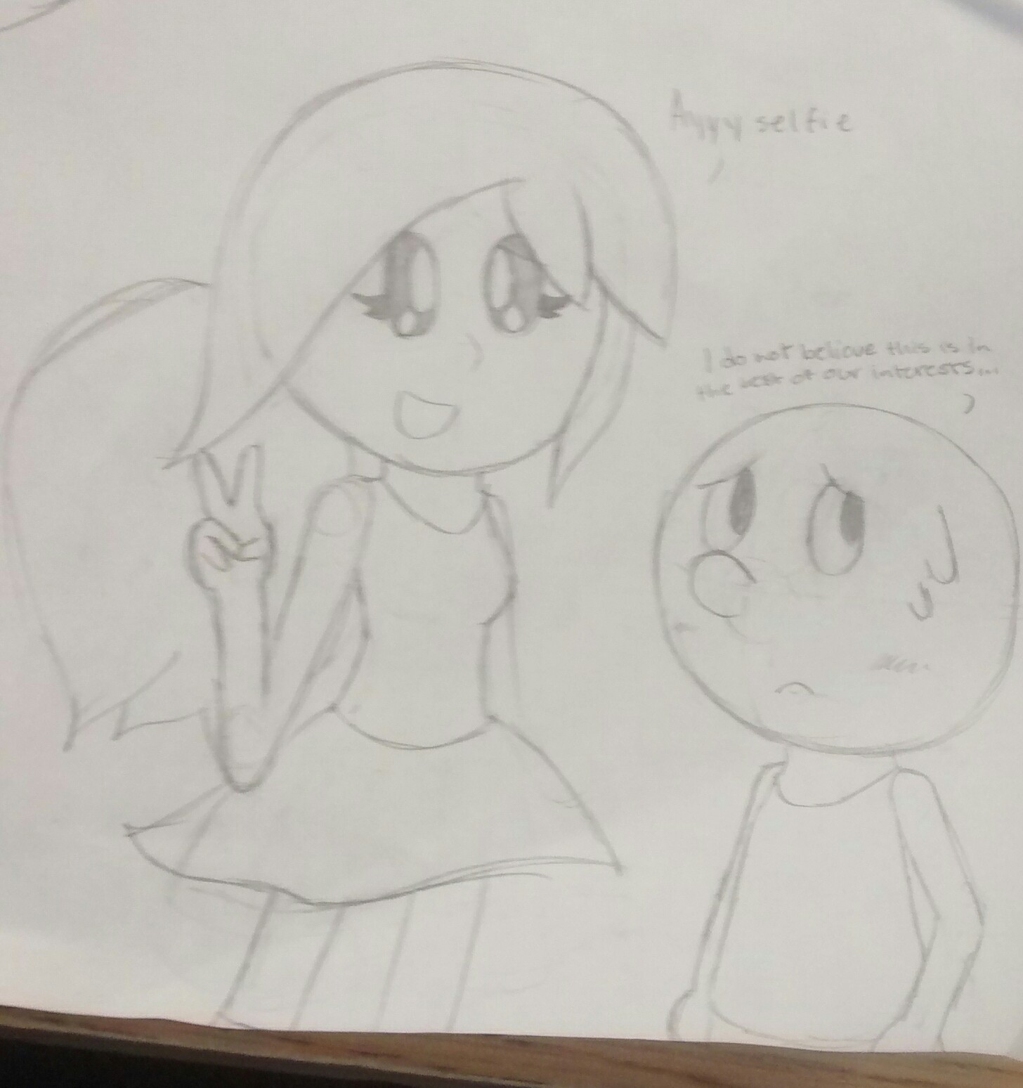
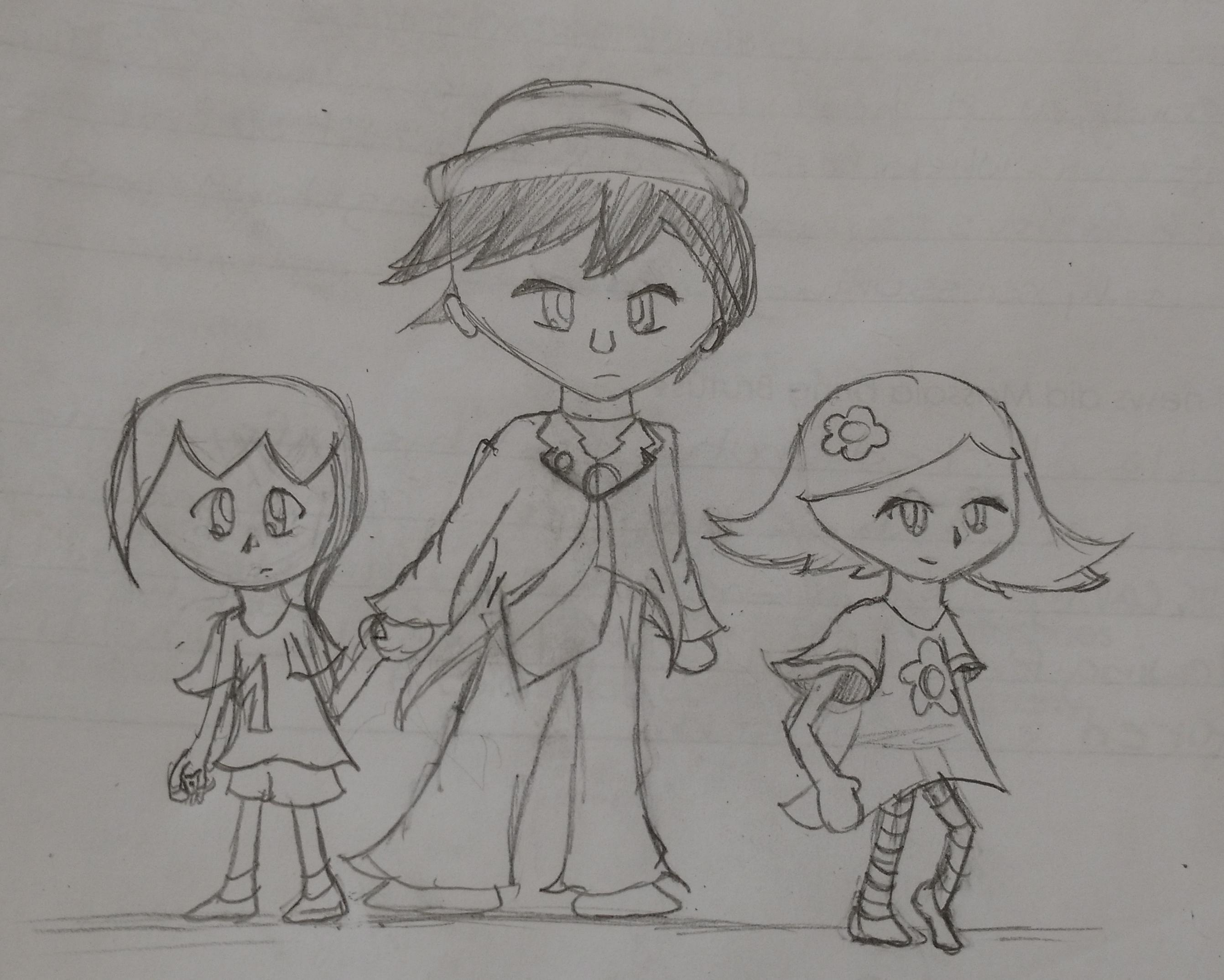
Here's a few examples of what I've done so far:
izM0I7g.jpg
e75Geah.jpg
toyAl2u.jpg
KmFM5VU.jpg

I draw a TON, so this thread shouldn't ever be dead! Please don't be afraid to leave your thoughts on this thread! Tell me what you think! Thanks for checking out this thread!
 
Last edited:
Here's my latest work that I've gone over, just a small doodle of Villager again (or Benjamin Cloviet, since that's who it's intended to be).

Y4tX7uH.jpg

This was originally something I drew in class one day, but I ended up having to add the legs into the drawing when going over it on my computer, for the original drawing had a bit of leftover space. I'm personally proud of the shading on this, and the background is at least something other than a solid colour. I'll be back with more art soon!
 
HUGE UPDATE! I found a bunch of stuff in my documents on my Mac, so I decided to post it all here! This is work from the recent past, with the oldest works going as far back as December 2015. Enjoy!

nbmz.png
This one was done on New Year's Eve, as implied by the title of this spoiler. I did this after having just found out about the Dodge and Burn tool in GIMP and instantly put it into use, resulting in this drawing. In all honesty, it isn't bad, but it could have used a bit of cleanup and an axe that didn't look like a pillow on a stick.
Mr_Awesome349.png
This was the first drawing I ever did with my current drawing tablet (as my old one had a strange port that only one computer had and was too big for me to really use), and was done per request by my friend, Mr. AWESOME349. He had asked me to do his Minecraft skin, and it turned out pretty nicely. I personally feel this could've had a better outline.
PikaMasterProfile.png
This is my current PB profile picture, which I have to say looks pretty nice when smaller in size. Upon closer examination, however, the outline looks terrible and is all over the place. I love how the eyes turned out, though.
PikaMaster Please Sub!.png
Yes, I drew this. No, I did not draw the Subscribe button. I used Clip Studio Paint's drawing dolls feature to help me with proportioning, as I'm really bad at drawing people sitting down, which was a huge benefit to this drawing. Outline is probably still an issue, but I've found a way around that issue, so no worries there!
Al Catraz.png Sakura Anaman.png Benjamin Cloviet.png Lucian Umbra.png
These works can also be found on the Turnabout Timber thread (which can be found in my signature), and depict the four main characters in Turnabout Timber. From first to fourth, ordered in chronological first appearance in the story, they go Al Catraz; Sakura Anaman; Benjamin Cloviet; Lucian Umbra. Art-wise, my favourite has to be Al or Benjamin, but character-wise, it's Benjamin. I draw him a lot, but I've been wanting to do Al at some point in the near future, so that'll probably happen soon.
JesiFinished.png
After playing a bunch of Miitomo, I decided to draw myself based off my Mii's appearance. This was the first drawing where I used the curve tool to make my outline as opposed to the pen tool, and I won't be going back anytime soon. This is also one of the first drawings where I used hard shading as opposed to soft shading, and I have to say it worked out great. I might consider making this my profile picture at some point, but I think I'll reserve that spot for the PikaMaster herself. 0v0
0-cus-d2-9c11b53ac48d20e1cc6daad8eb603b52.jpg
This is the pencil sketch for the above drawing. Not much has changed, but it's cool to see how a drawing started! The other drawings posted today don't have any pencil sketches, but I'd post them if there were.

If anyone's wondering, I use Clip Studio Paint to make my art. It's not free, but a screenshot app will do you good like it has for me. Next update will probably be pencil sketches for older drawings, so stay tuned for when that goes up!

Also, I should really draw something that's a Pokémon...
 
8Lx3BVf.jpg


This was the basis for the "Villager Caught" drawing above. I got bored in Fine Arts class and decided to draw Benjamin (which, if you can't tell already, is a character I really like from my stories), and it turned out really well. I managed to properly proportion the head to body, which is something I'm proud of.
04lJW3X.jpg


This was the basis for the Ness with Glasses photo in the OP, which is rougher than the one above but is one that has a rare attempt of me trying to shade with a pencil. It turned out okay, but it made a great target for computer colouring.
hZGcQlS.jpg


A while back, I got into a sort of writing slump and started writing a random story about something that happens in Return of the Interspectaculars that hasn't been posted yet. I decided to draw Amber Tzaziki in a fancy dress, which turned out great! If anything, I would change the eyes on this (and maybe the feet, because I'm not very good at drawing feet in my opinion).
Au96Ach.jpg


I draw this back around September, when the school year started, and I have to say I really like this! Despite the fact that I've left a note saying I've wanted to go over this on my computer, I haven't yet, but I really should do it because this drawing deserves it.
kZYp0i7.jpg


This was the basis for Ness Michelin with PSI. It's a very rough drawing and the clothing isn't as flowy as I made it in the computer coloured version. I did Link on this page, too, but I don't have an image of that and it was pretty bad, too.
e3fCwJV.jpg


I don't remember when I did this one, but I remember doing this after thinking of what a group photo of the main characters of RotI would look like. It might be a little hard to see the wording, but it's an okay drawing and may get a computer version.
NJ06m44.jpg


Something different from the happy, cheery stuff I normally draw, this was originally intended to be the "cover art" of Turnabout Timber, but got changed to a small character sketch of (from left to right) Benjamin, Al, and Sakura. This drawing experimented a little with "epic poses", and was when I was trying to figure out folds on shirt sleeves and pants legs. Al and Sakura look ready to kill, while Benjamin was supposed to be more mystical but turned out looking more confused or scared.
 
Last edited:
Today's update isn't much. I know, I'm a week overdue, but I haven't produced much material I can really put here. Anyways, here's the one thing I have!
Al Catraz In Viridian Forest.png
This is something I finished up today after having started it tonight, as I was bored and decided to draw Al. It actually turned out really nicely, and I even managed to pull off a background! Overall, I'm very happy with how this turned out. This was also drawn entirely on computer and took me about two to three hours to finish, not counting the breaks in between.

dgfjksdbjfk.png
This is the outlined version of this, before I did any major colouring.
Sorry about the lackluster update today. I'll try to get some more material ready for the next update! I've also done some art projects from before that I might show off, so stay tuned and tell me what you think of my art in the comments!
 
Very nice work ! I like the colors and the shadowing, though I think the color of the shirt should be different since it makes the shirt merging with the background.
 
Thank you! Now that I look back at the picture, I'm realizing I should've made the suit just slightly lighter (and since I have the drawing still open, I can change it), but I'm glad to hear you like it! My colouring style lately has been from the results of experimenting, but I think it'll be sticking around.

Seeing you had commented on my thread made me super-happy. I won't deny it. It always makes me happy to hear feedback on my works, so thank you again!
 
Since Friday's update was a bit lackluster, I've planned out two new updates to go up over the course of today and tomorrow! Here's the first update!

Not only do I draw, but I've also learned how to sew and crochet in the past. With this knowledge, I make stuffed dolls of various video game characters every now and then (with the exception of one), and some of them actually turn out pretty okay. Here's some of the ones I could find!

G&W.png
This was the first sewing project I did, in February 2015. At the time, my favourite Smash character was Mr. Game and Watch, and I wanted to have a doll of him to carry around (and I actually do that a lot; @thegrovylekid will be able to back up this claim), so I had my mom teach me how to sew and I made this after having learned. From this front view, you can't really see the nose, but it's there.
Daddy Kang.png
In October 2015, I joined sock monkey class for my Fine Arts option in my second unit (I have six units in a school year, and my high school is really different so I won't explain further), and the first monkey we had to make was just a normal monkey. Being the Smash fanatic I am, I decided to make a Diddy Kong for the sake of making a monkey, so I went to work using some wool socks. I ended up rushing the rest of it at the very end of the class we had to hand it in, so I didn't do a few technical things I could've, but it still looks okay and I like how it turned out.
Lemmu.png
I don't like how this turned out. The eyes could've been sewn on so much better, as with the legs. This thing just sits in a small crocheted bag that sits to hold up another doll on my dresser. I was in a crochet class for Fine Arts in my third unit of this year, and we got two projects in a row where we could make anything we wanted, so for the second go-around, I made Luma and the bag it stays in.
There's five different ones I've made, but three of them will be in this spoiler. I couldn't find the first one and the fifth one will be in a different spoiler.
Sock Villager.png
This is Villager #2, a sock monkey. In the same class I made the Diddy Kong in, we had to make a sock monkey based off a cartoon character. Now, with me wanting to make some sort of Villager, I loopholed by using the Animal Crossing short in Japan as an excuse to make this thing. It definitely needs some fixing up, mainly with the shorts, but when I finished this I was proud of its turnout and I still am.
Clowny.png
This was Villager #3, made in crochet class along with Amber Tzaziki as part of the first anything-you-want project in my crochet class. At the time, I could barely make a proper square washcloth, and I promptly decided I could handle a doll. The pattern is actually a modified version of the Sackboy from Little Big Planet (a game I don't play, but is a good pattern to know for making human-esque dolls. To say the least, this thing ended up looking like more of a clown than the Villager. I don't like its turnout nearly as much as some of the other projects I've done.
Villager Craig.png
This is Villager #4, a project I made after crochet class wrapped up. I was wanting to make yet another Villager and hopefully improve upon the previous one, which I did, but I didn't have brown yarn or the green yarn I needed. Thus, this one ended up being blonde (like Villager #1, which I couldn't find). It improves greatly from the last one (aka Mr. Clown as I like to call it now), but it still has its obvious flaws. I like to think this one looks like Daniel Craig, the guy who played James Bond in the Bond movies up until recently.
Umbra Tjaziki.png
This was made alongside the clown-looking Villager for my first anything-you-want project, which I have to say isn't all that much better but still miles ahead of the clown. I made this to go with Return of the Interspectaculars and planned to do Mr. Game and Ness Michelin as well, but I haven't gotten around to them still. The body is quite flimsy on this and the head is super-floppy, which are both things I'd change in a revision.
Benjiiii.png
Remember how I mentioned Villager #5 would be in a separate spoiler? Yep, this is that Villager. After being unsatisfied with Villager #4, I took to the yarn and hook once again in the search to finally make Villager the way I wanted it to turn out. Thinking of this, I decided that if I was going to make the Villager to end all Villagers, I knew I needed to make it with Benjamin Cloviet in mind (as his canon had just been changed to what it is today), because if I didn't, I knew I was going to want to make Benjamin. And... let's say this is why the number of Villagers has capped at five. When making this, I figured out how to "layer" yarn, in terms of adding three-dimensional sleeves, if that makes sense. I made this thing in February 2016, and I carry this thing almost everywhere I go up to this day, so I think that should explain how much I love this thing.
アル カテラス゛.png
The other day, I received a ton of yarn from my aunt as an early birthday present (I'm 14 on May 14), and with that yarn I finally found the inspiration to complete a new project after trying to make on in March but losing interest in it quickly. I finished this over the course of two days, which is slightly faster compared to the three to five days a crochet project normally takes me. Most of the yarn used in this was actually from the lot I was sent, with the exception of the grey and white. I love this thing so far, and we'll see in the future if it has as much of a story to tell about it as the one above in this spoiler!
The next update will definitely have some Pokémon-related sketches, so stay tuned for those! Thanks for taking a look at this thread!
 
Wow... it's been a long time since I last updated this. Pokémon sketches never really ended up happening, but I did do some other miscellaneous works that aren't too bad. Not only this, but I'm busy with a fairly big art project I'm doing, so I probably won't update this thread a lot until said project is finished.

Objection Final.png
This sketch was the one where I discovered the saturated lines tool. It's nice to play around with and actually doesn't look bad. Concerning the actual picture itself, the colouring looks nice and sharp, but I think the tie is a little off and Al has no ears. It looks nice at first glance, but come criticism time, it has improvements to make.
Inkling.png
Recently, I've gotten a sudden kick to play Splatoon, so I decided to draw the Inkling in its female form. I'm really proud of the shading done here, as well as the pattern on the "hair". I've never done stuff like that before and I thought to experiment, which worked out in the end.
Amber Werewolf.png
This drawing is one I did the pencil sketch for in about five minutes, and coloured in maybe ten or fifteen. It's obviously a very quick sketch, but it's a good quality of pictures like this. Why, you ask? I'll leave that for you to figure out yourself. On a different topic, the shading is a little tough but it does its job right.

It's not a big update, by any means, but it's at least something. There probably won't be very many updates until the art project is finished, but until then I'll try to at least provide maybe one or two art pieces every once in a while. Until then!
 
Has it really been three weeks? Time flies by fast.
This update has a mix of two of my avatars (including the one I'm using now) and a small bit of backlog I posted to my Miiverse page. Yes, I used to post to Miiverse (and I'm slowly reviving it), and it archived a bunch of art from two years ago. I'm posting some of the older stuff from 2015, though I may pull out some 2014 stuff in the future. Either way, let's cut to the chase!
Benjamin Avatar.png ]
At this point, it should be obvious that I like the Villager and my own characters a little too much. This is another drawing that I had before and goes with Amber from last update (as they're both being used for the same project), but with a background I like it as an avatar and it looks nice with one. The rainbows in this picture are amazing, but I'm a sucker for rainbows.
Benjamin Half.jpeg
Before anyone asks, yes, this is made in Pokémon Art Academy. It was my first introduction to computer-based art, and although I was really bad with it when I first got it, I can now use it for some fairly decent, quick, on-the-go stuff. I'd actually been wanting to do an avatar with half the character's face since I saw Double o Squirtle's gallery, and I finally got around to it while making it look decent! The only thing really with this picture is that the outline is a little wobbly, even with stabilizing. Once again, there's lots of rainbows, but the colour they're on top of isn't so pretty.
When I draw things like this, it usually takes me around half an hour to finish the whole thing, as when I don't try all that hard I can whip things out really fast. Now for the Miiverse backlog!
ホーシ ンオ カビ.jpeg
Other than the fact that the shadow is horrendous on this, I'm pretty proud of how this one turned out. I originally drew the pencil sketch in November during an assembly, and I really liked how it turned out, so I decided to go over it with this. This was before I discovered the amazingness that is Clip Studio Paint's trial mode, for the record, but it still looks like something I could've gotten claiming it was from said program if it weren't for the stupid watermark. That's the one thing I don't like about Pokémon Art Academy. It plasters a watermark on everything.
Cremm.jpeg
For those who didn't know, I'm actually a fan of Sonic games, and every now and then I'll draw one of my favourite characters. Cream is one of them, and she turned out really good for when I drew this–somewhere in 2015. I got the head shape down, the ears are nicely proportioned, the colouring is decent... The only problem I have with this one (and I seem to have an issue with most of my drawings but it's what makes me better) is that the foot in behind is longer than the one in front, which is slightly annoying but mostly hard to notice.
Ness and Amber.jpeg
For whatever reason, back in June 2015 or something (This picture is a year old?), I was in an Earthbound kick and decided to draw Ness and "Paula" in Magicant or something with Amber and RotI Ness taking the place of canon Ness and Paula. There's a ton of things wrong with this one.
1) Ness, your hat looks a bit off.
2) Where did Ness's neck go?
3) What happened to his shoulders?
4) What happened with his right hand?
5) Don't get me started on that entire left arm.
6) Ness's body looks like.. I can't place it, but the shading makes it look really weird.
7) Those shorts are off.
8) Don't get me started on the leg shape.
9) Don't get me started on the leg thinkness.
10) What happened to Amber's bangs?
11) The shading under Amber's hair looks really tacky and off.
12) The shading everywhere looks a little off.
13) What's up with that section right between the blue and the pink? It looks brown there.
This, my friends, is what happens when I'm allowed to go off and nitpick my works like this. I've made a list of 42 nitpicks from one paragraph in an old story from Gr. 6, so this could've been worse. Errors aside, it's an okay drawing. I should give it slack for being a year old.
This concludes our update for this morning! I hope you guys enjoy this update! (I'm aware I'm updating at 12:30 am. Probably now a good idea, but it's something.)
 
Another update! This one is based around the art I had finished for Mafia 35 (Pokémon Card GB3: Team GR's Last Stand), since PMJ asked me to do commissions for him. I feel honoured to have been picked, but I wasn't able to finish the art, unfortunately.

Screenshot at Jun 24 21-26-08.png
This was something PMJ had asked me to do for the current Werewolf/Mafia game, Team GR's Last Stand. I worked on this over the course of maybe four days, and I am more than proud of how this turned out. I wanted the backing to look like the current Japanese Pokémon card backing, because of flavour in the Mafia, and I used a hatching pattern for pattern on the back. I really wanted to give it that feel of a Pokémon card, and I feel I achieved that really well.
Mark.png
This was the original sketch of the image of Mark being used in the current Mafia game. I spent my French class working on this, and like with the above image, I'm proud of how this turned out. This would probably make a good avatar, to be honest, but Mark isn't the type of character I'd use in my profile. However, if you would like to use it as an avatar, just talk to me and we can figure things out from there.
Mark Banner Image.png
If you've seen the thread for the latest Mafia game, you might recognize this image. That's because it's the thread thumbnail, since I didn't have a finished banner at the time of the thread posting. This was supposed to be the first picture of about 20, but unfortunately time was a jerk and so was school, so I wasn't able to finish all the art. I like how this turned out, and I made a cel-shaded version of it, although I feel like version 1.0 was better in the pencil stages.
MarkCelShading.png
The cel-shaded version looks terrible when I think about it, especially with the jeans. At least it worked on the jacket.
That about sums it up for this update! I'll probably be back next week with some new, random stuff, and maybe some Sonic stuff. Thanks for taking a swing by!
 
I'll probably be back next week with some new, random stuff, and maybe some Sonic stuff.
Well, guess who didn't keep their promise again?

Anyways, I'm back with yet another update, this time something you might've seen around if you've seen me around on the forums recently, particularly my signature. After watching the Super Smash Bros. Brawl CaramellDansen, I decided to make a GIF after finding out there wasn't an SSB4 version of this video.
Thanks to @ExcalAura4D for showing me this over Skype.
I ended up really liking the video and wanting to see an SSB4 version just for the sake of seeing Villager dance to the song, but unfortunately, one didn't exist. So being the person I am, I decided I was going to make a GIF of it myself, because that can't be too hard, right?
That GIF ended up taking two hours.

So how did I actually make the animation? I went into Clip Studio Paint and sketched the first two frames in before doing the outlines and colours on separate layers. The canvas after finishing looked like this:
iit.png
For the sake of showing the progress, I made all the layers transparent except for the background. I only made two images, but this was because I could flip the image in Photoshop for the third frame.
After that, I went to work on Photoshop to reverse the "leaning to the left" frame, which wasn't that hard, and took the frames to Final Cut Pro to create a short video to make the GIF with. This is the reason everything took so long. I spent a while trying to make the "hands up" frame the same pixel dimensions as the sideways frames, which was really annoying because it was hard getting it right. And even after that, I was finding edits I could make.
Once the frames were finished (and this happened a few times), I took to Giphy (giphy.com) to make the GIF. That's pretty self-explanatory. Here's the first "finished" version of the GIF:
3PCKKupeNQ8c8.gif

This was before I figured out the QuickTime loop for the black borders, which was just recording the GIF while it played in Giphy. The one arm looks unusually thick compared to the other in the sideways frames, which was killing me and drove me to spend ten minutes in PS fixing it.
After that came this draft:
DfOasxznBtlIY.gif

Same as the first one, but with a fixed arm and going faster.
Eventually, though, I ended with this GIF, which is the same as in my signature:
krm5vp3p3zURi.gif

The speed is about on par with that of the Smash version, and everything couldn't have been better. I added lines extending from the thumb line to establish a bit of a wrist.
That's all for the process of making the GIF! However, I do have two other pictures I want to share in this update.
jfhdldshg.png
There isn't really much I have to say about this. Personally, I think the blue on the fur is a little too bright, and the eyes and "eyebrows" are off, but that's really it.
Gardy.png
Cropped for possible future use for a card fake (hint hint, could this mean something?), I drew this for a French project in early May. I used the 3DS model as a reference for drawing the head, and I think it really helped make this Gardevoir what it is. The right arm could use a bit more work, as could the arms, but otherwise, it turned out well.
I do actually occasionally draw Pokémon, and I should probably draw more of them for future updates. This is a Pokémon forum, after all. Anyways, that's it for this update! Thanks for taking a look!
 
Why do I keep abandoning this thread? I really need to post more here.

Anyways, with Mafia XXXVI (Werewolves of the Interspectaculars) now up and about to start its Day 1 cycle, I figured I might as well post some art from when I was making the game! This is going to include WIPs, so there'll be a few unfinished pieces in today's update.

First up is the banner. This was something that took a while to do, having gone through a few ideas in my head before deciding on something solid. It originally started with this really bad Photoshop sketch:
thingalingding.png
As you can tell, it's lazy and was done in five minutes.
This wasn't the idea I wanted to go with (I wanted to do an Academy corridor), but it's what I ended up starting since drawing people over a balcony is much easier than drawing hallways, and I'm already bad at backgrounds. The closest this ever got to being done was this:
WIP Mafia XXXVI Banner.png
This was executed much better than the Photoshop draft and actually had some decent colouring on Amber's hair, but it was still pretty messy and had places to improve on, like Mr. Game's lopsided head and Ness just looking weird in general. I experimented with gradients when colouring this and found the airbrush to have been much better. I ended up losing this to a computer restart, I think, but the finished product was better anyways.
Skip ahead to last week. I was on vacation and had the idea to do a sketch of a new banner on Pokémon Art Academy, but with the characters zoomed in and much closer. I never did finish that sketch because of 3DS dimensions restrictions, but when I got home from my vacation, I got straight to working on the new banner. Here are the WIPs of that in order, including the finished product:
Banner WIP 3.png
Earliest WIP I have. Ended up idiotically deleting the other two from my computer, though I'm sure if I looked I could probably find them in my Skype backlog. In this version, I added black with an airbrush for where I wanted two stars to go––one light blue, one red––to represent the two student halves, the Interspectaculars and the Darks. By the time this WIP was done, the characters had already been coloured in and finished, although I do think I should've done a little more to the lighting on Ness's hair. Mr. Game's outline is silver not because a black outline wouldn't have shown up, but rather because it's a reference to how Mr. Game and Watch in Super Smash Bros. has a silver outline, who was the inspiration for Mr. Game's character.
Mafia XXXVI Without Wording.png
Instead of going with the "giant stars" idea, I decided to take out the black mist and add a sort of energy black, with the same concept of the student halves. The purple is there because the red and blue would inevitably mix, though if you wanted to, you could perceive it as equality, or peace, or something of the like. I added a ring of stars rotating over the energy blasts so that I wouldn't scrap the stars idea entirely, and it actually worked really well in my opinion, even though I had trouble making the energy blast work without making it seem random. The sky also got a few brighter hues of orange and a little yellow.
Mafia Finished Banner.png
This is the finished banner. The only real differences are that I added purple stars in the middle, as well as the title. The font is Hanzipen SC, the font used in my Word document of RotI for Amber's handwriting. I played with some other fonts, but none really seemed to work as well as this one, in my opinion. I still would've much preferred to have gone with an Academy hallway for the banner, but this turned out just fine so I see no reason to complain.

Now for character art! I actually had three pieces ready at first, and a fourth still in the works, but I ended up scrapping character art due to time constraints. I'll still try to get a collection of sketches done for them, though, since some people might be interested in seeing what some of the other characters who haven't had art posted of them look like. Here's what I had in the works!
Amber Werewolf.png
This one was by far the most finished. All the colouring had been done, and I even made the image transparent. The shading on the tank top is a little wonky (there shouldn't be so much of a shadow on the top), but otherwise it turned out well and I'm happy with it.
Benjamin WW Profile.png
This should look familiar. You'll probably remember this from somewhere...
Benjamin Avatar.png
Yes, I had the audacity to slap a background on this and use it as an avatar, even though at the time this was a secret project that hadn't been sent in for applications yet. In my defence, though, I really like how this looks, and I already use Benjamin for my avatar half the time, so it was bound to happen either way.
Sakura Mafia.png
The third piece I had finished. The ears are very out of place (and the colouring's even weird, because you can see pink lines faintly), but otherwise it's not a bad drawing by any means. It does have a few improvements to be made, though.
NessProfileWIP.png
This was going to be Ness. I still kinda wanna finish this and possibly use it as an avatar, but this is as far as I got. This would've probably been one of the better profile images if I had finished it.
RFeQ42C.png

Tracy only got as far as a pencil sketch, though it would look decent coloured in. I'll try to get that done if possible, which it should be.
KA0KNGg.jpg

I don't know why this is so big, but it's supposed to be Mr. Game. Have I ever actually posted a picture of him here before? I don't think I have. Here's Mr. Game, PokéBeach, for the first time.
fNDpr5g.jpg

This is Mrs. Fit. I could literally just slap in a stock image of the Wii Fit Trainer in and call it a day (since that's where her character comes from), but I didn't want to do that. She's supposed to be in her late 20s or early 30s, but that didn't work out the way I wanted it to.
That's it for today's update! The next one might consist of more RotI character sketches, so stay tuned for that! Thanks for taking a look around!
 
I would love to see a finished version of Ness! I really like how you draw him (her?).
 
Thank you! I actually did go and finish that drawing later that night, but I didn't post it until now because of the double-posting rule. Here it is:
Fuzzy Pickles #2.png
This actually turned out nicely. I really like how the shading on the shirt turned out, and everything else came together pretty well, and goes well with the background. Only things I would change would be polishing the highlights on the blue part of the cap and fixing the arm proportions somehow, which I originally tried when doing the outline originally but couldn't do right. (Oh, by the way, Ness is a guy. My male characters tend to have longer hair, so I can understand the confusion.)
Aside from the Ness drawing up there, I did some drawing yesterday (mainly trying to get sketches of the remaining human/humanoid characters from RotI done for the sake of the current Mafia game) and did a small drawing of Jeremy Baker, the substitute teacher in Chapter Ten of RotI:
Jeremy Baker.png
The hair. All I have to say. I took a really small airbrush on Colour Dodge and just swiped in places, and then I did the same with an airbrush on Linear Burn. It worked extremely well, and I'm really proud of this just for that. The shading on the shirt ended up being a little weird, but aside from that, this will probably get used as a hair reference for a long time.
That's it for this update! I'm going to do my best to finish RotI character sketches, so it's safe to expect there'll be some stuff from that in the next update. Thanks for coming by and taking a look!
 
Ooo, the textures on Jeremy Baker look quite nice! They work quite well with your style.

Also, just so you know, double-posting isn't a problem in the Creative Works when you're posting new art to showcase. :p
 
Ooo, the textures on Jeremy Baker look quite nice! They work quite well with your style.

Also, just so you know, double-posting isn't a problem in the Creative Works when you're posting new art to showcase. :p
Thanks! I was simply experimenting with a more realistic (or maybe not, I dunno) style, but I do agree that it works well, and I'm going to play around with it in the future.
Also, thanks for clearing up the double-posting rule! Wasn't sure what the rule on it was, so I was thinking something similar to the Ruins of Alph.
 
Another update! When I made the Jeremy picture, I decided to draw on Pokémon Art Academy and try a lineless style with Amber Tzaziki, which actually turned out pretty well.
Amber Crying (Dead Mafia XXXVI).jpeg
Drew this for Mafia XXXVI, since Amber was lynched Day 1. I'm actually extremely proud of how this turned out, with the cherry blossom petals somehow actually working. The shading was amazing and the background was done pretty well, and I don't think there's anything I could've possibly done better on this. I'm a little surprised the red on the skin worked as well as it did (because I was expecting it to stand out in a bad way), and the lighting on the hair also worked very well.
And of course, when I finished the above drawing, I decided to test it on Benjamin Cloviet to see if it would work the same, this time with a happier vibe to the image.
Benjamin Lineless.jpeg
Personally, I don't think this turned out as well as it could've and would've liked to do a little more to it, although the yellow shading highlights were a first. It's still a decently nice picture, though. The hair turned out quite nicely, along with the eyes, and the rainbow specks in the background look nice. I would consider using this as an avatar if I decided I didn't like my current one. (Come to think of it, more than half my avatars here have been of Benjamin...)
Thanks for coming and taking a look!
 
Thank you! I'm glad you like the art!

Anyways, I decided to make a new avatar out of the curiosity of seeing Benjamin with Al Catraz's suit on, with a rainbow-ish background. This was the result:
Fixed Rainbow Benjamin Avatar.png
I love this drawing so much. It's got lots of rainbows. It's got Benjamin. It's got Benjamin in Al's suit. It's got nighttime. It's lineless. What more could I ask for in an avatar? I'm super-proud of how this turned out. Everything went the way I wanted it to, and it's just too good to not be my avatar.
That's it for this update! Until the next one!
 
Back
Top