Pikachu!'s Custom Pokemon Cards

To post cards individually, get the image's URL (usually by right-clicking, and depending on your browser, something like "Copy image URL"), and then use tags:
[code][IMG]put the image URL here[/code]

Alternatively, you can also link to the image:
Code:
[url=put the image URL here]Type whatever you want the link to say here[/url]

Now that that's out of the way, you cards would be improved with proper fonts. Check the resources/help sticky for some links.
 
CMP said:
To post cards individually, get the image's URL (usually by right-clicking, and depending on your browser, something like "Copy image URL"), and then use tags:
[code][IMG]put the image URL here[/code]

Alternatively, you can also link to the image:
Code:
[url=put the image URL here]Type whatever you want the link to say here[/url]

Now that that's out of the way, you cards would be improved with proper fonts. Check the resources/help sticky for some links.


Well, I do use one of the Proper Fonts, I Use Gill sans, but dont Bold it Because in GIMP I havent found that Option Yet. Thank you for the help, but what if my images are huge? will it still work? Also, where can i find Glow Balls, etc, to make my EX Cards look Better? It would be a Huge help, and Curent Black and White Fonts are? And do you have a link?
 
There should be answers to those questions in the resource/help sticky, as I know some members here use GIMP...not sure of the answer to that since I use Photoshop.
 
CMP said:
There should be answers to those questions in the resource/help sticky, as I know some members here use GIMP...not sure of the answer to that since I use Photoshop.

What is that? (I know what Photoshop is the other thing) resource help sticky, what is it? oh and i updated my Post.
 
Where did you get that holo treatment for Pikachu EX (both the newer and the older)? It reminds me of the holo treatment for some Yu-Gi-Oh cards.
 
don()shinobi said:
Where did you get that holo treatment for Pikachu EX (both the newer and the older)? It reminds me of the holo treatment for some Yu-Gi-Oh cards.

The old and New one I used Tissue Paper, the FUll arts? If the Full arts, yes I only Used Tissue Paper :D Holo Tissue Paper :) Oh and in your Signature, Isnt N getting Dizzy? xD I dont see how he isnt he is having fun though :)
 
You already know that I love printed cards. Especially printed HOLO cards!

In GIMP, in order to make a font bold, you need to have the bold version of the font installed as well. You can't just have Gill Sans installed. You must have Gill Sans and Gill Sans Bold installed. Same goes Gill Sans Condensed Bold, Futura Medium, etc. It's really annoying because some fonts don't have seperate bold or italic versions. I hate how GIMP can't make Sanvito Pro italic.
 
Nekoban Ryo said:
You already know that I love printed cards. Especially printed HOLO cards!

In GIMP, in order to make a font bold, you need to have the bold version of the font installed as well. You can't just have Gill Sans installed. You must have Gill Sans and Gill Sans Bold installed. Same goes Gill Sans Condensed Bold, Futura Medium, etc. It's really annoying because some fonts don't have seperate bold or italic versions. I hate how GIMP can't make Sanvito Pro italic.

Exactly. hats why sometimes I use Paint Shop Pro 7, and that really gets on my nerves as well, because its just difficult :p if you look at my Pikachu Lv X, that card for the bottom part, and the italic parts, you can tell i used something other than gimp, because it looks REALLY Bad in the text areas. I did make the text a bit too small, i will admit that for the card x( but the rest i think turned out pretty good :)
 
Here are some New Cards ^u^

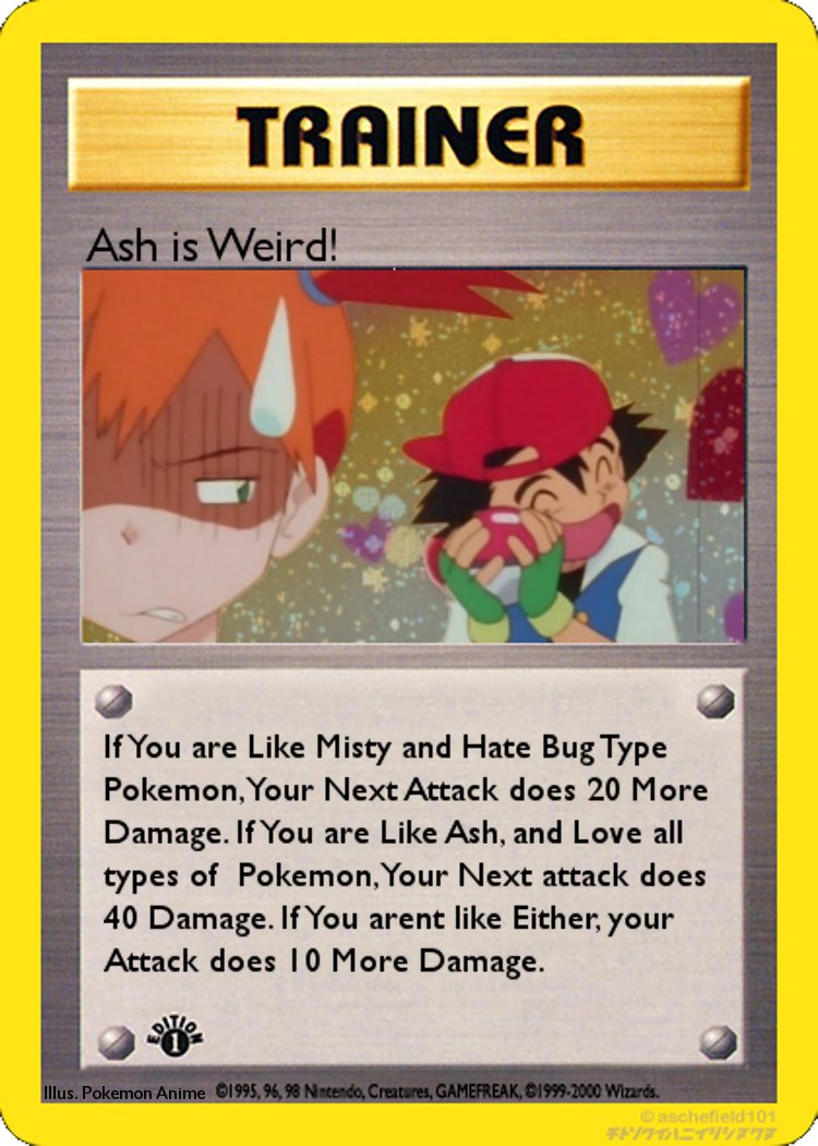
joke_card_for_the_lulz_by_pikachupokemon123-d58h7s3.jpg


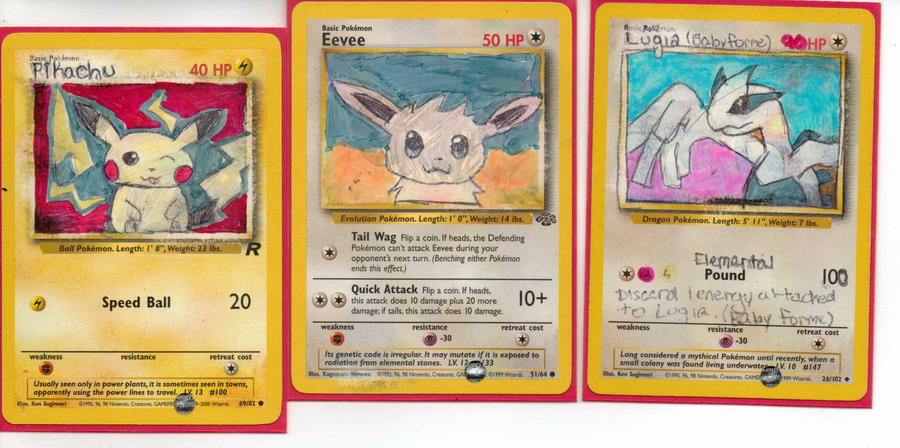
hand_drawn_pokemon_cards___sort_of__by_pikachupokemon123-d58gwqh.jpg
These, are Hard Work. Very Hard.

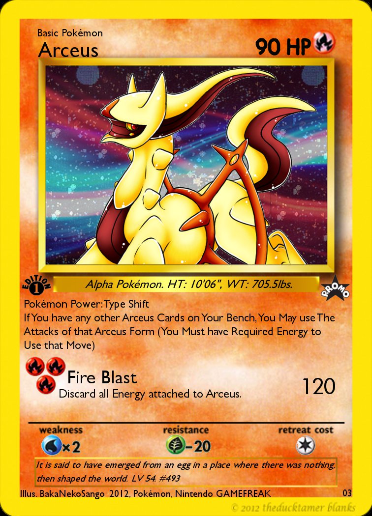
flame_plate_arceus_by_pikachupokemon123-d587byz.jpg


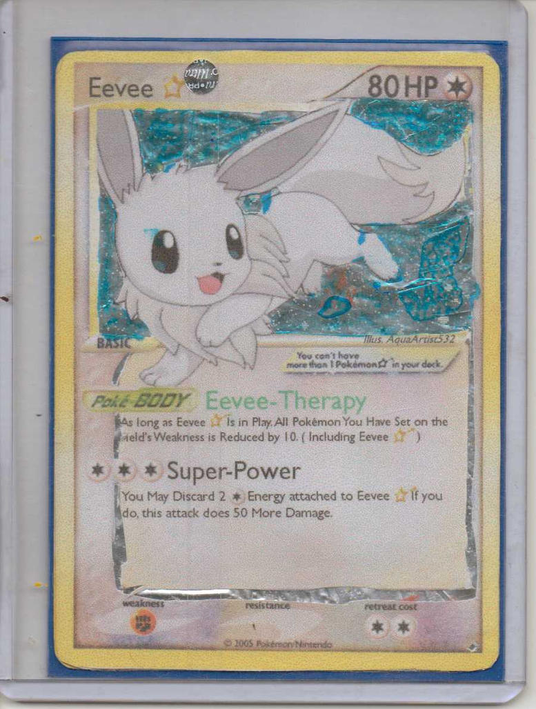
eevee_scan__real_scan__by_pikachupokemon123-d58feda.jpg

I put them in spoiler tags due to their large size. ~CMP
 
One thing I would highly recommend in your text would be to tone down the use of capital letters. There are only certain areas where it is truly necessary to use them. If you are confused as to when they should be used, try checking out the official Pokemon cards and they will help you greatly. :)
 
Ice Arceus said:
One thing I would highly recommend in your text would be to tone down the use of capital letters. There are only certain areas where it is truly necessary to use them. If you are confused as to when they should be used, try checking out the official Pokemon cards and they will help you greatly. :)

Haha I just Have an Issue with typing like that :p So i am Used to Doing that, so i Do it when i am writing a card. It is a REALLY Bad Habit of mine, but atleast i dont Write like this on School Work
 
Spoof cards FTW! I like the Trainer card. My only issues are that the card name is too low and, like IA pointed out, your cap-happy habit. Try to think of fake cards as your school work and you might be able to kick that habit. In the rear. Hard.

I love the custom art cards. They remind me of some of the altered cards they used to show in Beckett Collector's magazine. My favorite is the Pikachu.

That Arceus... I'm not really a fan of. The fonts, alignment, placement... it's all off. Try using some references next time.

The shiny Eevee had potential, but the execution wasn't very good. Admittedly, it is difficult to make only certain parts of a card holo if you don't have white ink. Or transparencies. It would've probably been best not to make this one holo at all with your current lack of resources.

I also feel that Super-Power was intended to have damage written next to it. If not, then the effect doesn't need "more" in it.
 
Nekoban Ryo said:
Spoof cards FTW! I like the Trainer card. My only issues are that the card name is too low and, like IA pointed out, your cap-happy habit. Try to think of fake cards as your school work and you might be able to kick that habit. In the rear. Hard.

I love the custom art cards. They remind me of some of the altered cards they used to show in Beckett Collector's magazine. My favorite is the Pikachu.

That Arceus... I'm not really a fan of. The fonts, alignment, placement... it's all off. Try using some references next time.

The shiny Eevee had potential, but the execution wasn't very good. Admittedly, it is difficult to make only certain parts of a card holo if you don't have white ink. Or transparencies. It would've probably been best not to make this one holo at all with your current lack of resources.

I also feel that Super-Power was intended to have damage written next to it. If not, then the effect doesn't need "more" in it.


Hehe, Yup, it is just too hard, i have had a Habit (did it again) since 4th grade, and I have the feeling that will be hard xD

My favorite is the Pikachu too, of those 3. i made a Luffy and a Goku one, and they may be my new favorites Next to Pikachu.

Arceus was meant to be towards a contest, but never was. i Made the text too Small, and Arceus too low. Also didnt put that "Shiny Holo" on the card like the SR Cards on arceus usually have. As, no on has it >:p haha,

I guess X-acto Knife, and a Fat Highlighter dont work too well ^u^'' Haha

And Yes, Super power was meant to have the Damage Next to it. I usually Screw up on that stuff. like Flying victini i forgot Move Damage. Happens all the time. And if i catch it before i tape the card, i write it on. if I dont catch, it Shove it in a Sleeve and call it a Misprint xD

Thanks for the Info ^u^
 
Back
Top